Metroid Prime Remastered Review: Suit Up
- Core gameplay holds up extremely well
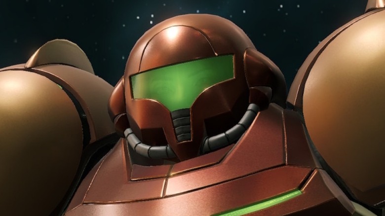
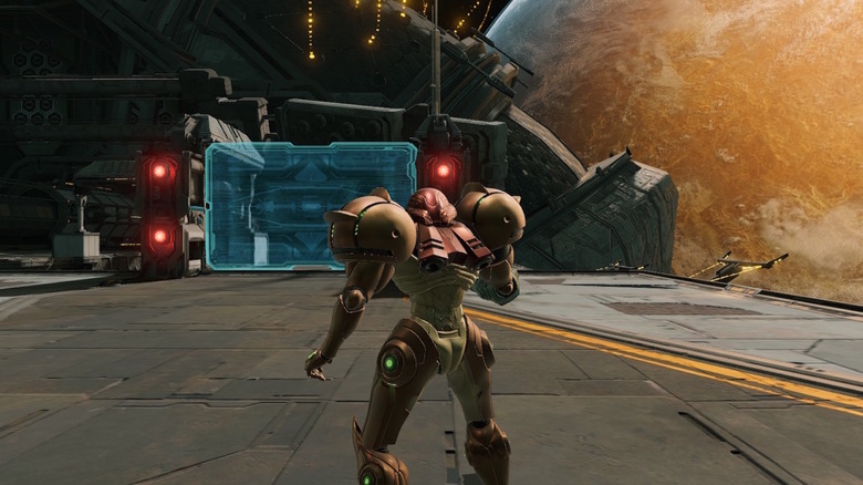
- A major visual improvement
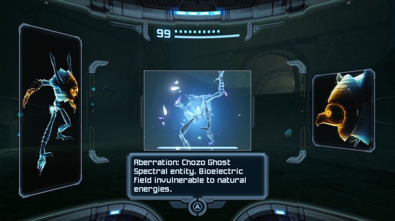
- It’s much easier to keep track of scanning
- Many worthwhile control options to choose from
- Rooms feel a bit small due to the original’s limitations
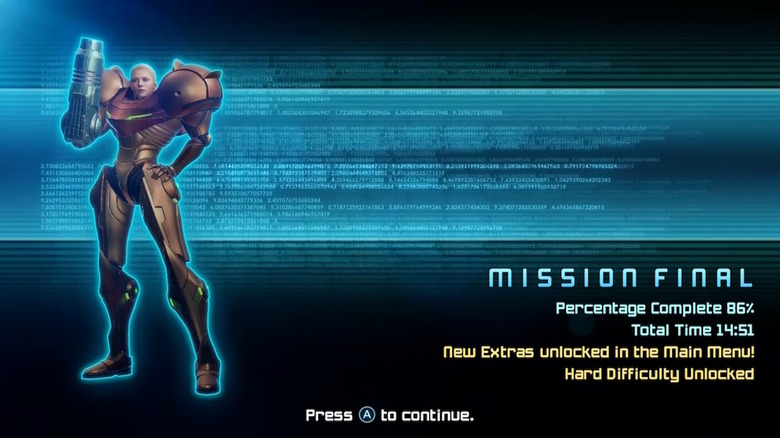
- Hard mode isn’t unlocked from the start
I can't speak for everyone, but for me, whenever I'm asked what some of my favorite games are, "Metroid Prime" is always towards the top of that list. It's the first video game I can remember playing that left me feeling like I had nothing to critique. It was — at least back in 2002 — perfect. And like most fans, I've been quietly pining for a remake in some capacity for a very long time.
That's not to say I was dissatisfied with "Metroid Dread" in any way, or that I'm anything less than excited for the eventual release of "Metroid Prime 4," but Samus' original first-person outing was always the best of the bunch for me. Even if it doesn't have the Dark Suit (a.k.a. The Best One) in it. So of course I made all sorts of happy noises when Nintendo revealed "Metroid Prime Remastered" out of nowhere during the February 2023 Nintendo Direct... followed by more noises when I found out it was released that very same day.
Now here I sit, one full playthrough finished and a second run on the unlocked Hard difficulty (in which I also attempt a 100-percent scan of everything and acquire all the items), trying to figure out how to express my thoughts effectively. Because the short version is that this game is as amazing as it always was, only now even more so because of the handful of updates and additions found in this remaster. But there's a bit more to it than that.
Welcome back to Tallon IV
If you're a fan of — or at least familiar with — the original Gamecube game, it's worth noting up front that there's no new content here. This isn't a remake, it's a remaster, which means the maps and item placement and encounters, and so on are all the same as they were back in 2002. If you strip away the updated visuals, control options, and whatnot, there's no fundamental difference. Fortunately, that original game was (and still is) phenomenal, so yeah it's more of the same but it's more of the same excellence.
While in pursuit of her eternal nemesis, Ridley, and because Space Pirates are involved and they're always up to no good, Samus ends up on an unfamiliar planet called Tallon IV. With all of her gear inaccessible to boot, so she's starting over with just her basic arm cannon and Power Suit. She'll have to explore the planet while rebuilding her arsenal, deal with Ridley and the Space Pirates, and figure out just what the heck is going on with this bizarre blight that's killing off much of the local flora and fauna. And what it doesn't kill, it makes a lot bigger and more aggressive.
"Prime" is a bit more story-heavy than most of the side-scrolling games, to be sure, but it still follows the familiar formula of accessing the areas you can in order to find new equipment. Once you have said equipment, you use said equipment to access new areas to find more items that can let you reach other previously unreachable locations, and so forth.
An interesting perspective
While much of the plot in "Prime" can be glossed over (by either ignoring scannable computer terminals or not bothering to read the results), I wouldn't recommend it. One of the biggest elements that stuck out to me when I first played this game many, many years ago was the way it provides insight into how the Space Pirates operate, and how they view the rest of the galaxy (and by extension, Samus herself). Call me a nerd if you want, I won't disagree, but I always thought it was really neat to finally have the chance to see things from the bad guys' side.
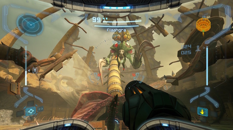
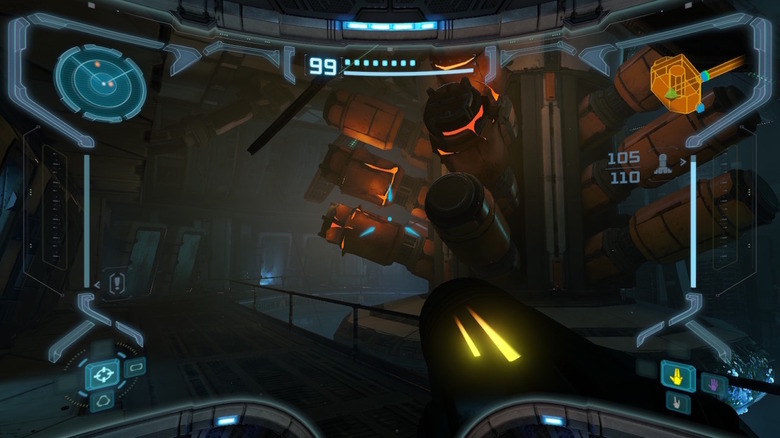
And, of course, there's the literal perspective change that puts you behind Samus' visor. Most of your time will be spent looking through her eyes, which are in turn looking through the helmet, with the heads-up display situated around the edges giving you all the info you'll need (remaining health, missile stock, and more). What made this work so well then and still work so well now is that the HUD is useful but also makes sense within the context of what Samus would probably want to see herself. It's a very clever approach that's not all that dissimilar (when you consider the in-universe context) from the still brilliant diegetic HUD approach used in the "Dead Space" series.
It's in the details
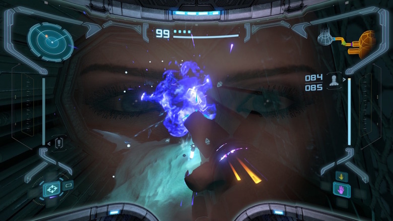
I can't stress enough how ahead of its time "Metroid Prime" was in the way it handled its first-person perspective beyond just having a handy HUD. Bright flashes cause a temporary reflection of Samus' eyes, water, and monster goop will temporarily distort your view, and looking up in the rain causes droplets to bead. Only now these effects look better, and in the case of rain, they've actually been noticeably enhanced because now raindrops will also bounce off of the arm cannon. But more than that, looking up or down in the rain will cause water to flow in the appropriate direction, up or down the length of the cannon as gravity would require.
Additionally, there are thermal and x-ray visors that do just what their names imply. Using the thermal visor gives you visible heat signatures that can be used to spot cloaked enemies, see better in the dark, locate hidden items and puzzle elements, and more. And said heat signatures are used in ways that make sense, with the arm cannon's own glow changing depending on the beam you have equipped, and mechanical enemies are practically invisible (because no body heat).
Also that x-ray visor. It blew my mind to not only realize I could see the bones of Samus' arm and hand inside the cannon, but also figure out that the position of her hand and fingers change for each of the four beam types you'll acquire. And each hand position corresponds to the symbol in the HUD used to depict said beam. This game is full of little details like that and it's amazing.
Metroid Prime, remastered
I'm sure there are nitpicks to make about the visuals in "Metroid Prime Remastered," particularly because as much as I love the Switch it's definitely not the most powerful console on the market, but even if it's not the most technically impressive thing in existence it still looks fantastic. The Gamecube original was no slouch for its time, but Tallon IV (and everything that lives there) has never looked this good. And as an added bonus, you can unlock and view enemy and suit models, concept art, and more as you play.
My own nostalgia made it difficult for me to figure out just how much had been improved, but after looking up some screenshots and checking out one of the dozens of side-by-side comparison videos that popped up in the past few days it became much more apparent. This is so far beyond a simple up-scaling of textures and screen resolutions. Visually, at least, it appears as though the game was pretty much rebuilt from the ground up. The textures are indeed improved, but so are the models themselves. There are a ton of extra details to be found in everything.
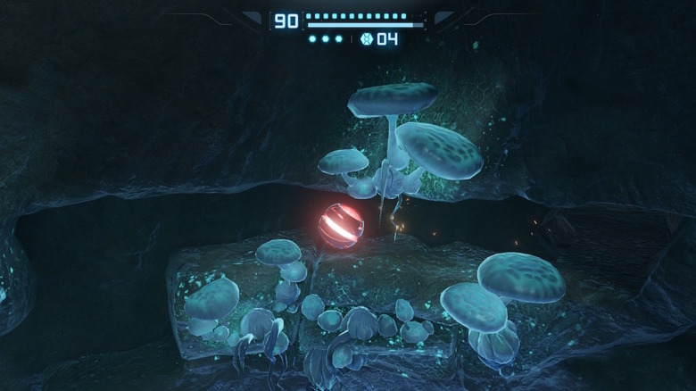
And the lighting. Holy moly the lighting. As I said the original release was no slouch but there have been several instances during my playthrough(s) where I had to stop and admire what I was looking at. Ambient glowing, Samus' suit lights, fires, arm cannon bursts, the sun shining through a broken ceiling — this game is flipping gorgeous from start to finish, either docked or handheld.
Non-visual upgrades
Outside of the obvious glow-up, another big improvement in "Metroid Prime Remastered" is the scanning. On the Gamecube, it was often tricky to figure out whether or not something had already been scanned, which could make aiming for a "100%" accomplishment a pain. Now the icons for scanned objects are a bit more faded, so it's much easier to know when something has already been checked. Also, side note, if you beat the game and start over using your previous save it'll remember everything you've already scanned.
As noted in the Direct announcement, there are several control options available now as well. You can choose to play using the original Gamecube scheme, which avoided the dual-control stick approach that's become commonplace in first-person shooters, but it also offers a dual-stick option that works very well (and was my preference the first time around). The downside to this is changing beams, which originally was done using the right stick. With this option, you have to press and hold the X button and use the corresponding directional buttons (normally used to swap visors).
And if that's not enough, you can also opt for a pointer-style control scheme that mimics the Wii remote and nunchuck controls implemented in the "Metroid Prime Trilogy," which has become my new go-to thanks to the faster movement and quicker beam switching because the right stick is free. The only downside is that the pointer calibration regularly gets thrown off, particularly during frantic fights. It's easy enough to re-center by pressing one of the right shoulder buttons, but it would've been nice if I didn't have to keep doing that.
Not much to complain about
Just like the original Gamecube version, it's difficult to wrack my brain for anything to criticize here. I guess there's that constant need to recalibrate the pointer, but that's one of many control options so you won't encounter it if you never use it. And if you do use it, it's a mild quirk at worst, really.
I'm not a fan of the narration (a carry-over from the European and Japanese releases) because it's... somewhat awkwardly presented and directed. Also it kind of ruins the quiet, serene atmosphere, but it's entirely optional and is turned off by default. I'm also disappointed that Hard mode isn't available from the start. I didn't mind playing through once to unlock it (thus giving me an excuse to play through again), but I would've preferred to at least have the choice of jumping straight into it.
Really though the only significant (semi-significant) aspect that stood out to me is the size of each of Tallon IV's individual "rooms." Because this is a remaster it's completely understandable that the maps would be the same, and the Gamecube had its limitations, so of course, none of the separate areas are particularly big. It's how they were able to cram as much detail as they did into the game back in 2002. But looking at it now, yeah, some spots definitely show their age in terms of how tiny and segmented they are.
But again, that's because of 2002 hardware limitations, and it in no way made me enjoy the game less. It's just something I noticed now that we're 20+ years out. Though I do feel it's important to note how gross it is that the original "Prime" development team was left out of the credits for the remaster, with nothing but a general "Development Staff" note appearing towards the end.
Metroid Prime Remastered verdict
I was ecstatic to find out that "Metroid Prime Remastered" was a thing, and that it was available right away. To the point where I couldn't even wait to see if we might be able to secure a review code — I just paid the $39.99 "Metroid Prime Remastered" costs in the store outright because I had to play it. And to be honest? I think the price is too low.
Don't get me wrong, I'm more than happy to only pay $40 for the best version of one of my favorite games of all time. But for the amount of work (and love) that obviously went into this remastering — the updated models and textures, multiple control options, freaking physics (or at least faked physics) in the rain effects, etc — I would have happily paid the more typical new game price of $60 with no regrets.
In truth, I'd have been thrilled with something as basic as some AI-upscaled textures and a new screen aspect ratio. So long as I could play "Metroid Prime" again, on a modern console that I own, that would've been enough. Instead what we got is a superbly crafted upgrade to a stellar game that holds up just as well today as it did in 2022. Only now it looks way prettier and I can play it on the go. It's the kind of scenario I couldn't even dream of back in the day, and yet here it is. Definitely buy it if you're a fan, and I'd say at least think about it if you're new to "Prime" and are the least bit intrigued.
