Garmin Venu Sq2 Review: Smartwatch Battery For Days
- Fantastic battery life
- Recharges fast
- Great AMOLED display
- Tons of data
- Lots of watch faces (though limited in square shape)
- Software elements lack polish
- Notification workflow is just ok
We may receive a commission on purchases made from links.
Smartwatches are in this weird place these days. There are two major categories of them. The first category is comprised of smartwatches that mimic a lot of your phone's functions but on a small screen. These only last a day or two. Then there are fitness trackers that serve up your notifications and are otherwise health-focused, tracking steps, sleep, and other body functions. The Garmin Venu Sq2 smartwatch decidedly falls into the latter camp. It's a fitness tracker that does a pretty good job with notifications, tracks most kinds of basic health metrics you could want, and lasts for days and days on a charge, all with a good sense of style.
I've been wearing the Garmin Sq2 paired with my iPhone 14 Pro for three weeks. I am not the target demographic for Garmin, finding myself on the wrong side of 45 years of age and 300 pounds. All the same, I absolutely love Garmin watches for their endurance even if mine can't keep up. This is my full review.
Hip to be square
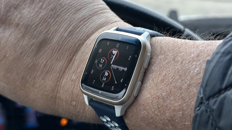
Those familiar with the Garmin line of smartwatches probably think of round watches first and foremost. But in September 2020, Garmin released its first square-shaped smartwatch, the Venu Sq1. This refresh has the same shape as its predecessor but carries a slightly bigger screen at 1.41 inches of AMOLED (vs. LCD last generation) and a higher resolution of 320 x 360 pixels. There's one other minor difference in that Garmin basically doubled the battery life up to 11 days in "smartwatch mode."
Health sensors include heart rate, respiration, and blood oxygen level which all tell you how well you're sleeping and how stressed out you are. In my case, not enough and way too much. Heart rate is recorded at all times. Sleep tracking is only recorded when you tell the watch you're going to sleep during the initial setup. Naps are not recorded.
Garmin doesn't advertise battery size, opting instead for battery life. Eleven days is ambitious though and we'll talk a lot more about battery life later. For now, let's just say it's really, really good.
There are two buttons on the side of the watch that serve multiple functions. Each button has two functions depending on how long you press it. Naturally, there's an accompanying app that connects and manages most of the watch functions. That's actually a pair of apps as you'll see when we dive into the software.
Using the watch
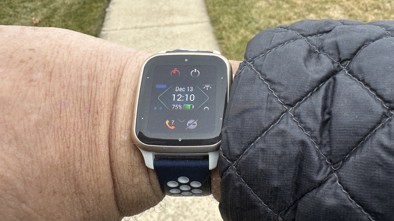
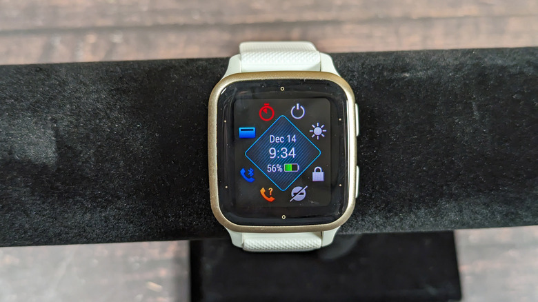
As mentioned, there are two buttons on the side of the watch, and each performs two functions based on how you press it. The top button starts an activity with a normal press and goes into watch functions with a long press. Watch functions include ringing your phone, setting timers, Do Not Disturb, and Garmin Pay. As a side note, Garmin Pay is like a normal NFC payment, but with Garmin's system. It works as you would expect.
The bottom button serves as a back button when pressed and takes you into the watch settings when long-pressed. Those settings include watch faces, alarms, controls, and sensors. Once you get used to how the buttons function it's pretty easy to navigate.
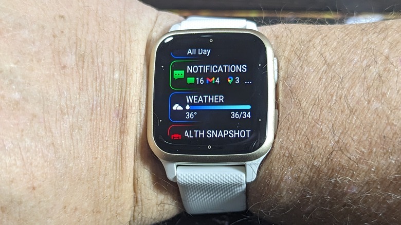
Speaking of navigation, a swipe up or down on the watch face will take you into your glances. These can include apps like Accuweather, notifications, calendars, and all the other data that the watch collects, such as sleep data, activities, stress, body battery, and more. You can tap on any of these to get more data, but honestly, it's easier to do in the app. A swipe up or down will get you to the same menu just at the top or bottom. A swipe to the right gets you a customizable shortcut (I had mine set to Garmin Pay). That's it, it's super easy to navigate.
I think I would like to see notifications serve a more prominent role than just a glance; perhaps a swipe to the left could do that in the future. I'd also like to see notifications be more actionable, but that's pretty ambitious for a cross-platform application. But for now, notifications are readily available in the glances menu.
There's a face for that
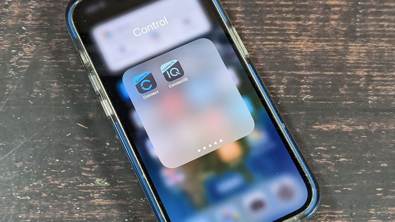
The software on the watch is good, but I did run into a hiccup or two. First of all, there are two apps you'll need. Garmin Connect is the main app that connects to your watch and allows to you look at your statistics. There's also Garmin ConnectIQ which is basically the watch's app and face store. We'll tackle that first.
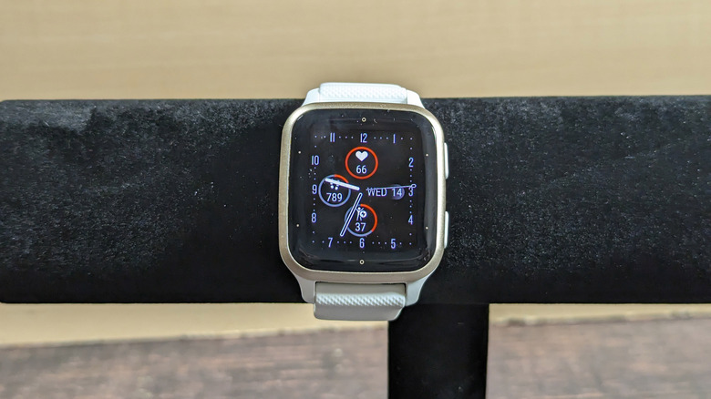
Garmin has a huge variety of watch faces at your disposal with different displays, complications, and data. You can have as busy a watch face as you want or as basic. Many of the watch faces are paid watch faces, though there are some free ones. One thing that isn't really there though is support for square watch faces. As I mentioned, the Venu Sq2 is only Garmin's second square watch, so that's not terribly surprising, but I would have liked to see Garmin contribute a few of its own watch faces to support the platform rather than rely on developers to do the heavy lifting. Of course, if I'm wrong and Garmin did contribute faces, searching for "Square" or "Sq2" yielded few results, so perhaps it's a discovery issue. Either way, it's an issue.
Complicated complications
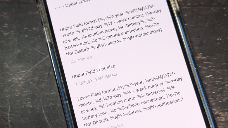
Another rough edge is how complications are handled on the watch. Put simply, configuring watch faces is seemingly left up to the developer to determine how they want users to configure their watch faces. In most cases, it's a bit janky. For example, one watch face I use has pages and pages of options that are all toggle switches or filed under names that are not clear. The preview for the face is on the page before, so it's easy to get confused when toggling options. Another watch face has to type what amounts to code into a text line so you can configure what fields to display and where.
Garmin would be wise to throw some development dollars at its SDK to make configurations much easier for the end user. I'm a nerd and a reviewer, which means I'll deal with whatever you throw at me. Most end users are not, and this could easily be a pain point.
Data for days
On the other half of the software picture is the Garmin connect app which has all of your data and dashboards for tracking your health stats which include your sleep, stress level, steps and activities, heart rate, calories burned, and the list goes on and on. You can see your data from the past day, week, month, and year to get an idea of your trends. Additionally, you can data such as water intake, menstruation, weight, and activities not originally tracked.
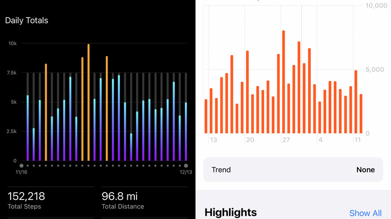
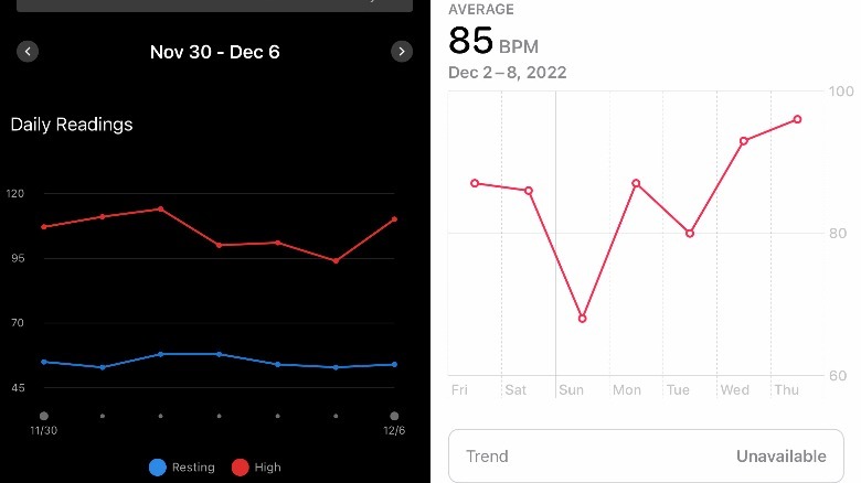
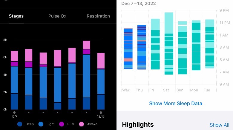
Personally, I am most interested in sleep because, despite all evidence to the contrary, I like to sleep and wish I could do it more. I talked to several of my more athletic friends about the watch and they all swear by Garmin because of the data and the organization in the app. I wish I could speak more authoritatively about the data, but the only thing I have to compare against is the first-generation Apple Watch SE. In this section, Garmin data is on the left while Apple Watch data is on the right. Generally, both watches were pretty far off from each other in some metrics like calories burned per day and sleep, but for step counting, they were pretty close.
For sleep data, I don't know who to trust except to say that the Apple watch consistently showed me getting more sleep than the Garmin watch during the week I wore both to bed, but I can also tell you that week I felt like walking garbage, so I'll go with Garmin. I enjoy Apple's data organization better. It's more difficult to navigate on the Garmin Connect app. This is again another area where Garmin could stand to spend some development dollars. The data is solid, but the display is lacking.
Battery for (even more) days!
Now, we get to my favorite part of a Garmin smartwatch — the battery. Put simply, it's stellar. Garmin advertises 11 days of battery life in smartwatch mode. I never got that, but I got close. There are a few ways you can set up your smartwatch, but most of the battery life will be determined by heart rate tracking, pulse ox tracking, and Always On Display. Out of the box, I left everything at their defaults – heart rate was always on, pulse ox was only during sleep, AOD was off, and GPS was off.
I should mention that of all of these, GPS will kill your battery the fastest. If you leave the GPS on all day, you'll barely hit 24 hours. As it happens, there is rarely a need for 24-hour GPS.
As for the rest of the functions, when working under those conditions, I got just under nine days of battery life. When I went in and turned everything (except GPS) on all the time, including AOD, I got three days of battery life. Let me repeat that; under the worst-case scenario, I got three solid days of battery life, or more than any other smartwatch I have worn from Apple, Samsung, or Google. Once I turned pulse oxygen tracking back to sleep only (but leaving AOD on), I started getting a solid five to six days of battery life. That is insane battery life. I wish I had longer to play with these settings to find the right combination of lifestyle and battery, but for now, it's simply awesome. You can basically do whatever you want with this watch, and it'll smile and just keep going.
Back up in minutes
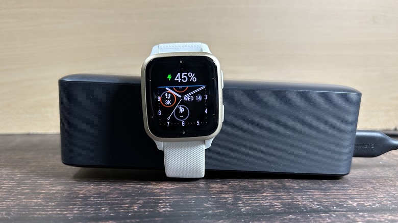
As the piece de resistance, the watch changes with a proprietary cable to full in under an hour. In my time with the watch, I never killed it, meaning I never took it to 0% so it shut down. But I typically started charging it from between 5-7% to full. It never took more than 45 minutes to charge up to 100%. Put another way, I could binge an entire season of "Dark Matter" while killing the battery, but I could recharge it during a single episode.
This is the reason why, when I'm not wearing an Apple watch, I wear a Garmin. I don't like worrying about battery life or deciding when I can sacrifice data to set it on a charger. It's a first-world problem, for sure, but when you compare this battery to what you'll find on an Apple watch or a Pixel watch, there is simply no contest. The Apple watch's expansive functionality makes up for the fact that it only lasts a day and a half. That's the only reason why I let it give me the time of day.
Wrapping it up
So where does that leave us? Put simply, if you love data or battery life, or both, this is the watch for you. While I maintain my stance that the Apple Watch is better for iPhone users, it's only by a very slim margin. Garmin definitely needs to work on its software, no question there. But as for raw data collection, hardware, and battery life, there is simply no contest.
Of course, Garmin also costs a premium as the Venu Sq2 will run you $249 as reviewed while the Music Edition of the watch (which has local storage for music on the go) will run you $299. Garmin watches have always been expensive, but this watch compares favorably to an Apple Watch SE. Compared to a Fitbit however, there's a pretty decent-sized price gap.
If you have an Android phone, I highly recommend this watch. You will get more functionality from something like the Galaxy Watch 5, but you'll sacrifice battery life for it, and in my world, that's not a good trade-off. The Garmin Venu Sq 2 gives you style, functionality, and battery life that won't quit. That's a compelling offering and this watch deserves a long look.
