How Steve Jobs Influenced Apple's Iconic Logo
Today, Apple, Inc. is one of the most profitable companies in the world, with one of the most recognizable logos. But when two 20-somethings named Steve began building computers in a garage in 1976, it was the very definition of a bootstrap startup company. And the now iconic logo looked very different.
But did you know there was a third co-founder of Apple? Ron Wayne, an elder statesman in his 40s, owned a 10% share of the company for 12 days in April 1976. He sold it back to Steve Wozniak and Steve Jobs for a mere $1,500 after deciding the gamble wasn't worth the risk, missing out on an estimated $75 billion. Oops.
Before leaving, Wayne happened to create Apple's first logo — a pen and ink drawing of Isaac Newton sitting under an apple tree. A quote from a William Wordsworth poem laced the edges of the frame, and the "Apple Computer Co." name was emblazoned on a banner wrapped around the whole image. It had a very "olde English" flair to it.
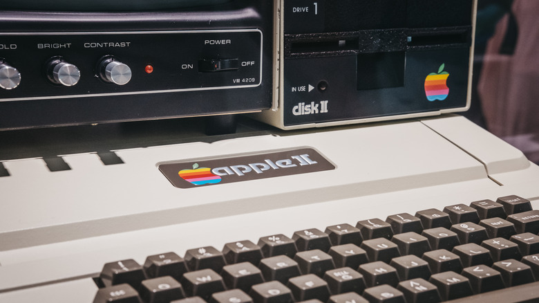
In 1997, as the Apple II was headed towards release, Steve Jobs realized the logo didn't look right on the case. Enter Rob Janoff, the art director at a public relations firm named Regis McKenna. The name of the company has a symbiotic relationship with the logo. During their initial meeting on a new design, Jobs' only actual directive to Janoff was, "don't make it cute" (via Creative Bits).
The apple didn't fall far from the tree
Janoff recalls that personal computers were still new to the world at the time, so one coming into the home was "threatening" (via Creative Bits). Some of the other personal computers of the day had "very techo names," like the TRS-80 sold by Radio Shack. Jobs, ever the forward thinker, wanted a logo that wasn't techy or corporate. In particular, he wanted it to be relatable to kids so they could get computers into schools (via Creative Bits).
An apple was, as Janoff called it, "basic." It was something everyone around the globe knew at first glance and was the antithesis of technology. So, he took the image of the apple and created two initial versions. One was a whole apple and one had a bite taken from it. He was afraid Jobs might find the one with the bite too cute. He also said the bite was added for scale, ensuring people wouldn't mistake it for some other fruit (via Creative Bits).
The Apple II was the first fully assembled computer to produce color images on a monitor. Contrary to urban legend, the multi-colored rainbow logo represented the color bars on the monitor and nothing more. Janoff recalls trying to do the stripes in greyscale halftone, but it simply didn't look good. There was some pushback from an account executive at Janoff's agency over the colors. The exec thought Jobs would hate it because the cost of printing color stationery would financially ruin Apple before it even got off the ground, but Jobs liked it immediately.
If you were curious, Janoff didn't use a computer to create the logo. It was made the old-fashioned way ... free hand (via Creative Bits).

