5 Terrible Features Nobody Wants To See On New Cars
Cars have come a long way since they first debuted in the late 19th century. They are refined, quiet, and smooth ... for the most part. More basically, they go, stop, and steer as you would hope. Standards are high, and buying a truly terrible new car is unlikely.
Time and technology have made it so a car customer's attention typically now focuses on the minute details. Instead of worrying about whether the engine will start on a cold morning, we're disappointed by the little things: A dashboard display that isn't touch-sensitive, voice recognition that wakes up every time you so much as mention your car's manufacturer, fake vents and exhaust tips that put form over function.
With that in mind, there are some major faux pas that can show up in the architecture of a modern vehicle. These are five terrible features that nobody should have to deal with in a new car.
Fake exhaust tips
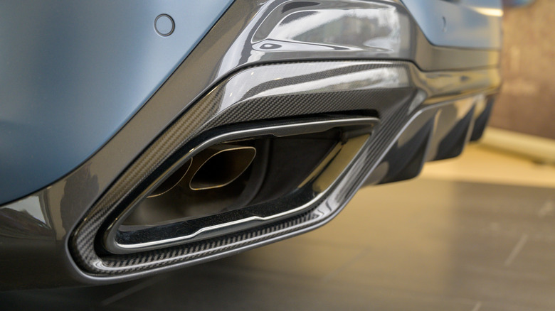
We all know that big exhausts, and preferably several of them, mean the cars they sprout from are powerful, fast and exotic. Look at the beautifully sculptured pipes at the rear of a Pagani, or the six (count 'em, six) telling you all you need to know about the Ferrari 365 GT4 BB.
But for all the tailpipe victories, there are also failures. Audi has been guilty of fitting fake exhaust tips to its cars for years, and so too has Mercedes. Even the first-generation Ferrari California has exhausts sitting within decorative tips, and the Bugatti Chiron hides a couple of extras part-way along its diffuser.
The worst offender? It's a close fight between the BMW 8 Series, pictured above — whose pipes are plainly not part of the tip itself — and the Audi SQ5, which has four prominent, chrome-tipped tailpipes that look good but are completely fake. Instead, the real muffler pokes out from underneath the rear bumper. No wonder the U.K.'s CarWow employs a 'stick of truth' to call out just how many fake tailpipes there are.
Fake vents
Here's another form of design nonsense to make cars look more aggressive than they really are. Vents indicate a monster of an engine under the hood that needs vast amounts of cooling. In reality they often don't let any air through at all. This isn't a particularly new trend, with the R56 Mini Cooper S from 2006 featured a fake air vent on the hood that was filled in with a piece of black plastic trim. This was a design nod to that of the previous-generation R53 Cooper S, where the intake was used to cool the supercharger. But a switch to turbocharging for the R56 Cooper S meant the vent was no longer needed, and a fake was fitted to help retain an iconic design.
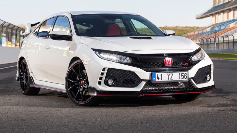
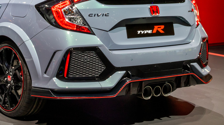
Far less subtle are the enormous fake vents on each corner of the FK8 generation of Honda Civic Type-R from 2017. These look like they'll gulp up massive amounts of air to cool the turbocharged two-liter motor, but instead they are entirely decorative. The rear grilles, pictured above, are equally fake. They instead serve to house parking sensors and nighttime reflectors. That lovely triple tailpipe, mercifully, is real.
Voice recognition
Voice recognition on our phones and around the home can be great. Speaking to Amazon's Alexa is a handy way to set timers while cooking in the kitchen, and Siri makes it easy (and safe) to phone a friend while driving.
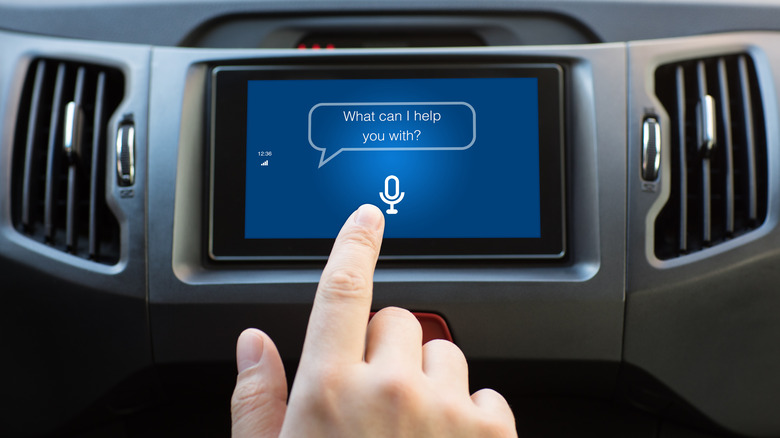
But car manufacturers' own voice recognition systems? They're less than stellar. These are often summoned by saying "hey" and the vehicle manufacturer's name. Or, amusingly in the case of the Ferrari Roma and SF90, you can say, "Ciao, Ferrari." But this has been panned by reviewers.
The problem here is obvious. Siri is a made up name, and no one goes about their day saying "Okay Google" unless they want to talk to the Google Assistant. But in the car? You're quite likely to mention the brand of the vehicle you're in when talking to a passenger, or when you see another one out on the road. Before you know it, your music is muted and the car is listening when you don't want it to. We might forgive all this if car manufacturers made decent voice assistants, but it's the tech firms who have the upper hand here. Please, automakers of the world, stick to Alexa, Google Assistant or Siri and leave it at that.
Haptic touch controls
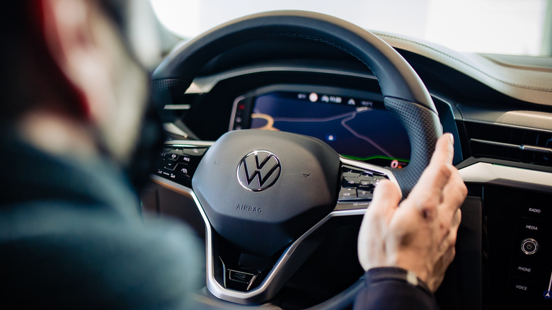
Not just a gripe about modern technology, but a genuine safety concern — the interior of a car is no place for haptic touch controls. Volkswagen's use of haptic buttons on the steering wheel and dashboard of its electric ID.3 and eighth-generation Golf is perhaps the most prominent example of the technological failure. As a result, VW has pledged to bring back physical buttons for future models.
"We are bringing back the push-button steering wheel!" Thomas Schäfer, CEO of Volkswagen Passenger Cars, said on LinkedIn. "That's what customers want from VW."
As SlashGear said in its review of the 2022 Volkswagen Golf R, which is otherwise a high-scoring hot hatch: "These [HVAC temperature] sliders, lacking any sort of tactile feedback and demanding one to take attention from the big glass windscreen displaying real-time information about what's going on in front of the car, aren't even illuminated at night. Just hope you like whatever temperature and fan speed you fumble upon, because unless you stop you aren't easily changing it."
We also haven't quite got over Ferrari's removal of the physical red starter button from its latest steering wheels. Tapping a touch-sensitive panel to fire up Italy's finest simply isn't what you want.
Non-touch displays
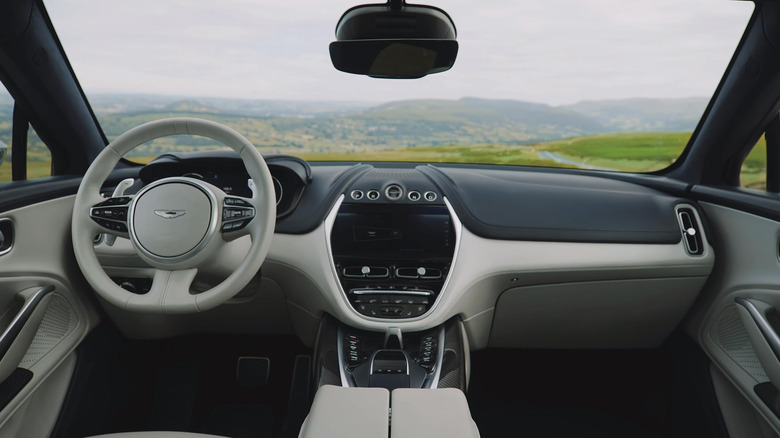
Only a handful of manufacturers are still guilty of this, but the rarity makes it all the more frustrating when you prod at the infotainment screen and nothing happens. The Aston Martin DBX is one such car, where tapping the screen does nothing but leave a fingerprint behind. Instead you have to navigate the infotainment console using a previous-generation Mercedes trackpad and scroll wheel.
At the risk of disagreeing with our previous point about haptic controls, we want to stress that car infotainment is about striking balance between touch-sensitive controls and tactile buttons. Quickly tapping or swiping at a screen to return to the map or answering a call can be far more convenient and intuitive than pressing buttons or turning a scroll wheel.
Even if you disagree and prefer scrolling over swiping, it's nice to have the choice. Aston Martin's 10-inch screen not supporting touch controls, especially when Apple CarPlay is designed as a touch-first experience, feels wrong.
Similarly annoying is how Mazda's infotainment system stops the display from being touch sensitive when the car is in motion. It's good that Mazda wants to limit driver distraction, but in our view, scrolling through the screens of CarPlay and Android Auto with an MX-5's scroll wheel is far more distracting than reaching out and tapping an app.
