Apple iPad Pro 2022 Review: M2 Heart But Hover Steals The Show
- Desktop performance in a thin, fanless tablet
- iPadOS 16.1 edges closer to Mac-style flexibility
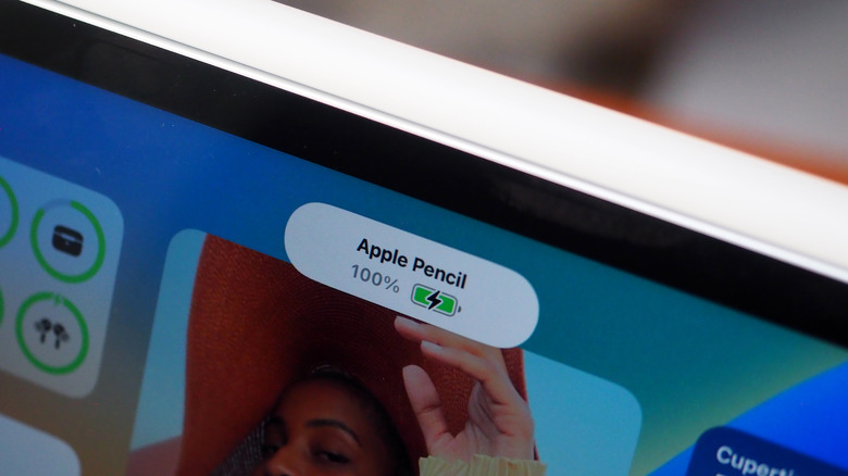
- Apple Pencil hover makes stylus more intuitive
- 5G is a welcome upgrade
- Expensive, especially with accessories
- 5G is not a cheap upgrade
- Performance is there, but apps need to tap into it
The "pro" In Apple's iPad Pro has always been tricky to define, ever since the flagship tablet debuted all the way back in 2015. Whether designed for professionals or prosumers, the question of just what you can, cannot, and could reasonably expect to do from Apple's tablet has left users divided, either ready to give up their laptops and desktops in favor of a more flexible slate or still bemoaning shortcomings that typically hinge more on what the software allows you to do than anything else.
Ask the cynic, meanwhile, and they might simply point to the fact that — like the MacBook Pro — these are the most expensive models in the line-up. With MacBook Pro-like pricing, iPad Pro ownership is no casual step. For 2022, then, Apple sweetens the deal with the same chipset as its most recent laptops, not to mention more involved and intuitive ways by which the tablet interacts with its key accessories.
Plenty of iPad Pro overlap
Some of the iPad Pro recipe has stayed the same, and I can't really fault Apple for that. The 12.9-inch Liquid Retina XDR display remains one of the best panels around: bright, color-rich, and generally enough to make you look at every other screen in your life with unbridled scorn. The 11-inch model sticks with the Liquid Retina display that doesn't get the mini-LED backlight magic.
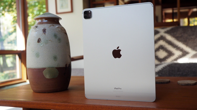
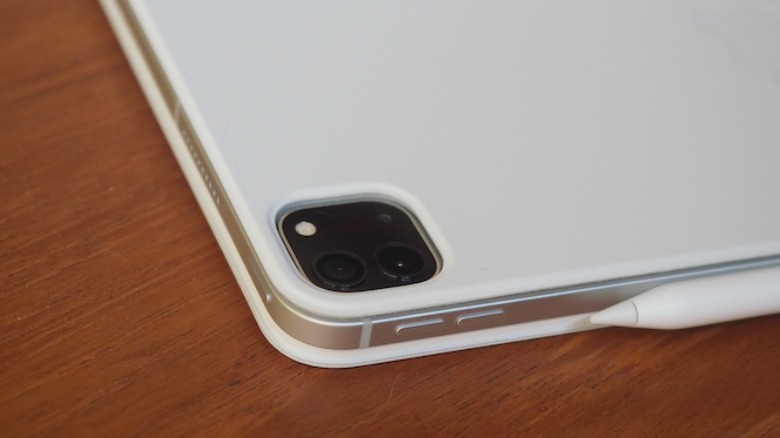
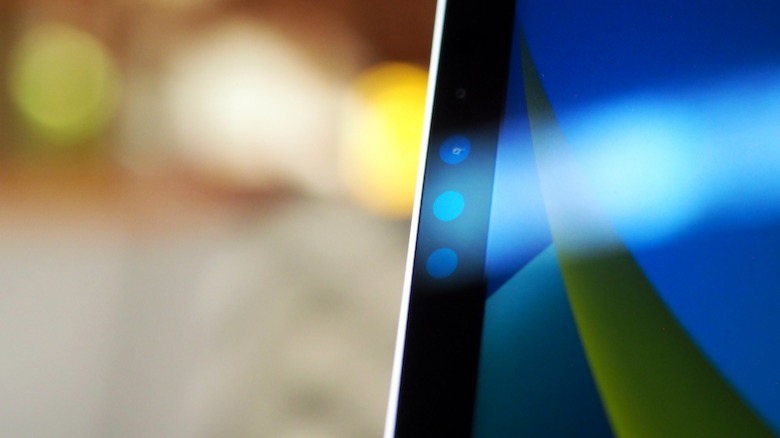
The cameras, meanwhile, are also carried over. That means a 12-megapixel wide and 10-megapixel ultra-wide on the rear, along with the LiDAR Scanner. The front keeps the TrueDepth camera that powers Face ID, but where the 2022 iPad's selfie camera has been shifted to the landscape edge, the iPad Pro's remains at the top of the portrait edge.
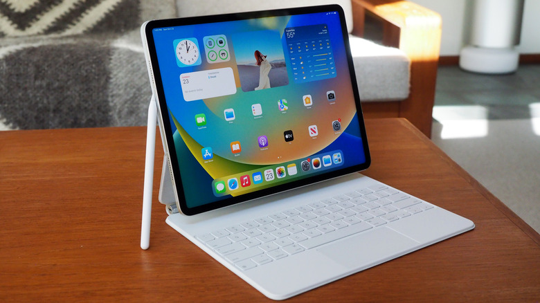
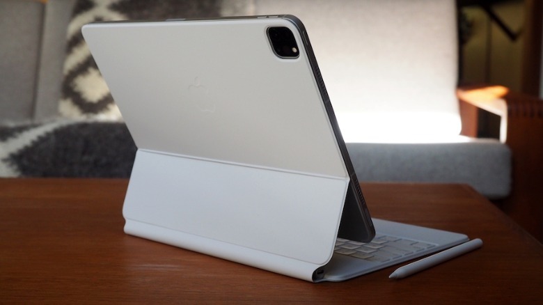
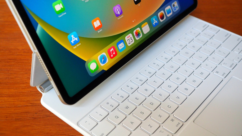
I suspect that's a packaging issue — TrueDepth does have a few more sensors than a regular camera — but it's a shame, as I typically find myself using the iPad Pro in landscape orientation. That's particularly the case with the MacBook Air-like Magic Keyboard — a still-expensive $299 option that frustratingly lacks the dedicated function key row Apple added to its new Magic Keyboard for the 2022 iPad — which more often than not I have attached. I really like Apple's Center Stage, which keeps you in the middle of the frame during video calls, but I wish the camera itself was positioned a little more centrally to make where I'm staring look entirely natural.
Baked-in 5G is welcome
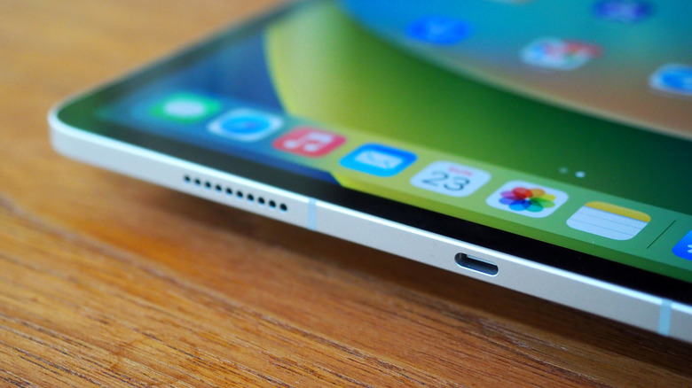
Physical connectivity remains the same as the last-gen iPad Pro, too, with a USB-C connector that supports Thunderbolt and USB 4. I can't fault Apple's audio, either, with the four speakers spread around the iPad Pro being more than capable when it comes to video — even if, for the most part, I used Bluetooth earbuds (sadly, no, there's still no 3.5mm headphones port).
Apple has added Wi-Fi 6E this year — something still missing from the MacBook range — and there's the option of integrated 5G. Like the iPhone 14, Apple is using eSIM alone for its cellular connectivity. Unlike the iPhone 14, however, it's much easier to access roaming data plans from the iPad Pro, since you can choose them directly from the tablet. I just wish stepping up to 5G wasn't so expensive.
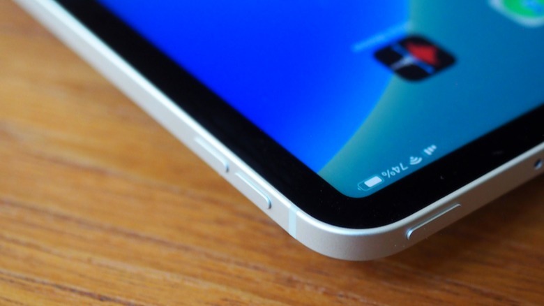
Battery life is the same 10-hour promise that Apple has been making for some generations now. In practice, with 5G active, I found that was a reasonable estimate.
iPadOS 16.1 brings iPad Pro even closer to Mac
Out of the box, the iPad Pro runs iPadOS 16.1, and Apple is adding further distance between its iPhone and iPad versions of the software. Widgets and new versions of Mail, Safari, and other native apps are pretty familiar at this point. However, it's the updates to things like multitasking that stand out.
It's fair to say that multitasking has been a long-standing point of frustration for many iPad users, myself included. If you're used to how the process works on a Mac — or, for that matter, on any desktop computer — then iPadOS' combination of swipes, gestures, split-screen layouts, and the like may well have felt like a complex answer to the question of app windows. Now, we have Stage Manager to try to tame the process.
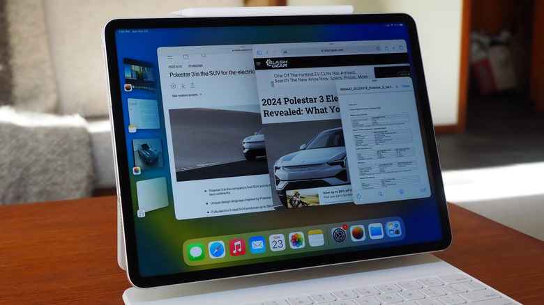
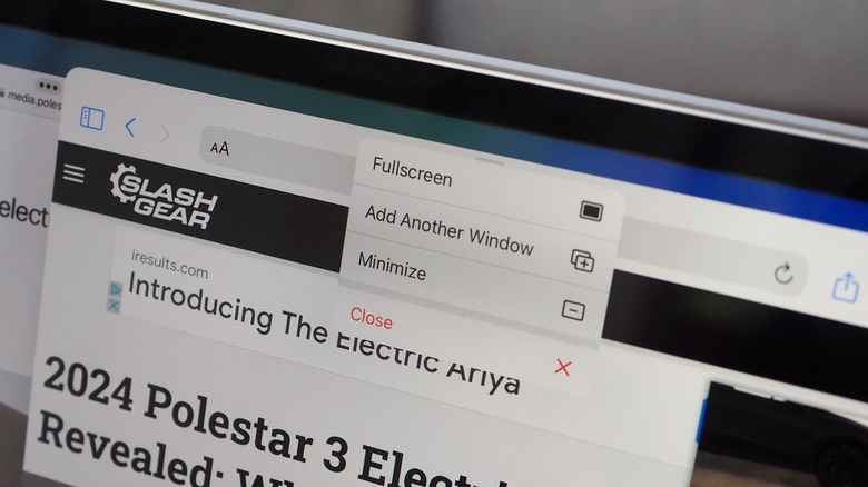
I've ended up thinking about Stage Manager as a combination of macOS virtual desktops and app-switcher thumbnails. The idea is that you have your — automatically organized — recent apps and documents running along the left edge of the screen, and then tap between which gets maximized. There's (finally) support for having several windows visible at once, and for resizing them.
Stage Manager has promise, but still feels clunky in places
How well it works depends on, well, how you work. When I sat down to write a car review on the iPad Pro, being able to quickly jump between my copy in Pages, the photos I'd imported, a spec sheet, my notes, and the automaker's website was neat. It felt, in fact, pretty close to how I do the same thing on Mac, and the experience got even more impressive when I plugged in an external display (the iPad Pro can drive up to a 6K monitor).
I'm not so convinced that users of some of the desktop-level (or near-desktop-level) apps for video editing, sound production, or graphic design will be so enamored. Those are apps that really make the most sense maximized in full-screen view. Anything that reduces the size of the interface feels like a non-starter. The problem here is that it's really those sorts of prosumers that the new iPad Pro is likely to be of greatest interest with.
iPad hardware, Mac performance
It was frankly astonishing when Apple added the M1 chipset to the iPad Pro in early 2021. For the first time, the Cupertino firm's tablets had the same processing potential as its laptops, a narrowing-of-the-field that, though predicted by many, still felt borderline magical in a device that was fanless and still capable of lengthy battery life. As we've seen from the Apple M2 in laptops like the 2022 MacBook Air refresh, the delta between the generations of Apple Silicon hasn't been quite as jaw-dropping as the leap from x86 to M1 was. Nonetheless, it's tough to understate just what the offer is here: desktop-level grunt.
The qualifier — which also lingers from previous, potent iPad Pros — is that how well you can take advantage of the power on offer depends on the whims of developers. DaVinci Resolve, Octane X, and Affinity Publisher users will all be getting updates later in the year that unlock features and processing speed that legitimately would've forced them to turn to the Mac version before now. That's huge.
There's a sense nonetheless that there's more here from the M2 than is really necessary for most iPadOS apps and iPad users. My typical workflow of email, messaging, browsing, writing, and watching the occasional video barely touches the sides, when you're talking about a CPU that's up to 15% faster than last year's, and a GPU that's up to 35% faster. Never has the fact that this is a pro machine, and not designed for everyone, been more stark.
Apple Pencil gets an intuitive upgrade
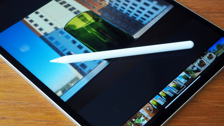
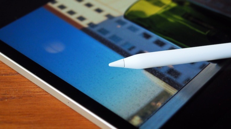
The other big change with the iPad Pro 11-inch (4th generation) and the iPad Pro 12.9-inch (6th generation) is Apple Pencil hover. Until now, Apple's rechargeable second-generation stylus could track touch, pressure, and tilt when its nib was in contact with the display. With this update, the nib can be tracked up to 12 millimeters from the glass.
Having a tablet recognize a stylus before it actually comes in contact with the screen isn't new, of course. The trusty old HP tc1100 (running Windows XP Tablet Edition) I had in the mid-2000s could do that too, its Wacom digitizer allowing the pen to move the on-screen cursor from a short distance away. It always — as with most Windows-based tablets — felt like it was trying to emulate a mouse, though.
That's not how hover on the new iPad Pro feels. Instead, it's more akin to having a shadow cast by the nib of the Apple Pencil onto the screen, and in whatever form of tool that nib is currently set to represent, whether brush, eraser, or anything else. As a result, you have a better understanding of how the pen and app will interact before that actually happens.
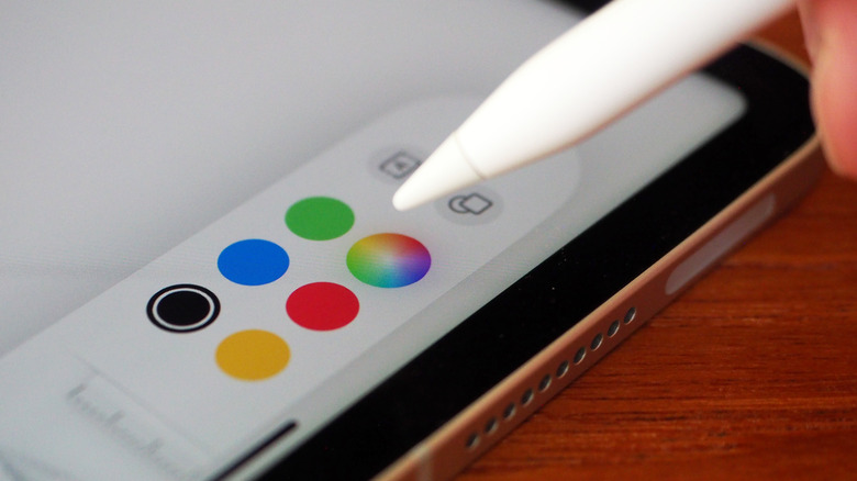
App icons swell preemptively before you tap them; Scribble fields enlarge on the assumption you're about to use handwriting to text. It takes away a little of the guesstimate process as to what you're going to get, especially in apps that have explicit hover support. For casual — and not especially talented — artists like myself, seeing exactly where my digital ink or paint will land, and how thick and transparent it will be before I've actually applied it, makes for hitting the undo button far fewer times.
Hover is just getting started
You get the feeling, though, that hover is just getting started. As long as developers have already added support for Apple Pencil, they'll get all the new, standard hover features by default. However, the API opens the door to more tightly integrating the Apple Pencil as a UI tool.
The developers behind Pixelmator Photo, for example, are combining hover with the Apple Pencil's double-tap, essentially drawing out a new level of interface from the on-screen icons. Other apps will allow you to adjust brush size — complete with a hover preview of the result — by pinch-zooming with one hand while the nib is poised above the display. It should mean, generally, less tapping and more time to get on with creating.
I'm curious to see how this pans out as more developers — beyond those Apple reached out to ahead of time — get to grips with the API. It's worth noting that hover only tracks Apple Pencil position, and the stylus only starts reporting tilt (and of course pressure) when it's in contact with the display. Nonetheless, it feels like it could potentially become a bigger deal than simply for artists.
iPad Pro M2 verdict
In fact, that sense pretty much describes how I feel about the iPad Pro in general. There is so much clear potential here, whether it's with the Pencil's new talents, the steps iPadOS is taking toward making the iPad a laptop replacement like Apple always claimed it was, or the raw performance of the M2 chip. It feels like we're scratching the surface, still.
I also feel like I've been saying that about iPad — and iPad Pro specifically — for some generations now. What's changed is the alignment of iPadOS and macOS on Apple Silicon, an awakening of pro-level app makers to the experience parity across both platforms, and the fact that in some ways the iPad Pro now feels like the place Apple debuts some of its most compelling hardware.
Does that mean you should spend the $1,099 that the 2022 iPad Pro M2 will cost? That, mind, gets you the 128GB version — you're looking at $1,799 for 1TB or $2,199 for 2TB, plus a $200 premium for 5G. Then there's $129 for an Apple Pencil, and $349 for a Magic Keyboard. In short, MacBook Pro-level processing and MacBook Pro-level pricing too.
If the apps you use professionally are supported, though, I can't help but feel like it's probably worth it. The convenience of detaching the keyboard and kicking back with Apple Pencil makes a laptop feel staid. For the rest of us, just like with a MacBook Pro, the iPad Pro may well be overkill, and an iPad Air a far better — and more affordable — fit. I can't blame you if you still go for the Pro upgrade, though.
