The 5 Best And 5 Worst LG Phones Of All Time
LG exited the smartphone market in 2021, after years of struggling to compete against the big players like Samsung and Apple. In its later years, LG's smartphone division was a huge lossmaker for the company, with total losses estimated at around $4.5 billion. LG's strongest-selling lines were its lower-end phones, and even up until 2020, the brand still retained roughly 10% of the U.S. market overall. However, these lower-end devices carried smaller profit margins, and try as it might, LG never had much luck in getting buyers to upgrade to its higher-margin flagships instead.
While it always struggled to compete in the wider market, LG's smartphone brand had plenty of fans, who appreciated its innovative ideas and cutting-edge tech features. Unfortunately, for every hit LG produced, there was an equally big miss, with plenty of both highlights and lowlights in the brand's back catalog. Here, we take a look at five of the best models the South Korean manufacturer ever made, and five that simply couldn't cut it in the highly competitive smartphone market.
Best: LG G2
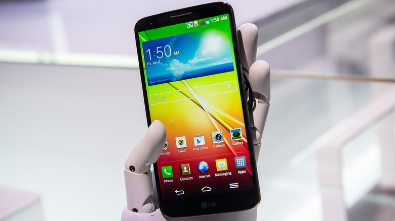
Released in 2013, the LG G2 combined an attractive design with an impressive 13 MP camera and long battery life. It ticked pretty much all the boxes for a solid flagship smartphone, including featuring the then-latest Qualcomm Snapdragon 800 processor, being the first American market smartphone to do so. The 5.2-inch display was another highlight, with 1080 x 1920 pixels and a pixel density of 423 PPI, one of the highest on the market at the time.
It's also remembered for its unique rear-mounted buttons, which never caught on with the rest of the market but were surprisingly intuitive to use. The exact layout of the buttons varied slightly with different versions of the phone, and our review conceded that they took some getting used to compared to other handsets. But, once a user did get used to them, they provided an extra layer of functionality that rivals couldn't match. The software on the G2 was also comparable to its main rivals, being both feature-rich and easy to use. It was a vast improvement over its predecessors, which had felt a little behind the times on this front, and it helped the G2 stand out as one of the premier flagships of its era.
Best: Google Pixel 2 XL
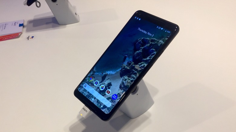
As well as making phones to be released under its own name, LG's smartphone division also manufactured units for big industry players like Google. The regular Pixel 2 was manufactured by HTC, but the Pixel 2 XL was an entirely separate device built under contract by LG. With a QHD display and excellent two-tone color block design, the 2 XL is one of the most impressive releases from the Pixel line. Perhaps its crowning glory, though, was its camera, which at its launch, was arguably the best ever put into a smartphone.
Despite only having a single rear lens when nearly all its competitors had two, the Pixel 2 XL's cameras captured an impressive depth of field, with true-to-life colors even in low-light images. Portrait Mode was also available with both the front and rear cameras, which captured two images: one clear and one rich with bokeh, allowing users to choose which one they liked best. It might have been an expensive phone for its time, but the Pixel 2 XL's unique features made it stand out from its competition, and well worth its $849 starting price.
Best: Google Nexus 5
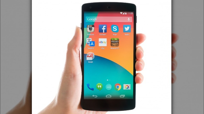
Another Google-branded phone manufactured under contract by LG, the Nexus 5 was a true bargain, with a price of just $350, yet some of the best tech on the market at the time. It was unveiled in 2013, the same year that LG released its flagship G2, but it was markedly different from LG's own-brand rival. SlashGear reviewed it at the time and called its appearance "sober, minimalistic, and discrete," with a focus on everyday usability over all-out style. A particular highlight of the phone was its display, a 4.95-inch panel with 1920 x 1080 pixels that was one of the sharpest on the market at the time.
Like the G2, the Nexus 5 came with a Qualcomm Snapdragon 800 processor, paired with 2GB of RAM. Also included were desirable features like wireless charging and 4G LTE compatibility, making it a firm favorite among the SlashGear team. Compared to its predecessor, the Nexus 4, the Nexus 5 was much more evolution than revolution, but the finished package was considerably more polished and feature-rich than almost anything else on the market at the time.
Best: LG V20
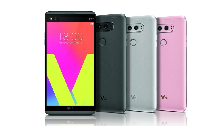
LG was sometimes criticized for pandering too much to niche crowds, but with that tendency, it produced some excellent specialist phones. The V20 was one of them, fixing many of the flaws that made the previous-generation V10 a flop. It featured a built-in quad DAC, and supported FLAC playback, making it a must-have for audiophiles. It also came with three microphones for high-fidelity audio recording, an unusual feature for a smartphone, but one that was no doubt appreciated by the phone's target audience.
It wasn't just a one-trick pony either, as the V20 also featured two screens, an unusual layout that had initially debuted on the V10. The primary screen was a 5.7-inch LCD QHD panel, with a pixel density of 513 PPI. The secondary screen, located directly above the main one, sported a 160 x 1040 resolution, and it could display things like app shortcuts, media controls, and favorite contacts. It perhaps wasn't the most necessary feature, as it didn't add that much extra functionality over a well-designed single-screen layout, but it was a unique feature nonetheless and made the phone stand out at a time when designs from other manufacturers were becoming more and more homogeneous.
Best: LG G3
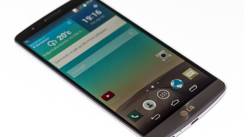
The flagship G3 might not have enjoyed the same sales success as some of the brand's other big-ticket releases, but it was an impressive device nonetheless. It was one of the first phones released with a QHD display, and it came with plenty of fan-favorite features, like wireless charging and a removable battery. The camera featured Laser Auto Focus technology, which helped ensure focus on both closeup and far-out subjects was both fast and accurate.
Thanks to its Qualcomm Snapdragon 801 processor, the G3 featured levels of intelligent battery conservation that its predecessors simply couldn't match. This meant that each charge lasted significantly longer, with well over a day's battery life per charge even with intensive usage. It's also worth noting that despite being up there with the best flagships on the market, the G3 cost considerably less than many of them. It was a little over half the price of the iPhone 6, yet in terms of tech, it was a genuine challenger. Unfortunately, LG didn't have the marketing budget to show off the G3 in the same way that Samsung or Apple did, and so it flew mostly under the radar in the general smartphone market, at least in the United States.
Worst: LG G Flex
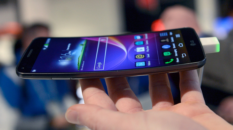
One of LG's many promising ideas that simply didn't work very well in the real world, the G Flex was a curved phone that touted better immersion than its competitors thanks to its slightly concave screen. LG claimed that the curved screen offered better one-handed usability and our review confirmed this was true: With the G Flex, it was indeed a little easier to reach the top corners of the screen when holding it in one hand. However, this innovation came at a cost — the G Flex's pixel density came in at 245 PPI, far less than the G2 from the same era, which delivered 423 PPI.
Despite having "Flex" in its name, the phone wasn't really bendable, since it was only able to withstand being bent around 100 times before it got damaged. The G Flex's other selling point was its supposedly "self-healing" casing, yet it also couldn't quite match up to its marketing in this respect. During testing, we found it could withstand a scratch from keys or a scouring pad, but due to the scratch-resistant coating being rather thin, anything sharper than that would still permanently damage the phone. LG promised the G Flex was the start of the next big smartphone trend, but the ideas it came with simply didn't translate well enough into reality for many consumers to care.
Worst: LG G5
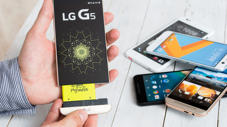
The once-celebrated line of LG G-Series phones had already passed its peak by the time the G5 debuted, but its underwhelming "modular" construction really sealed the G's fate. The idea of making a modular phone wasn't unique to LG, as Google also explored the idea through its series of Project Ara prototypes in the mid-2010s. While the Ara got shelved before ever seeing production, the G5 debuted as a flagship for LG. The premise was straightforward enough: the phone featured a removable bottom end to attach accessories, which could be bought separately through LG's store.
It worked in theory, but the idea was met with little enthusiasm from consumers, especially since only a very limited number of accessories were ever available. In fact, just two accessories were available at launch, a camera grip with an extended battery, and a DAC designed by Bang & Olufsen. The idea was that third parties would step in and design a whole range of products to supplement LG's core line of attachments, but thanks to disappointing sales figures, this never happened. The market simply wasn't there for the idea, and by the time the G6 rolled around, the idea of modularity had been dropped by LG altogether.
Worst: LG Optimus Vu
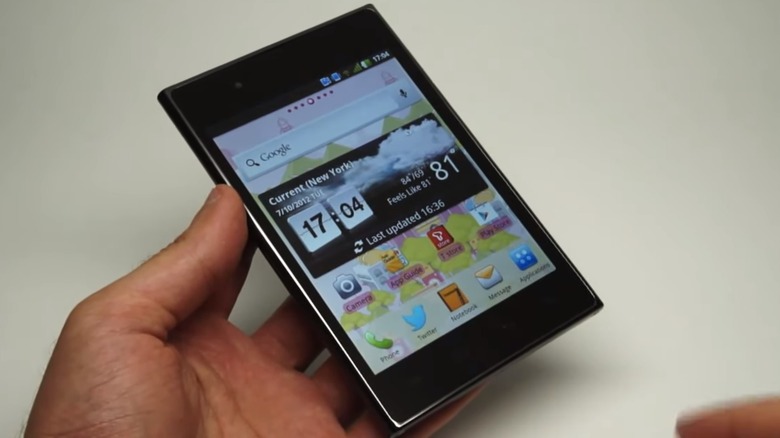
Back when the term "phablet" had just started making its way into smartphone discourse, LG tried to make a phone that took the trend to new heights. Or rather, widths, as the Optimus Vu was designed to be as wide as possible, with an aspect ratio of around 4:3. The oversized oddity came with plenty of desirable hardware, but the design proved its undoing. It was first launched in South Korea in 2012, where it sold relatively well, shifting over 500,000 units. It was then launched in Japan to slightly lower sales figures, at which point, LG decided not to release it in other international markets.
Smartphone design today has generally converged on the idea that making a longer panel is the best way to increase screen size, as it doesn't impact much on usability. Nevertheless, when the Optimus Vu first launched, LG Mobile's CEO was bullish on the phone's prospects, reportedly saying, "we expect [the Optimus Vu] will catch on once they become more widely available," according to Mobile Phone Museum. Clearly, he was wrong and looking back, the phone seems almost comically proportioned.
Worst: LG G8x ThinQ
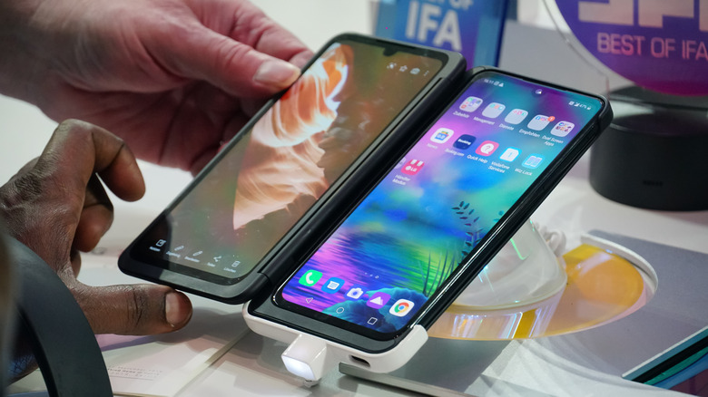
Foldable screens are still something that manufacturers are experimenting with today, most notably Samsung with the Galaxy Fold series. One of the earlier interpretations of the idea was LG's G8x ThinQ. The phone stuck two 6.4-inch OLED screens together, which could then be used in conjunction with each other. This unconventional setup was considerably cheaper to manufacture (and therefore sell) than the folding single screen of the Galaxy Fold, but it came with a number of drawbacks.
Firstly, it was impossible to use with one hand, and given its size, it was a little too bulky to comfortably fit into a pocket. The cameras it came with weren't great for the price, and running two screens at once led to relatively underwhelming battery life. Perhaps the biggest drawback, though, was that most apps weren't optimized for a two-screen setup, and so either used just the single screen or were very buggy. This included essentials like Chrome and most social media apps. The G8x ThinQ was praised for its innovation by some reviewers, but consumers weren't enamored by the idea, and it sold poorly.
Worst: LG DoublePlay
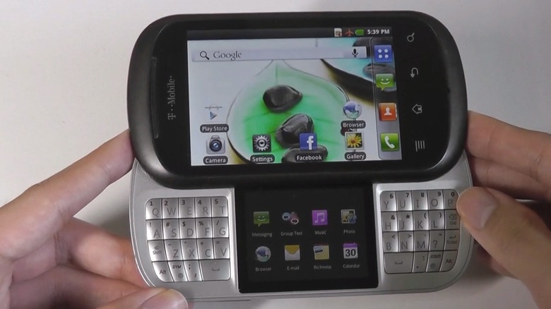
Released in 2011, the LG DoublePlay tried to capitalize on a trend that was already dying, and needless to say, found very little success. Phones were switching from fiddly physical keyboards to sleeker on-screen interfaces, but LG decided that the traditional keyboard could be improved. The DoublePlay featured a QWERTY layout split down the middle with a second, small screen in the center. This secondary screen had slots for eight apps that were specially optimized to run on it, but in total, only nine apps were available to choose from, and users were unable to add their own.
The QWERTY keyboard itself was also very cramped, which offset most of the supposed improvements in practicality that the DoublePlay claimed to make. Typing was often a more laborious affair than on touchscreens of the era, and the split setup took a lot of getting used to for the uninitiated user. To really crown things, the DoublePlay's primary display sported a lower resolution than other phones from the era, and its own-brand software wasn't as sleek or intuitive as many of its competitors. Like many of LG's failed phones, the DoublePlay might have been a good idea in theory, but it never really translated well into real-world practicality.
