3 Infuriating Things About iPhone 14 Pro (And 3 Great Things About It)
The iPhone 14 dropped this past week with the usual amount of fanfare. Indeed, I ordered the iPhone 14 Pro as my personal phone, so I am also guilty of partaking in the hype. But I have to admit, despite my almost $1,300 purchase, I have seriously mixed feelings about this year's iPhone. When a 48-megapixel camera and a "notch with a hat" are the features you boast about the most, that might be a sign that something is wrong. When lock screens are your halo feature for your latest operating system, perhaps the well is starting to run dry.
But, despite my consternation, those are indeed the features I'm most excited about with this generation of iPhone. But overall I'm disappointed in this year's release. I'd argue I'm more disappointed than in recent years. No phone is ever perfect, so there's always something to gripe about, but this year more than most, the lows are glaringly obvious and right in your face. So, without further ado, here are three things I love about the new iPhone, and three things that made me pretty mad.
Living on your own Dynamic Island
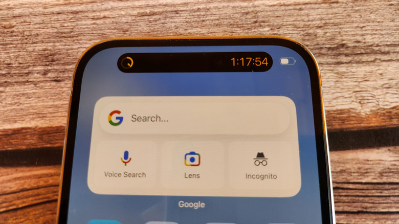
Is the name stupid? Yes. Is the functionality's usefulness questionable? Also, yes. But I have to tell you, I'm here for it. I dig the Dynamic Island in a hard way. Normally I choke when people say this, but I can't wait to see what developers do with it. Apple took some creative license and showed off streaming sports scores and Lyft wait times on stage, even though neither of those functions exist yet.
At the moment, only Apple's native apps and a limited number of third-party apps are taking advantage of this feature under the SDK releases later this year. Phone calls and podcast players living in that space are fun, but I'm really looking forward to sports scores. It's such a natural implementation of the technology that even though it doesn't exist yet, I'm sure it's amazing. Am I a little over-excited about this? Also, finally, and definitively yes. But I'm convinced it's going to be awesome and you can't change my mind.
Voted off the island
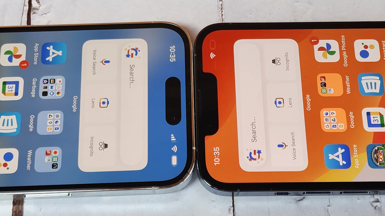
I wish the Dynamic Island wasn't limited to Pro models. One person's Dynamic Island can be another person's Dynamic Peninsula. There's no reason why the function can't work with older iPhones or non-pro models. Adoption is the main concern here. I hope developers won't hold back implementing the function because they'd only be catering to a small percentage of the world's iPhone users.
Rolling out the feature to Pro models first makes sense, but only if there's a road map for mass adoption. Admittedly, iPhone features aren't usually held back in this way –- developers are usually pretty eager to lap up what Apple serves. I would frankly be surprised if it was even a factor, but why chance it? I could see perhaps limiting the feature to pro models initially just to give those users a bit of exclusivity, but I think embracing the notch across the whole range of iPhones makes a ton of sense and would make developers a lot more likely to bring the code.
Locking it down
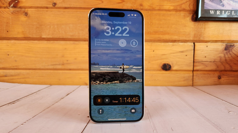
One thing that iPhones have been missing is an Always-on display and boy did Apple make up for lost time on this feature. iOS 16's lock screen is the Applest Apple of the whole thing because Apple took an old concept, plussed the hell out of it, and put out a demonstrably better product than anything that has come before it. Yes, Apple was late to the party, but it also brought the best Scotch.
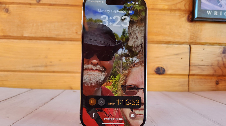
For those not familiar with the new lock screen, you can set up customized photos and fonts, and pick widgets to display on the lock screen. One of the coolest parts is the depth effect where the subject of your photo actually sits on top of your clock widget. It's a little limited at the moment. Only certain photos will work, you can only obscure a limited portion of the clock, and the presence of widgets cancels the effect entirely. There's probably some more tweaking coming in the future, but in the meantime, if you have just the right photo, it's a neat trick.
Plus, when your power turns off, the AOD keeps all your widgets, clock, and even a darkened image of the photo, so it's just always there. This doesn't adversely affect battery life. I left the phone off the charger for a night of about six hours of sleep and only lost around 3% of my battery. It's a good compromise for something that's really impressive and fun.
eSIM, schmeeSIM
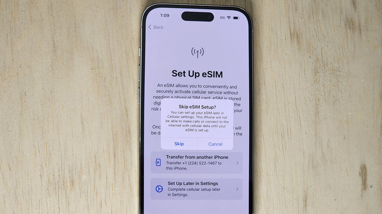
As Apple announced its iPhone 14 lineup, a collective moan emanated out from the reviewer community as the company noted that its lineup of phones would exclusively work with eSIM. Gone are the physical SIM cards that adorned iPhones of the past. For Joe Average, this is not a big deal. Most people will buy an iPhone and use that single phone for years. But for those people who like switching phones, or whose job requires it, this is potentially migraine-inducing.
Indeed, when I set up my iPhone 14 Pro, I had to insert my physical SIM into my iPhone 13, wait for the phone to recognize the SIM, and then transfer it over to my iPhone 14. From that moment on, my old SIM card is dead. When (not if) I need to move into a new phone that doesn't use eSIM, I will need to contact my carrier or go to a carrier store to get a new SIM provisioned. Heaven forbid I want to transfer back to the iPhone after that, round and round we go.
Again, this is a low for me and probably not you, but I'll just take my spilled milk over to the corner and let you go about your day.
Finally, a new camera!
Apple finally bumped up its camera resolution from 12 megapixels to ... 12 megapixels after pixel binning. That's right, Apple is now using a new 48-megapixel sensor which by default uses quad-binning to get right back to its old familiar 12-megapixel output. That's not meant to be a criticism -– basically, every phone maker uses pixel binning to output smaller, but better photos. Apple is simply jumping on board the bandwagon, and knowing Apple, it will work very well.
Apple is commonly known for its camera tech and like the lock-screen above, it's likely (though we have yet to fully test it) that Apple will take this years-old tech and make it awesome. Before people suspect that Apple is padding my bank account for saying that, I want to point out again that we haven't fully tested the camera system. It's equally likely that Apple, now using a brand-new image signal processor pipeline, may not get the results it hopes for. But let's be real here –- history is on Apple's side.
Zoom no one asked for
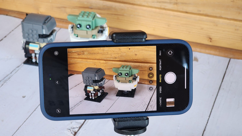
Ok, so now let's address the biggest gorilla in the room. Apple proudly announced that its new 48-megapixel camera sensor allowed it to do an amazing thing. Apple could use just the pixels in the center of the 48-megapixel sensor to zoom in on a subject without losing resolution. Apple could achieve a whopping 2x zoom with this amazing technology!
Except it's not amazing. It's a digital crop. It's literally what hundreds of other phones have done for years. But Apple Appled it up by bragging about how you could zoom in without losing any detail. Apple took three minutes of yadda-yadda explanations to tell you what I just explained to you in the previous three sentences -– two of which were unnecessary. But that's not my only problem with it.
My other problem with it is that the iPhone 14 Pro already has a 3x optical zoom lens. I'm not sure what niche Apple thought it was filling by allowing both 2x and 3x zoom, but it's not my niche. I frankly wish that Apple had just put in a 5x periscope lens and bragged about that for minutes on stage. Zooming to 2x just flat out is not necessary, and I hate that Apple not only thought that it was necessary but also took the time to tell us that it thought it was necessary.
Same old, same old
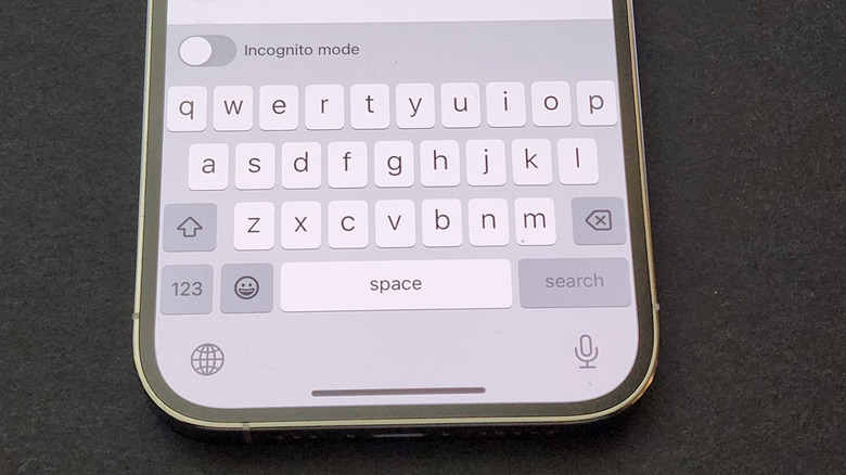
Of course, that's not all for the iPhone gripes, but the rest are things that are still problems despite the fact that they've been problems for years. There is still no number row on the keyboard. Apple is still using lighting ports. Notifications are basically a dumpster fire, though in fairness, they're at the bottom of the screen (only on the lock screen, though) where they belong.
The funniest part is, despite all that, I'm still excited to get back on iOS and the iPhone 14 Pro. There's just something about Apple's products that gets me excited. They are well thought out and well put together products that, it kills me to say this, just work. iOS is a great operating system that's easy to use and is so mature that Apple had to reinvent the lock screen to get us excited about it. At the end of the day, that's awesome, but it leaves the door open for some fair criticism as well.
