We Finally Know What The iPhone 14 Pro Max's Megapill Looks Like (And Why The Dynamic Island Exists)
Apple's iPhone 14 series is finally here, with the global retail rollout now well underway. The device features the first significant redesign of Apple's controversial display notch which was first introduced with the iPhone X in 2017. The notch houses the TrueDepth camera system that makes its popular Face ID biometric authentication possible. Face ID replaced Apple's equally popular Touch ID biometric authentication system that was hidden in the Home button of earlier iPhones.
However, Apple wanted to make the iPhone X as close to an all-screen design as possible and made the risky decision to adopt Face ID instead and introduce the notch in the process. The notch has been criticized for interrupting user content, but it has become as equally iconic to the iPhone brand as the circular Home button at the bottom of the device originally was. Besides, users have argued that you get used to the notch, and that Face ID is a fast and convenient way of unlocking a device.
The new megapill and Dynamic Island
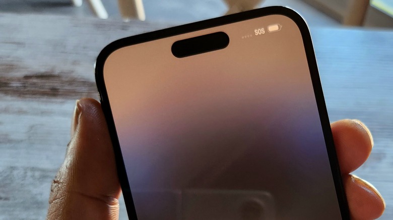
As had been rumored months in advance of the launch of the iPhone 14 Pro, Apple has removed the notch from the "forehead" of the device and replaced it with a pill and hole cut out instead. However, in the days immediately leading up to the launch, it became apparent that Apple was going to turn off the OLED pixels between the pill and hole cutouts to create the impression that it is a singular, but longer pill — not a separate pill and hole. Of course, Apple had one more trick up its sleeve that it calls "Dynamic Island." In a rare moment at an Apple event, the company managed to keep the Dynamic Island feature under wraps, and, as the company had hoped, the new feature made a splash.
Dynamic Island utilizes the pill cutout by retaining the touch layer under the glass covering the revised TrueDepth camera system and allows users to interact directly with the pill cutout in response to dynamically changing notifications and interface elements that accompany certain apps and functions. However, there are questions around why Dynamic Island actually exists. While it is undoubtedly a clever UI design element, it also appears that it may have originated to help mask the even more intrusive location of the pill-shaped camera cutout by functionalizing it. As has been highlighted, this design element now pushes even further into the screen than the old notch ever did.
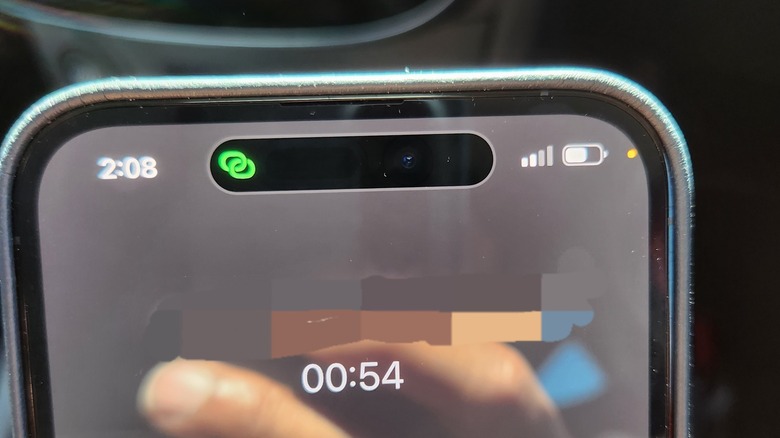
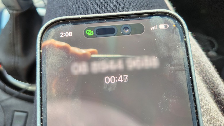
Bright sunlight exposes ugly side to Dynamic Island
As a compulsive early adopter, I have picked up an iPhone 14 Pro Max. Things had been going smoothly, until I took my iPhone 14 Pro Max out for a phone call in bright daylight received a nasty surprise. At first glance, the new cutout looks similar to longer pill-shaped cutouts we've seen on the Galaxy S10+ and the Huawei Mate 40 Pro. However, under bright daylight, the cutouts on those devices look quite similar to what they look like indoors. Not so with the iPhone 14 Pro cutouts. Apple has wrapped both cut outs with prominent banding that makes them stand out in an unsightly way, especially when compared to how Android OEMs treat cutouts. I shared an image of my iPhone 14 Pro Max to social media with both a front on view and then how it appears under bright daylight. The tweet has since received an excess of 2 million impressions with Twitter user @MaazMz comically suggesting that the pill looked like a USB-C port, and the punch hole, a headphone jack. For better or worse, iPhone Pro users are expected to get used to the megapill over this generation and the next, with highly regarded display analyst Ross Young tipping that Apple won't be taking the TrueDepth camera system fully under display until the iPhone 16 Pro launches in 2024.


