Nothing Phone 1 Review: Gambling On The Glow
- Great 120Hz screen
- Nice Software
- Snappy hardware
- Unique product design
- Small design miscues
- Camera issues
- Limited release
The Nothing Phone 1, as its name suggests, is the first phone released by Carl Pei, the founder of the frustratingly named company, Nothing. Pei comes from a long history at OnePlus, and as such he came into this with some serious street cred. Anticipation for this phone was, understandably, pretty high.
This past summer, Pei stood on stage and as much as told us that Nothing is gunning for Apple and taking on Apple's "walled garden" philosophy. In contrast to that, he suggested, Nothing is going to partner up with everyone and build all this amazing cross-platform functionality from all manner of companies and categories into one super-phone and everything will be copacetic.
The Nothing Phone 1 is not that. It's not even close. But that's neither surprising nor is it bad. Instead, the Nothing Phone 1 is a midrange phone packed with some gimmicks, flair, and thoughtful design. I've been using the phone for two weeks on the T-Mobile network and this is my full review.
I see right through you
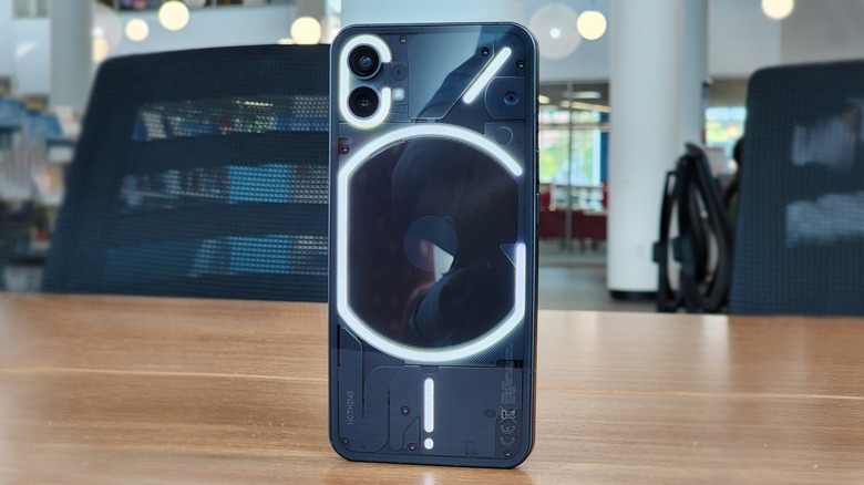
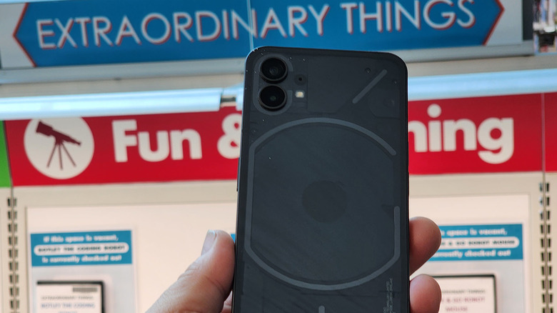
Any conversation about the Nothing Phone 1 has to start with the design of this phone — which is pretty great, but with one big-time flaw. If you set this phone down on the table with the screen off next to an iPhone 13 Pro Max, you'd be hard-pressed to tell at a glance which was which. It has the same footprint and similar button placement as Apple's biggest phone from 2021. It has the same squared-off edges that Apple's been toting for a few generations now.
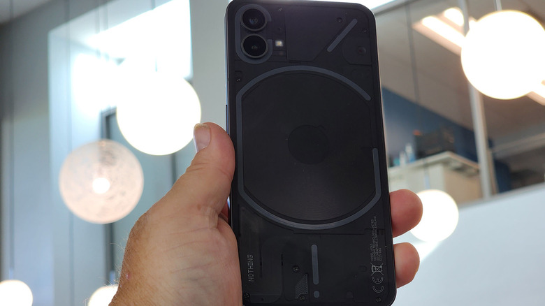
Only a close look at the camera on the front and the antenna lines on the sides will tell you which is which. Of course, if you flip the phones over, it's a completely different conversation. Nothing made its first product, the Nothing Ear 1 headphones semi-transparent and it took that philosophy here too.
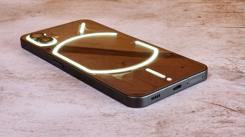
Put simply, in terms of hardware design, Nothing is copying the right company. Apple is an excellent design company as well. The main issue I have with the design is that the volume down button is located directly on the opposite side of the phone as the power button. As a result, I took literally dozens, if not hundreds of screenshots when I was powering the phone off to slide it into my pocket. It was maddening. Even after two weeks of using this phone, I still did it almost daily, and it drove me batty.
Living that glyph life
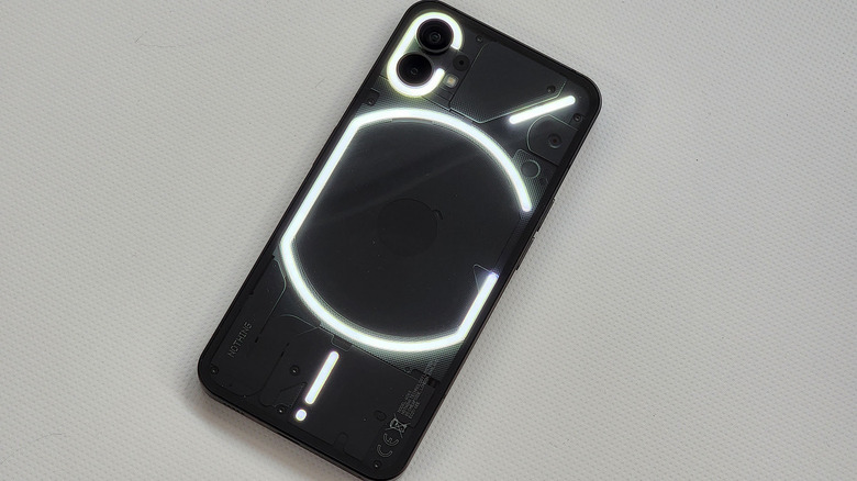
On the back of the Nothing Phone 1 is the Glyph interface. The back of the phone has LED strips that light up. Some of this lighting is functional, but it's mostly a gimmick. This is going to be divisive. On the one hand, the glyph interface is extraneous and mostly useless, but on the other hand, it's a little awesome. You can probably tell by now on which side of the fence I fall. Frankly, I'm here for it.
2022 has been a delightful year for me in the phones that I've gotten to play with, and the Nothing Phone 1 is no exception. It would have been easy to make the back of the phone a polycarbonate, maybe with a fun color choice, but going clear and including these LED strips is just flat-out fun. The only one that really approaches anything useful is the bottom strip that lights up progressively when charging to become a sort of battery meter. You can also use the glyphs as a sort of fill light for macro photography which works well enough, but only just.
Honestly, the lighting feels like a party trick, and that's about it — but it makes the back of this device so much more interesting than most other phones on the market today. Could Nothing have made a cheaper phone without the glyph? Sure, but it would not be as fun nor as notable, and when you're a new company, notability is gold.
It's what's on the inside
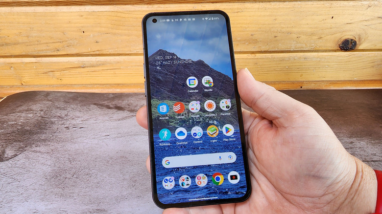
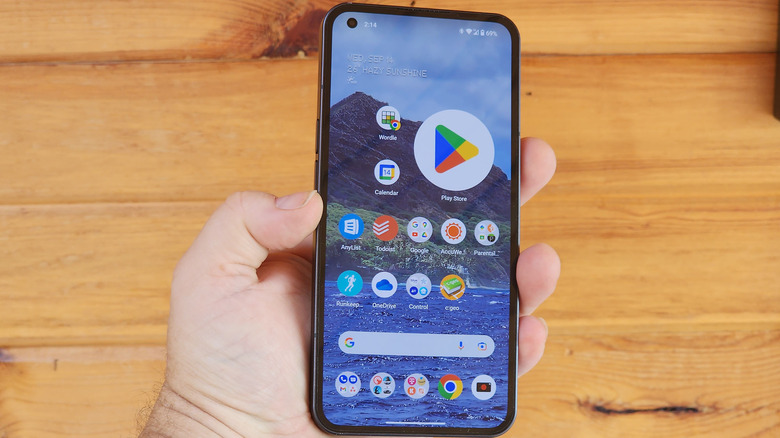
Opposite that LED candy shell you have a 6.55-inch 120Hz 1080p OLED display up front under Corning Gorilla Glass 5. Under that display sits a Qualcomm Snapdragon 778G+ processor, either 128GB or 256 GB of storage and 8GB or 12GB of RAM. My review unit was on the 8GB/256GB RAM/ROM configuration. All that is powered by a 4,500 mAh battery, and it comes in any color you want as long as it's white or black.
The cameras on the phone are dual 50-megapixel sensors. The main camera is a 24mm wide lens with an f/1.9 aperture and the ultrawide camera has a 114-degree field of view and f/2.2 aperture. We'll talk more about camera performance in a later section, but suffice it to say, the numbers don't really hold up, all things considered.
Together these features add up to a fairly standard midrange phone that meets its price tag adequately. There's a little bit of flash, and only a few peccadillos. Overall, it's fair to say that this is a solid offering for a new brand's first phone out of the gate.
Embiggening the software
On the software side of things, Nothing is putting on a delicate balancing act between running a stock version of Android 12 and adding in enough flair to make the Nothing phone 1 unique. The outside of the phone isn't the only panache that Nothing added to this phone; the software is along for the ride as well.
We got a taste of how it would run back in spring when Nothing released its Nothing Launcher into the Android app store. That particular offering was underwhelming, (to put it nicely), and frankly made me nervous about the phone itself. What you get in the Nothing phone 1 is a much more complete package including some niche under-the-hood additions.
Like the Nothing Launcher, you can make app icons extremely large if you should so desire. You can also use a couple of custom widgets that Nothing ships with its phones. In terms of third-party integration, Nothing offers integration with Tesla baked into the operations system on the off chance a Tesla owner doesn't own an iPhone. I didn't have the opportunity to test that particular aspect of the phone, since I don't own a Telsa, but it's there if you do.
Dotty fonts and fine UI design
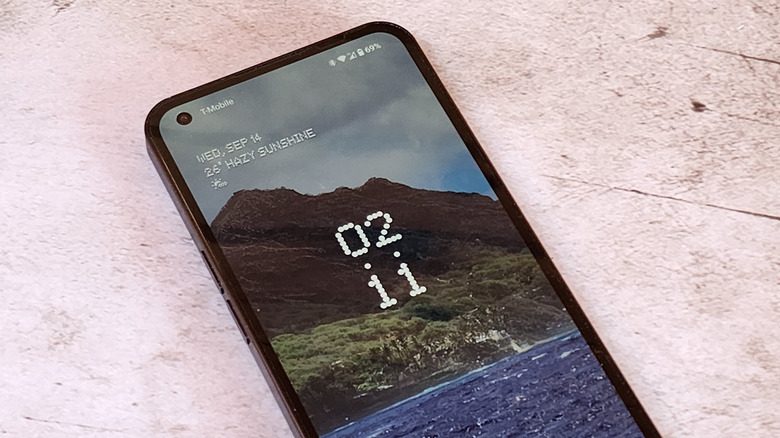
The most obvious software addition that Nothing made to its first phone was in the default font used just about everywhere in the interface. The font, which is also used on Nothing's website comes up on the splash screen when you power on the phone, on the lock screen, or on the home screen if you use any of Nothing's widgets. It shows up in Settings, too. It's basically everywhere.
Additionally, Nothing uses a lot of customized noises for ringtones and notifications, which are also fun. Indeed, I may use these same tones in future phones (if I can be bothered to download them). A new notification sound delivers two short beeps. The ringtone sounds like an old-school ringtone from the '80s. Nothing includes 10 ringtones, all of which also trigger different glyph patterns if you do so wish.
One small irritation is in the Quick Look widget which shows you the weather and your upcoming schedule. The weather displays in Celsius and, putting aside the fact that the U.S. should just adopt the metric system already, there is no way to change it to Fahrenheit. You can change the weather widget to the U.S. system, but not Quick Look. It's an understandable oversight since this phone was never meant to see U.S. shores, but it feels like an oversight nonetheless.
The rest of the software is consistent with Android 12. Nothing promises three years of OS updates and four years of bi-monthly security updates which is pretty good for a phone in this price range.
Photos in the light
You would think that dual 50-megapixel cameras would give you, at the very least, a good leg up in the camera department. It should give you a solid base. You would think that, but unfortunately for the Nothing Phone 1, there's a lot of work to do here. First, let's talk about the good.
If your subjects are stationary and in good lighting, you can grab some great photos. Landscapes and macro shots will be your friends. If your subject is moving, you will have a harder time. That's not to say that moving subjects are impossible to capture — but certainly harder. Take a look below at these two photos of a roller coaster and my daughter on a trampoline. In burst mode, the roller coaster is a fairly sharp shot while my daughter is decidedly not.
Speaking of burst mode — burst mode file organization is a mess. When pulling my photo samples onto my computer, so I could pixel-peep the shots, I found that all of my burst mode photos were filed in order of the number in the sequence first, and the file name second. What that means is if you take three burst photos during the life of the phone, you get the first photo from bursts one, two, and three, followed by the second photo of bursts one, two, and three, and so on. That was not awesome.
Photos in the dark
Even when you are capturing landscapes, you'll find a lot of grain in the photos, so you'll want to limit your sharing to social media posts and other media hosts where you'll shrink the image. Also, movement is an issue. Things like waving flags, or people walking in the frame will be a touch blurry, which isn't unexpected for this price range, but it's something to be aware of.
While we're on the subject of movement, video stabilization is non-existent at both the 4K and 1080p resolutions and it doesn't rear its head in the front-facing camera either. Pans can be smooth, but if you're planning on walking while you shoot, bring some Dramamine for your audience.
This continues at night when you'll also be plagued by dropped frames and frankly weird artifacts during playback. One shot of my daughter walking resulted in her face being in two places at once. If that sound weird, that's because it is, and I've never seen it before. I wonder if it's software that's causing the hang-up, but it was like I was seeing two halves of two different frames simultaneously.
Of course, it's possible that software updates might help resolve a lot of these problems. Indeed, Nothing has been pumping out updates since its launch, now sitting at 1.1.3, which is a good thing. Pei, on Twitter, said that most of its updates have been focused on the camera, battery life, and new features, so it looks like it's already heading in the right direction.
Macro photography and glyphs
One neat trick the Nothing phone can do is to use the LED glyphs on the back as camera lighting in dark situations. This gives you a softer fill light rather than the harsh flash you would normally get. The results are not bad, as illustrated below. The photo on the left was taken at night using the flash while the photo on the right was taken using the glyph. If nighttime macro photography is your thing, the Nothing Phone 1 is uniquely suited to the task.
Otherwise, daylight macro photography is quite good. The main sensor captures a lot of detail in the subject and the natural depth of field provides a really good bokeh blur behind the subject, really allowing it to stand out.
Overall, I'd say the camera is not great, and not even great for the price point. If you're a shutterbug, there are other, better ways to spend your money. But if you just need a passable camera to get you by and you like everything else the phone offers, this camera will get you by.
Performance and battery
At the performance end of the equation, I have to say I was pleasantly surprised. The Snapdragon 778G+ is a capable processor, but games like "Call of Duty: Mobile" and "Genshin Impact" both ran perfectly fine. The latter has its graphic settings defaulting to low, but I turned it up to medium without a hitch. The phone does not get hot during prolonged gameplay, even with a case on.
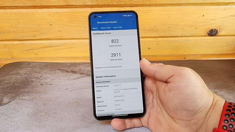
As for benchmarks, Geekbench scores a decent 822/2911 single/multi-core score. But everything runs smoothly on the phone. The only exception to that would be switching between camera modes. There always seems to be a little bit of a hiccup when switching between the ultra-wide and main camera. That could be a UI issue or a performance issue. Judging by the rest of the phone's performance, I'd think it's the former.
The phone's 4,500mAh battery will definitely last you a full day, even a day out on mobile data. I typically hit the sack around 10:00 at night with anywhere from 15 to 30% left in the tank. With the capacity this device's battery has, I'd like to see a little more left over, but I've also used worse.
A note about carriers in the United States
One thing that's important to mention about this phone is that it was not — nor will it ever be — released in the United States. As such, carrier connectivity is going to be sketchy. Most of the time I used this phone, I sat comfortably on T-Mobile's 4G LTE network. I saw 5G every once in a while, but it was the exception, not the rule.
I wanted to take a section to specifically point this out because while it's not terribly difficult to import this phone to the U.S., you honestly probably shouldn't. Granted, 5G is not a requirement for a good phone experience, but in a few years, it might be. I'll also reiterate that I used this phone on T-Mobile's network, so if you're with one of the other carriers, your mileage almost certainly will vary.
Future phones from Nothing will come to the U.S. — or so they've suggested — so I'd recommend waiting for those. Official support is always more important than features and gimmicks.
Wrap-up
There are two ways you can look at the Nothing Phone 1. You can see it as a decent midrange phone with a few tricks that jack up the price but are of little practical value. Or you can see the Nothing Phone 1 as I do, which is to say, it's a decent midrange phone that has a lot of quirky, gimmicky, tricks that give an otherwise boring phone a little personality. That's something desperately lacking in the smartphone market at large. The Nothing Phone 1 is one that I will remember as a standout in 2022, which has been a year that gave us quite a few fun phones to play with.
I regret that this phone won't see U.S. shores, but I'm happy that it made it to my doorstep. Quite frankly, it's neat, and if that's not enough for you to fork over your hard-earned dollars, I totally get that. But this phone's tricks are built on a solid base of features like a 120Hz screen, wireless charging, reverse wireless charging, and a lot of other things that you don't often see at this price point. Stir in some light-up glyphs on the back and a fun font throughout the phone, and there's a lot to like here.
The camera definitely needs some work, and its battery life could be better. But what the Nothing Phone 1 definitely succeeds at is making me look forward to what the Nothing Phone 2 will bring, and in a first-generation phone, that's enough.
