The 2024 Ford Mustang Dashboard Is A Shock
Car dashboards and gauge clusters are hardly something people — except for the most die-hard car enthusiasts — get excited about. Ford may stand a chance of changing that with the new, seventh-generation 2024 Mustang, though, and it could give long-standing pony car fans a shock in the process. The current Mustang features traditional gauges in a fairly conventional layout: a tachometer, a speedometer, a small screen in the middle for readouts, and an infotainment screen to the driver's right.
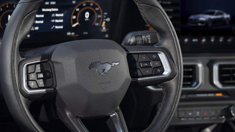
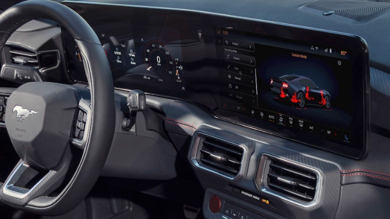
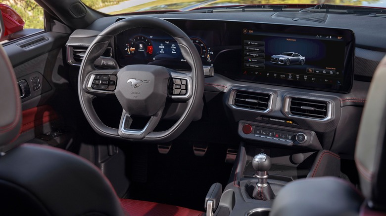
The new Mustang is something else entirely, and propels the Mustang squarely into the 21st century. For starters, half of the dashboard is covered in one giant rectangular piece of glass that encompasses two displays: one serves as the instrument cluster and the other serves as the infotainment screen. Ford also notes in their press release that the software running the display supposed being continually upgraded.
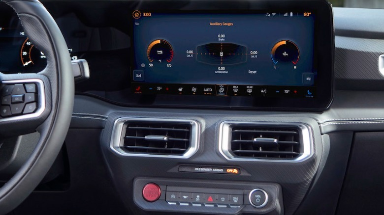
Ford says that the screens will be able to provide real-time renderings of the Mustang as you're driving, borrowing technology straight out a video game. "We're taking advantage of every pixel," Craig Sandvig, the Mustang's interaction design manager, explains. "We can be creative in showing necessary driving information and give the driver control of selecting colors, classic Mustang gauges or even 'calm' screen where only minimal details are displayed." Powering it all is the Unreal engine, no stranger now to dashboards, the same that professional game designers use to power titles on the latest consoles.
A dash from the future
Ford was listening to performance car fans when outfitting the newest Mustang with enthusiast-focused bells and whistles. It appears they've also consulted smart phone users when designing the new dashboard layout. The design borrows a lot from the already very tech-friendly Mustang Mach-E, the new Mustang's all-electric crossover cousin. It's not as minimalistic as Tesla's design — which manages to look a little more complex than an iPad attached to the dash — and it still emulates physical gauges even if they're now recreated in graphics.
In fact, Ford says, its digital layout was inspired by fighter jets. That's not to say it can't be tweaked to suit each driver. The default layout uses a copper color-scheme, but it — and the ambient interior lighting — can be adjusted across multiple hues. There's a more minimalist layout available, paring back the vehicle details to the bare minimum so as to provide fewer distractions, plus a "Fox Body" mode that leaves the interface looking like that of the old Fox Body Mustang.
Ford hopes the newly designed layout will allow drivers to quickly (and safely) select drive modes, read navigation direction, or just change the radio station. In the process, some of the physical controls have been retired in the name of a cleaner overall dashboard. There's still a physical volume knob, for instance, but the climate controls have been moved to the touchscreen. All in all, the Mustang's new screen layout might seem like a shocking change for a muscle car, but it's likely part of Ford's effort in modernizing its lineup.


