iPhone 14 Pro Surprise: Apple's Dynamic Island Is A Hit In Early Reviews
Apple announced the launch of the iPhone 14, iPhone 14 Plus, iPhone 14 Pro, and iPhone 14 Pro Max at their event on September 7. Although the phones aren't out yet, (the iPhone 14 Pro has a few days before its release, and the iPhone 14 Plus won't arrive until next month), reviews of Apple's latest flagship device are beginning to trickle through.
A common theme in those reviews is the similarity between the new iPhone and its predecessor. There is a strong suggestion that Apple hasn't included enough new features and the new model isn't that much of an upgrade over the iPhone 13. Reviewers aren't alone in this. During the launch event, influencers, Apple enthusiasts, and its detractors all took to social media to post memes about the similarity of the new phone to previous editions. Even Apple founder Steve Jobs' daughter posted an Instagram story that poked fun at the lack of change between generations.
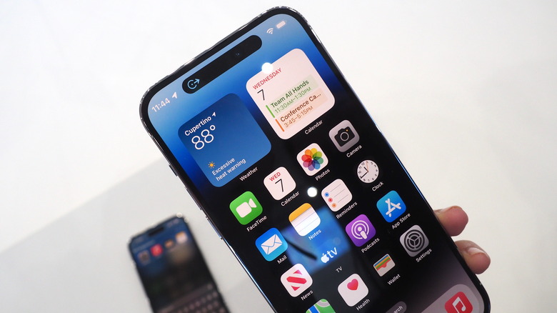
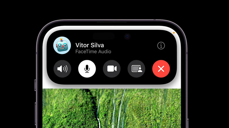
However, there is one standout feature that reviewers have been praising. The iPhone 14 Pro's "dynamic island" makes use of the space around the front camera and speaker. It can display alerts, change shape and size depending on how the phone is being used and is more visually appealing than a simple camera hole.
The Dynamic Island a key talking point
Engadget's Cherlynn Low, who rated the phone 92 out of 100 overall, described the Dynamic Island as feeling "slick" and saying how it makes "everything feel polished and thought-through." Low focused a large portion of her review around the new feature, which makes sense as it's one of the few key differences between the iPhone 14 and its predecessor. Despite praising it heavily, Low may have also discovered an issue with the new feature. While it hides the speaker notch pretty well, it doesn't make it go away entirely. She says: "When nothing is happening in the space, the hole is still obvious, especially when watching a fullscreen video."
The Verge's Nilay Patel also centers his review around the new feature. He highlights how noticeable the island is, and points out the feature stands out a bit less if the phone is running in Dark Mode, saying: "this is the first iPhone that feels like it's better in dark mode because of it." He goes on to say that as this is the feature's iPhone debut, there are a few issues and there is some streamlining to be done. But overall, Patel believes it might improve in the future saying: "Dynamic Island feels like one of those things that need a year of refinement and developer attention before we really know how important it is."
Gizmodo's Florence Ion believes the island could be enough to coax more users into adopting Apple products. She says the new feature works pretty smoothly, comparing it to similar processes on Android. Ion writes: "The process is quite fluid, and it's nice not to worry about swiping down when trying to access something, as I would on an Android device with its notification shade."

