YouTube's One Channel Design Taken Out Of Beta
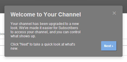
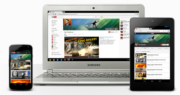
YouTube has taken its One Channel design out of beta and made it available for all who want it. The design looks quite different than what users are currently using, and offers many features and improvements that both casual and career YouTubers will appreciate. The features are designed to help users score new subscribers, have snazzy-looking channels across multiple devices, and curate their content.
With the One Channel design, users can designate a video as a channel trailer that will only be presented to individuals who aren't subscribers. The trailer is a welcomed feature that allows users to showcase their best work, or to sticky a promotional video that encourages users to subscribe for more. In addition, channel art has been optimized to scale to screens of all sizes, preventing ugly channel designs. Links to both merchandise and social accounts are displayed.
Another welcomed feature is the ability to form playlists of one's own content and other YouTube content. The playlists are prominently displayed for subscribers to view, providing an opportunity to sort one's own content into groups, such as "My Best Videos," and to create collections of relevant, funny, or otherwise enjoyable videos from other users. Ensuring maximum visibility, users are also taken to the complete channel upon clicking on it from the guide, rather than just being presented with the activity feed.

YouTube has provided several already-switched profiles that you can check out to get a feel for the new design, such as MysteryGuitarMan. Switching to the new look is as simple as following this link, then clicking the button asking if you want to switch. Are you using the new design? Let us know what you think in the comments!
[via YouTube]
