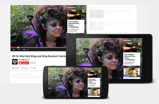
YouTube Cards Will Replace Pop-Ups, Work On Mobile
If you've watched a YouTube video lately (or ever), you may have noticed the hideous pop-ups that want you to subscribe the channel, or possibly check out another video from that channel for better context. They're unsightly in 2015, and YouTube is doing something about it. Today, the streaming video service is announcing Cards, which replace those ugly pop-ups (or 'annotations', as YouTube puts it). More beautiful, Cards also show up on mobile devices, tying YouTube together across screens.
Cards come in six styles: Merchandise, Fundraising, Video, Playlist, Associated Website, and Fan Funding. As you might have guessed from the naming scheme, each has it's own look and feel based on what the video creator is trying to accomplish.
As Google puts it, Cards are "like an evolution of annotations". They don't see them taking the place of annotations any time soon, though. Via their blog:
Because cards work across mobile and desktop and give you more flexibility to share what you want, our goal is to have these eventually replace annotations. But this will happen only once they can do everything annotations can do today, and more.
The new Cards format should be much cleaner for viewing on mobile devices, and definitely adopts Google's 'everything in card format' visual presentation. It will likely prove a welcome move away from the annotations we see on the desktop, too.
Source: YouTube
