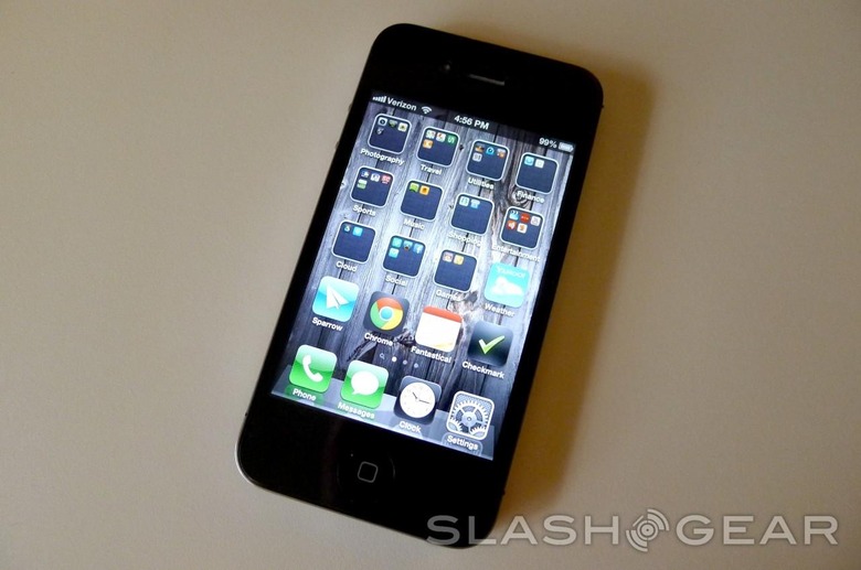
WWDC 2013 iOS 7 Expectations: 8 Features We'll Be Waiting For
WWDC is coming up quick, folks. On Monday, we'd like to think that Apple will be announcing some new products, including some new MacBooks, a possible iRadio announcement, and maybe a Mac Pro refresh. However, something we're almost certain about is an iOS 7 unveil, thanks to getting a peek at the banners at Moscone West before WWDC kicks off. I've spent a lot of time with iOS, and while I mostly love the user interface, design, and apps, there are several features that are downright annoying that Apple needs to fix in iOS 7.
Toggles in Notification Tray
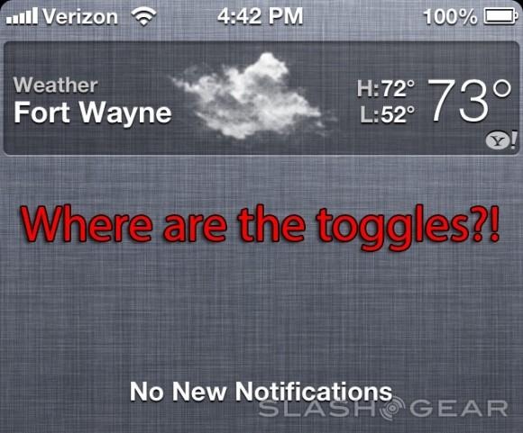
Apple needs to add toggles to various settings in the notification tray. I know it would simply be copying Android and they would most likely get a lot of flack for it, but who cares? iOS users will be so happy that they finally have toggles that they'll forget all about it anyway. It's cumbersome to have to go through numerous menus just to turn the Bluetooth on and off — airplane mode is about the easiest thing to toggle, and you still have to open up the Settings app in order to get to it.
Swipe Away Apps in Multitasking Tray
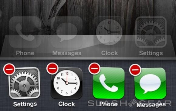
In order to close an app in the multitasking tray, you have tap-and-hold the app until it jiggles and then press the teeny-tiny delete badge up in the corner of each app. Why does Apple make such a simple task so complicated? Users should just be able to swipe down on an app to close it and call it a day.
Single-Tap Notifications to Clear
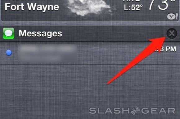
When you receive an alert in the notification tray, you can either tap on it and go to the respective app to clear it, or if you don't need to do that, you can clear it right from the notification tray. However, it takes two taps to close a lousy notification. Apple should just make it a one-tap deal, or better yet, take a page from Android and add swipe notifications. Again, it would be copying Android, but I would be too happy to even care.
Infinite Apps in Folders
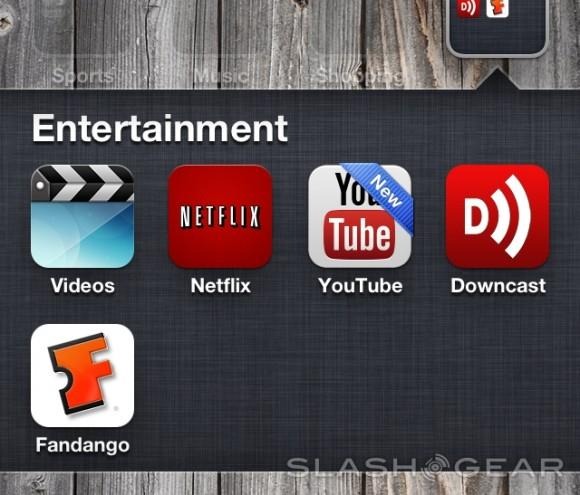
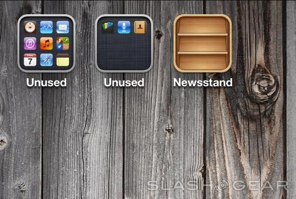
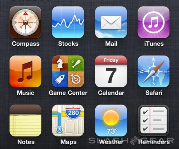
I honestly can't believe Apple actually puts a limit on how many apps you can put in a folder. I play a lot of mobile games, and I have too many to fit in just one folder, so I have two folders of games. Do you know how embarrassing that is? I shouldn't have to have two different folders that contain the same category of apps because it just gets confusing. Furthermore, all my unused default Apple apps don't fit in just one folder, so I have to make two "Unused" folders. Ridiculous.
Hide or Put Newsstand in a Folder
Yet another unused app that has to remain on my home screen, and the worst part is I can't put it in my "Unused" folder — I have to keep it out in the open where I'm haunted by it every day. Currently, I just have it on its own home screen that I never swipe over to, but I simply shouldn't have to do that. Apple should at least allow users to put it in a folder, or better yet, create a setting that allows you to hide the app if you don't use it.
Adding More Features to the Lock Screen
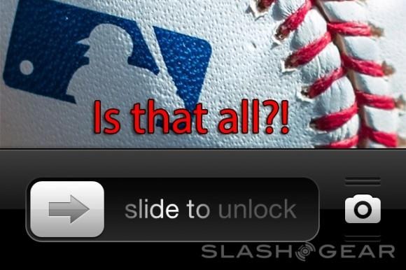
Currently, the only feature that the lock screen has that isn't the unlock swipe gesture is the quick access to the camera, but I feel like that's a major tease for all the other things that Apple could allow on the lock screen. It doesn't even need to be complicated stuff either. A weather widget that shows the temperature right on the lock screen would be excellent. I'm not asking for a ton of customization here, but little things that you could add to the lock screen would be terrific.
Change Default Apps
This is quite a longshot, but I'm giving it a try anyway. Apple doesn't allow users to change the default app that opens when you click on a link and such, and that's obviously to keep users in Apple's own ecosystem, but I think it's safe to say that it's not 100% foolproof. People still use third-party apps in place of some or even all of the default apps, and because of this, Apple isn't doing themselves any favors. Let us change the default apps and we'll be on our way.
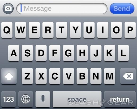
Uppercase/lowercase on keyboard
I saved the most minor annoyance for last. However, it's still a huge deal for me. With the iOS keyboard, letters always remain uppercase no matter what, so you don't know whether or not you're in uppercase or lowercase mode. I know most users will say that you'd be dumb not to know what mode you're in, but what if you accidentally tap the shift key without realizing it? You're now typing in uppercase, and the keyboard doesn't let you know that, aside from the faint highlight of the shift key that you can really only see out of the corner of your eyes because you're too busy typing.
Wrap-Up
These are all rather minor annoyances, but you know what they say: any annoyance is a major annoyance (or do they actually say that?). In any case, I still like iOS — it's apps are beautifully designed, it has a simple user interface, and the hardware is rather pretty (although the HTC One is proving that Android phones can look good). Please, Apple, fix these eight things and I'll mostly get out of your hair.
