Windows Start Menu Fuses Old And New Styles In Build 9788
Microsoft has received a lot of flack for how it ungraciously retired the Start Menu in Windows 8, but almost every time the topic comes up, there is always word of its return. Now it appears that the day is close at hand and the Start Menu will indeed be returning. But Microsoft isn't so quick to relinquish its investment on the "Modern" paradigm and has chosen instead to mix the two a bit artificially.
Perhaps there is no part of the Windows OS that has a more colorful history than the Start Menu (aside from animated desktop helpers, of course). A novelty in Windows 95, its transformation in Windows Vista and Windows 7 was met with some ridicule and apprehension. But when Microsoft actually removed it from the face of Windows 8, users were in an uproar. Though it was hardly the only thing that Windows 8 was criticized for. Microsoft has been making concessions to address those issues. Sort of.
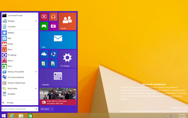
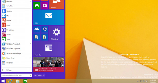
Windows 8.1 introduced some features that tried to bridge the gap between the "full desktop" and the Windows 8 "modern" worlds though the two still existed independently of each other. Noticeably still missing, however, was the Start Menu that everyone was talking about, or at least hoping for. Then in April, just a day after April Fools, a new Start Menu was spotted, one that was practically "Start Menu with Live Tiles". That is now being confirmed today with what is labelled as a screenshot of Windows 8.1 Pro build #9788, seen below in all its glory.

Here we see what could be called a mix, or a frankenstein, of the Windows 7-style Start Menu with that of the live tiles and flat aesthetic of Windows 8. Microsoft insiders are said to have confirmed that this is a genuine screenshot of the current state of affairs inside Microsoft's hallowed halls. The only thing that's missing now is an actual release date that will appease the masses.
But will it really appease them? This Start Menu is hardly the pure Start Menu that Windows users probably have in mind. The integration of Live Tiles into the side panel, once reserved for quick access, may be a compromise to those who have actually grown to appreciate, even love, the modern style, but it also feels coerced and artificial. In the end, the Start Menu might not be the real problem but only a symptom of the disjunct that exists between Microsoft's two worlds. Unless the company finds a way to seamlessly blend the two, or really force everyone to accept Windows 8+, there will always be those who will hold on to the past in bits and pieces and will never completely welcome any compromise Microsoft makes.
VIA: Neowin
