Windows Blue: 5 Features That Make Windows 8 Worth The Switch
This week we're hearing a whole lot about what Microsoft's first big update to Windows 8 will be doing for the operating system, hearing how this so-called "Windows Blue" will change the company's fortunes for the better. What Windows Blue is, for those that haven't heard of it, is a polishing of the less-then-fantastic bits and pieces of Windows 8, especially where it concerns the operating system's user interface. Have a peek here at several of the finer points that've been leaked in early builds thus far.
At the moment you're not going to be able to get Windows Blue without downloading it illegally or finding your way into a developer build. If you're an average citizen, you'll just have to wait – and we're not sure yet when that wait will be over, but we're hoping soon. Cross your fingers!
Real half-screen app snap
One of the most interesting discoveries you may have already made in Windows 8 is your ability to "snap" 2 apps at once, allowing yourself the ability to work with both at full-screen essentially simultaneously. The only bad part about it is the instant 75/25 share size – one app takes up most of the screen while the second app is so small you can barely use it. As PC World says so eloquently, "that particular design decision was... bone-headed."
With Windows Blue, the default is 50/50, a much more realistic half-and-half situation for those of you that love to keep two things open at once. Along with this is the push for more touchscreen-friendly settings.
Computer Settings become touch-friendly
When you're looking to change the settings on your Windows 8-toting machine, you find it a bit less than intuitive before Windows Blue. When the Windows Blue build comes to you, you'll find the "modern" user interface to have been brought with a fury to your standard settings galore. Before Blue you had to head back down to your standard desktop mode and tap through (if you had only touch) with teeny-tiny hotspots until you had nothing more than pre-Windows 8 UI never intended for touch at all – fix, yes please.

Live Tile options expansion
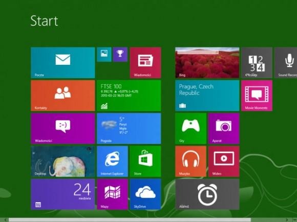
As it was with the change-over between Windows Phone 7 and Windows Phone 8, this update to Windows 8 "Blue" will allow you much more control over your Live Tiles. Here you'll be able to choose between 4x4 size, 4x2, 2x2, and 1x1. You'll also be able to change the color of your standard tiles, and – believe it or not – one option has been erased from your options altogether. That is the quick-push of a tile from one location to another.

That option has gotten in our way more than it's ever helped. That's the option where you hold down on a tile and move it to a different location on your home screen – if you've tried to flick between sets of tiles and hold just a bit too long in Windows 8, that tile will fly to the other side of the screen (wherever you leave off with your finger, that is). With Windows Blue, you'll have to right-click (or otherwise hold down with your finger) on a blank portion of your screen to activate a "Customization" option before you do any flicking – nice touch!
New Built-in Apps
With Windows Blue, as with all great massive operating system updates, there are a few app additions to entice those of us who would otherwise just ask "well yeah, but what do I actually GET when I update?" Here you'll find some oddities, bits and pieces like a new calculator, alarm clock, and sound recorder – note how these would go great on a tablet or – how about that – a smartphone!

Personalization
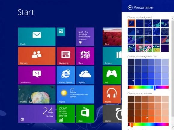
For those of you that love to change the look of your user interface, the Personalization options panel has been pushed up to the forefront. Instead of having to dig down deep in the tunnels that are the old UI, here you'll find this panel – touch-friendly and everything – up above your Tiles option – pull in from the right on your home screen and hit the settings – and go forth!
