Windows 8 Tablet Hands-On
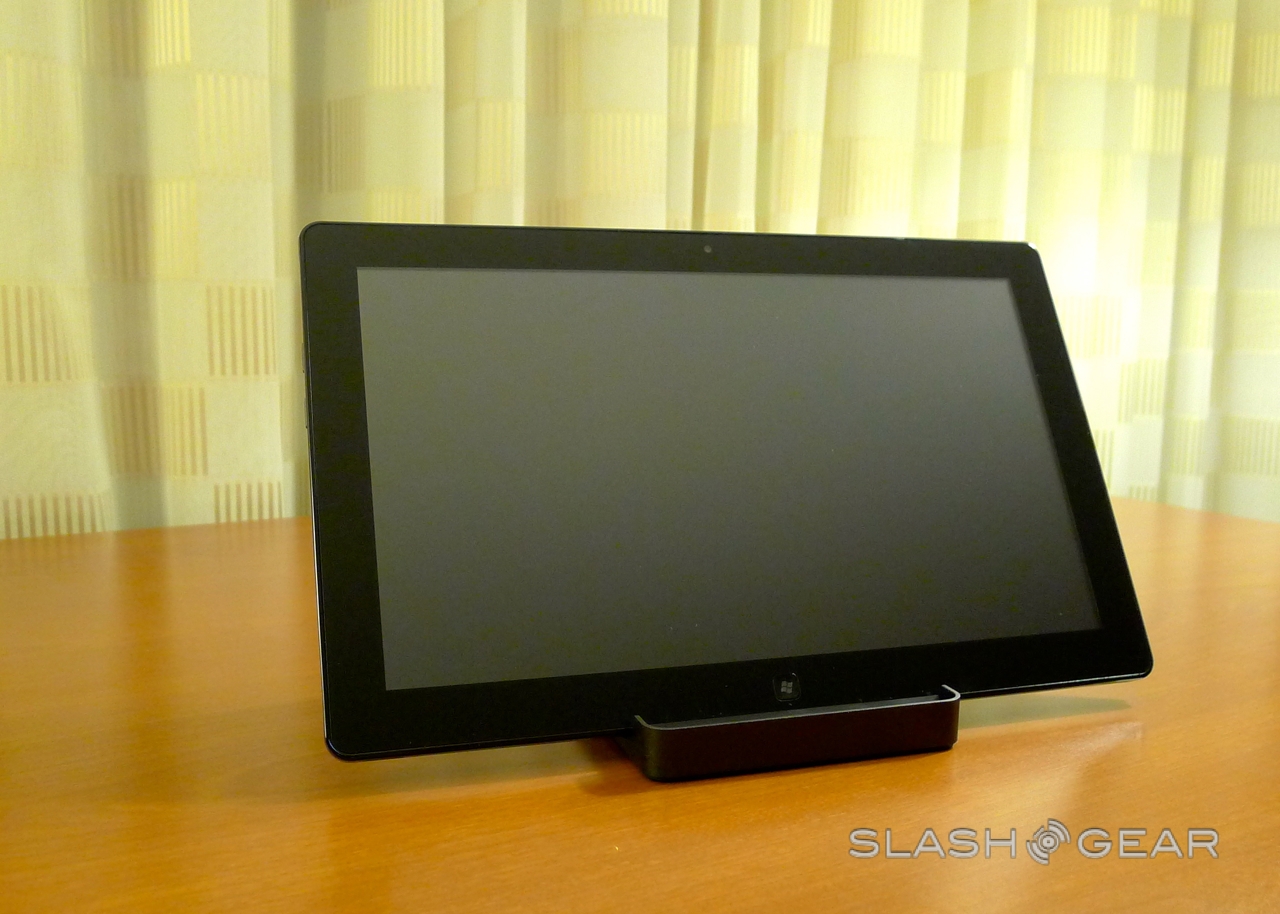
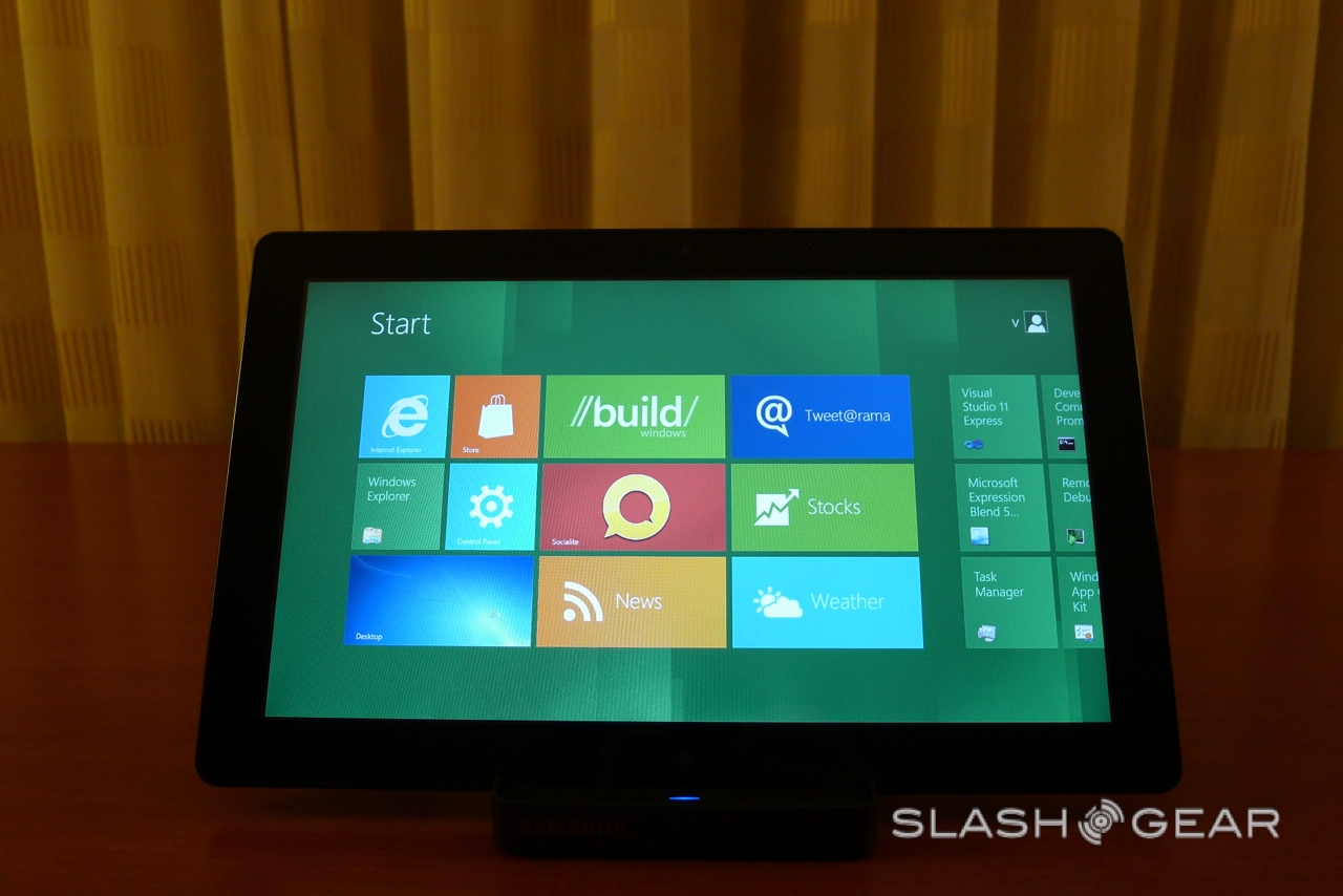
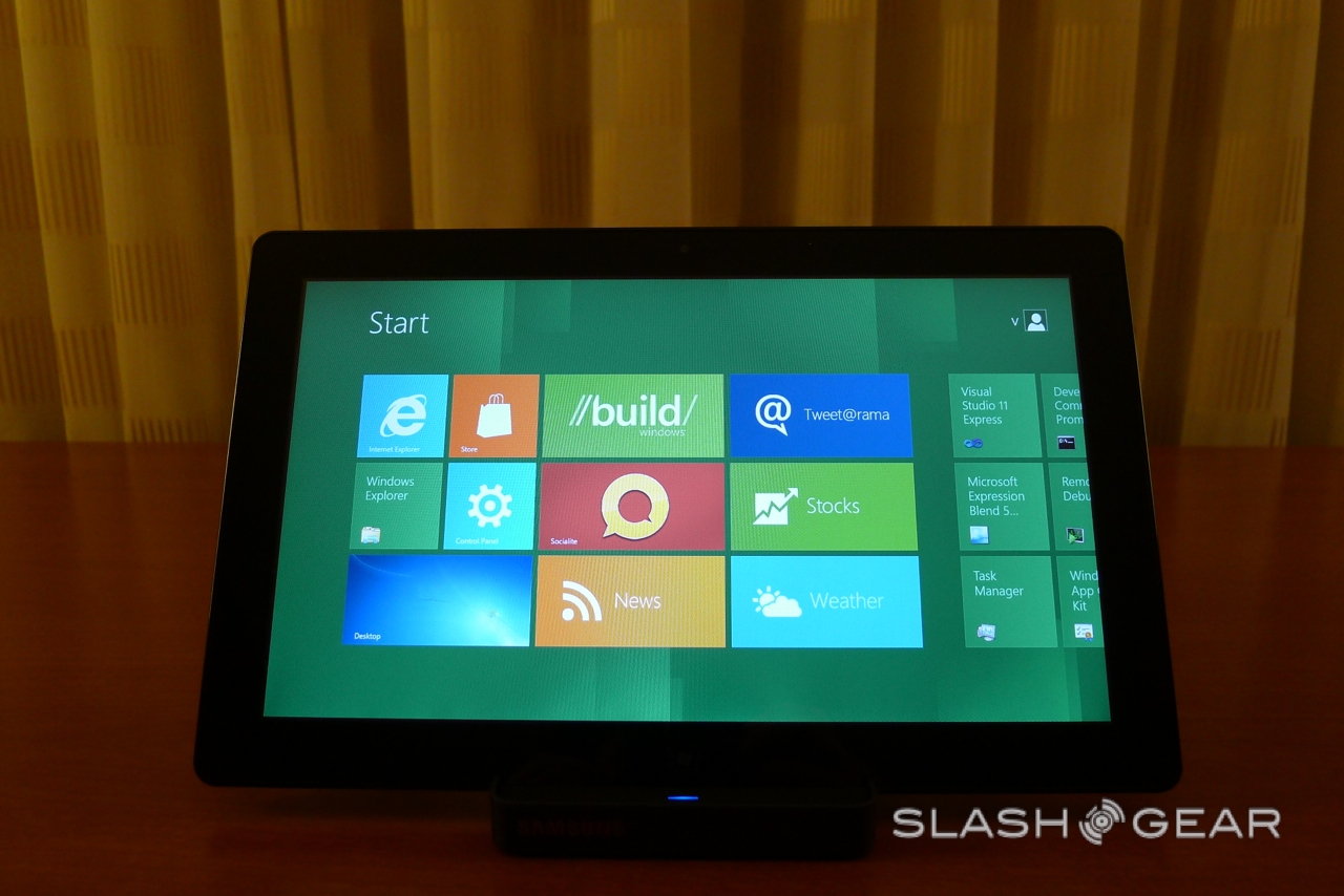
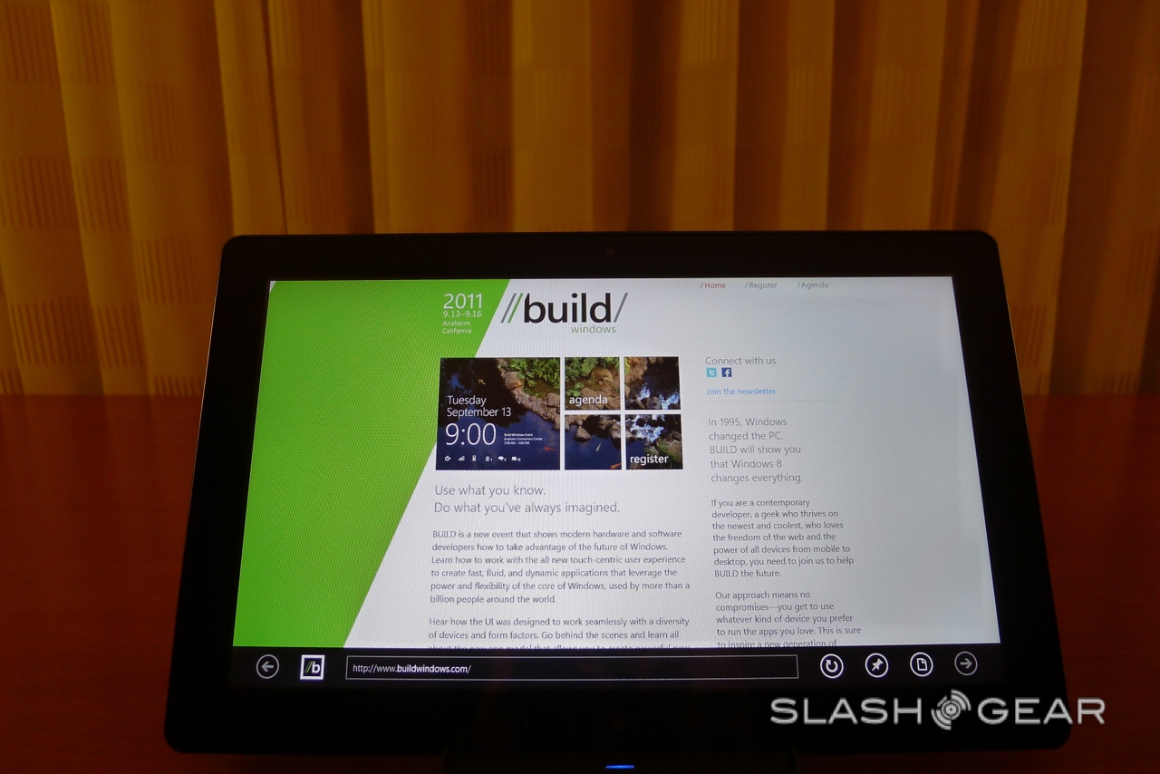
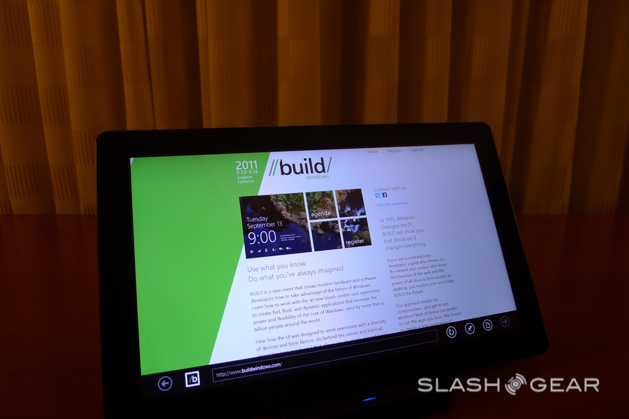
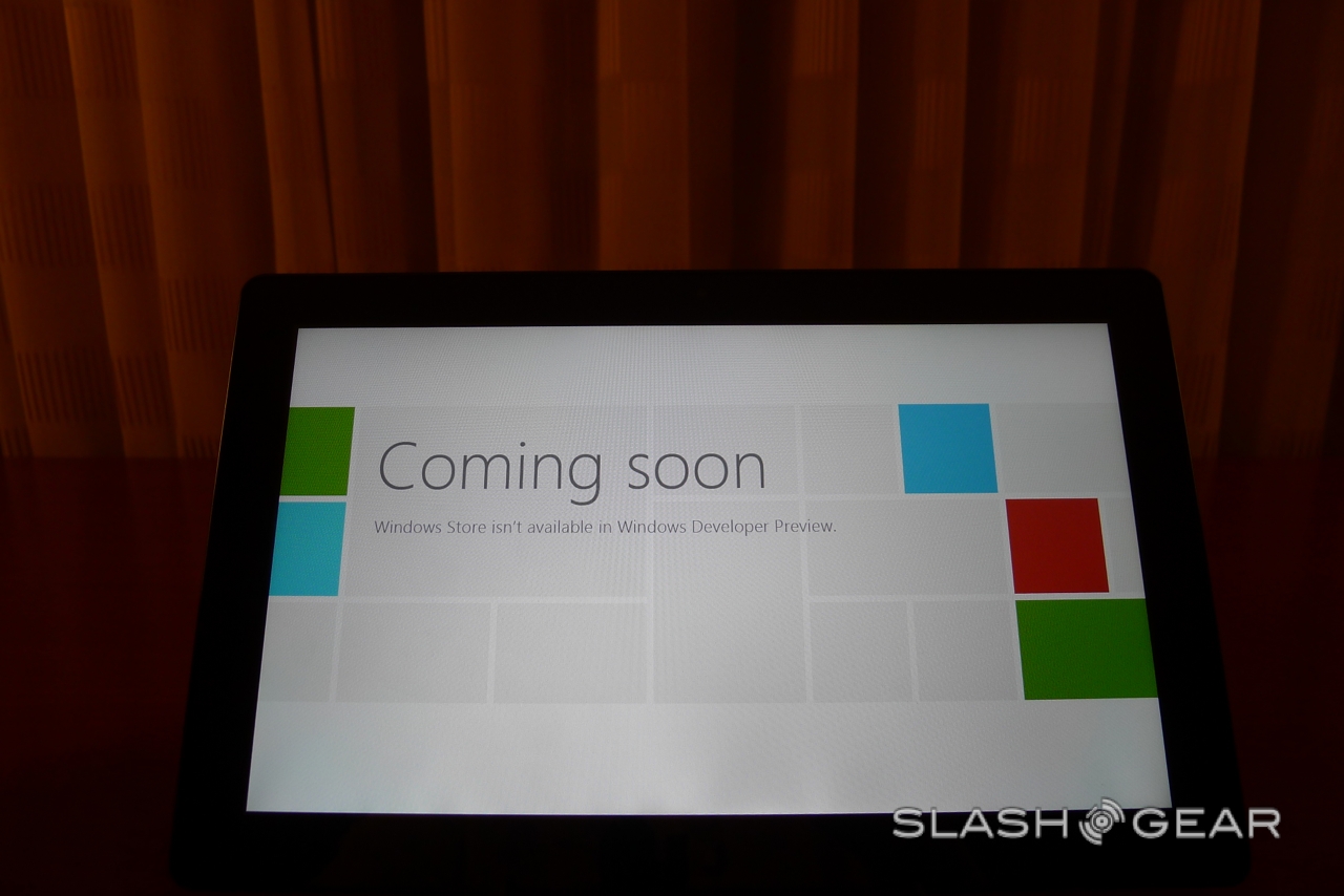
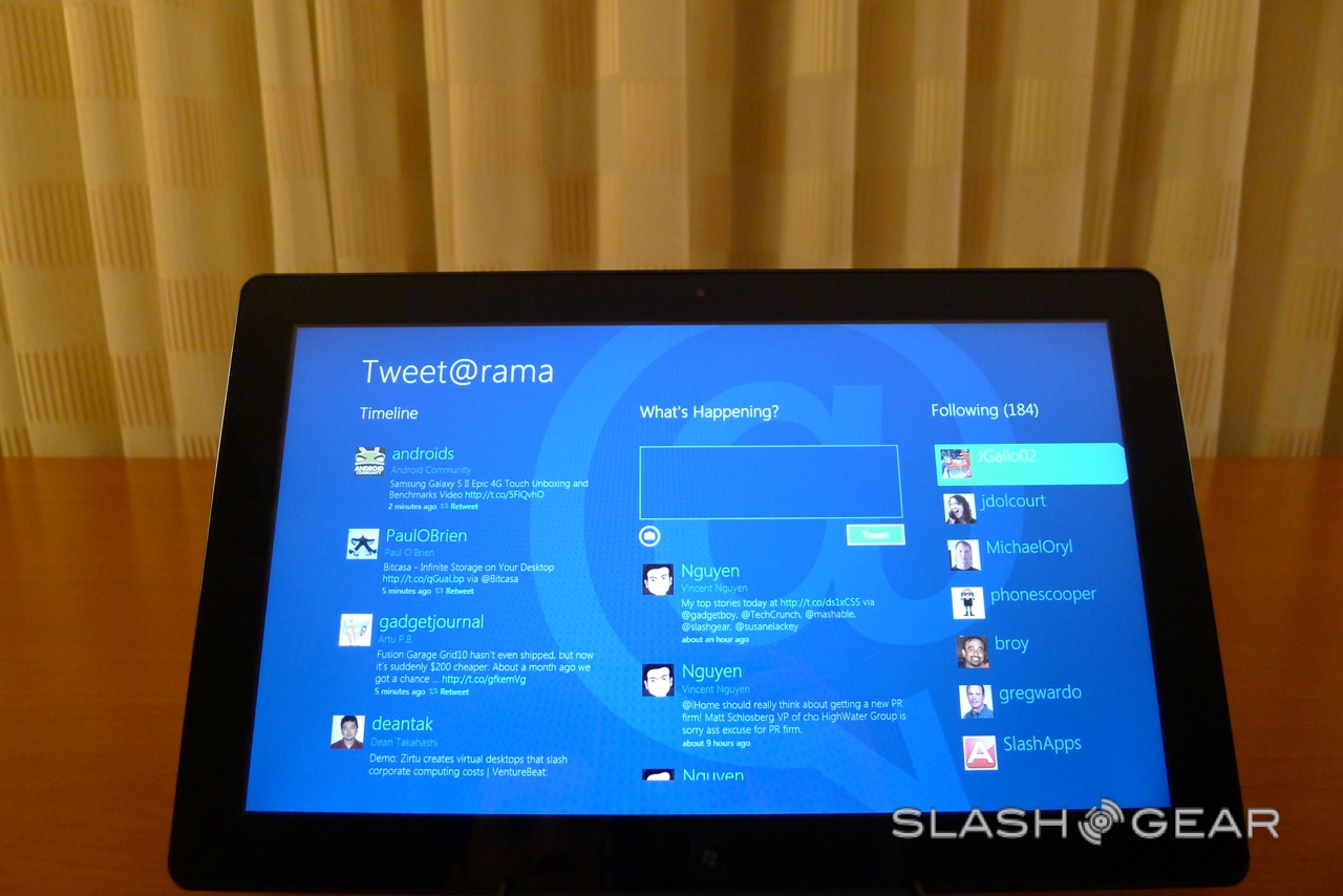
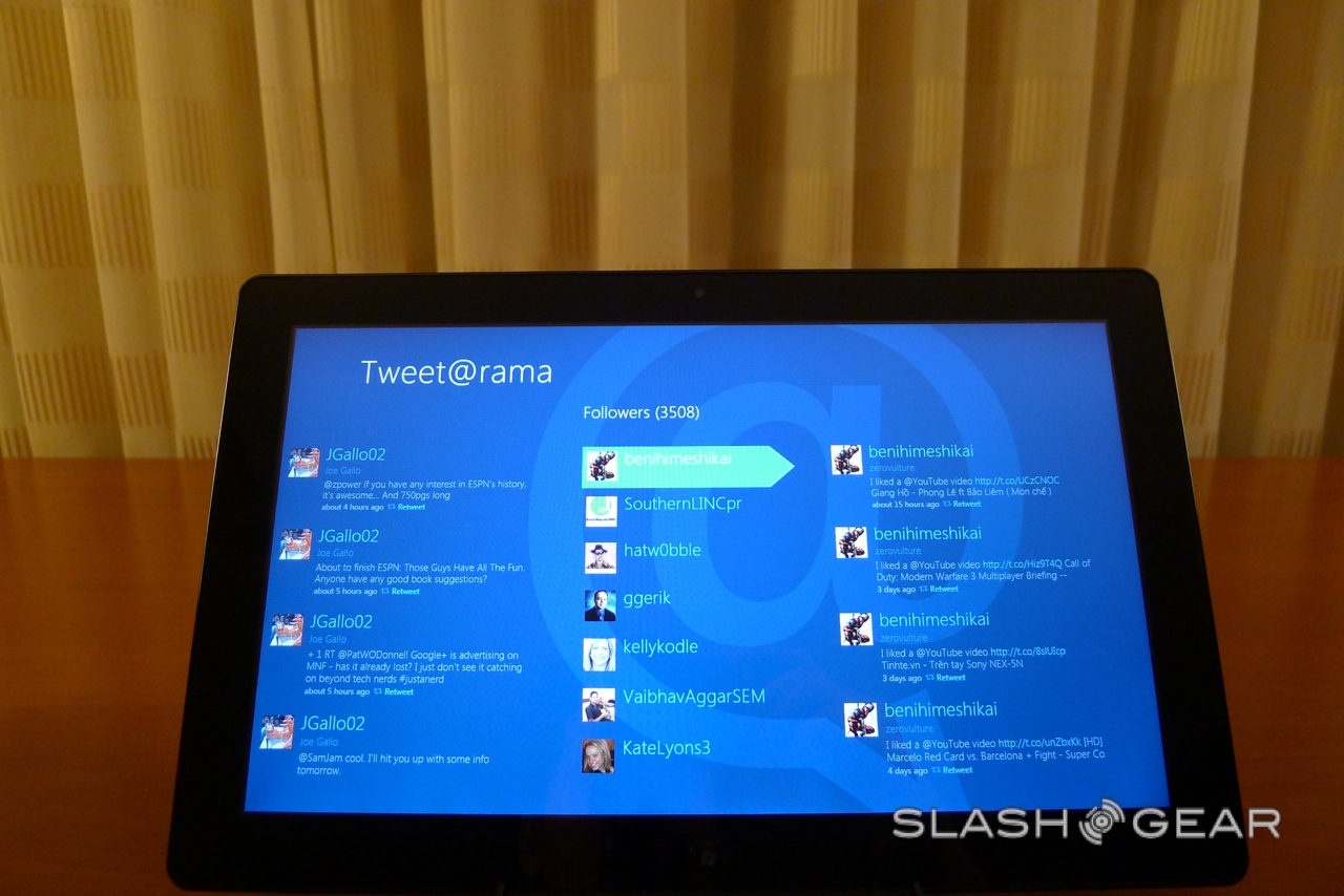
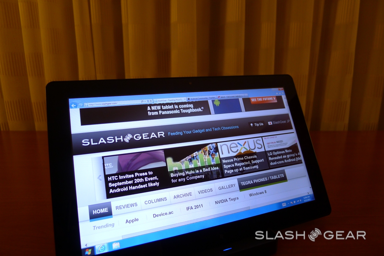
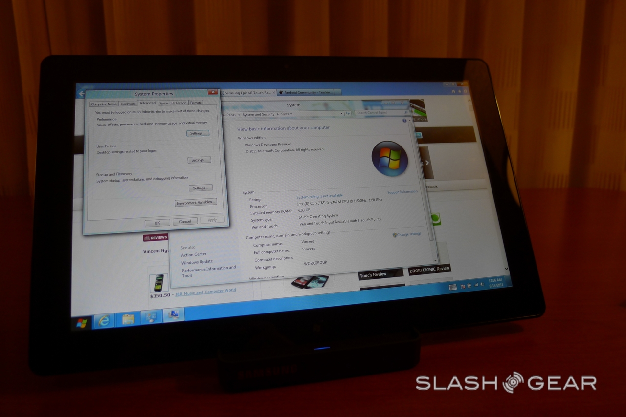
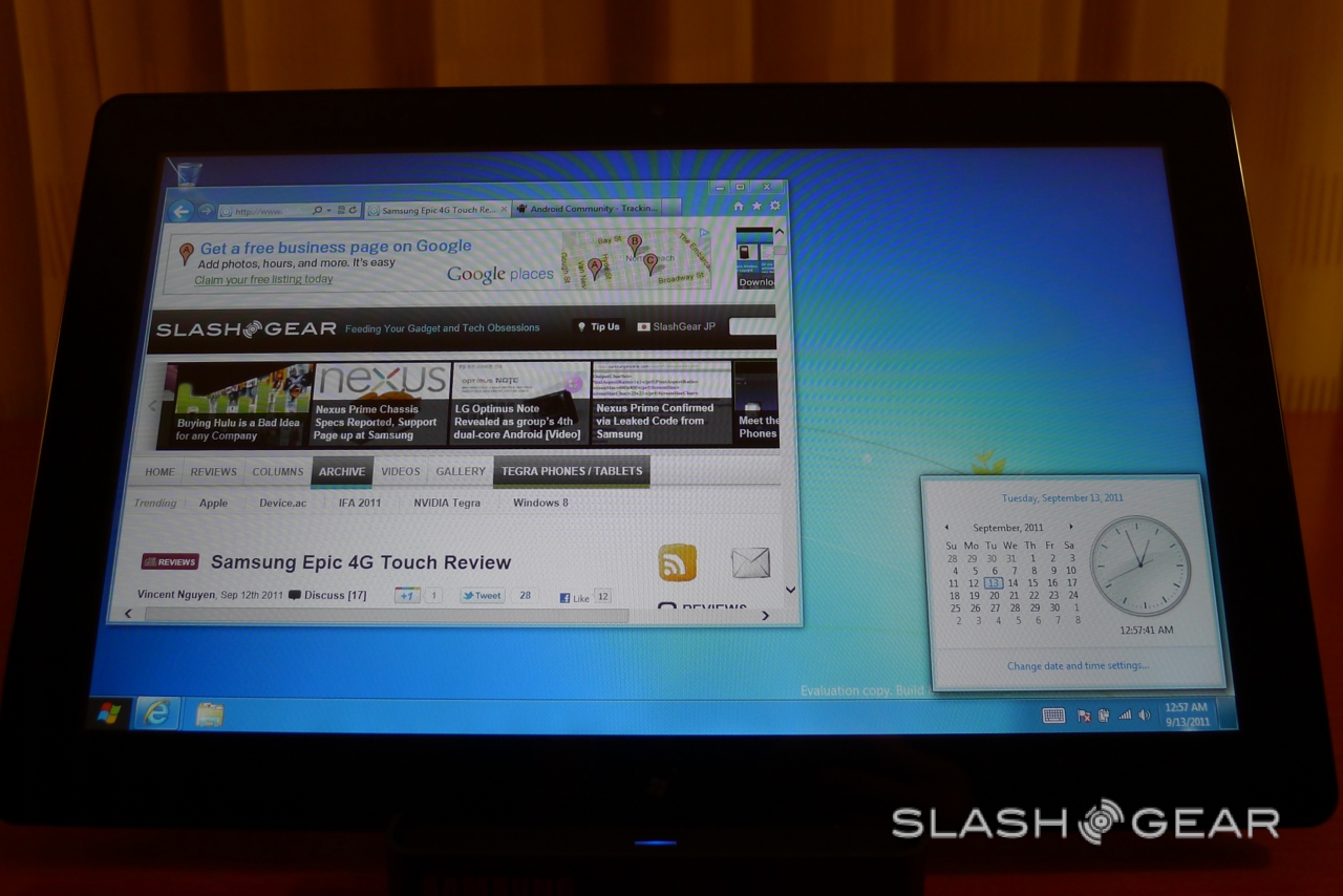
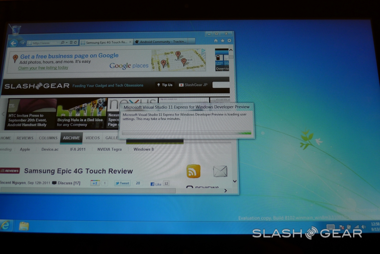
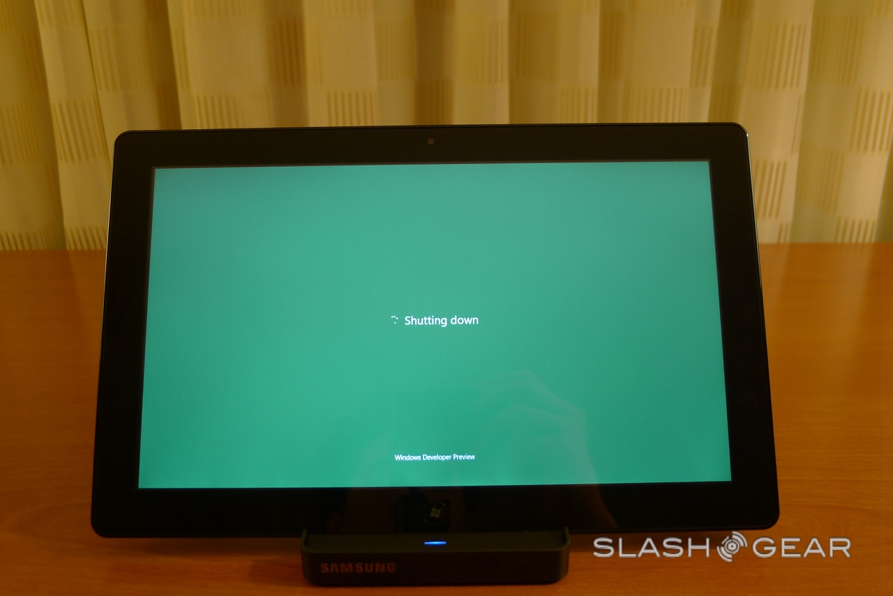
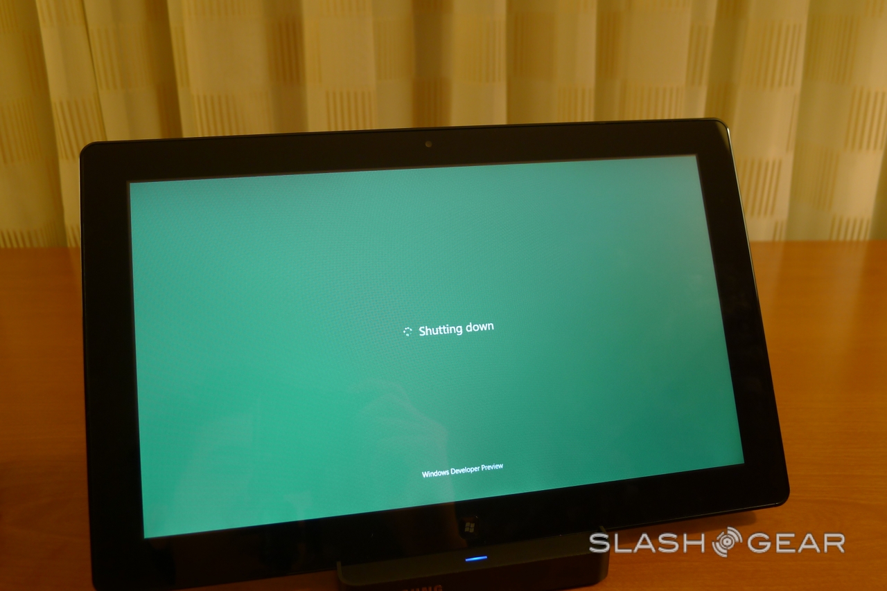
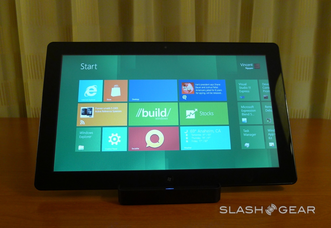
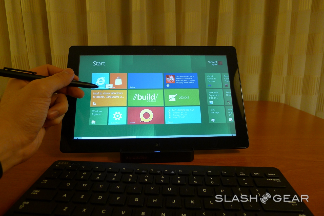
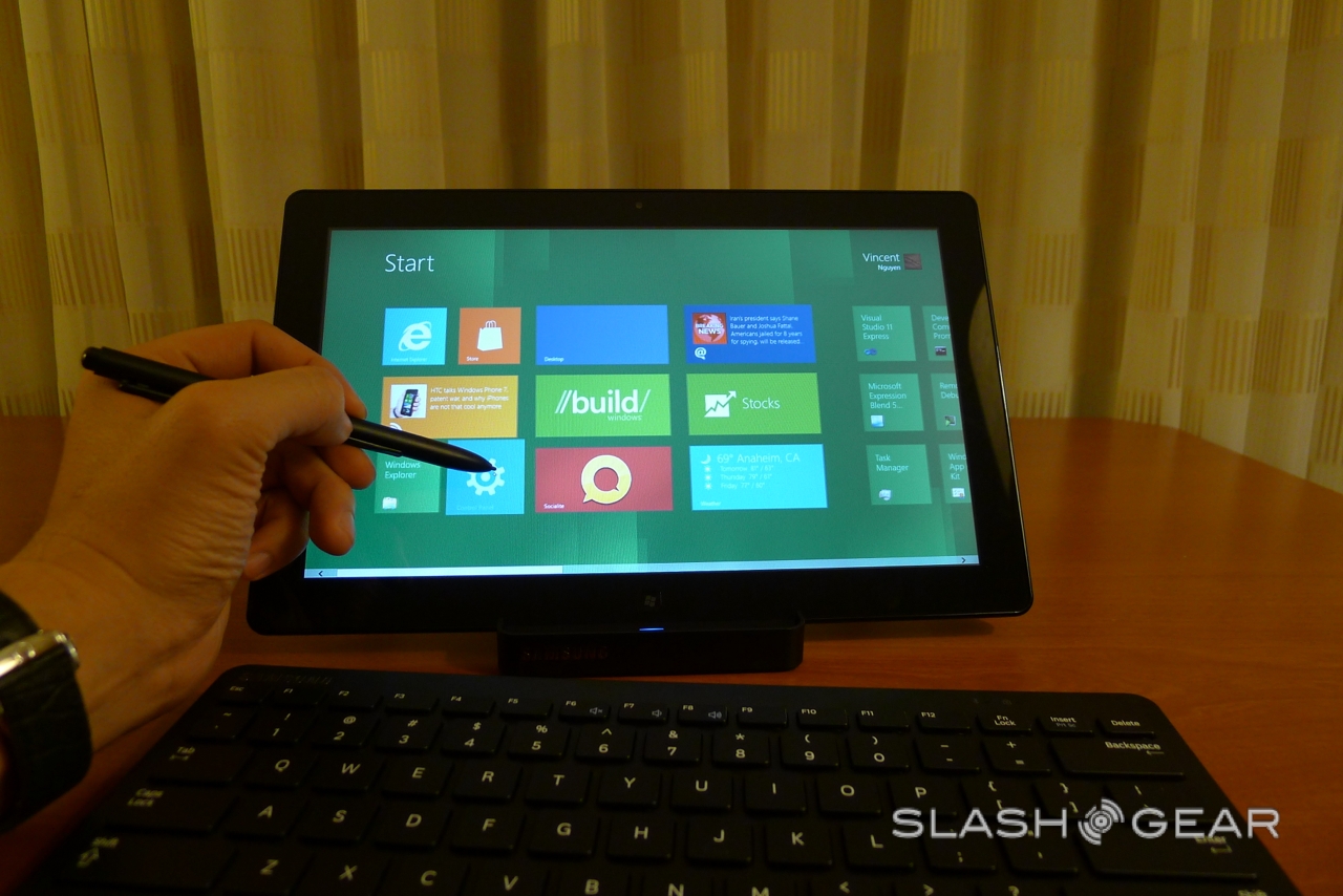
Microsoft BUILD kicks off this week, but we've already been playing with the star of the show: Windows 8 in its tablet form. SlashGear has been testing out a new Windows 8 slate, complete with sub-10s startup, Internet Explorer 10 for touch-centric browsing, and a new UI – previewed earlier in the year - that's strongly reminiscent of Windows Phone. Check out our hands-on preview after the cut.
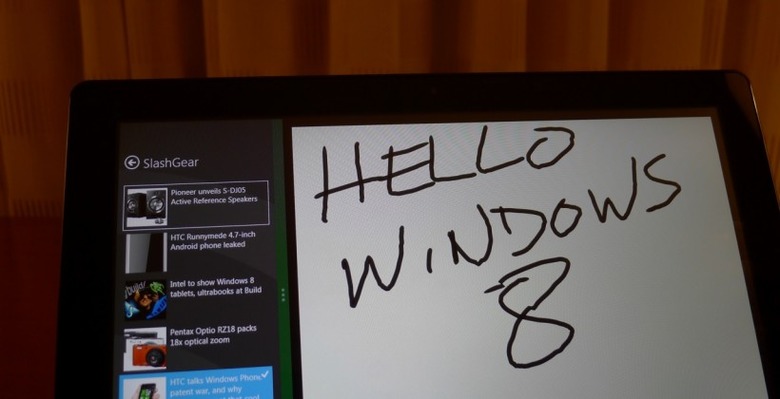
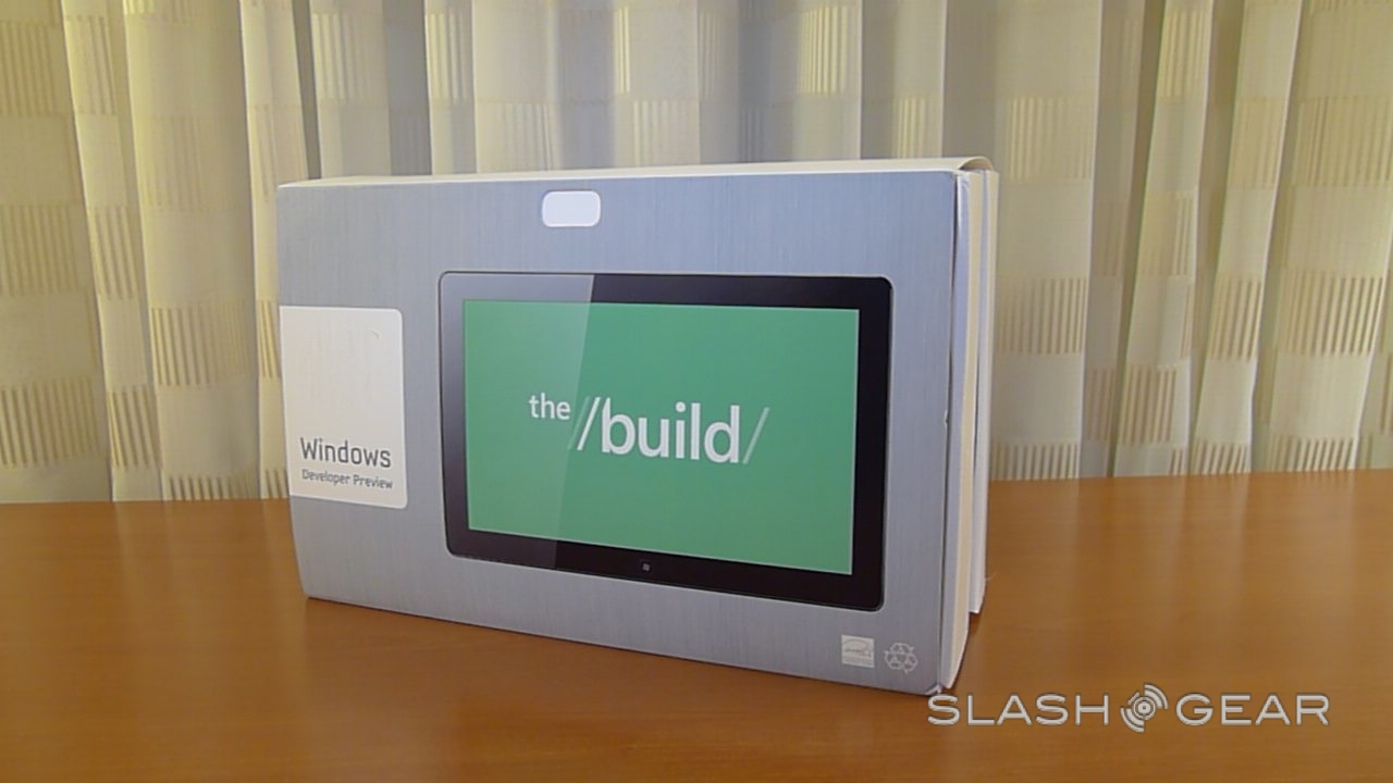
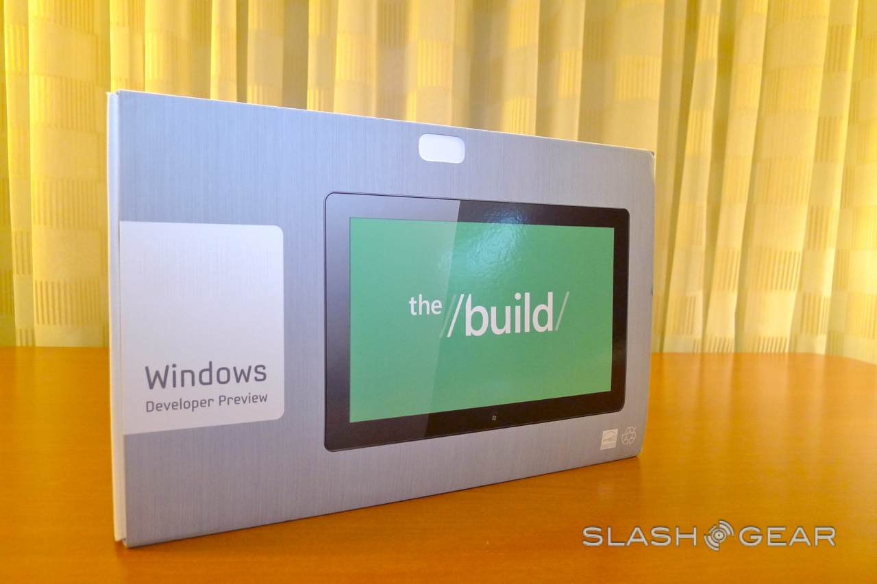
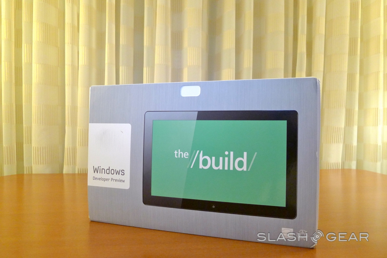
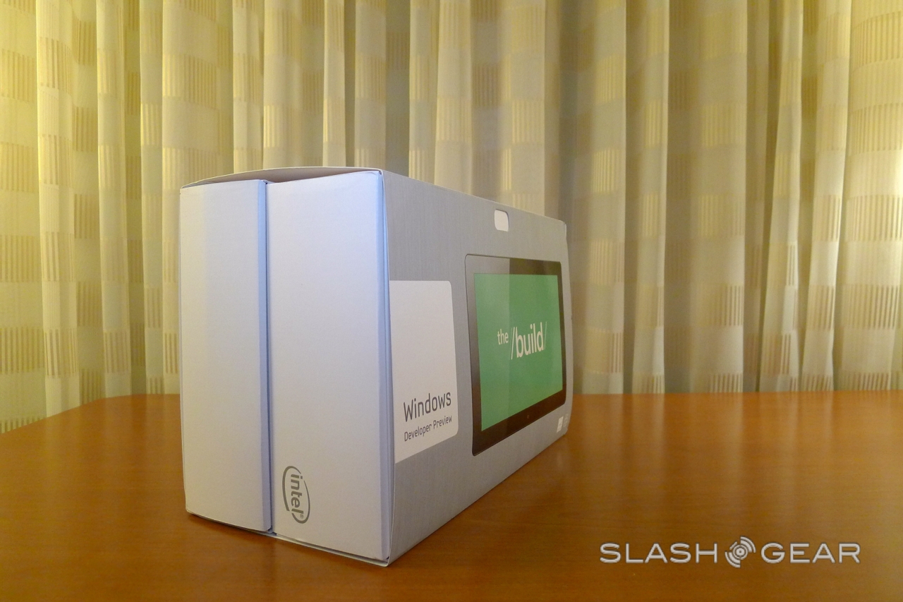
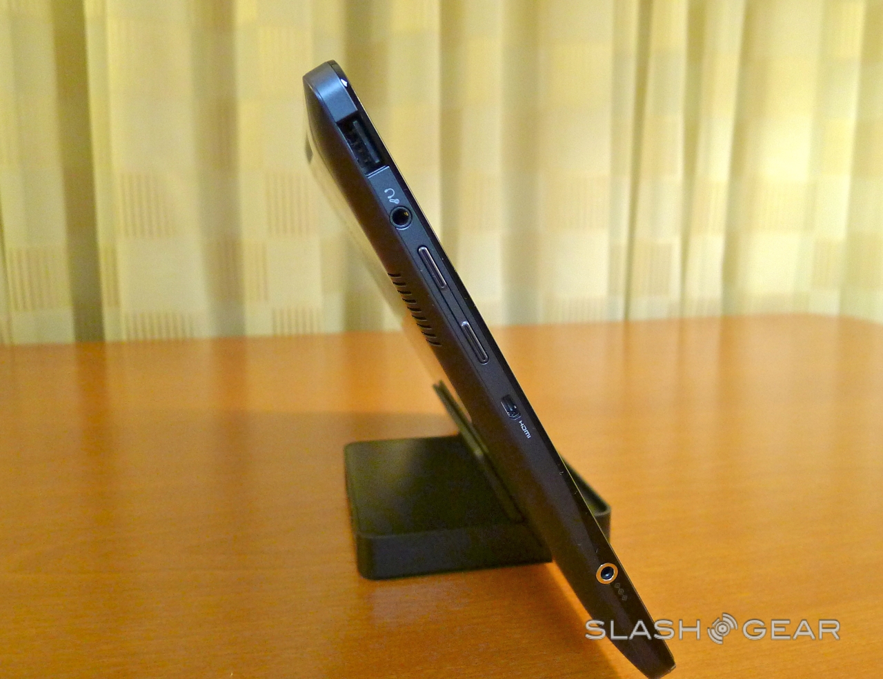
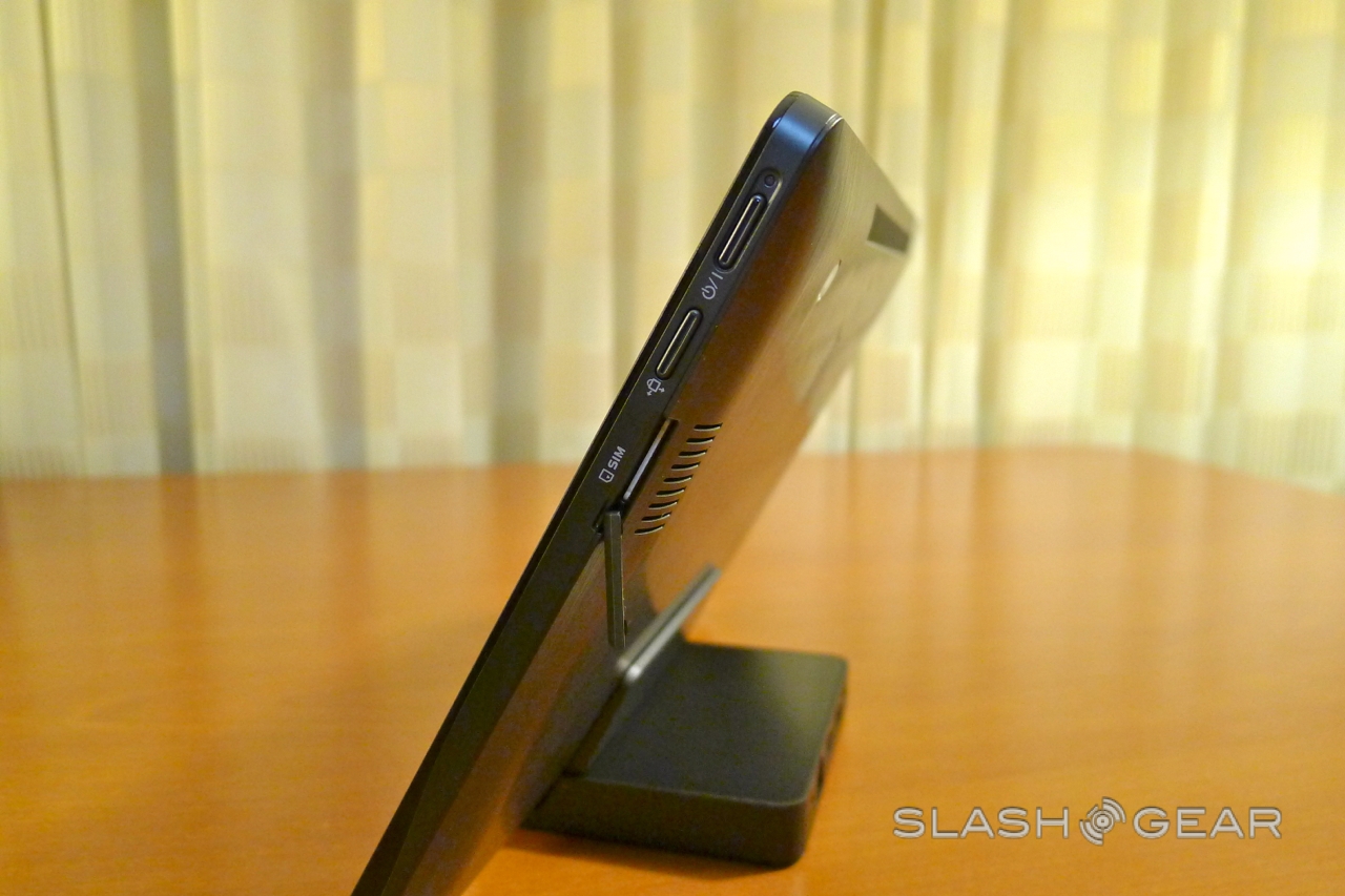
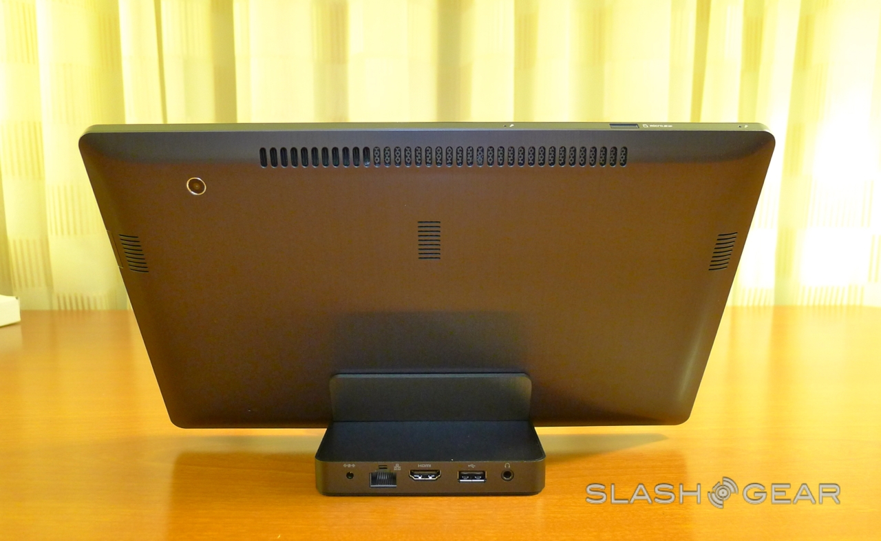
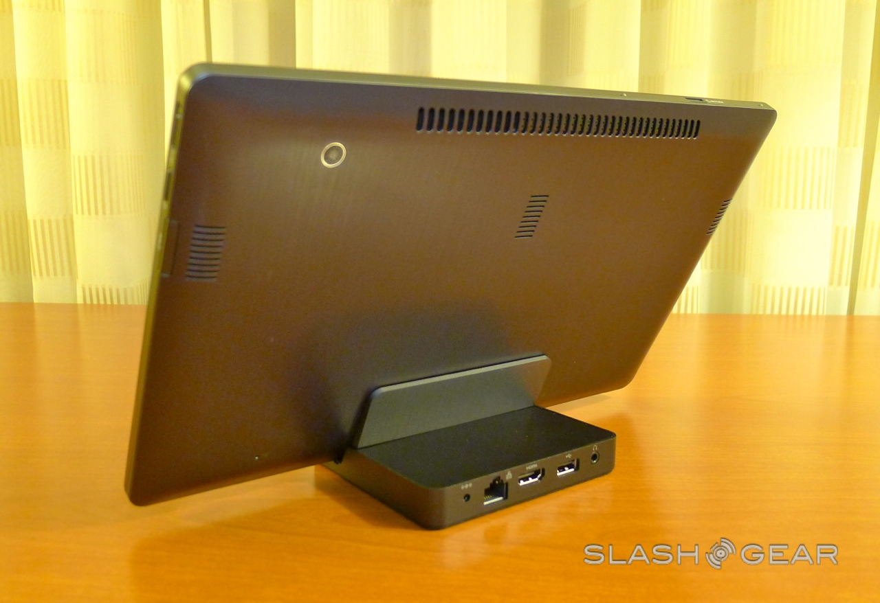
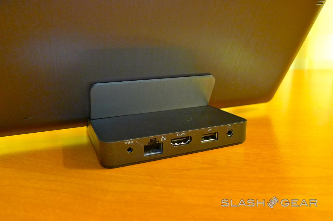
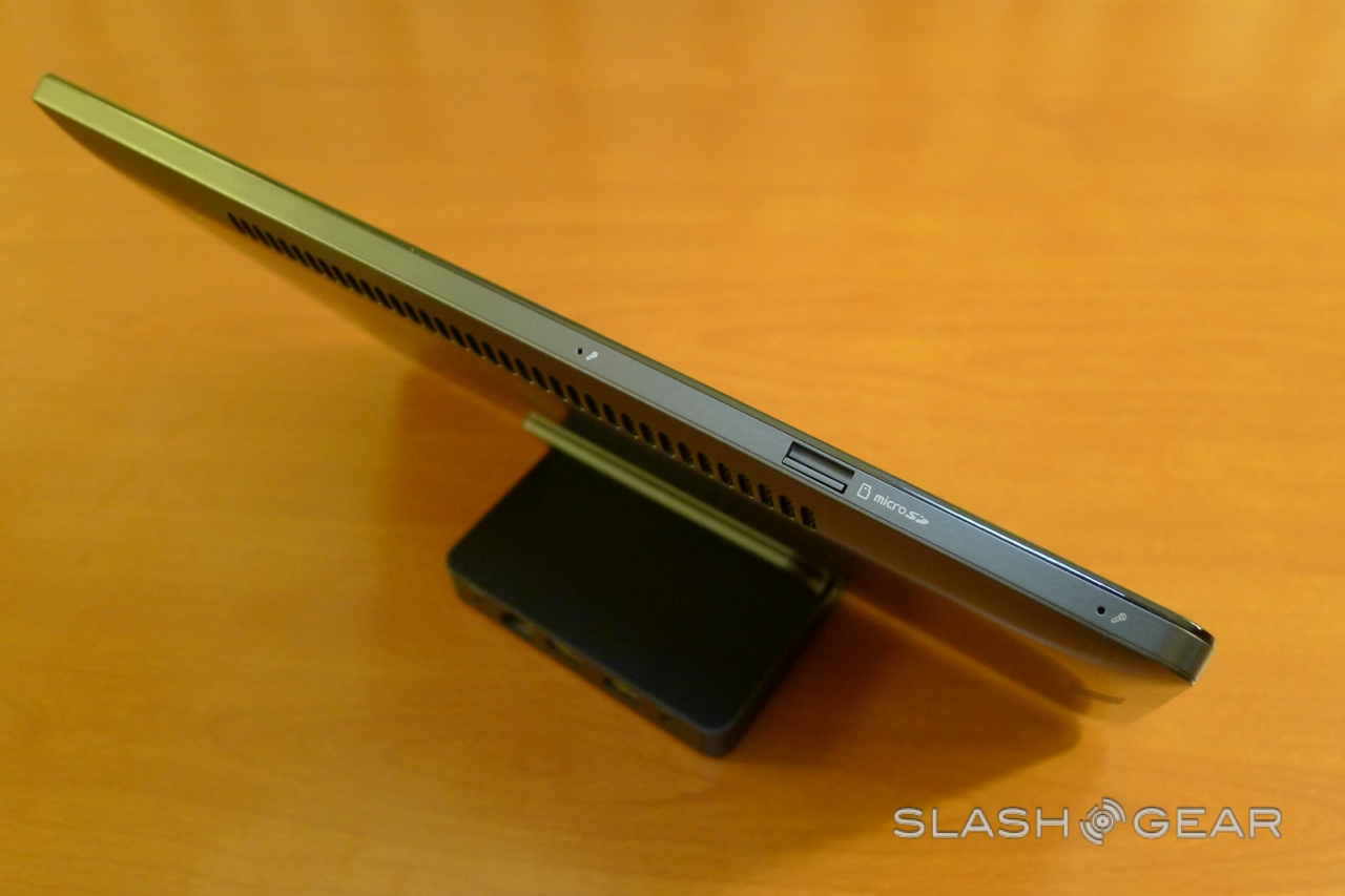
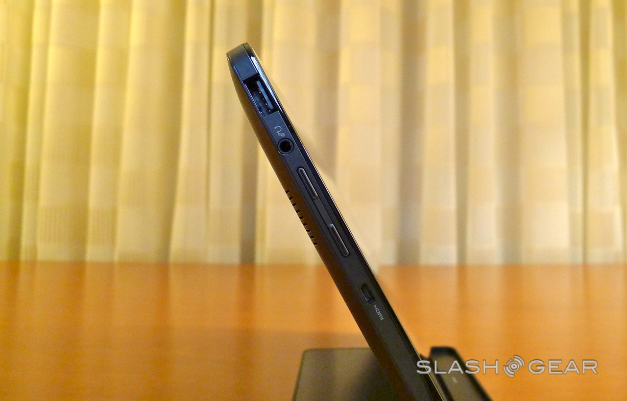
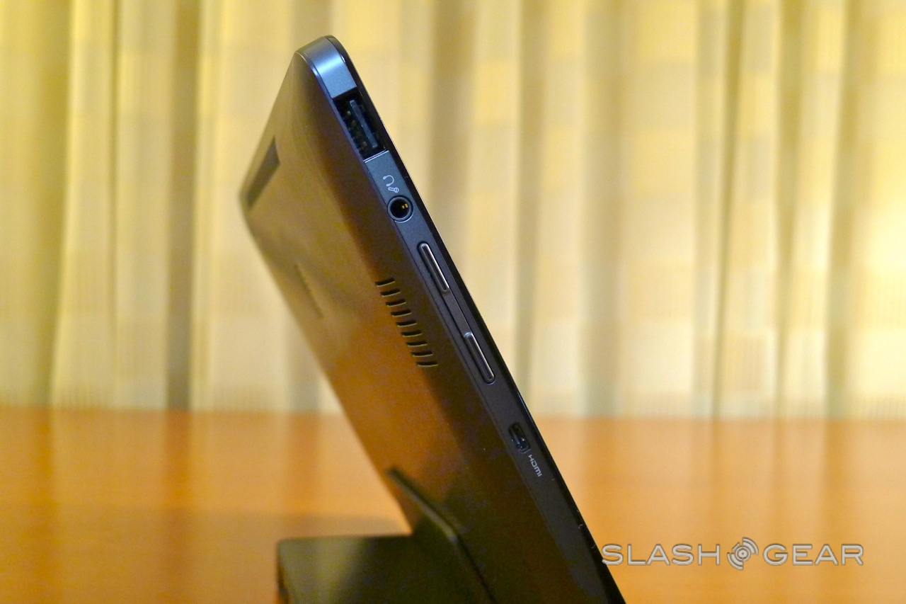
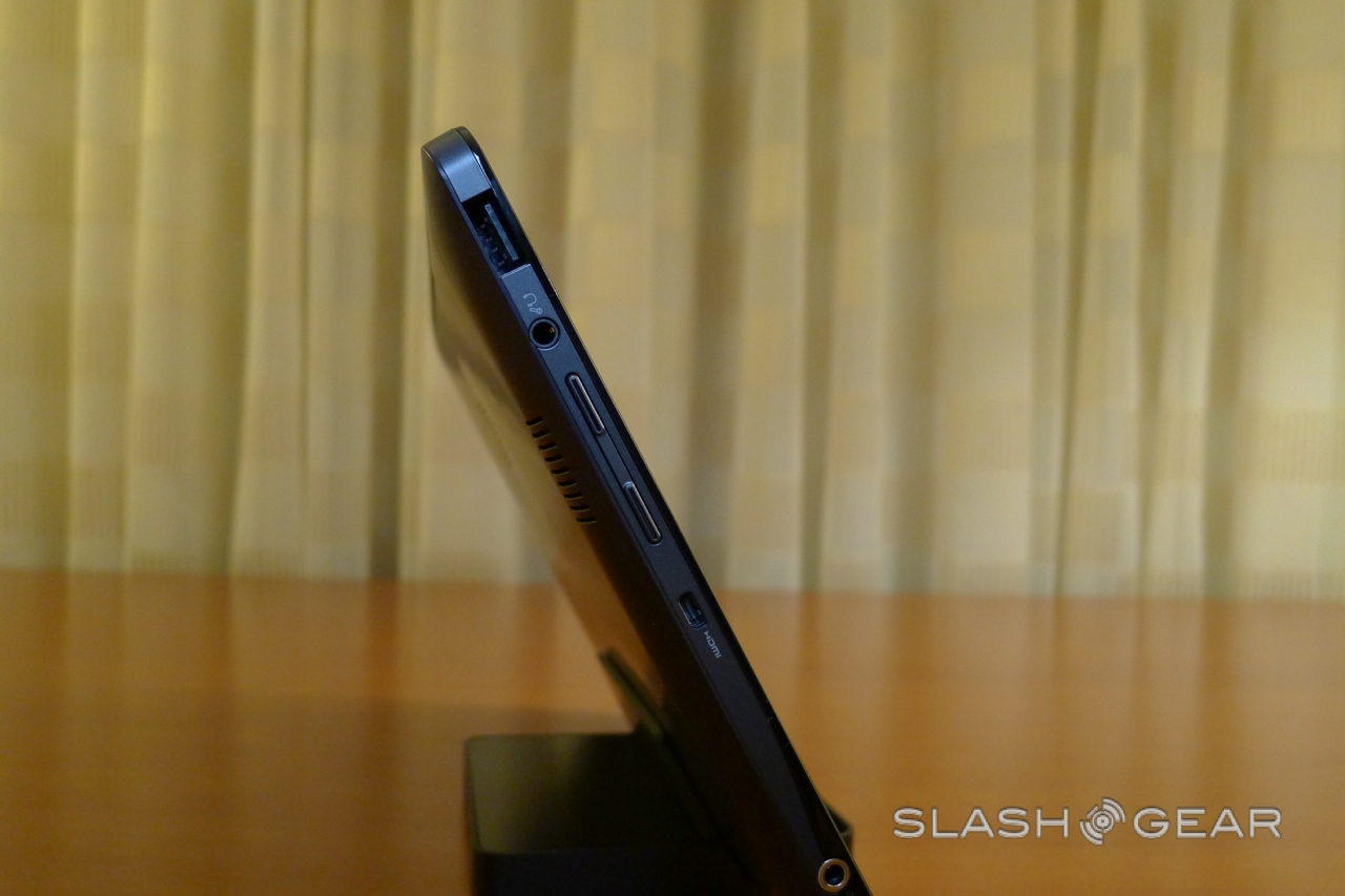
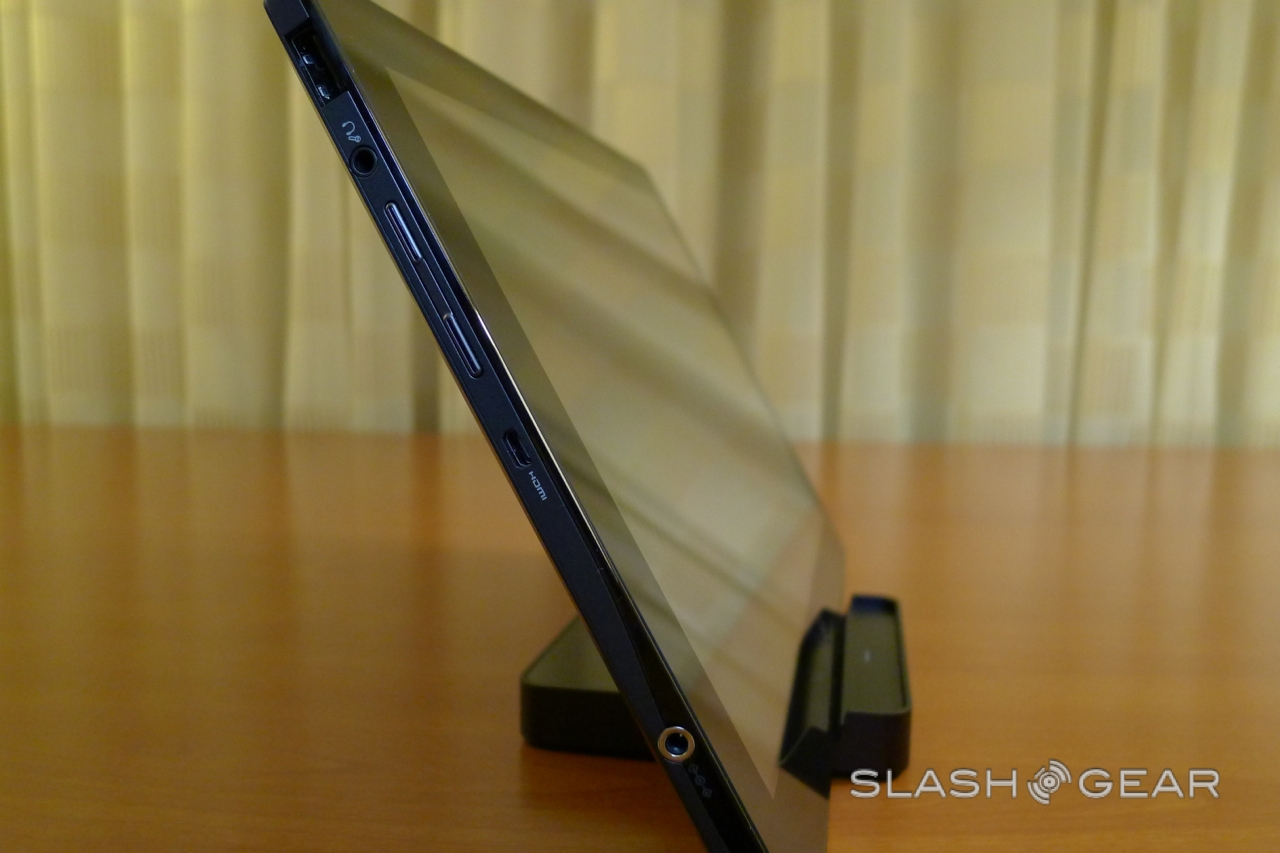
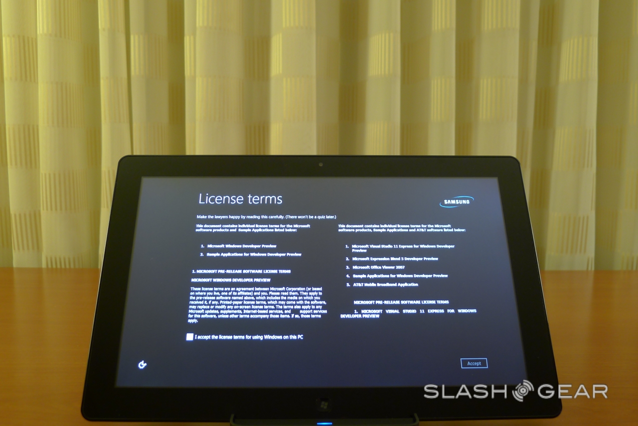
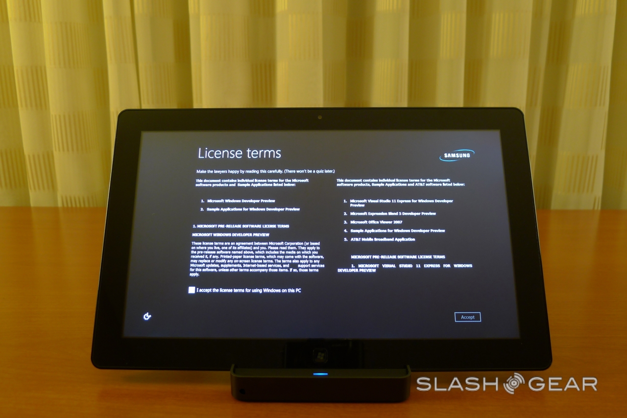
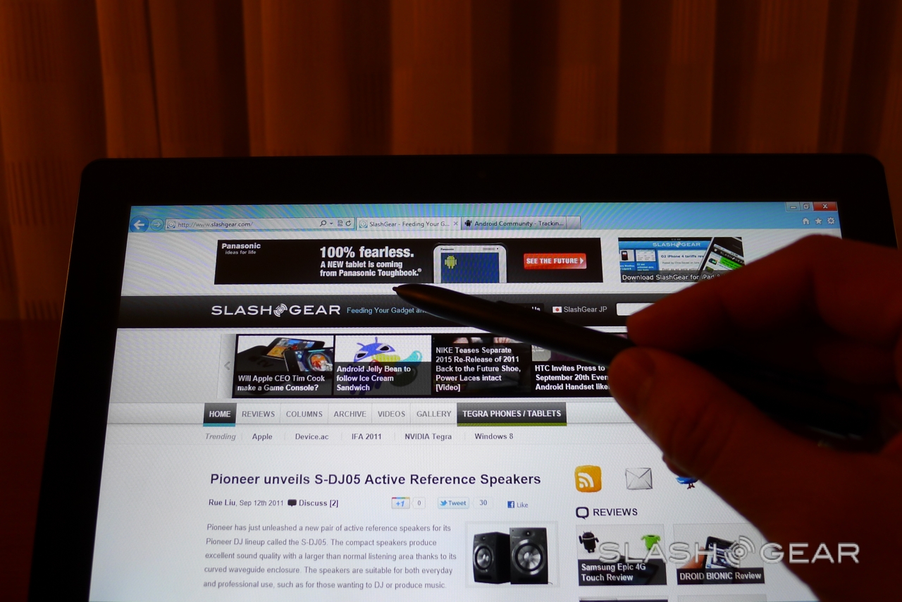
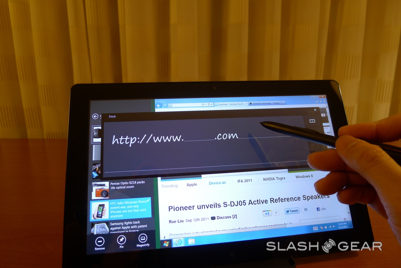
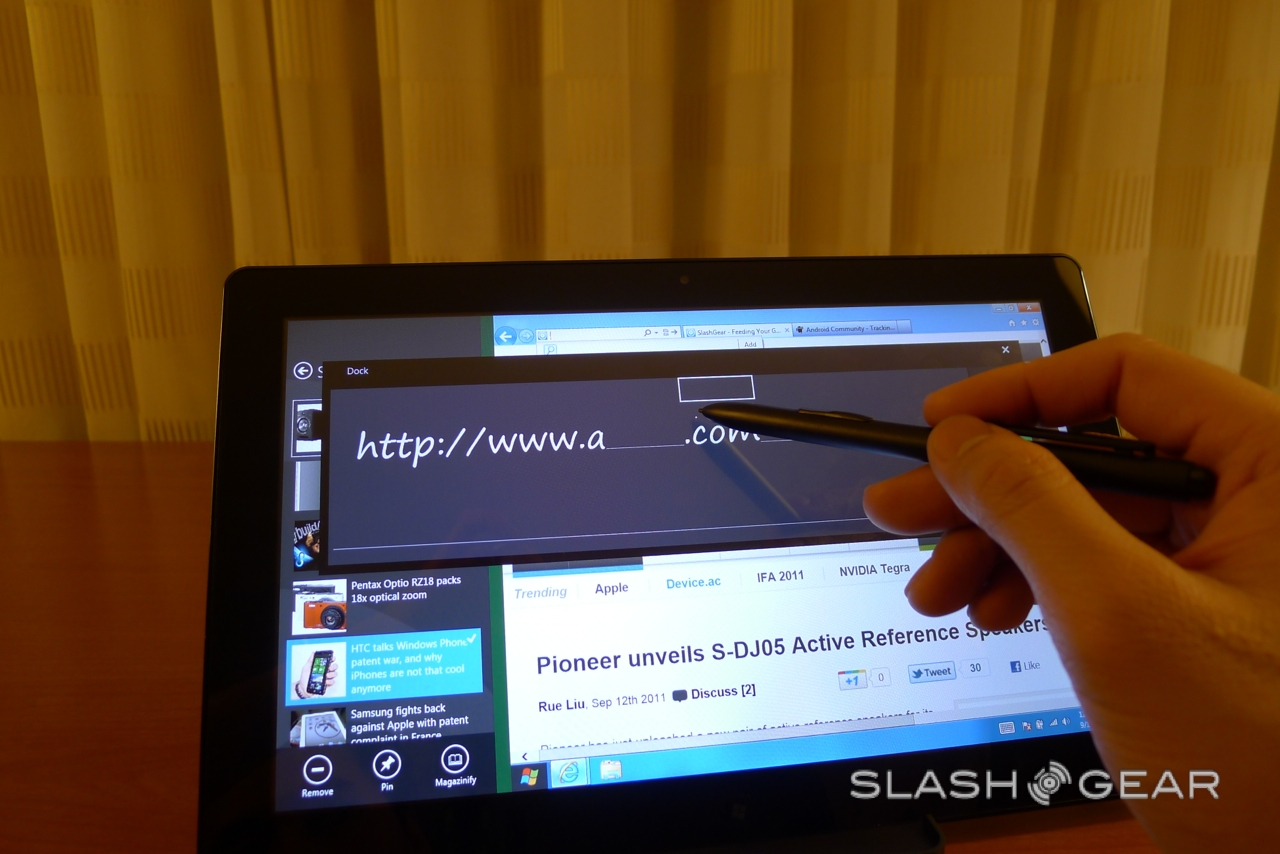
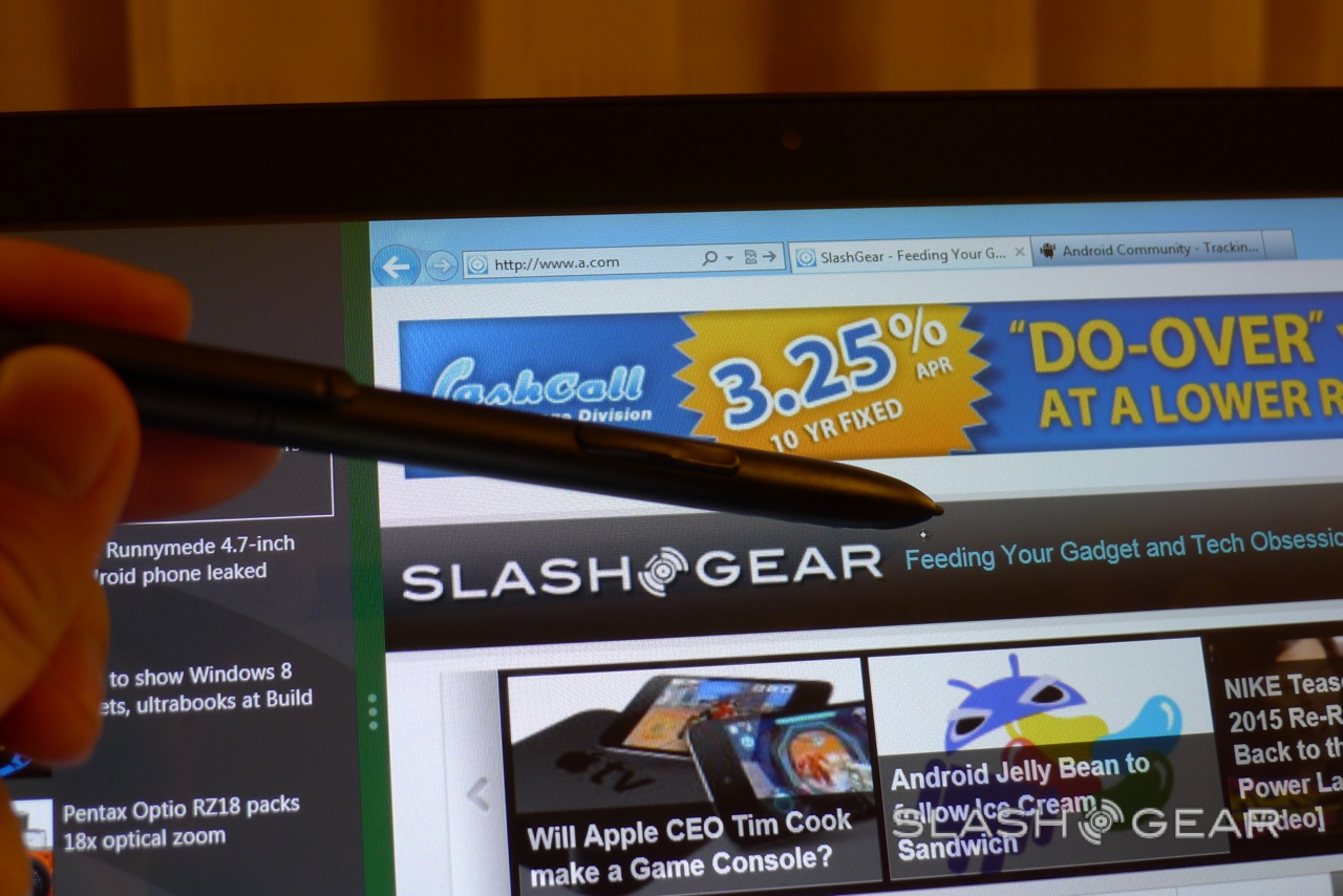
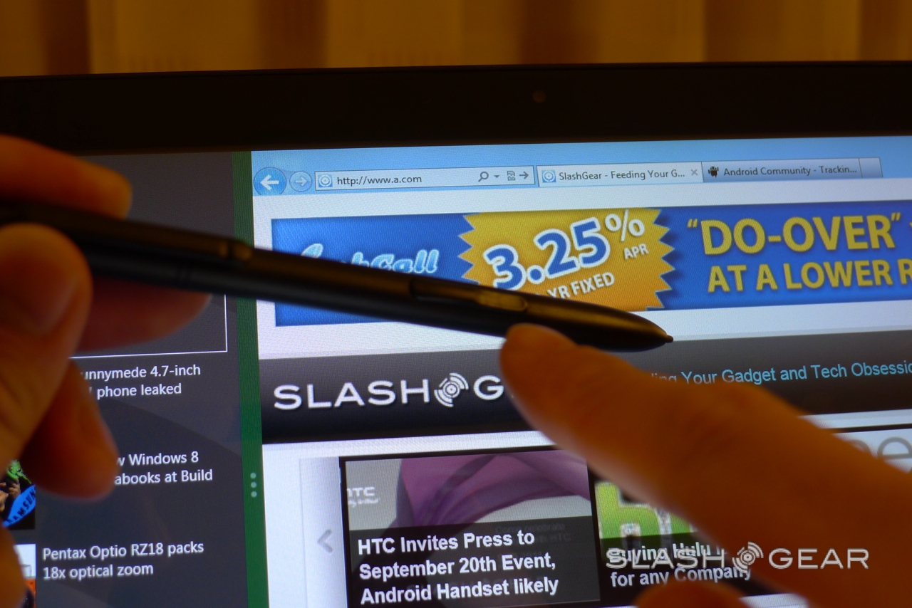
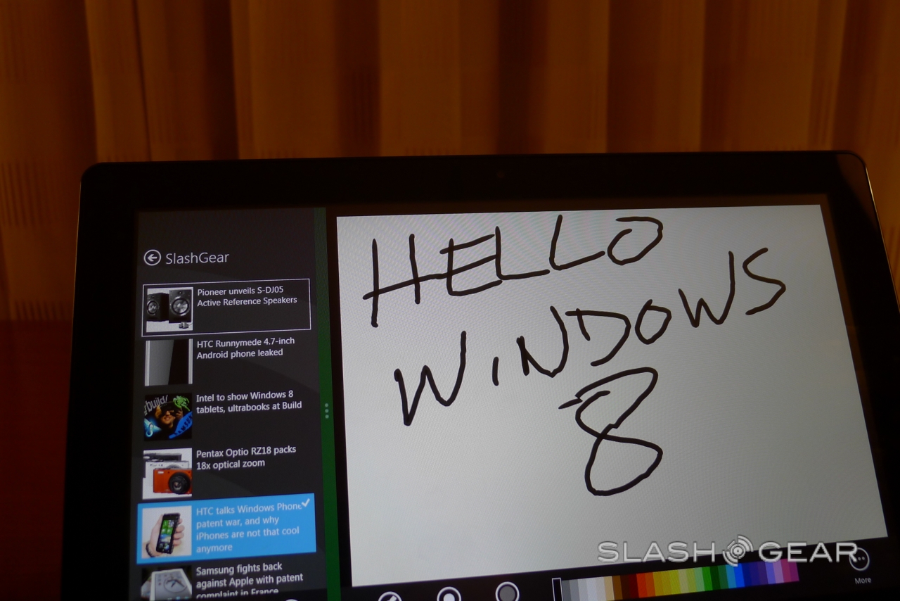
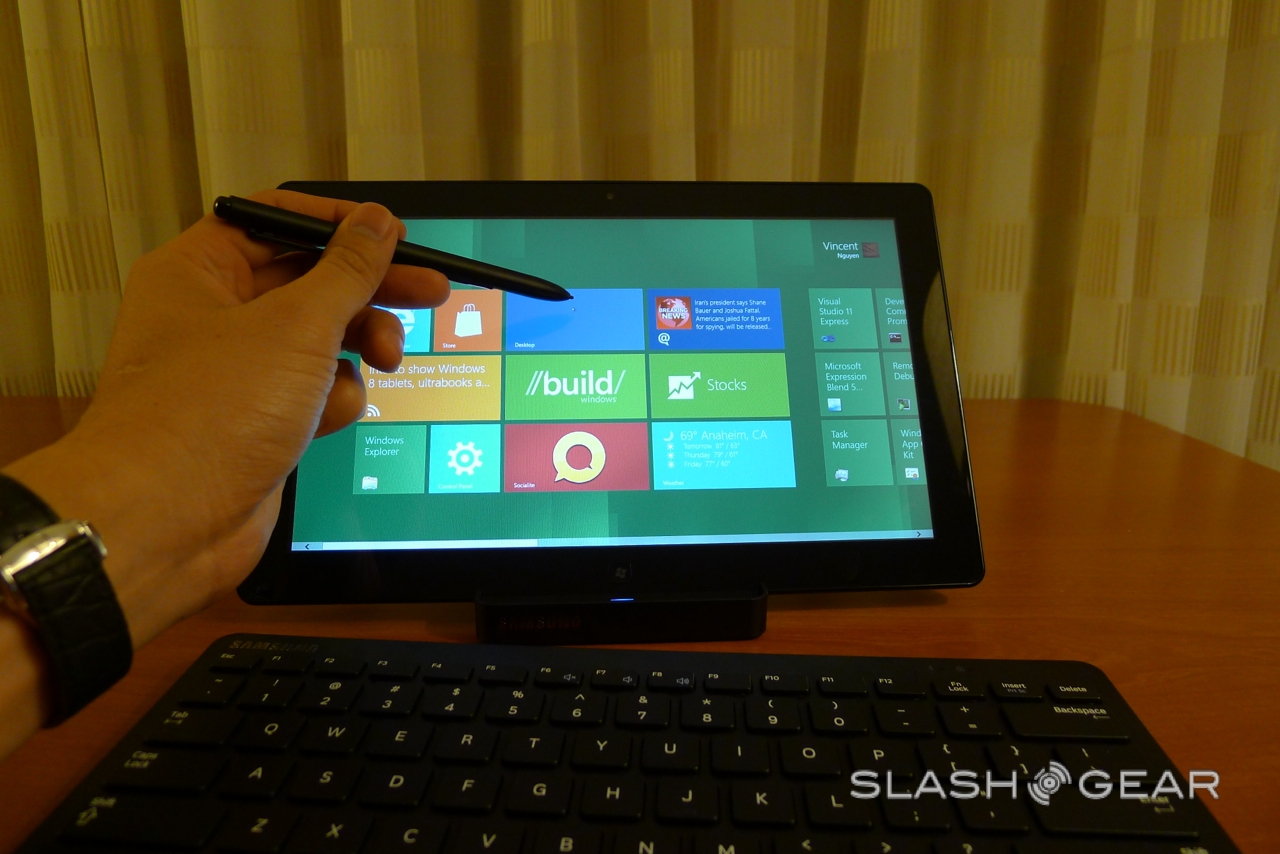
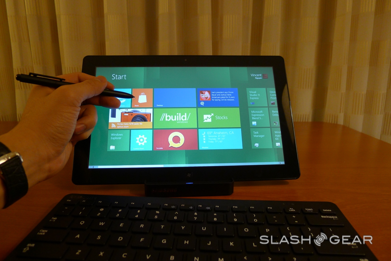
Microsoft is putting more emphasis on the software than the tablet itself, though the eagle-eyed might recognize it from earlier in the month. As well as the slate, there's a docking station and a wireless keyboard; you also get a contentious stylus, since Windows 8 works with both finger-touch and a digital pen for more accurate handwriting recognition and sketching.
Windows 8 Tablet hands-on:
[vms e194413056248a00ce00]
Windows 8 is packed with interesting tweaks that lend themselves to the slate experience – though Microsoft is keen to point out that it's the new desktop platform too, and will of course be found on more PCs and notebooks than tablets.

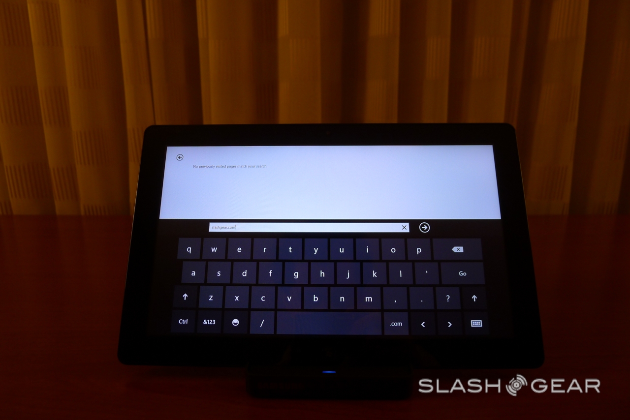
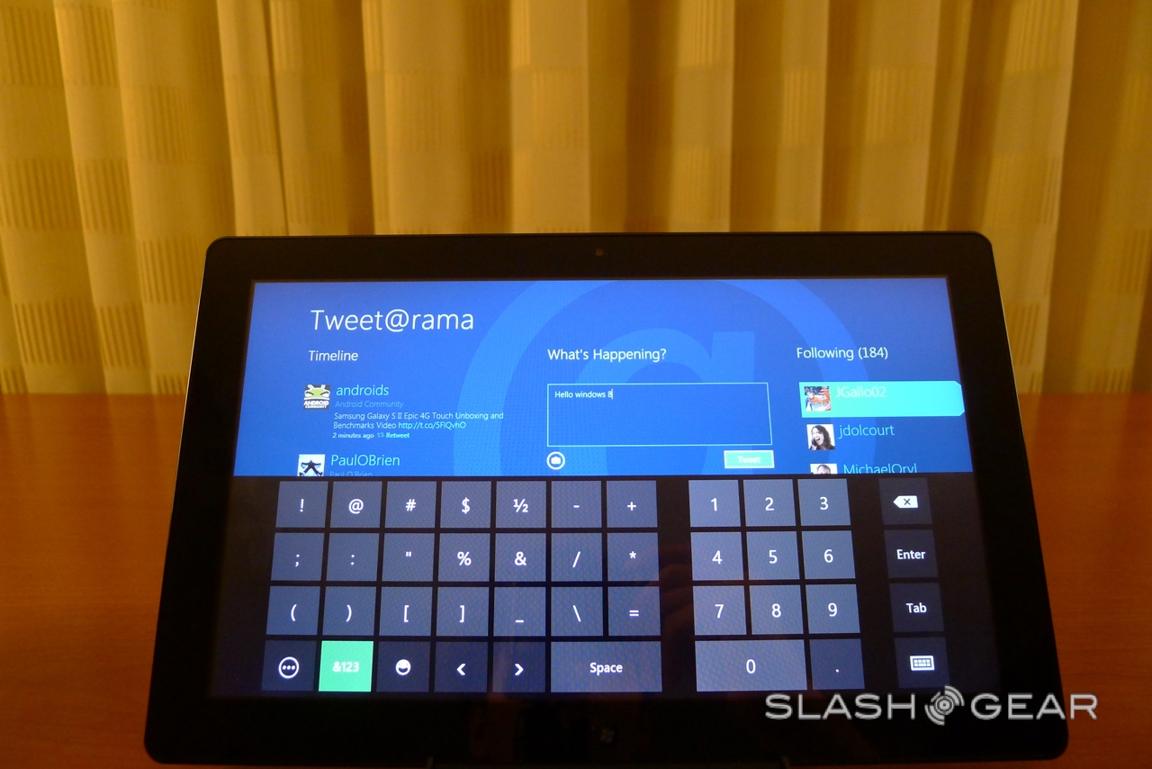
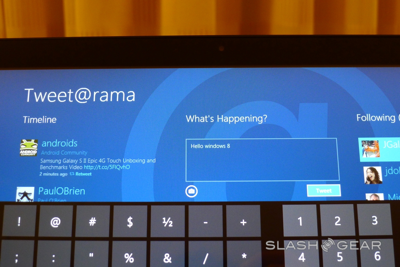
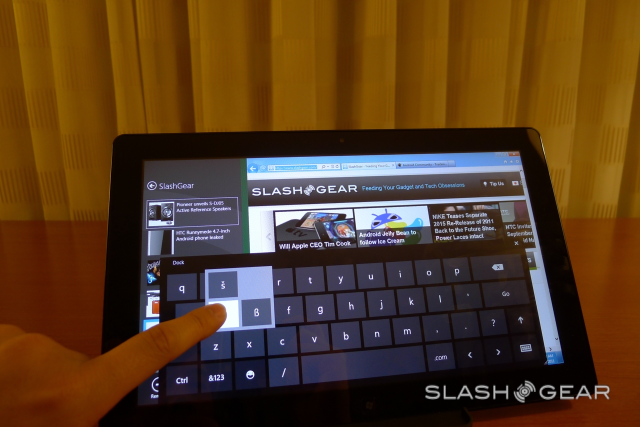
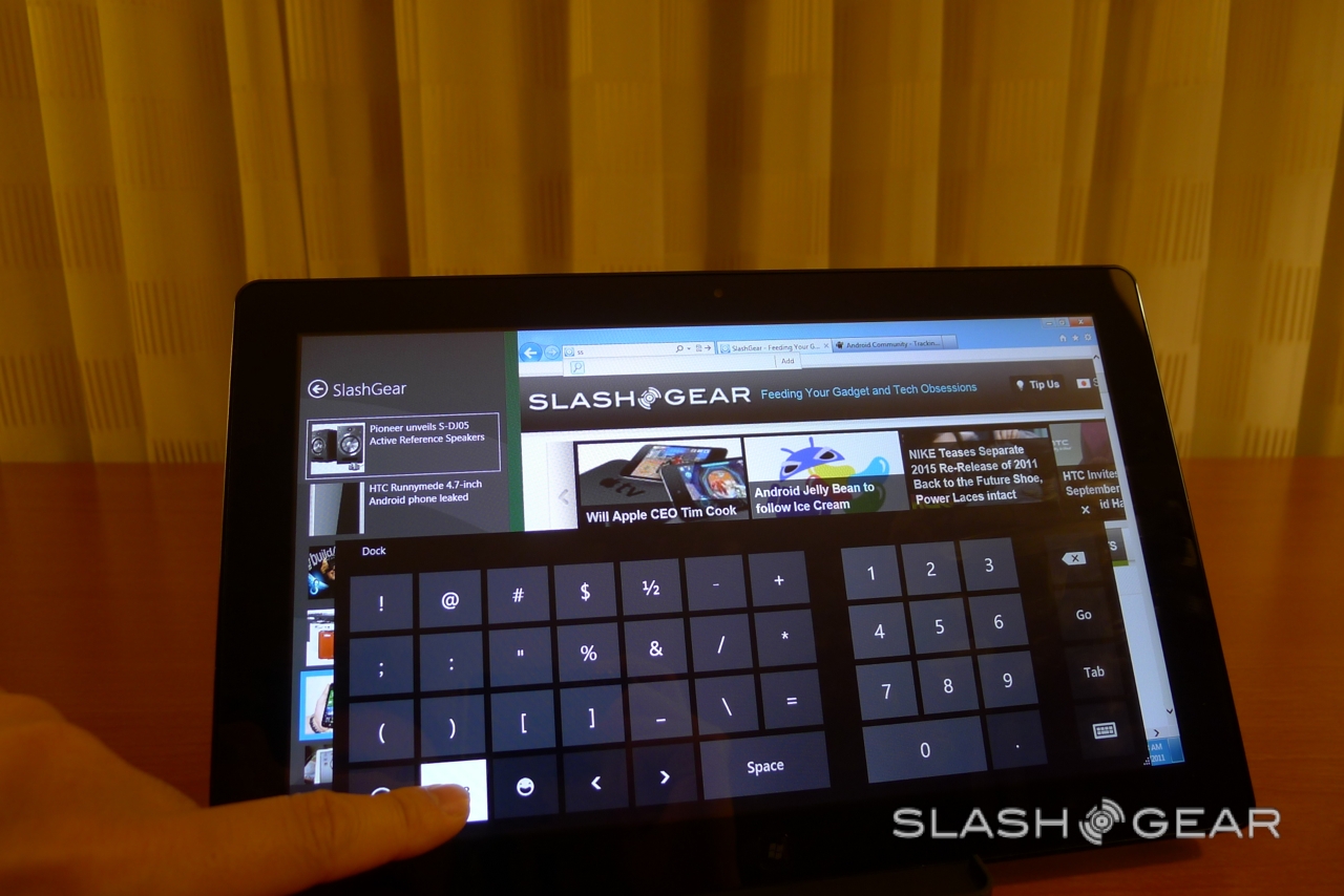
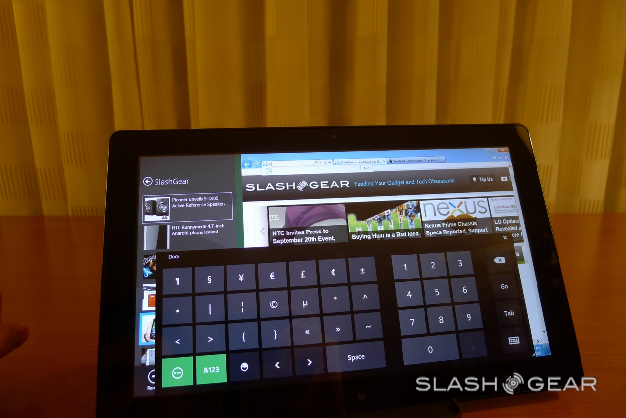
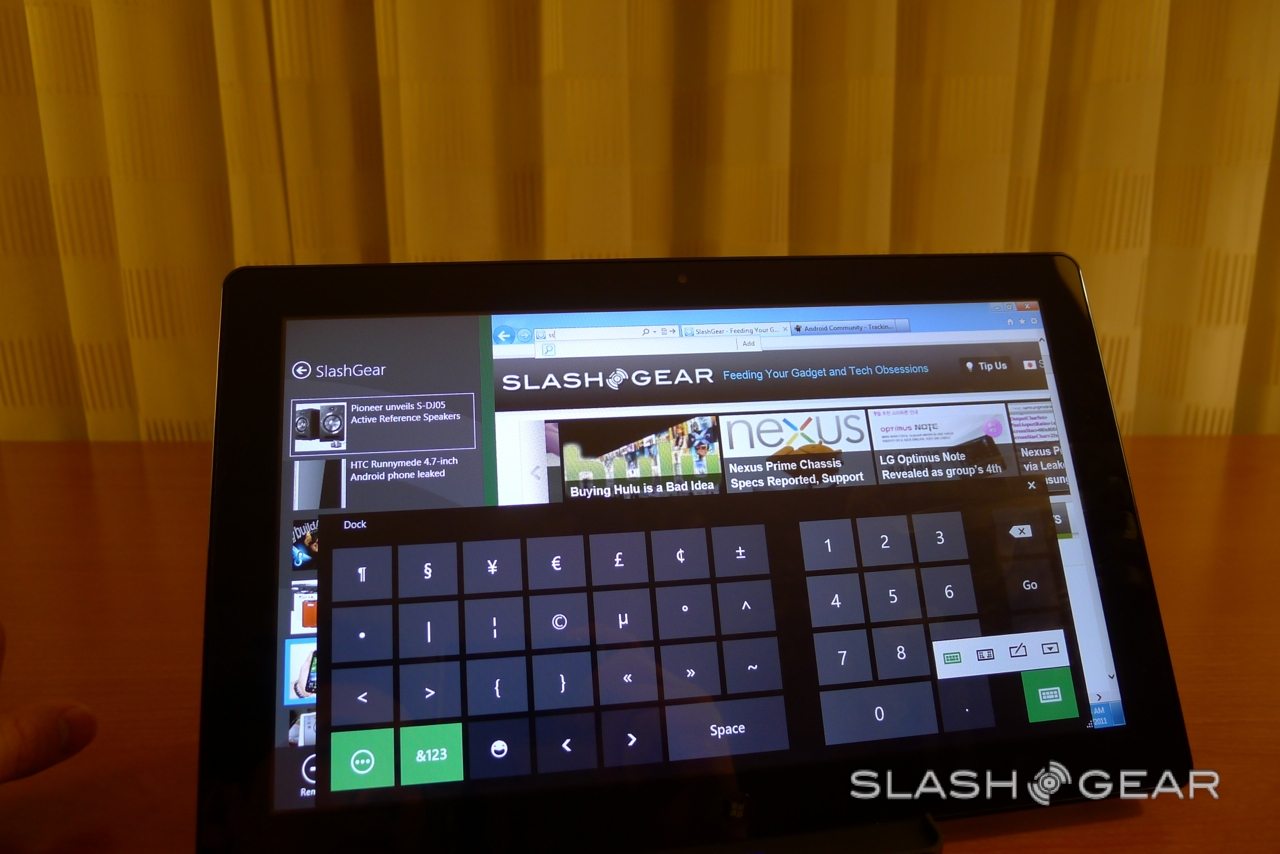
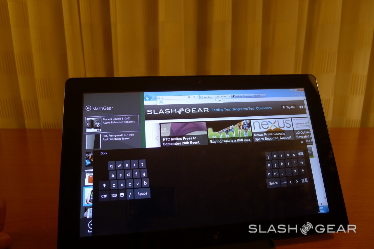
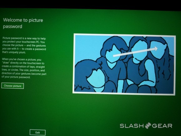
The on-screen keyboard is well laid-out and responsive, and there's a clever lock-screen system where you choose your own photo and then sketch out lines, circles or swipes across it with your finger or the pen. To unlock the slate, you simply replicate those swipes: straightforward for you, but difficult for others to guess.
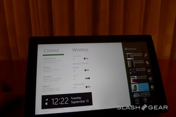
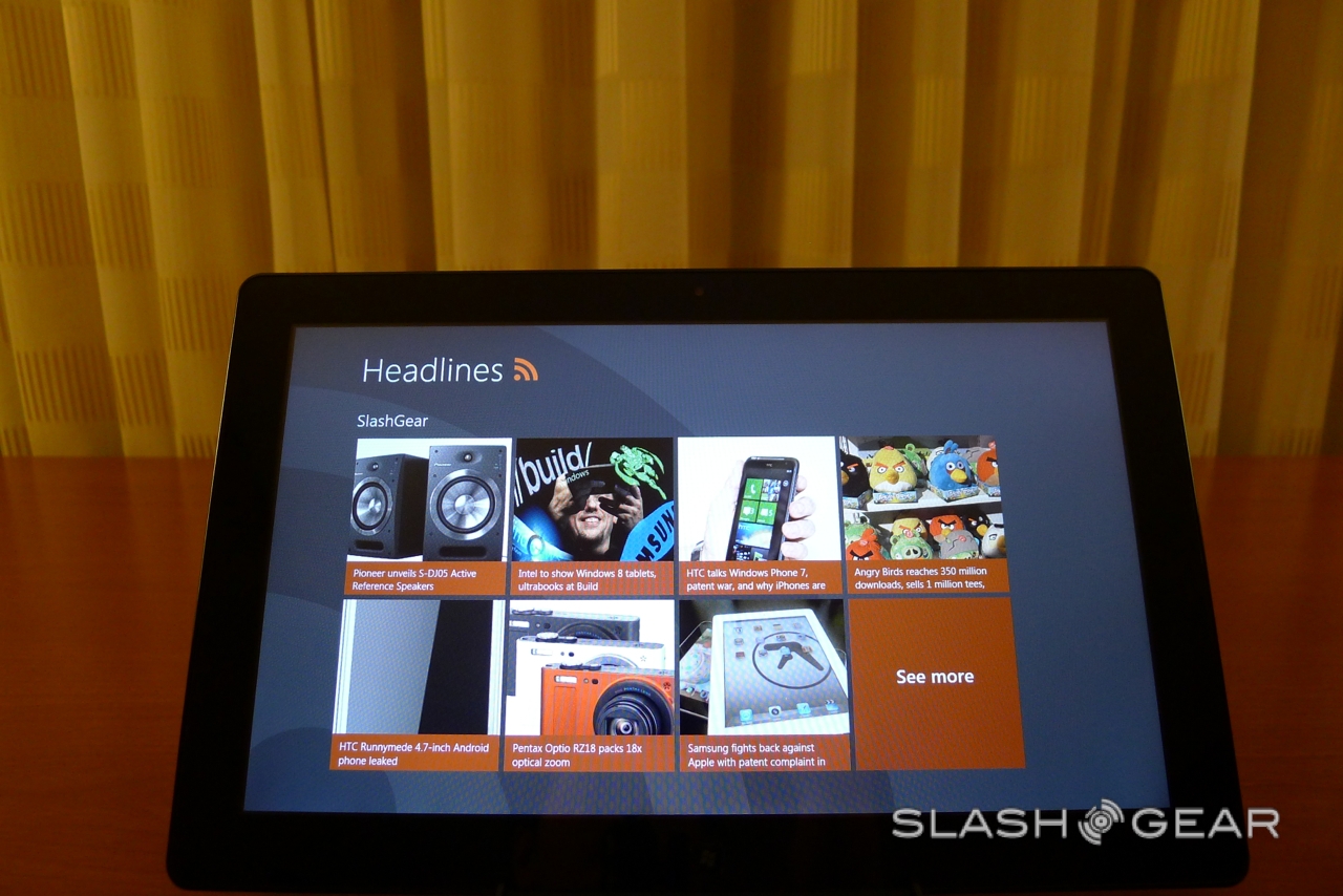
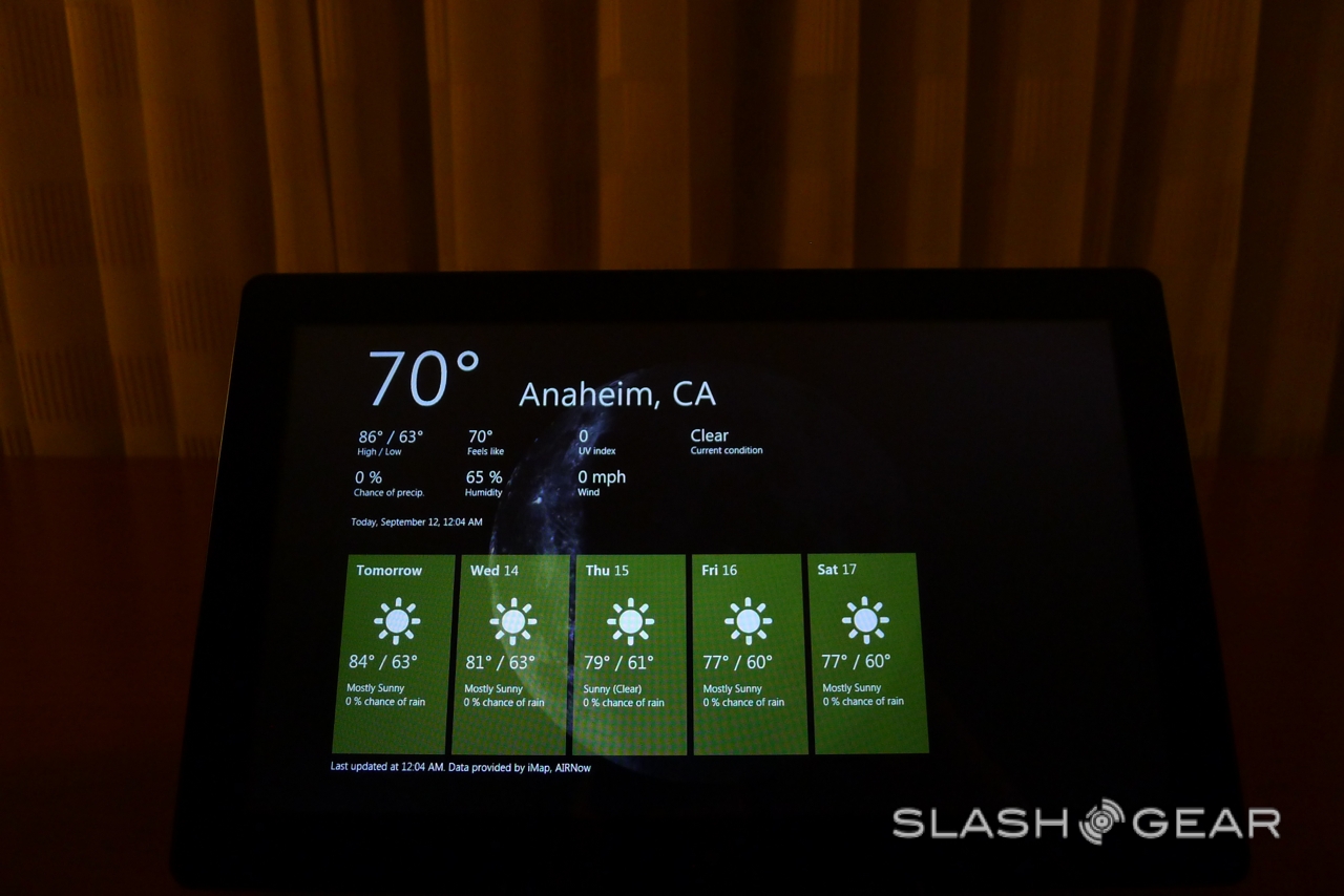
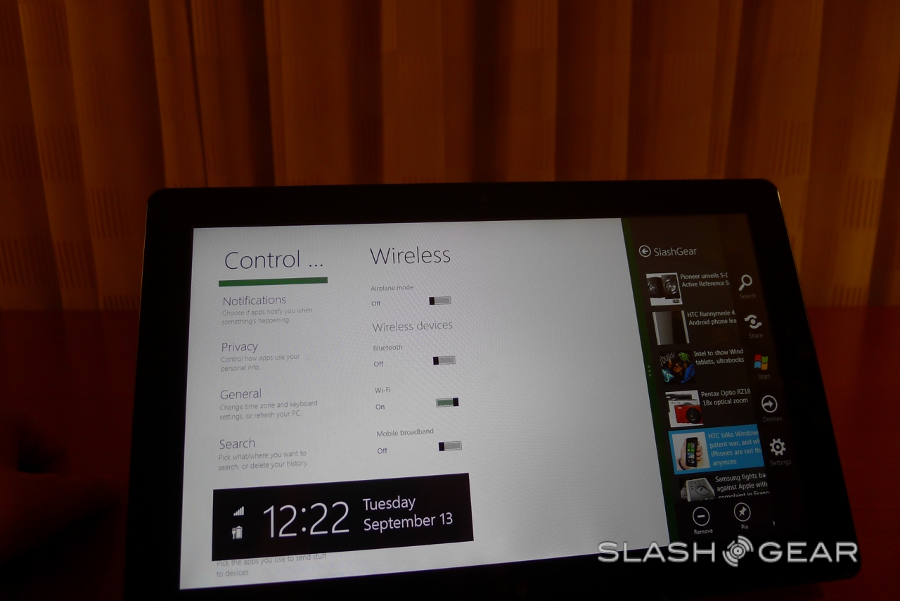
Like Windows Phone, there's a Live Tile based desktop and a lock-screen with a custom wallpaper and day/time along with battery life and wireless status.
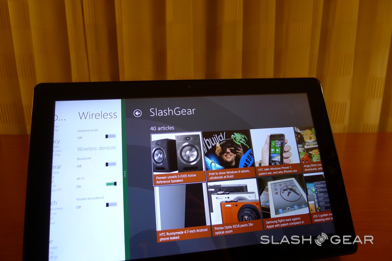
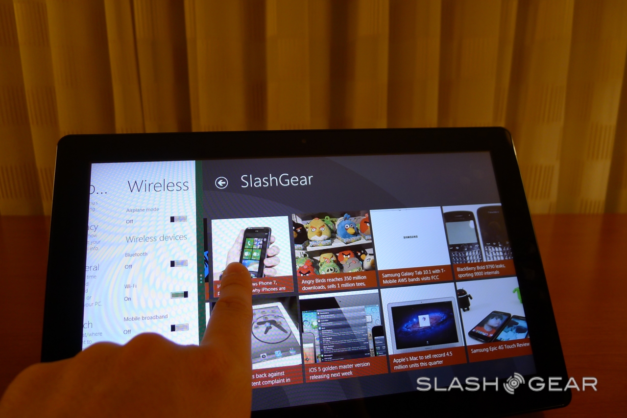
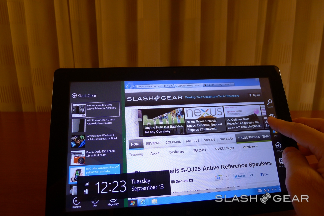
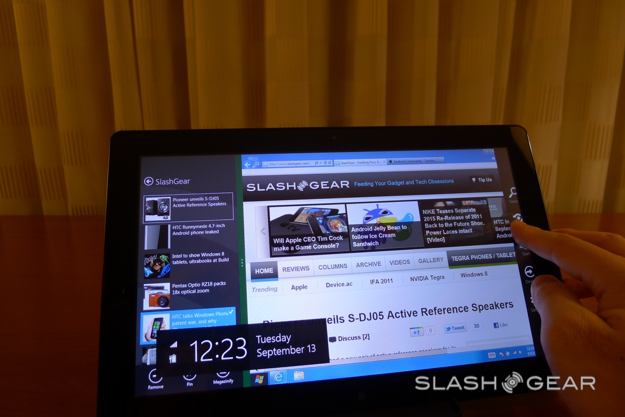
The Metro UI works well on the larger screen; for instance, the RSS reader lays out different posts as tiles, and then shows the articles themselves in a stripped-down format with simple side-swipe navigation. A swipe from the right edge pulls in a bar of five "charms" - Search, Share, Start, Device, Settings – from which you can navigate back to the homescreen among other things, as well as showing the date/time status display.
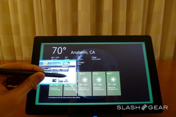
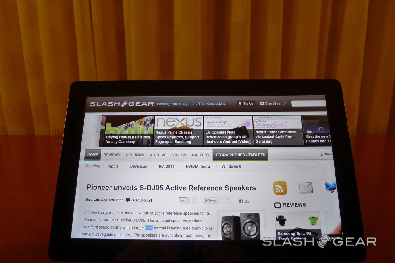
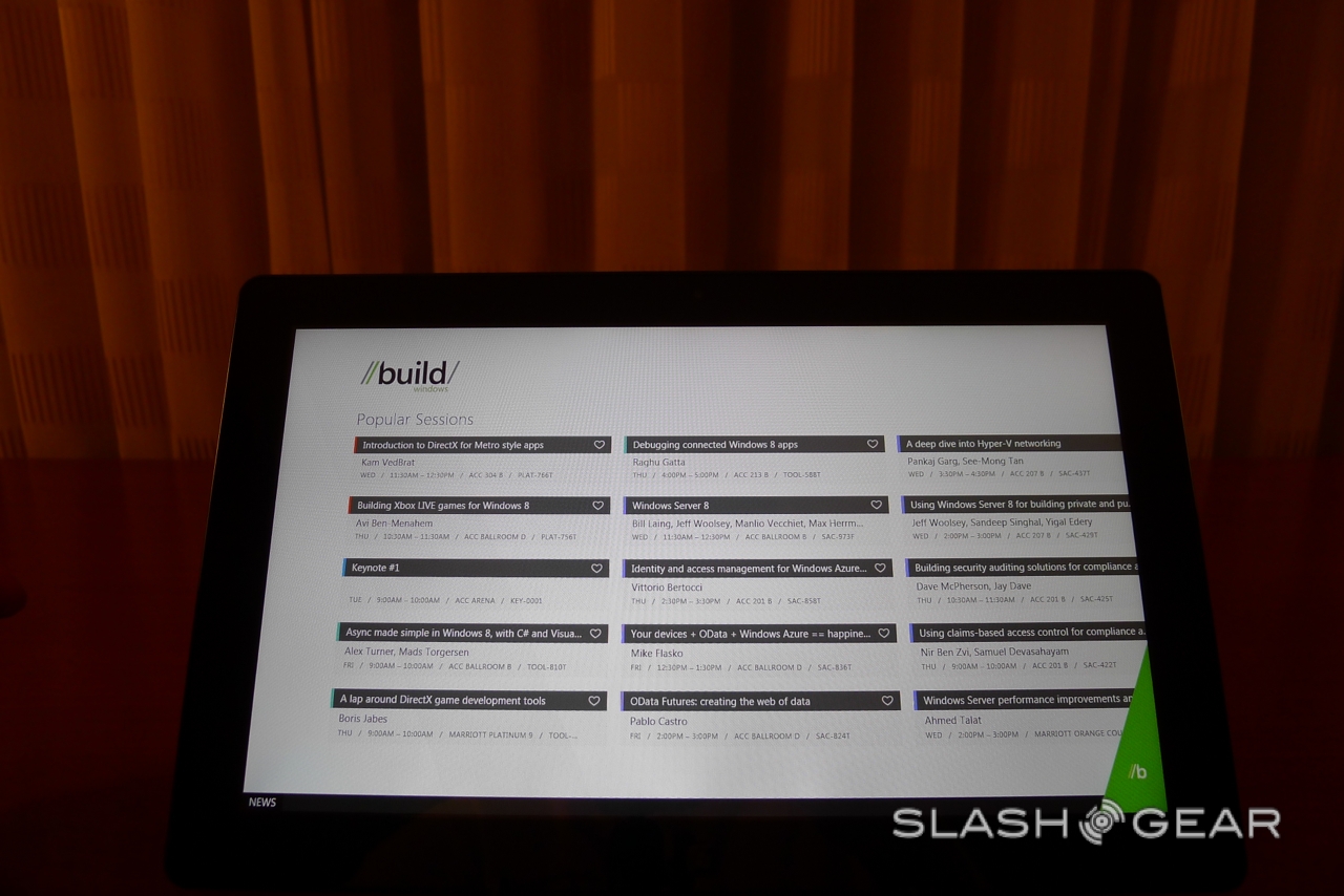
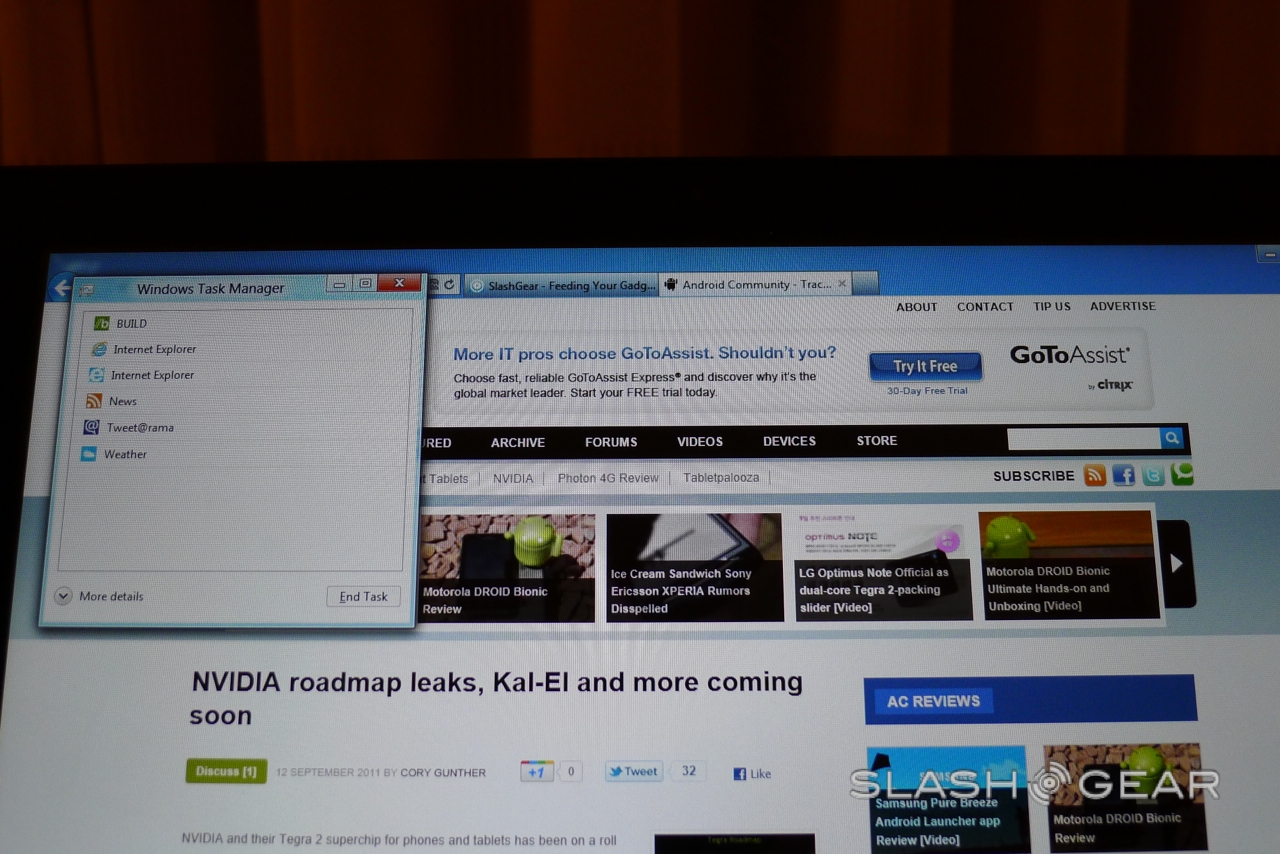
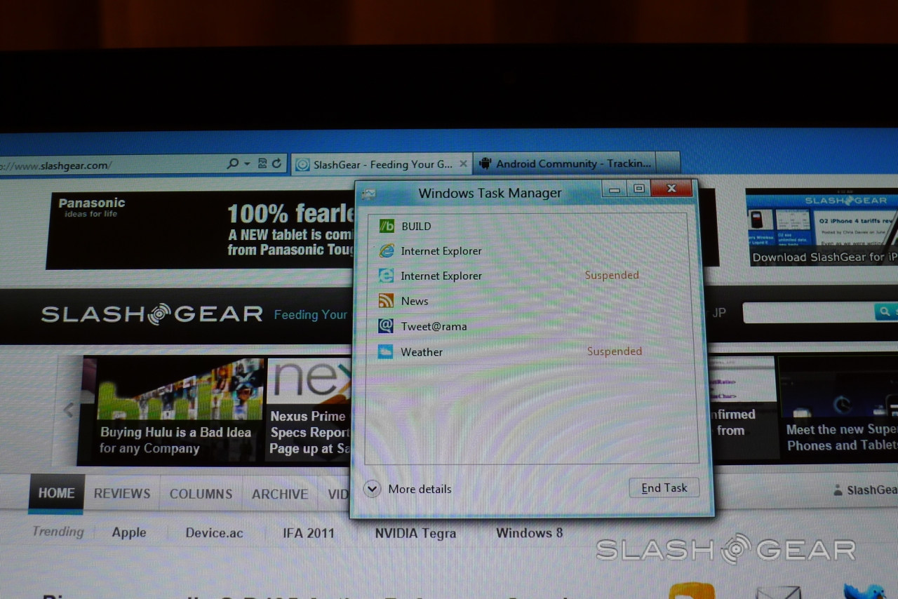
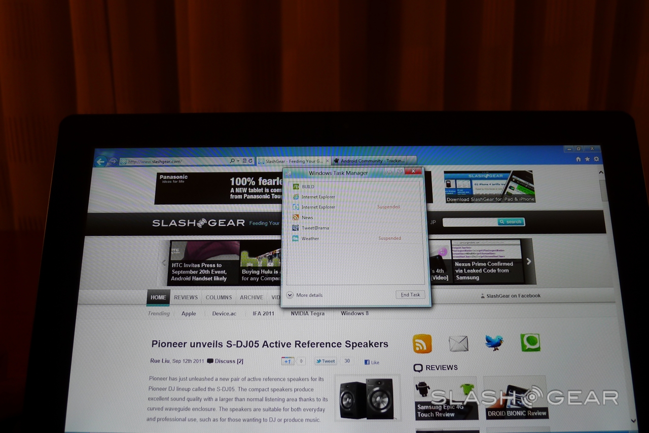
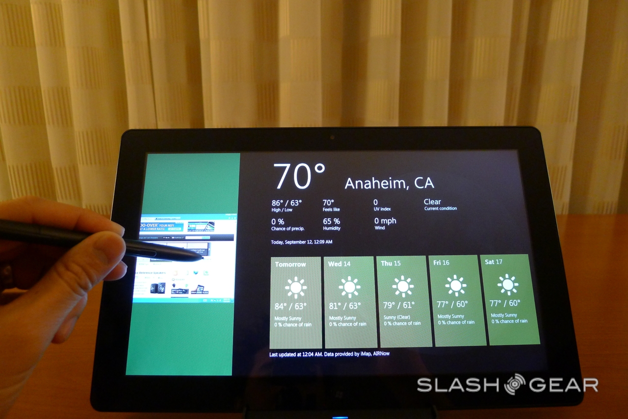
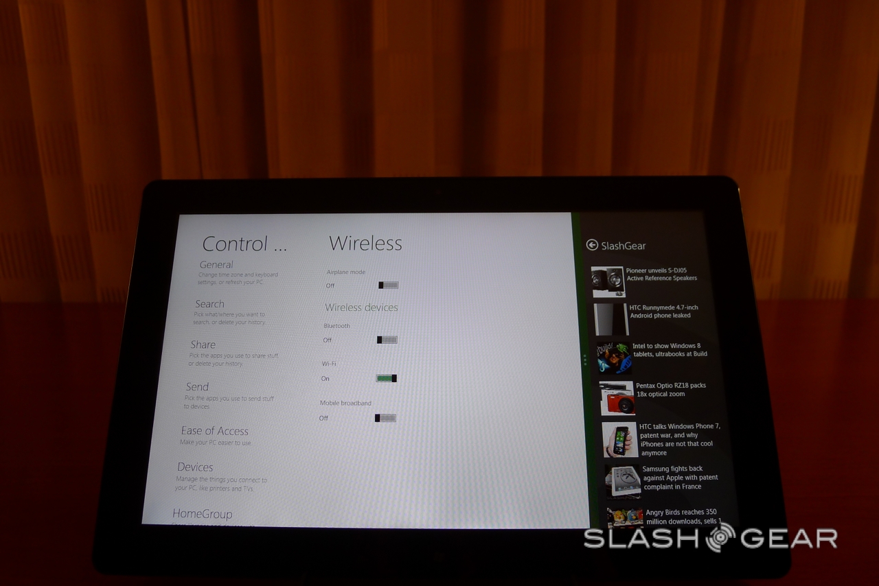
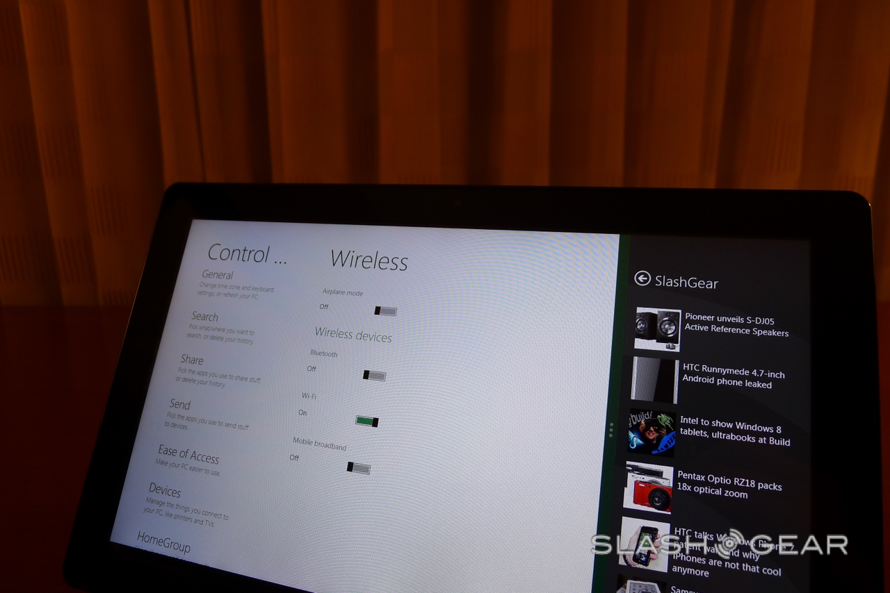
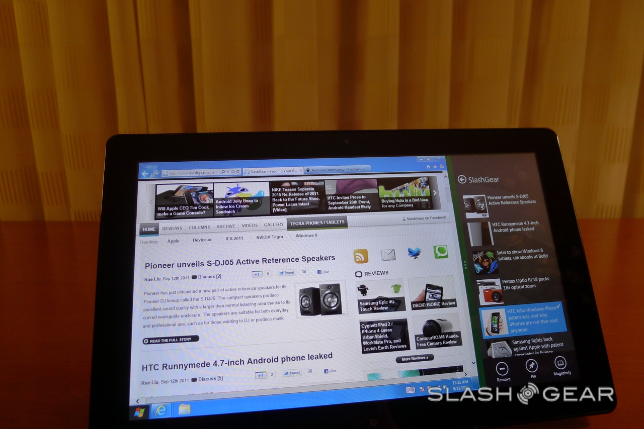
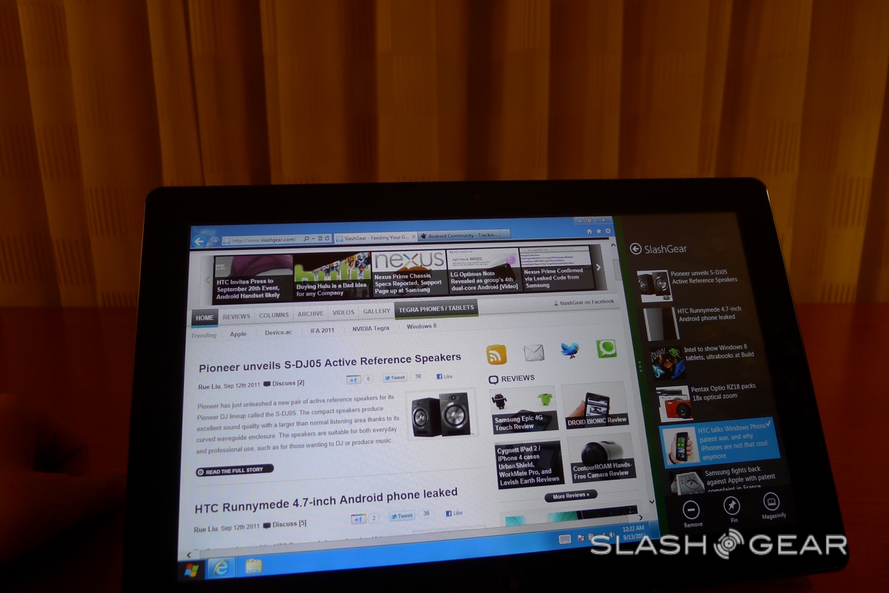
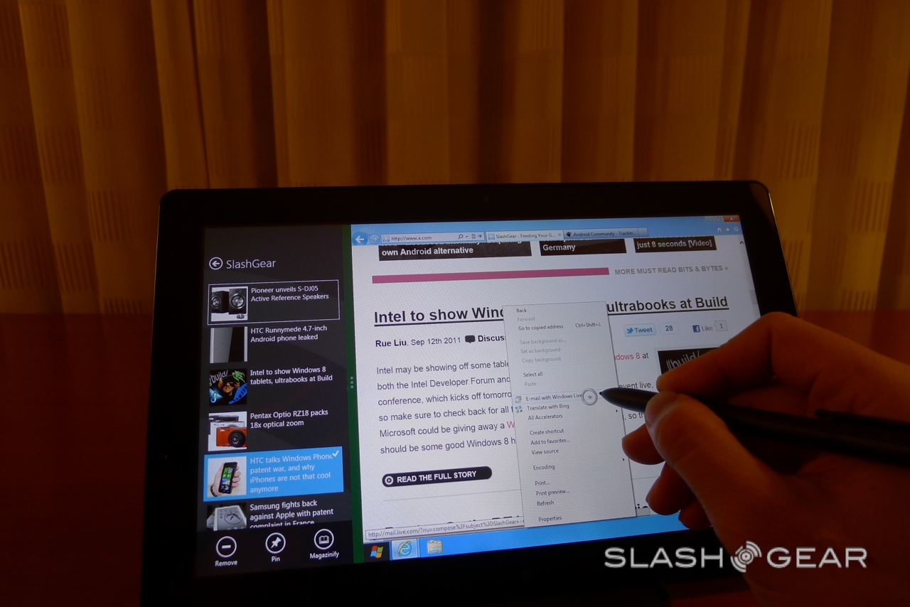
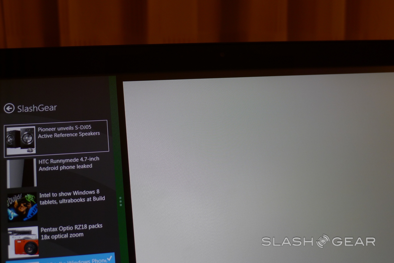
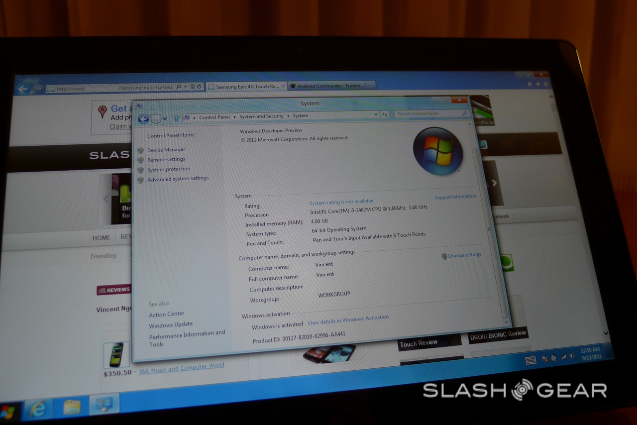
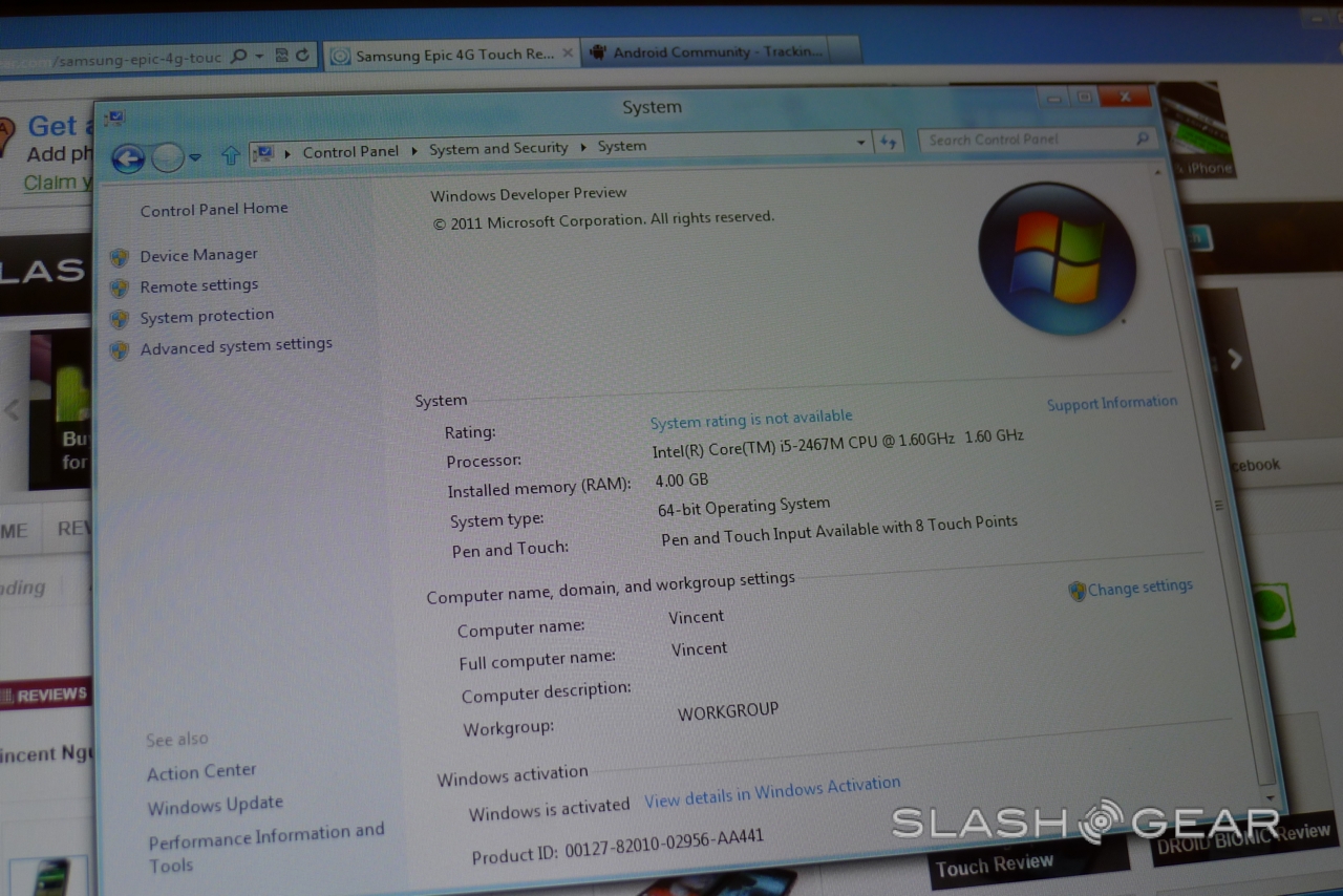
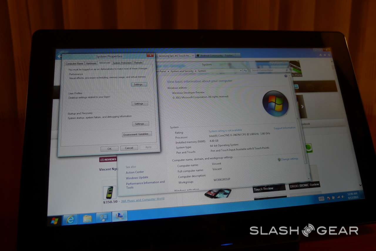
The multitasking system is also very impressive, building on the thumbnails in Windows Phone but taking advantage of the larger display real-estate to show concurrently running apps in a sidebar with the primary app taking the bulk of the screen. Some software is obviously designed for the regular Windows homescreen, with the standard desktop and Start bar. There are still some dialogs – particularly context menus – that follow the old UI style, though it's worth noting that the touchscreen on this particular tablet is precise enough to allow us to tap each option with a fingertip. Still, it's an occasional reminder of Windows' desktop origins, and does mar the tablet experience somewhat.

Nonetheless, as you can see in the video, Windows 8 is far, far more tablet-friendly than any previous version of the platform. You could feasibly stay immersed in among the tablet features and avoid the regular desktop for the most part, and Microsoft's touch interface is consistent and slick. We'll have more on Windows 8 for tablets soon, so until then enjoy the hands-on gallery and video!
