Windows 10 "Project NEON" To Bring Smooth Animations To OS
Animations are still a hotly debated topic in the field of user experience design. Some swear by it, other swear at it. While many argue that such animations are a pure waste of computer resources, when done judiciously and tastefully, they can make user interface feel more alive and natural. That might be the principle behind Microsoft's so-called "Project NEON", a minor embellishment to the Windows 10 design language that brings the aesthetics and animations from Windows 7's Aero to make the Windows 10 design "pop out".
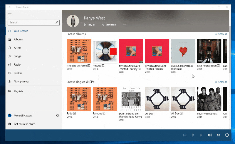
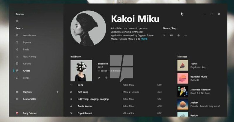
The idea behind using animations in user interfaces is based on the observation that instant jumps from one state to another is jarring and uncomfortable to the human mind. Just as nothing in the real world simply pops out of nowhere or instantly teleports to another place, animations provide both a visual and a mental transition that helps our brains and our eyes get from point A to point B, like in how the artist header in Groove Music shrinks to make room for the list of tracks.

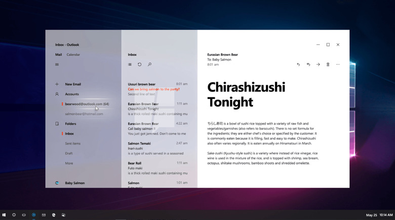
Project NEON isn't just about animations, however. A big part of it seems to be a new "Acrylic" design which practically means "blur whatever's behind the background" of a side bar or main window. It's most likely meant to help make whatever window or app is underneath more identifiable without making the current app in focus harder to read.
NEON also seems to be laying the groundwork for a unified Windows 10 design language for PCs, consoles, and HoloLens. For example, hovered elements seem to get an illuminated highlight that fits well with something like HoloLens but might be a bit too much for mouse and keyboard.

There is no word yet on when Project NEON will land in its entirety, if it even will. Parts of it are reportedly already in use in the current Insider previews, hinting that those would arrive in the upcoming Creators Update in April.
VIA: MS Poweruser
