User Interface Updates For Notion Ink
The folks at Notion Ink have some updates on their ever-evolving user interface, and as a bonus, they offer a video example of their 1080P in action and Full Volume *loud when you watch it, so turn the sound down before pressing play. Also, if you've been following the Notion Ink blog, you aught to know they've picked their top 10 list for logos and that all the folks who are on that list will be given something special! Then there's updates on the Aqua (Aero, Glass, and Gloss,) the Browser, and the Panels.
Beware of BWOOOOOMP. The video they show here is a trailer for the movie Inception. If this lovely device has blasting audio like this in its final form, heck, what a great alternative to television for people who travel a lot. Rockin and rollin.
The Aqua (Aero, Glass, and Gloss) : Notion Ink says they feel that these are all one. They've got no love for the gloss in the aesthetics of everything on the Notion Ink interface, showing these icons as examples where current devices with Android are already moving toward a low-gloss look.

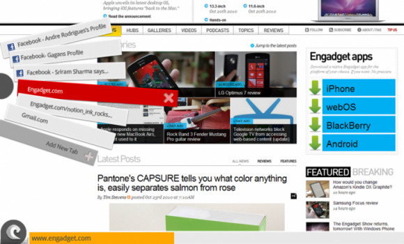
The Browser: Notion Ink will have a new way of handling tabs, noting how current Android Tablets have less-than-outstanding handling of tabs in their browsers. Tabs are essential, they note, and they'd love to attack the issue of how to not block the screen and "not force the user to "go hit menu and then "tabs opened" then select the one you want." To work with speed, switching, closing, opening of closed tabs, closing in multiple, and working with thick fingers, they've come up with a left-side fan sort of situation which you can see here:

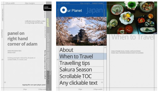
The Panels: the images you see below will be previewed first by those who get EAP and SDK access. In an attempt at making user interface development easy and seamless, the team at Notion Ink have converted ideation into guidelines:

[Via Notion Ink]
