Twitter Redesign Revealed
Twitter has launched a comprehensive revamp of its interface, updating its web UI, along with the free iOS and Android clients, in an attempt to speed navigation and encourage multimedia use. Previewed at fly.twitter.com, the new system offers four sections – home, connect, discover and me – with the same UI carried across the browser, mobile browser and app versions. In addition to basic "@" replies there's a greater emphasis on what the people you're following are clicking on, following, resharing and Tweeting about, with Interactions and Mentions showing conversations and more.
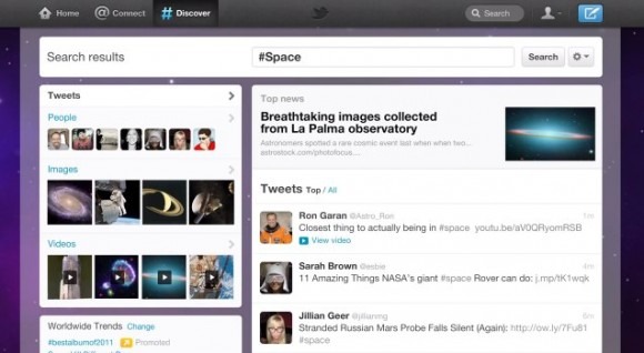
The new Discover section pulls together Twitter Stories and trends, showing a more global overview of what's happening on the 140-character social network. Hashtags and search are also found in this new section, along with suggestions of people to follow, and the more you use Twitter the more accurate the content suggestions are.

Finally, there's the new "Me" section, with lists, favorites, followers, photos and direct messages. It's possible to see what photos and videos you've shared from here, together with which other Twitter accounts are similar to yours.
In addition to the new UI on the browser and the Twitter apps for iOS and Android, the company has also updated Tweetdeck to suit the refreshed interface; an refresh to the iPad app is in the pipeline. The new browser interface will be rolled out in the coming weeks, but you can get early access by downloading the iOS or Android apps. Let us know what you think in the comments!
