Twitter For iPad v5.0 Gets Big (And Not Quite Perfect) UI Refresh
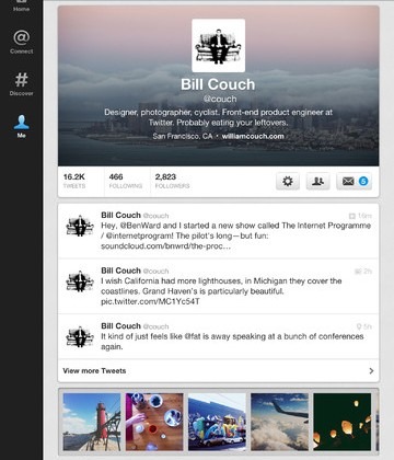
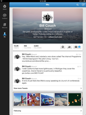
Twitter for iPad has been given a significant refresh, with v5.0 ditching the sliding panels of the previous version, and instead opting for a more oversized replica of the iPhone app. The new microblogging client – which is still a free download – was pushed to the App Store today, pulling the tablet software more in keeping with the web version.
The newly refreshed app also includes new profiles, with header photos. Photo streams have also been added to profiles and events, as per the web-based version, and Twitter says there have been other unspecified tweaks, bugfixes and improvements along the way too.
Twitter has been tightening the reins on apps for its service in recent months, leaving third-party developers equal parts frustrated and concerned as their flexibility is minimized and users are pushed toward the official apps. This new version for iPad seems, at first glance, like a mixed bag UI-wise.

The iPhone-style layout works in portrait orientation, but is less successful in landscape, where the column of tweets is merely centered onscreen and no extra information is shown. However, the extra photo integration does seem useful, reducing the number of taps needed to browse through a user's gallery.
You can download Twitter for iPad from the App Store [iTunes link]. Update: More info at the Twitter blog.
[via Steve Troughton-Smith]


