This Is Apple Watch: Hands-On
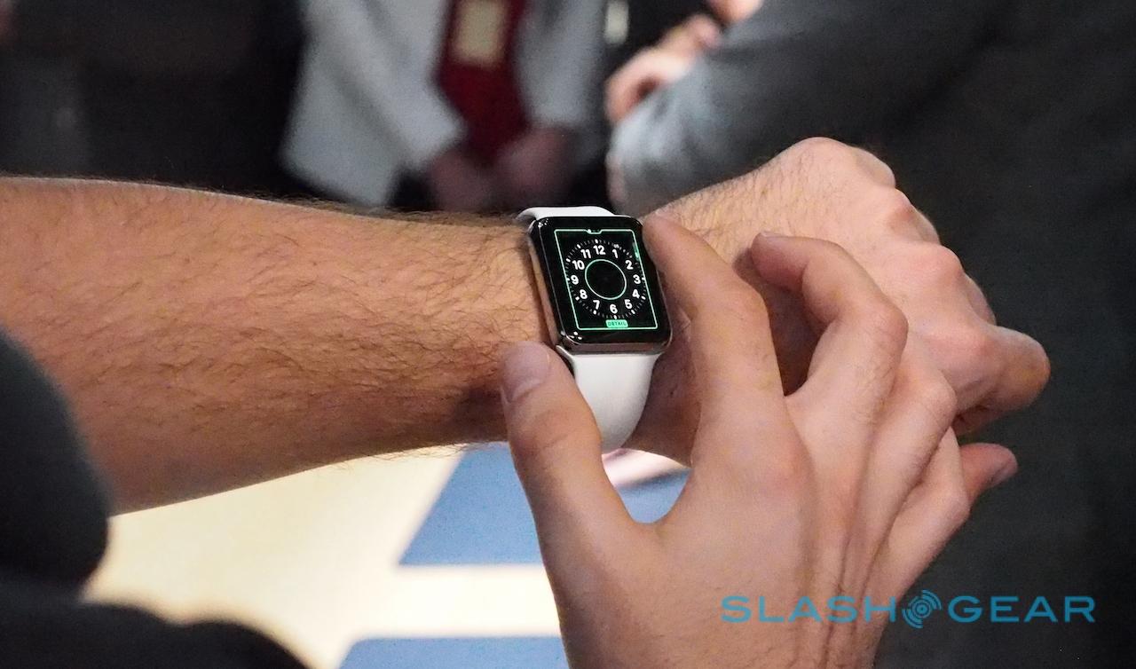
Six months ago, Apple showed us the Apple Watch. Today, I got to look past the prototypes of last year's event and instead try out a fully-functional version, more than a little curious about whether Apple had, indeed, cracked the smartwatch question. There's no denying that plenty of thought and design effort has been put into the timepiece – and some details are, frankly, inspired compared to what the competition is doing – but will that mean Apple Watch is an instant must-have?
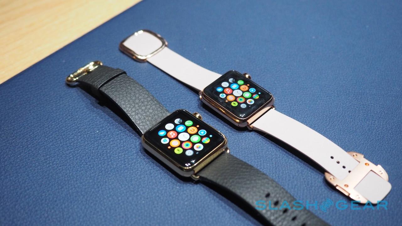
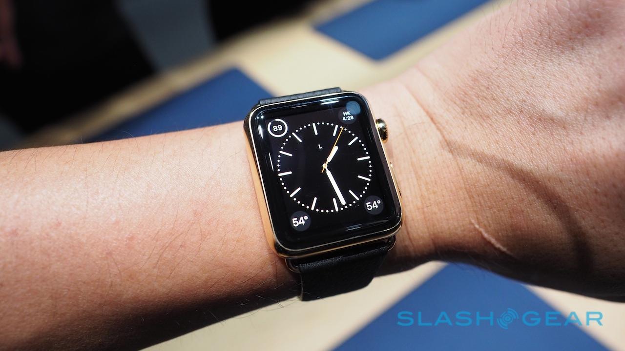
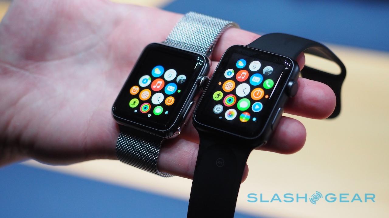
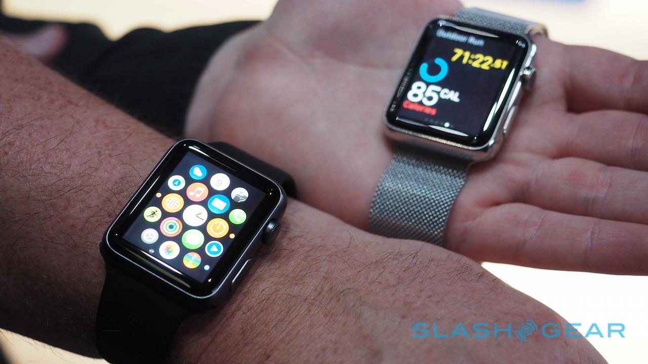
I already knew that the build construction was great, and sure enough no matter which of the three versions I tried – Apple Watch Sport, Apple Watch, or Apple Watch Edition – they all felt solid and well-made. The Watch Sport, with its matte aluminum casing, is both priced for the mass market as well as having what will probably be the most popular finish.
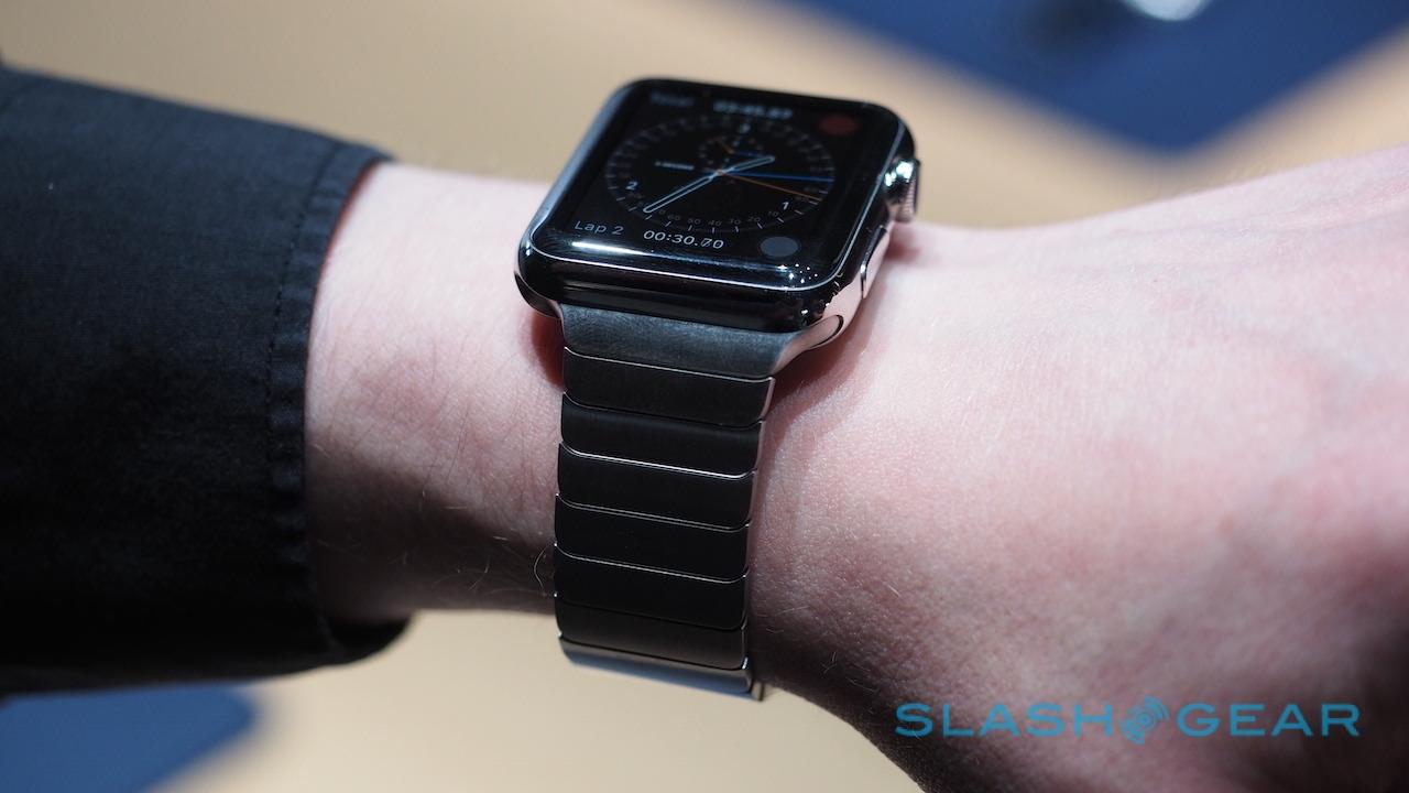
In contrast, though Apple Watch's shiny stainless steel looks great initially, it's greedy for fingerprints.
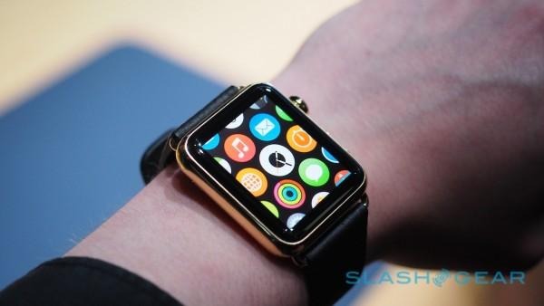
I don't often wear $10k+ watches, so I can't speak too much to how fit and finish compares between the 18 carat gold Apple Watch Edition and, say, a high-end traditional timepiece. My colleague Vincent is something of a watch fan, though, and he came away impressed by what Apple had achieved.
You'll probably need to have a keen eye to spot it. The gold is quite subtle, thankfully, and since the shape of the Apple Watch is the same no matter which range you choose from – the only difference is the 38mm or 42mm dimensions, which each is offered in – you could potentially miss it on someone's wrist at first glance.
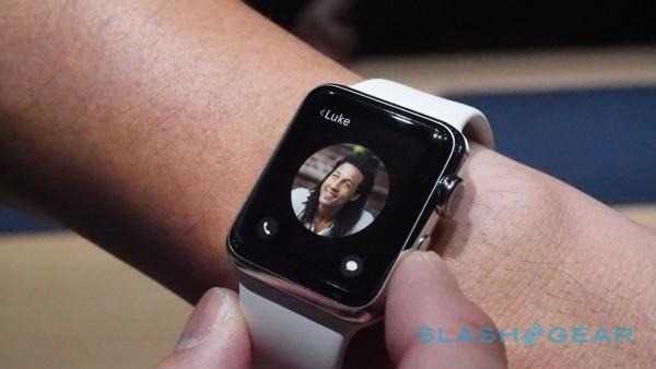
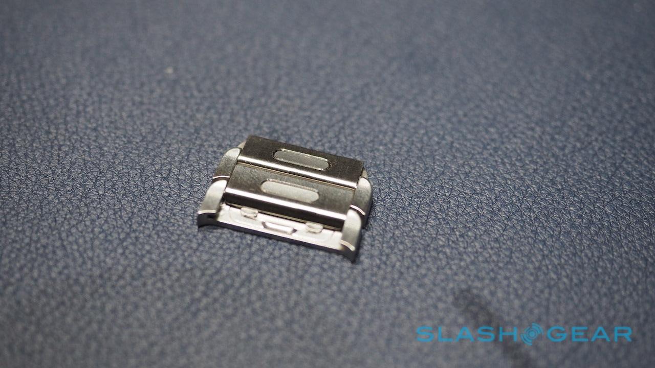
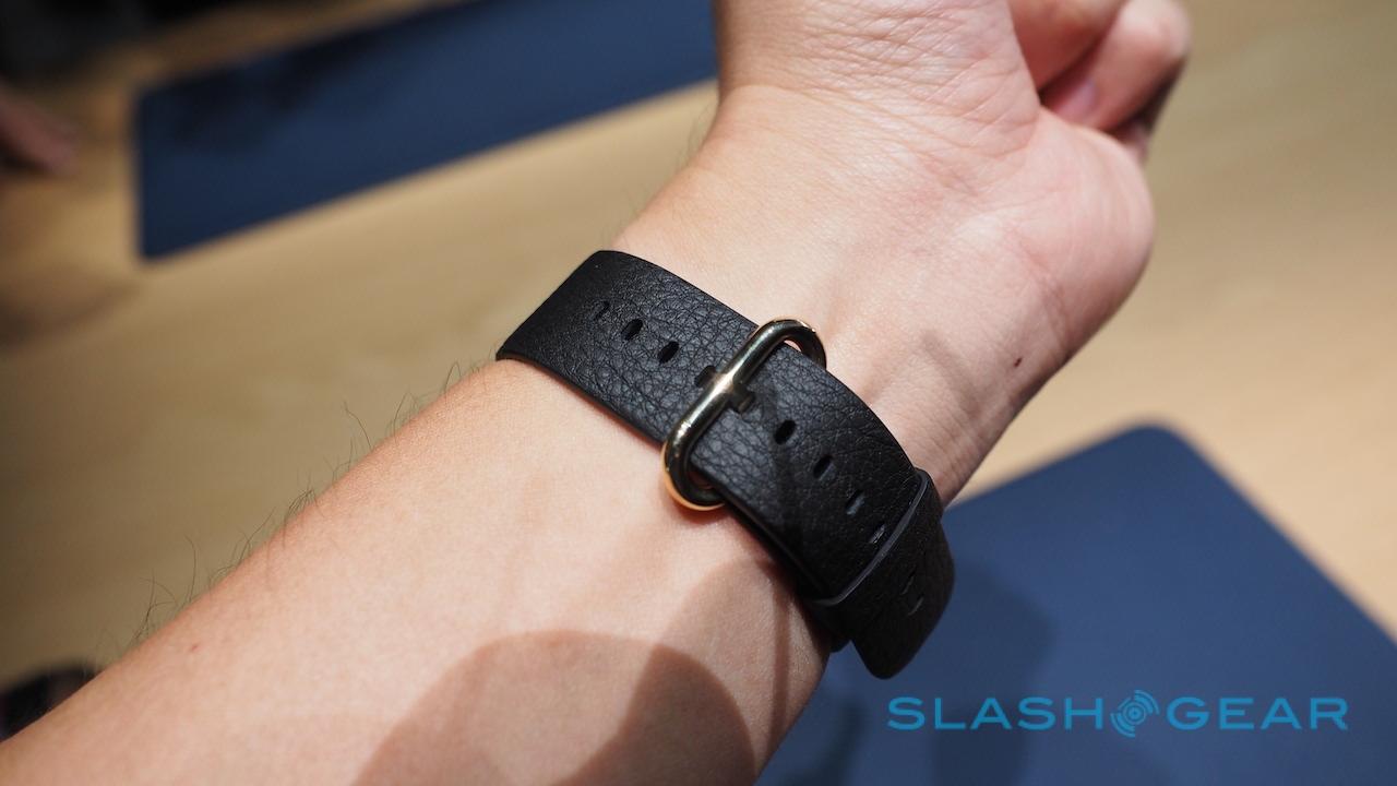
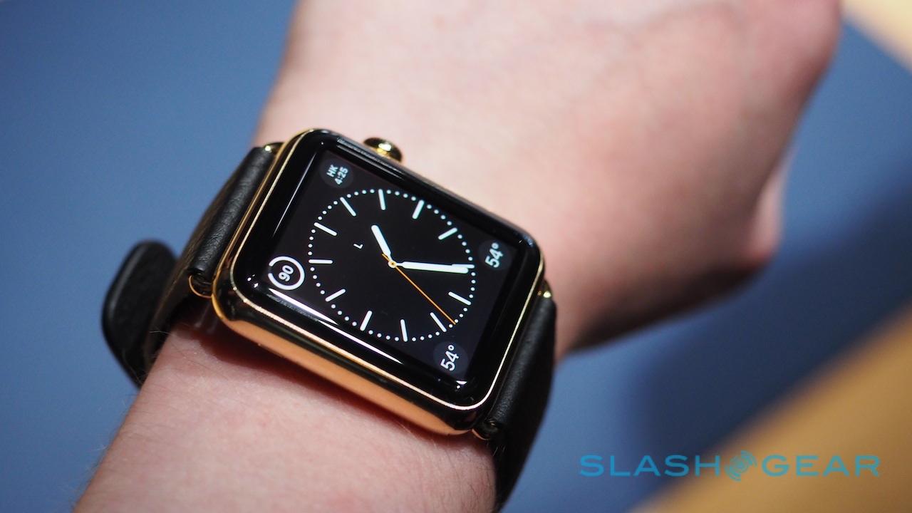
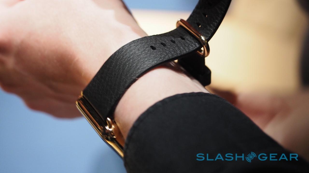
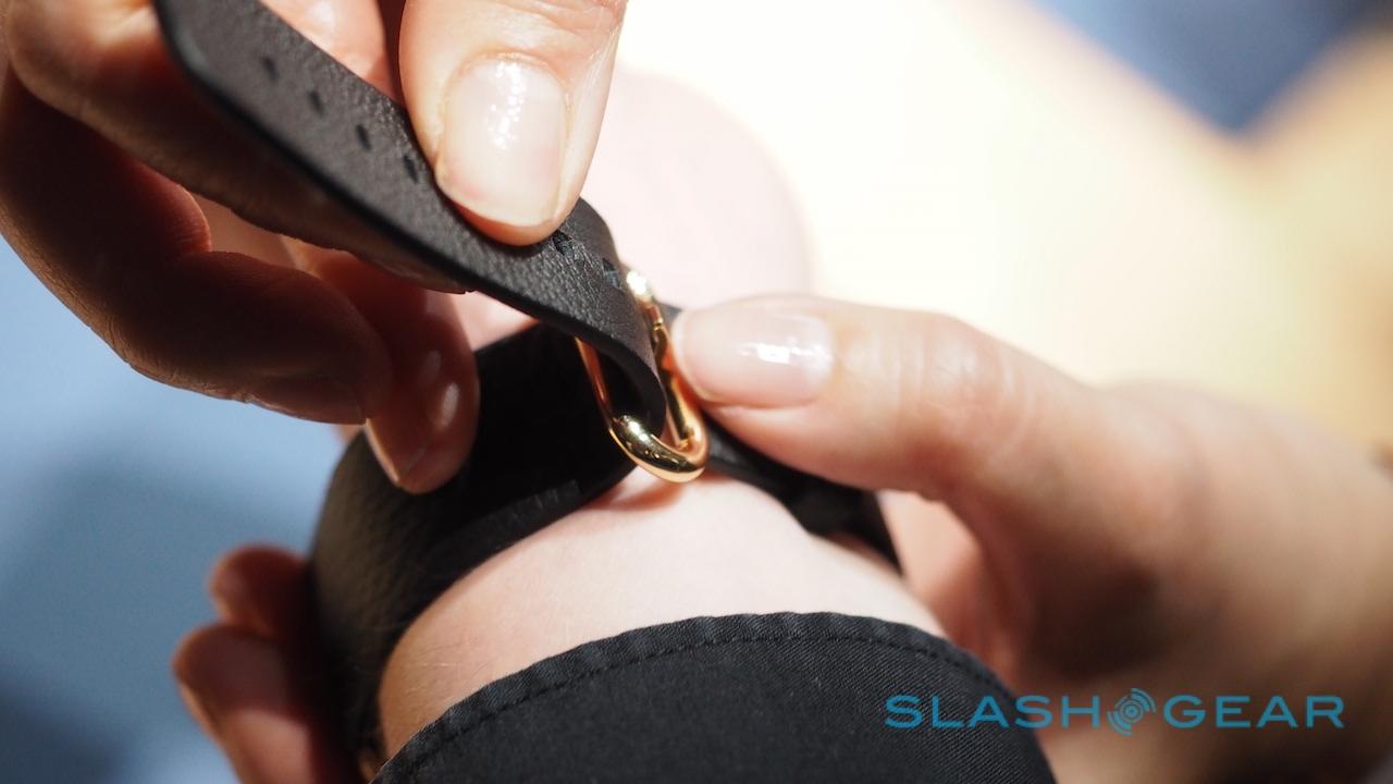
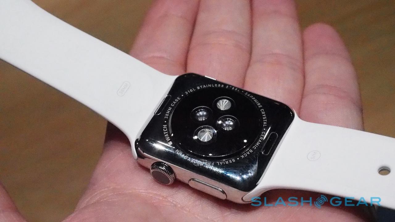
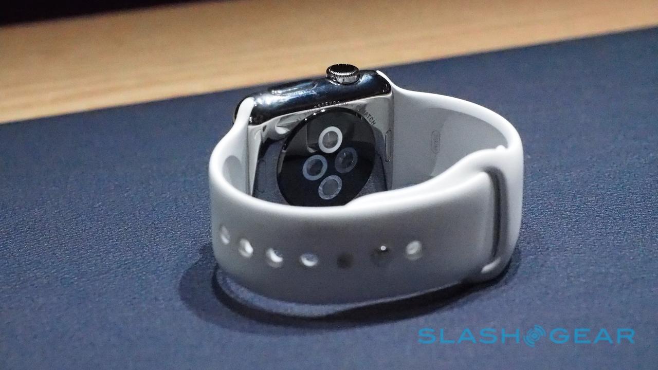
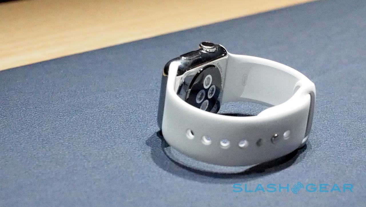
Either way, the strap design is particularly clever. Apple's slide-out system – which requires a fingernail to press in a release button first – is incredibly straightforward in comparison to the pin system other watches commonly use.
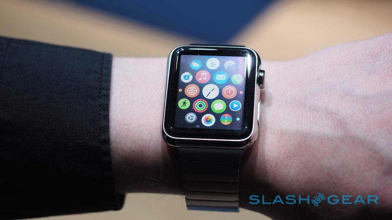
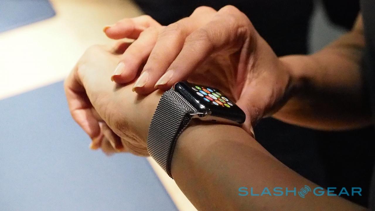
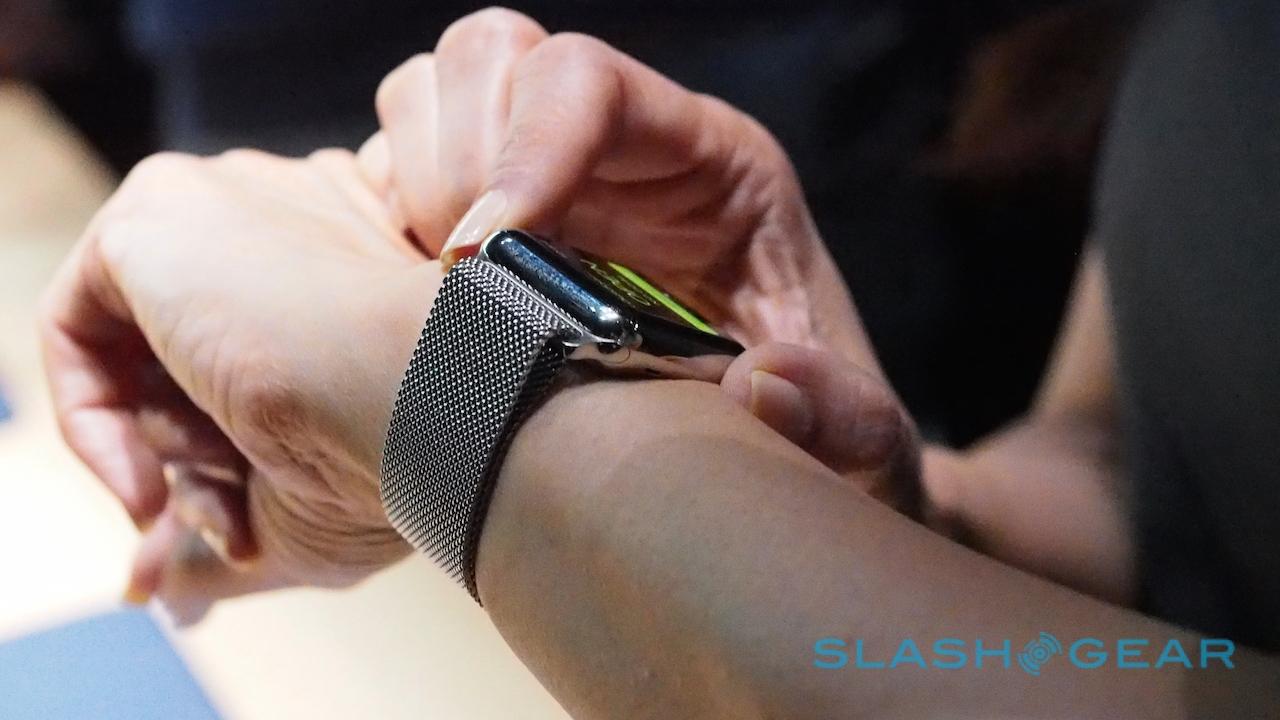
It's a cleverness shared by the metal bracelet strap, too, which uses the same little buttons to snap off excess links. Of course, if you don't want to mess with adjustments at all there's the Milanese strap made up of hundreds of tiny mesh links, and secured by a magnetic clasp. I was surprised at how comfortable it was, and how securely the magnet held, even as I shook my arm.
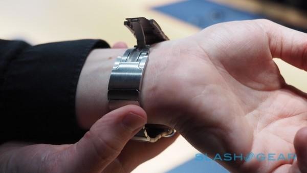
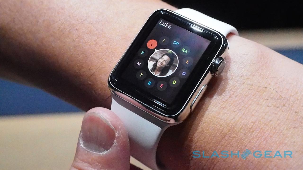
Since I don't have a particularly huge wrist, the 38mm didn't look entirely ridiculous on me. Still, my personal preference would be the 42mm. Several of the women I spoke to at the event commented on how pleased they were with the fit of the 38mm; it helped dilute some of the geek-factor of the touchscreen, for instance.
That geek factor is going to be the primary draw – beyond the branding, naturally – of the Apple Watch, of course. Last year's prototype could do a little bit of a couple of things; today, I got to see how everything fits together.

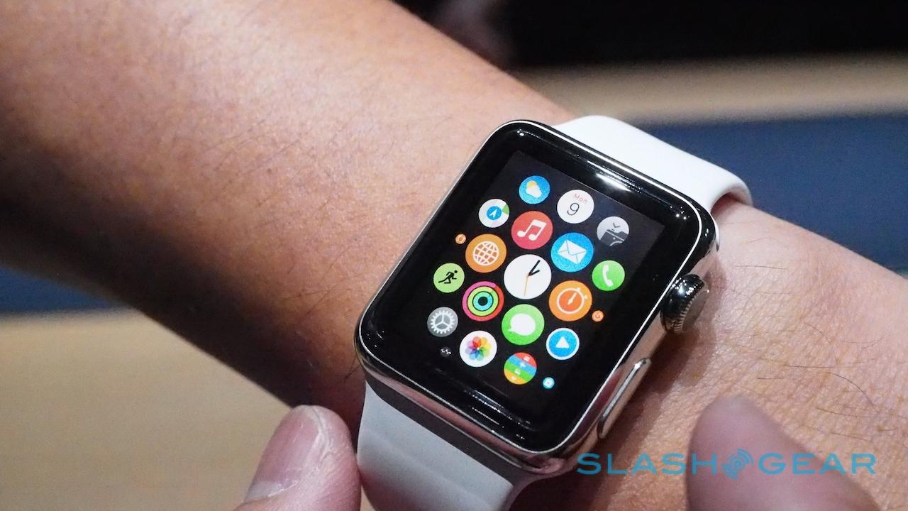
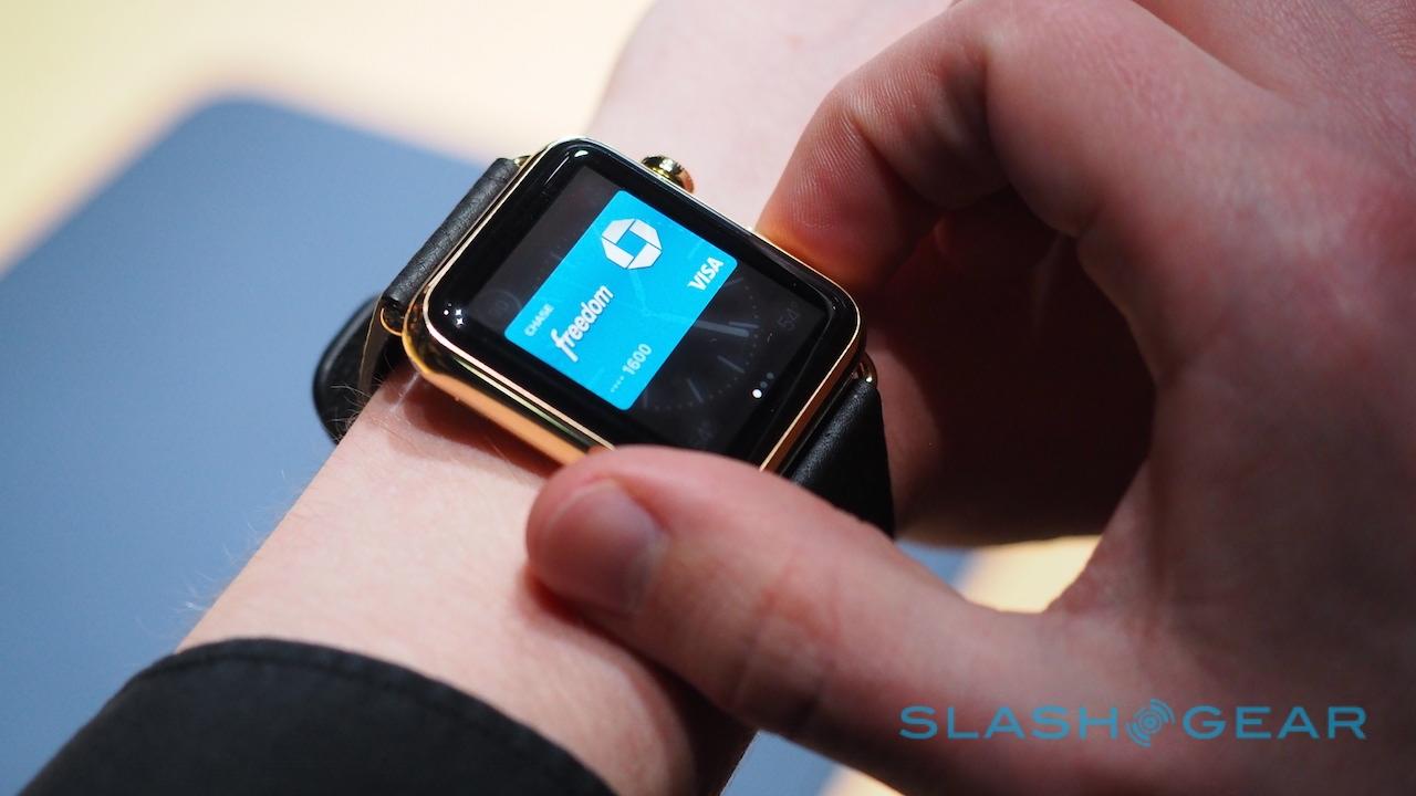
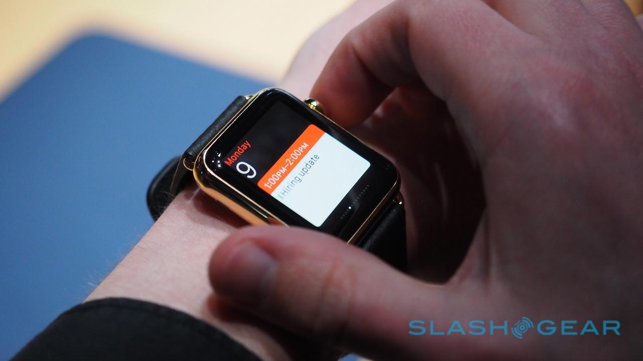
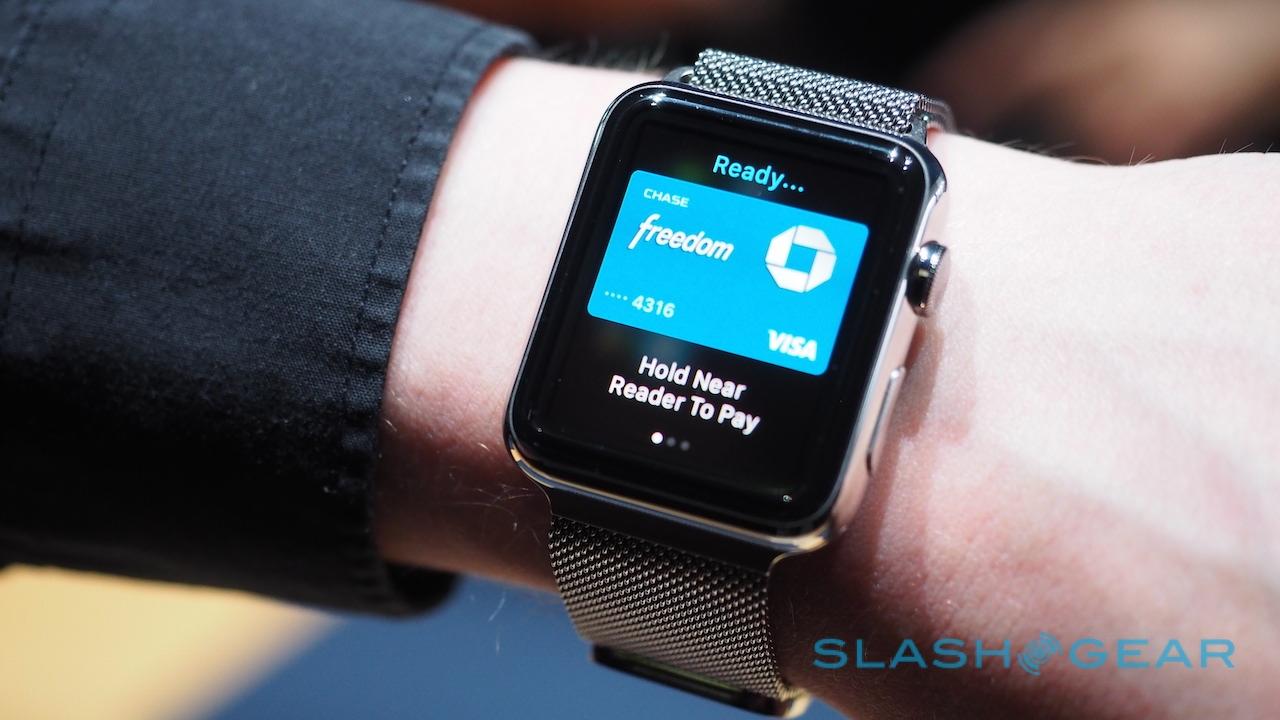
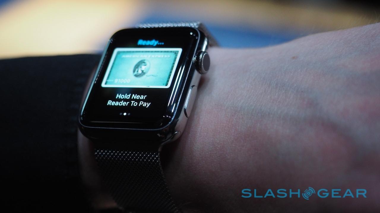
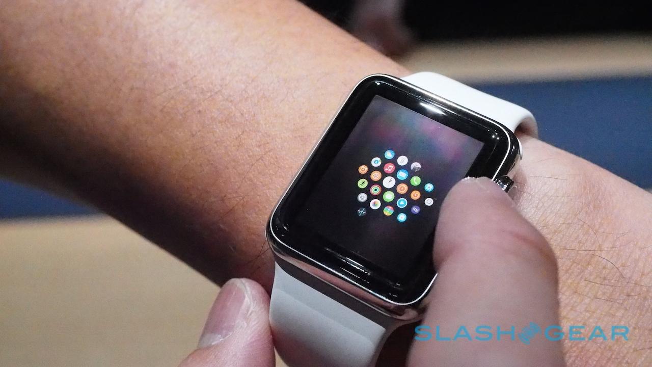
The interface takes a little getting used to. Some elements are familiar from iOS – pressing in the digital crown, for instance, which always takes you back to the homescreen – while others are more unusual. The second button under the digital crown summons Apple Pay with a double-tap, while holding down the crown pulls up Siri.
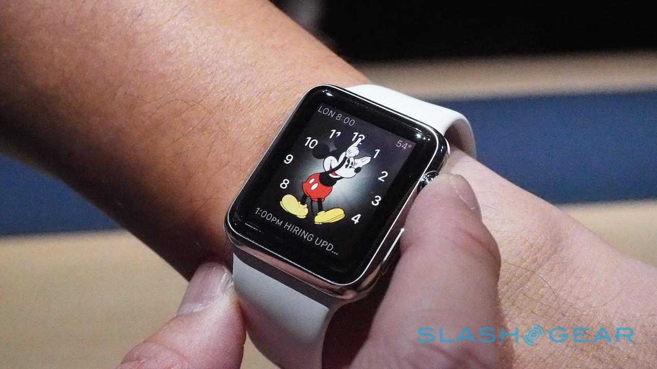
From the watchface, meanwhile, pulling down from the top opens a notifications menu, while pulling up from the bottom takes you into the "glances" view, a side-scrolling carousel of apps.
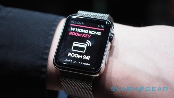
Scrolling through the digital crown is easier with a fingertip brushed across it than trying to pinch it as you might do a real watch crown. Sometimes it's confusing as to whether you should swipe the touchscreen or reach for the knob; the answer is usually that you can do both, though the latter does at least keep more of the screen in view at any one time.
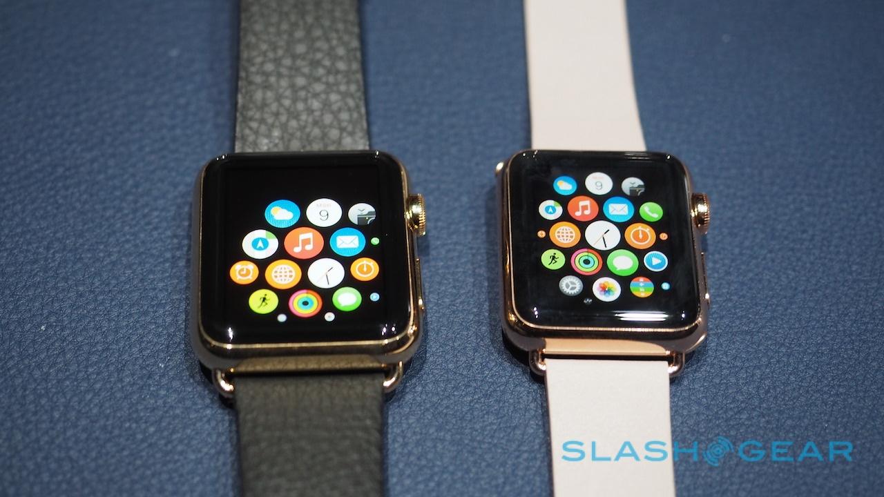
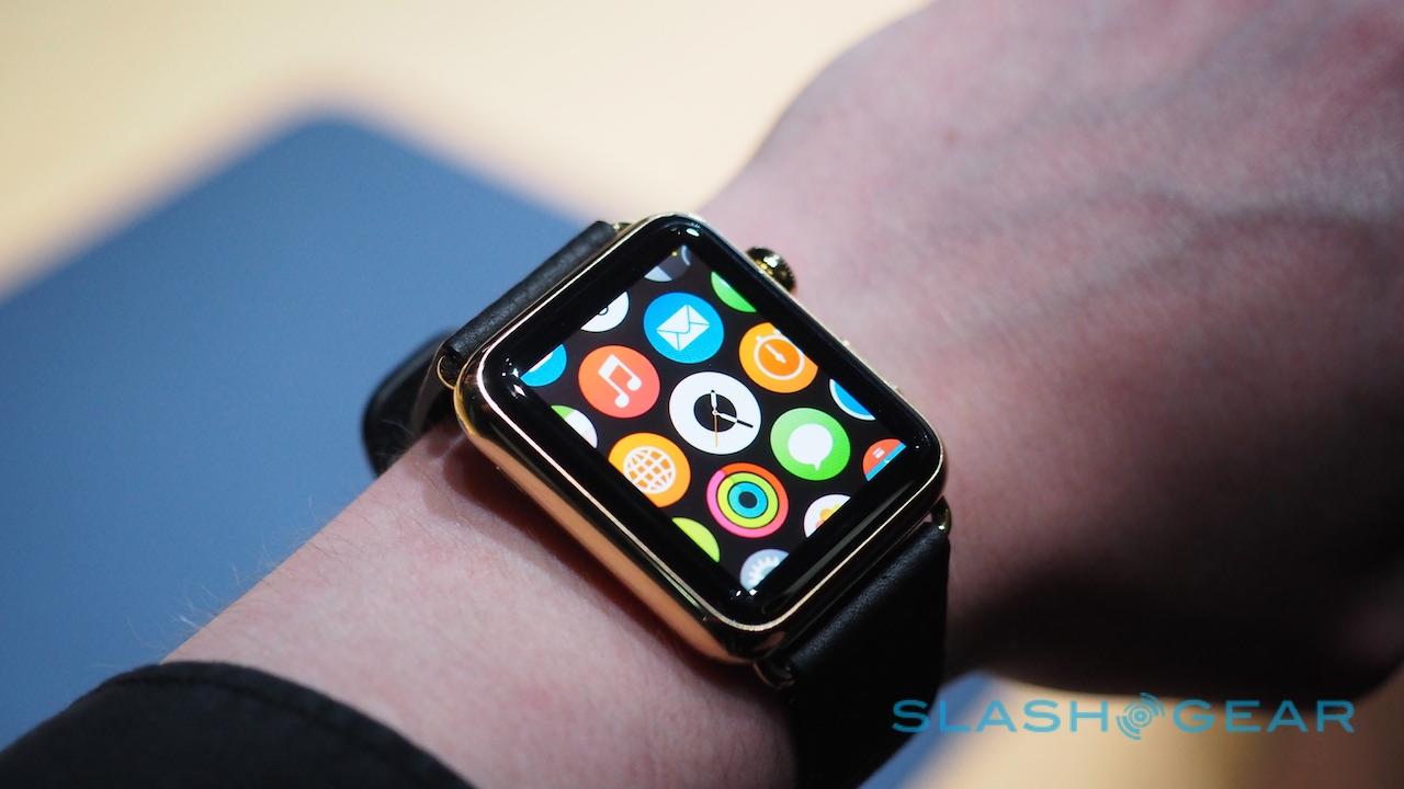
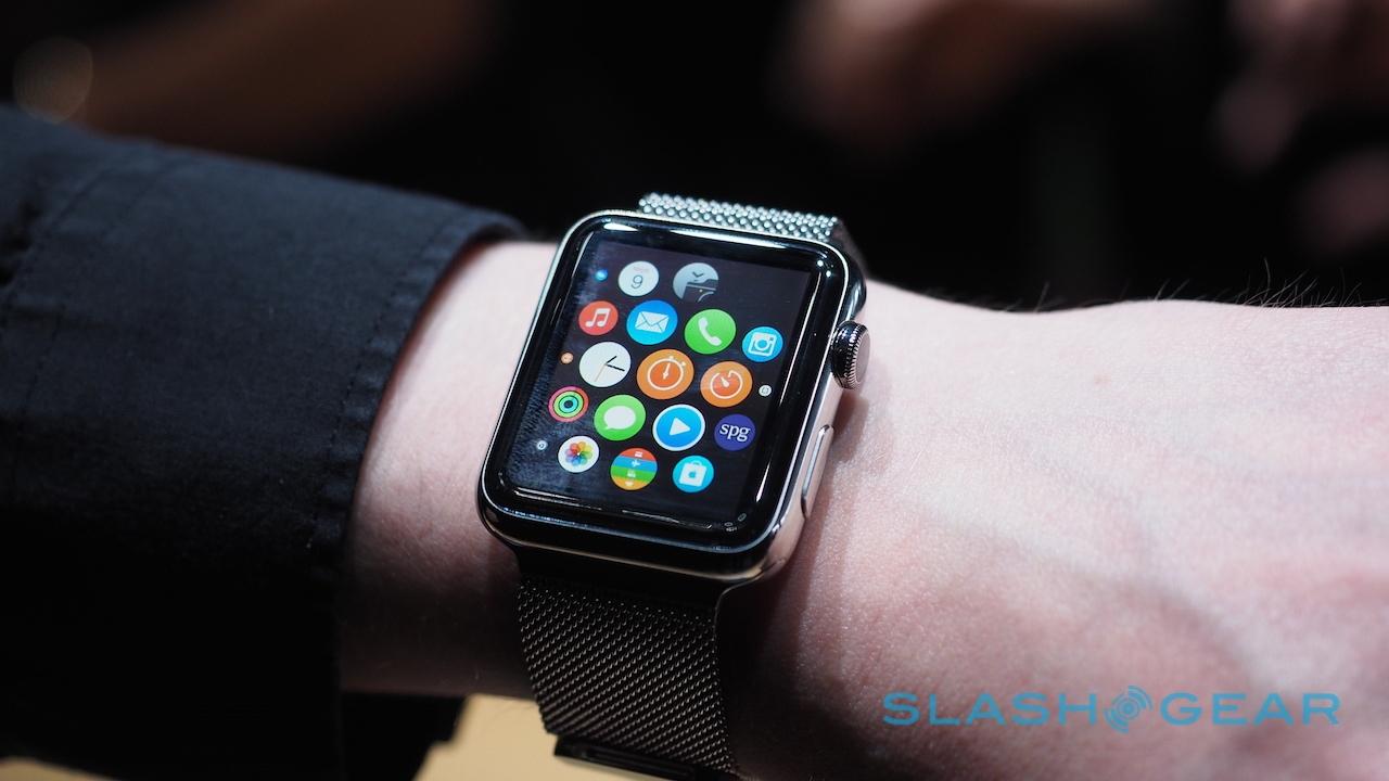
That's important since, though the screen is fairly high resolution – and the predominantly black-backed graphics blend relatively seamlessly into the bezel – it's still much smaller than I'm used to from any iPhone. Sometimes it felt a little like Apple was throwing a lot of detail in there at once: the bubbly homescreen, for instance, demands you recognize apps by their icon, and that'll be tougher as you install more software.

Most of the time, though, scrolling through with the digital crown was straightforward. Force Touch feels underutilized at this stage – you hard-press to customize different watchfaces, for instance – and since I had to keep my finger jabbed at the screen for a short period in order for the Apple Watch to actually act on it, I wasn't sure what benefit there was over, say, just a regular long-press without pressure.

Similarly, some of the apps felt more practical than others. Siri is, like shouting at Google Now on an Android Wear smartwatch, a mixed bag. Great if you want to check the weather forecast, or maybe set a reminder, but other times Apple's virtual assistant seemed reluctant to give me the answer I was hoping for. Some of the blame should probably be taken by the noisy demo room, mind, so it's something we'll return to when we have an actual review unit.
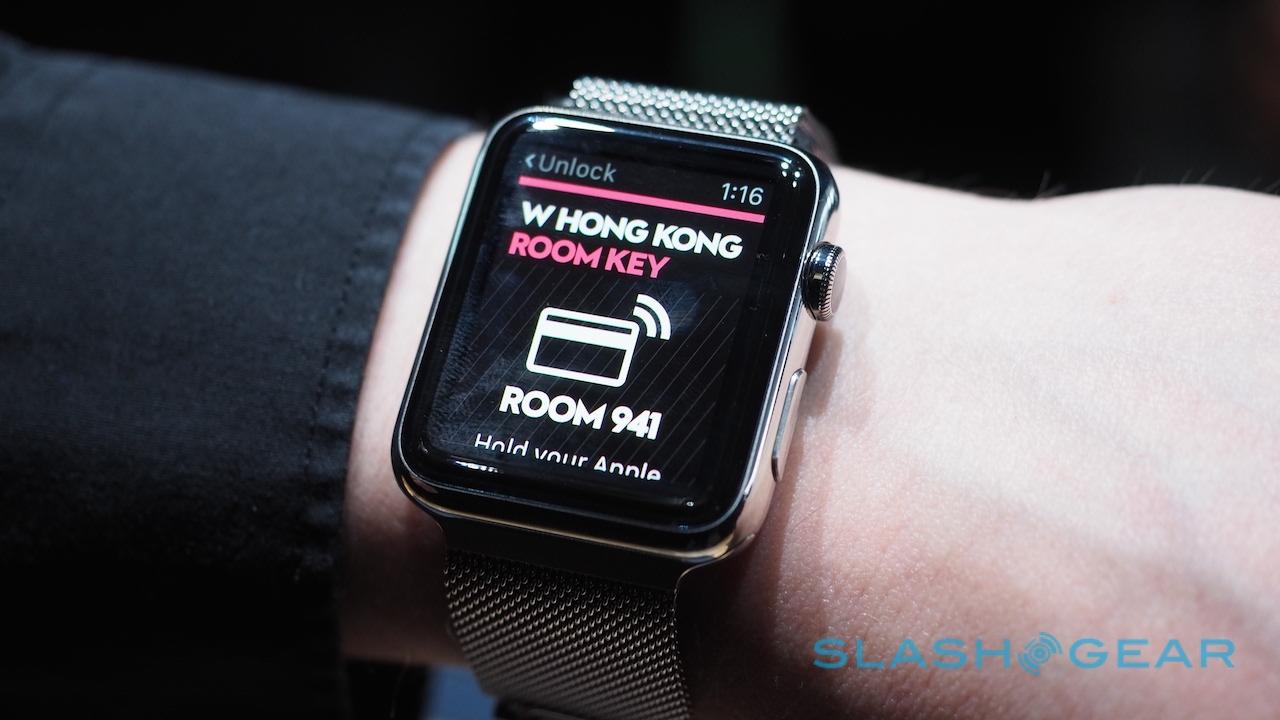
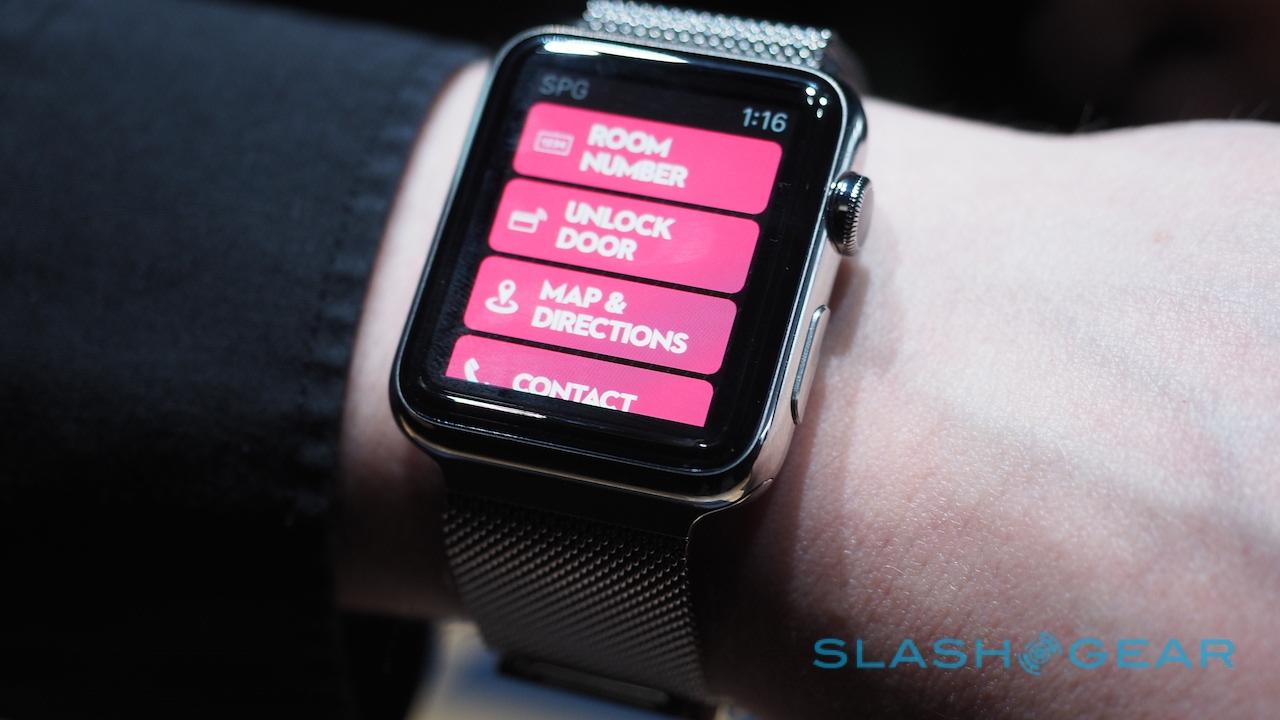
What felt more successful were the apps that, as Tim Cook had referred to the watch, were glanceable in nature. A brief snap of the wrist up, to trigger the display, and then quickly get the information or carry out the task you're hoping for: making an Apple Pay payment, or checking your hotel room using the SPG app (even unlocking the door), or summoning an Uber to your current location.

Used that way, Apple says the Apple Watch could last for up to 18 hours. Start getting more intensive – use it to make hands-free calls, for instance, like Dick Tracy – and it'll run down far quicker than that. Cook pointed out the magnetic charging adapter during the keynote, and it's certainly convenient in how it attaches, but on the flip side you're stuck carrying something else "just in case." I can't help but wish that Apple had gone for a USB-C as on the beautiful new MacBook.
What will be sink or swim beyond the initial lust of the Apple faithful will be how third-party developers embrace it. That I'm probably more hopeful about than for any other platform; interestingly, while Apple did mention a couple of apps developed by partners during the keynote, it wasn't the roll-call of must-haves I'd suspected they'd highlight.

If there's a wealth of third-party content from well known developers, as seems likely to be the case, the Apple Watch will have an edge out of the gate. Hopefully, now the cat is fully out of the bag with regards details of pricing and availability, more of those coders will be coming forward to share what they're working on.
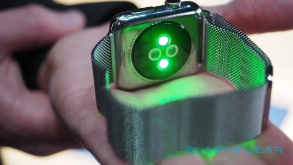
Is Apple Watch worth $349+? The jury is still out, though I'm more impressed than I was last year. Then, the prototypes left much to be detailed; today, there's more of a feeling of how the different elements of the wearable will fit together. I still have questions – plenty of them – but there's not long to wait to see them answered.

