Skype For Android Gets Huge Redesign As It Blasts Past 100m Users
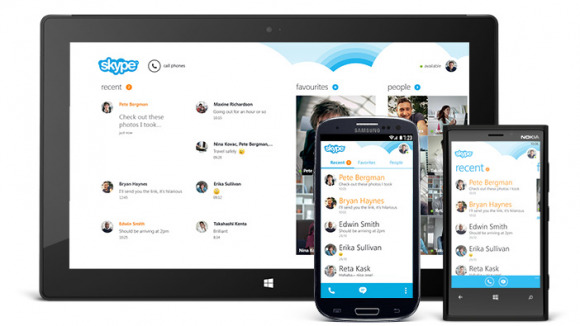
Microsoft has already been taking advantage of their buyout with Skype, merging Microsoft accounts to the newly-acquired software, as well as pushing out an all-new design today for Android devices. The redesign takes pages from Windows Phone 8 and gives the Skype for Android app a metro look that compliments the Windows variant.
Microsoft says the new design makes sure to put "conversations first," and focused on having everything at the user's fingertips. Opening the app will reveal a list of your recent conversations, and tapping on one will bring up that conversation, where you'll be able to continue chatting quickly and easily. Tapping on a contact will instantly open a new conversation window, as well as options to video chat or voice call them with just a tap.
The update brings the version number to an even 4.0, but Microsoft says that it's a whole new app, "literally." The company says that they "rebuilt it from the ground up to be faster and more reliable." So if the app was getting a little boring for your taste, it seems that Microsoft gave it quite the makeover to win over more users.
It seems that the company is focused heavily on the Android version of Skype, saying that more updates will coming in the future for the Android version. No word on the iOS version of Skype, but Microsoft is sure making us look lonely without any update or talk of a Skype redesign for iOS. Maybe they have something even better planned? Then again, seeing as how Skype just surpassed 100 million users on Android, it's no surprised that the company is focused on the platform, as well as its own Windows series.
SOURCE: Skype Blog
