Samsung Galaxy Note 7 Review - The Best Android Of 2016
- Sleek, high quality metal and glass build
- Superb Super AMOLED display
- Genuinely useful S Pen and software
- Class-leading camera
- Excellent battery life
- Expensive
- Large compared to more mainstream phones
- No USB-C video out
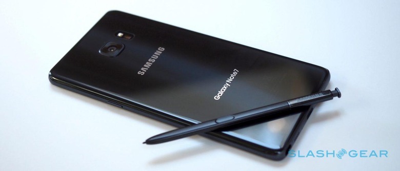
You could forgive Samsung for gloating with the Galaxy Note 7; after all, the phablet category the original Note created was dismissed by many as a sure-fire flop. People laughed at its size, its stylus, and its price, and yet time after time, generation after generation, Samsung has demonstrated it knows what its most serious users want. Now, with the Note 7, it's time for the phablet to go mass-market.
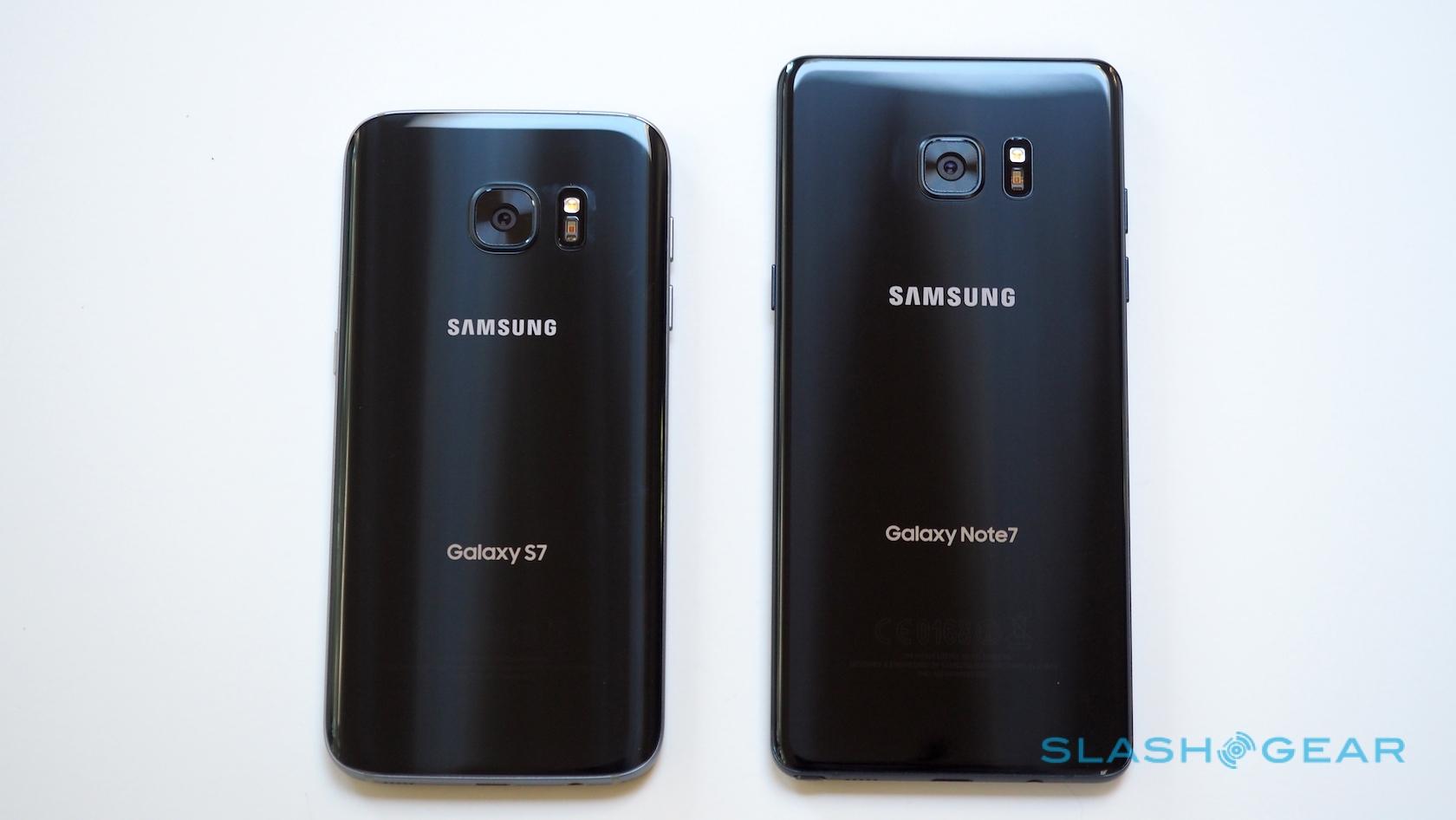
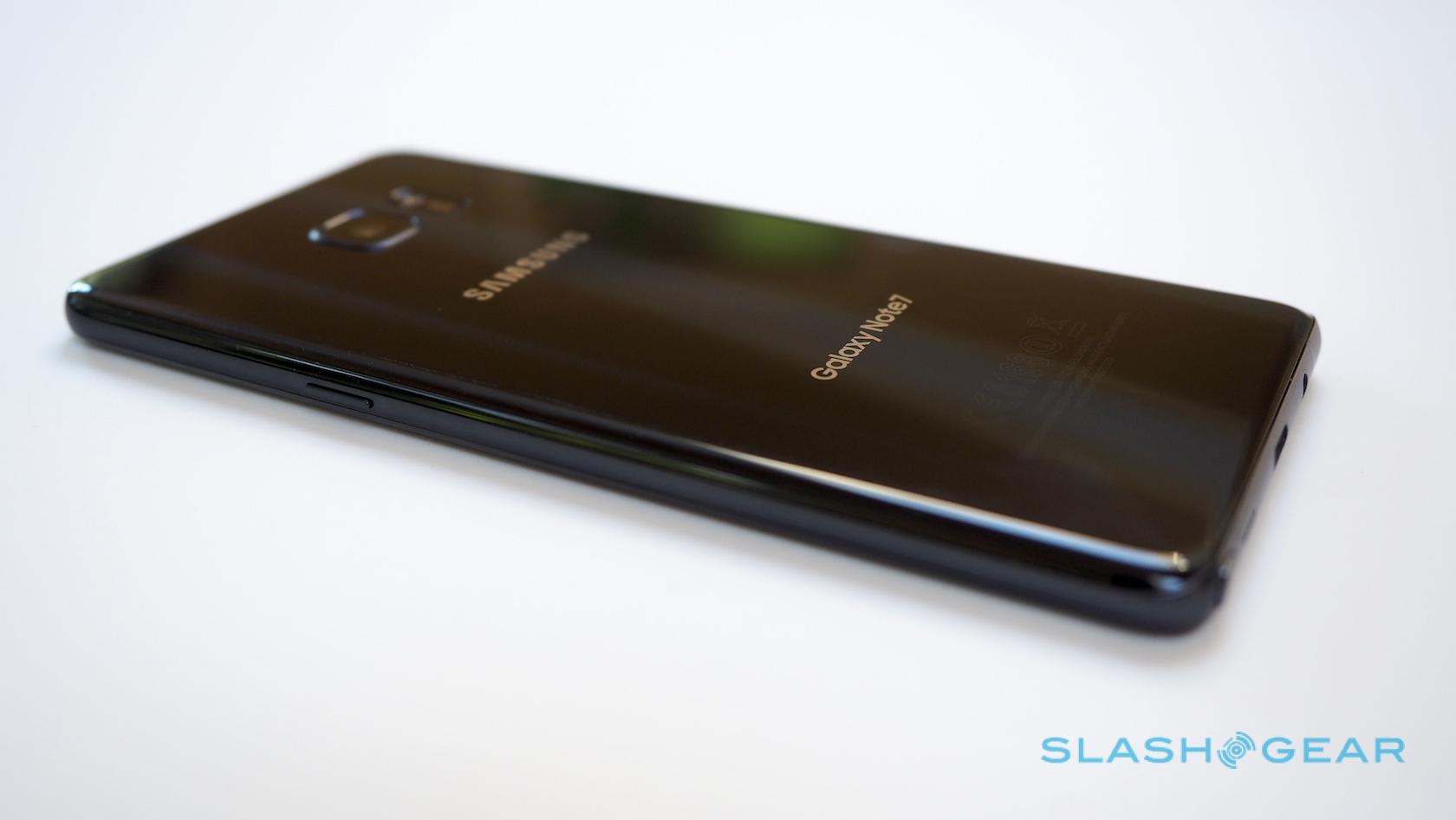
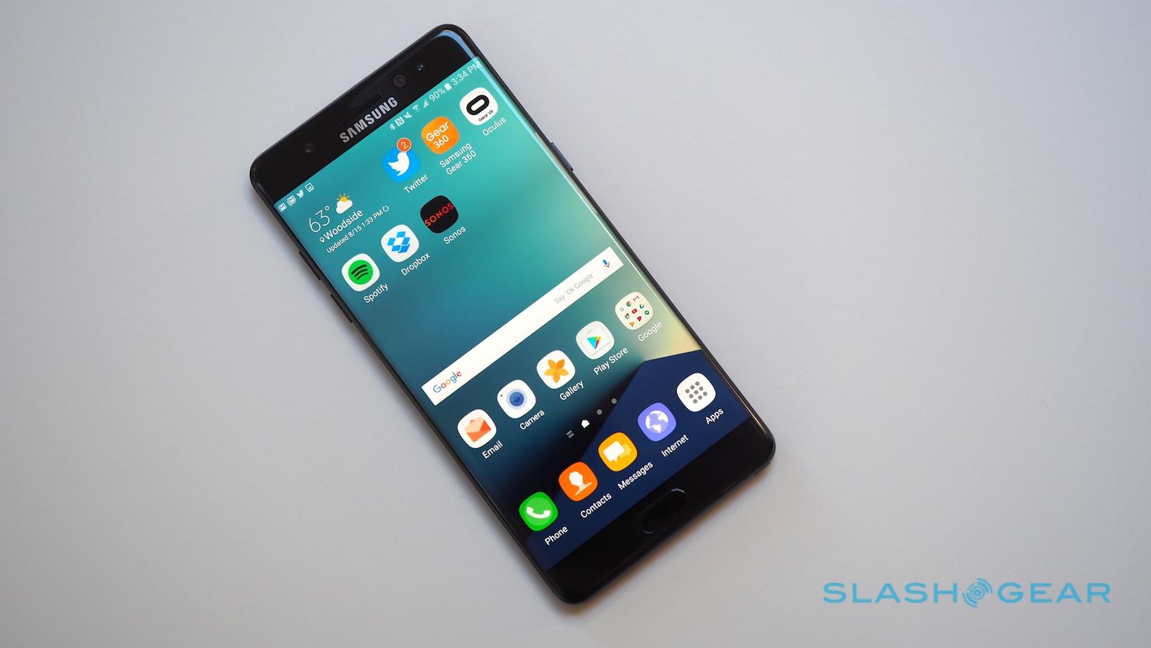
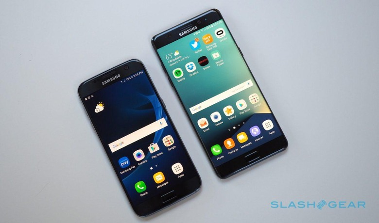
Samsung skipped a generation as it named the Note 7, arguing that the similarities between its newest phablet and the Galaxy S7 and S7 edge were so great that number parity made sense. I can't really argue with that: the three phones are clearly siblings.
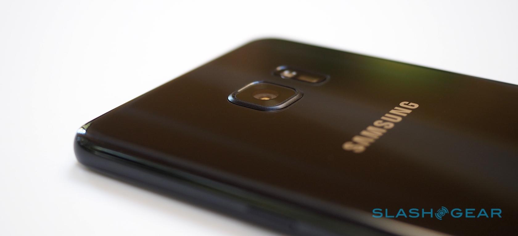
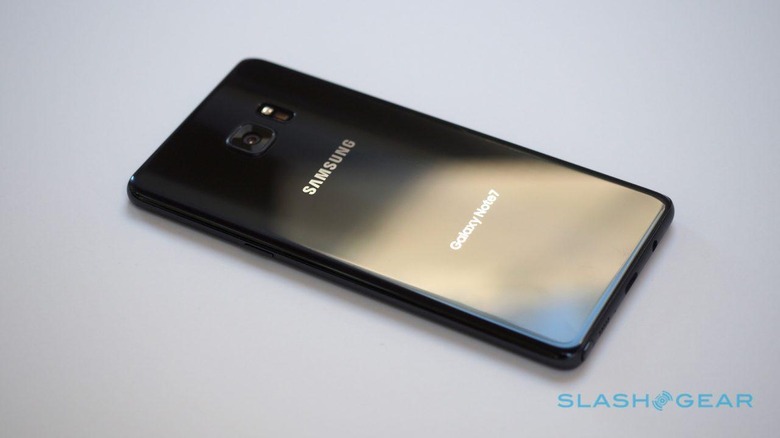
The S7 remains one of the better-designed and constructed smartphones on the market, but the Note 7 eclipses it in a number of small – though collectively compelling – ways.
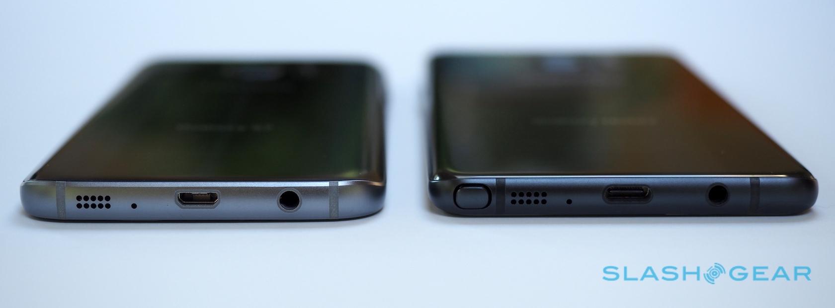
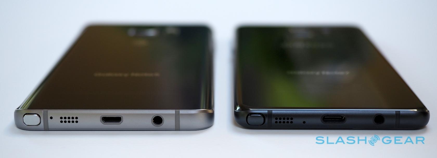
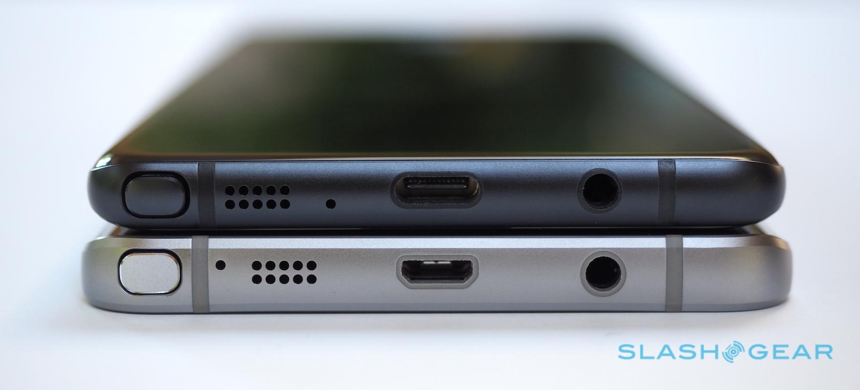
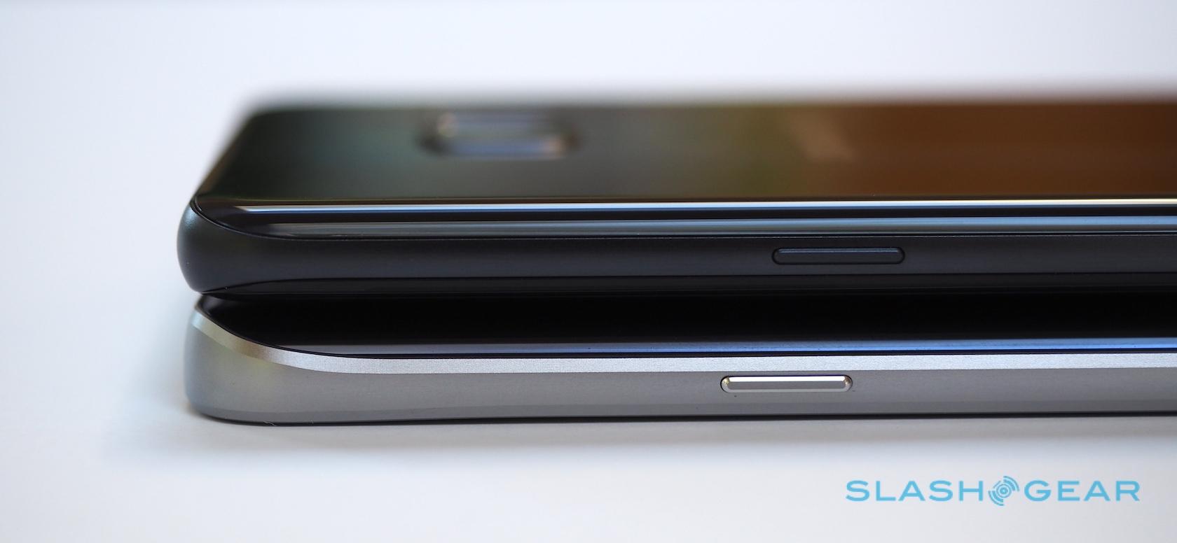
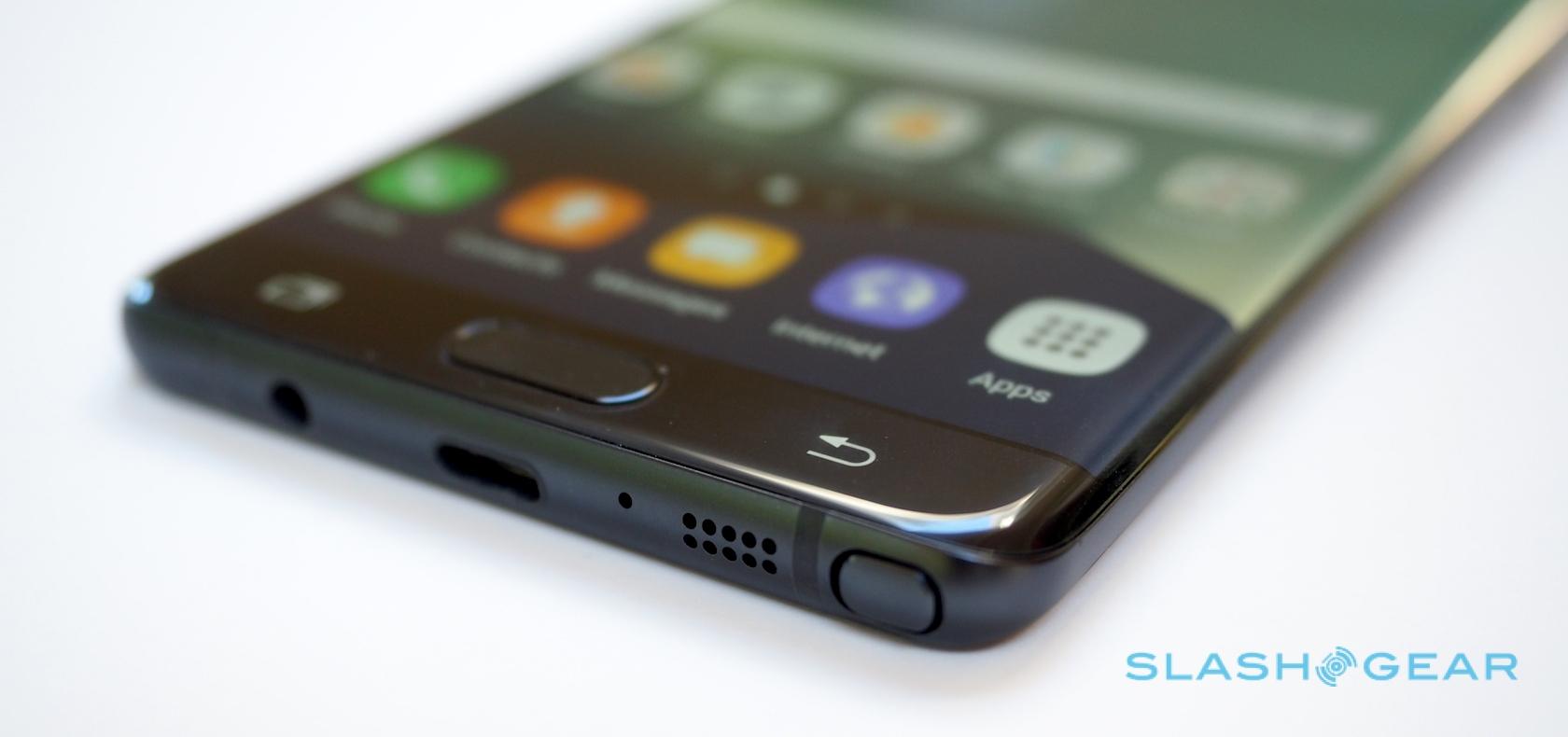
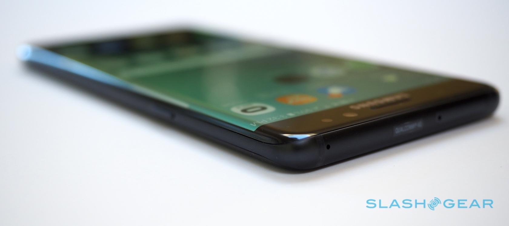
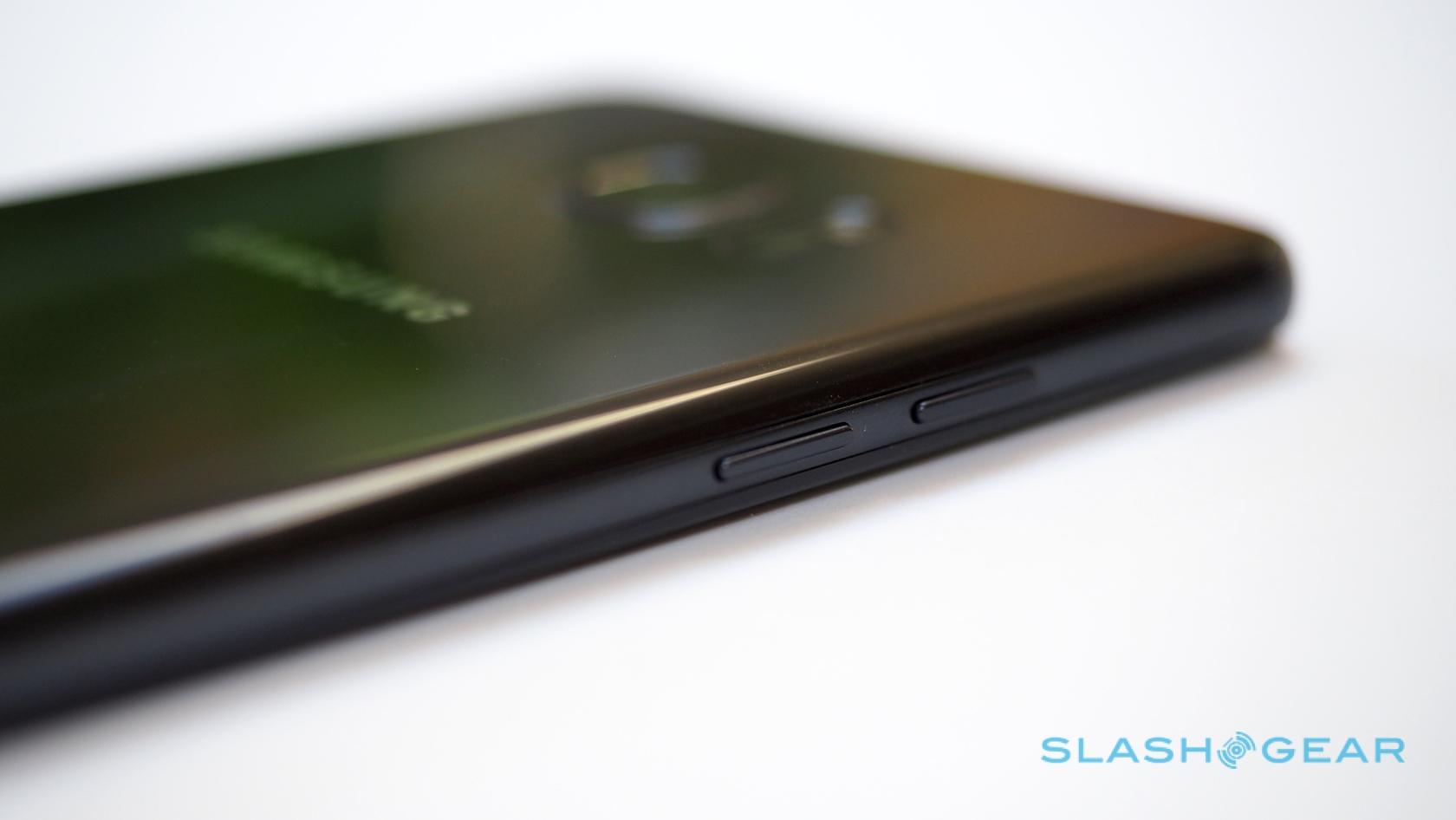
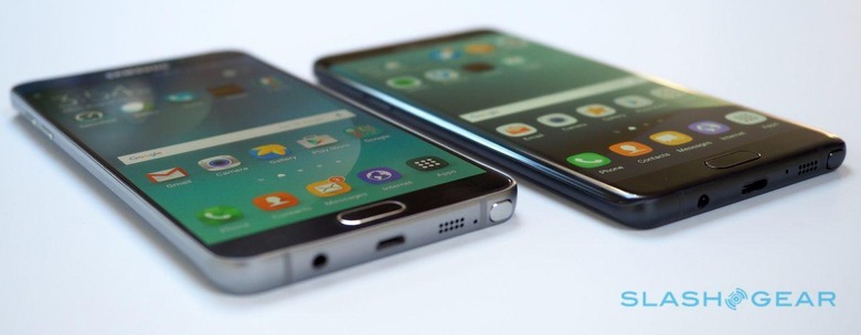
The way Samsung has blended the curved glass into the metal frame, for instance, leaves less of a ridge around the edges of the handset. The rim of plastic around the 3.5mm headphone jack and the USB socket is slightly thinner on the Note 7 than on the S7. The earpiece on the Note 7 is ever so slightly more recessed than that of the S7, while its power and volume buttons press with every so slightly more crisp a feeling beneath your fingertips.
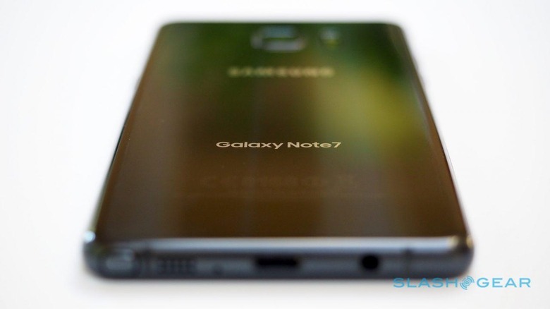
Tiny details, yes, but refinement is a huge and important part of the high-end smartphone segment. If with the Galaxy S7 it felt like Samsung was finally wising up to Apple's compulsive attention to detail, then the Note 7 represents the next obsessional step on that journey.
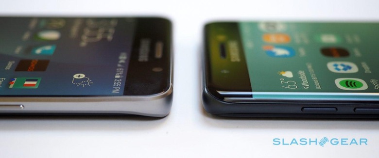
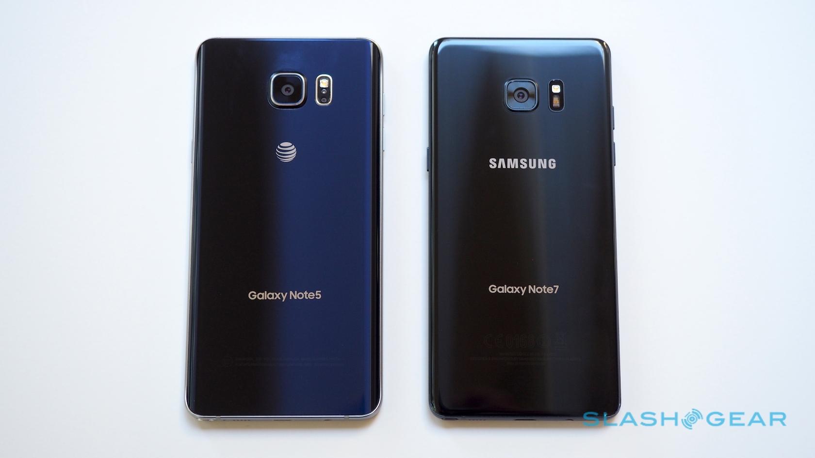
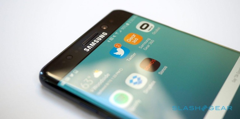
Combined with the trimmer display bezels, the Note 7 fits the same size display as its predecessor into a more manageable form-factor. Though it is indeed, at 73.9 mm wide, physically narrower than the Note 5, the curving edges magnify the impact of the mere two millimeter reduction.
Gently thumb the power key, though, and the Super AMOLED display could well distract you from the design. Slightly curved around both sides of the phone, panel experts have already weighed in on why this is a brilliant screen, but let's face it, most of us go by what our eyes see rather than a battery of testing tools.
Bright, color-rich, and so high resolution – 2560 x 1440, pixel counters, if your eyes were actually good enough to make out individual pixels – that even my scruffy handwriting looks as clean and smooth on-screen as it does on real paper, this is a fantastic display. Samsung has added a blue light filter option, too, that cuts out the amount of blue the AMOLED emits and, so the theory goes, reduces eye strain and even helps you get to sleep quicker as a result.
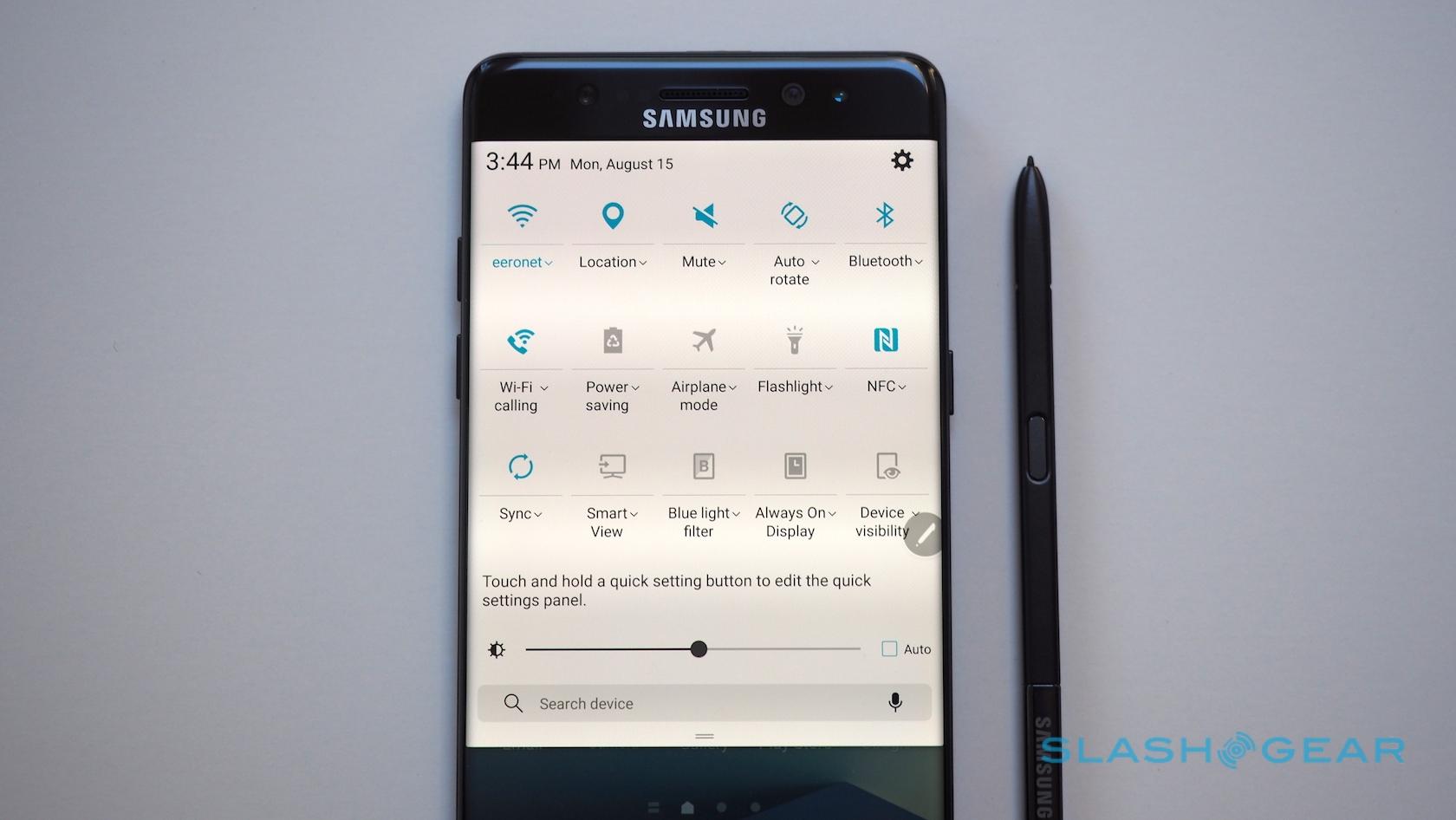
You can conveniently toggle it from the shortcut panel in the notification area, or alternatively leave the Note 7 to turn it on and off according to a specific schedule or even to match the sunrise and sunset times of wherever you find yourself.
Meanwhile there are different screen modes – AMOLED cinema, AMOLED photo, Basic, and Adaptive – which tune the color range, saturation, and sharpness. No, you don't get entirely granular control over how the screen handles each element as you might on a Samsung TV, but I suspect there are few Note users who want quite that level of customization.
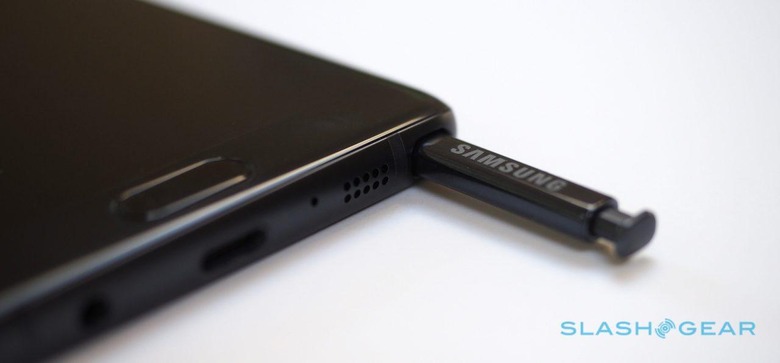
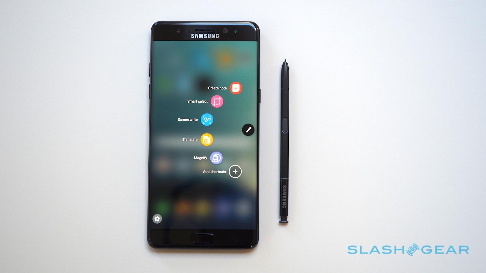
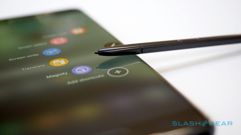
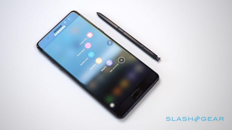
A Note wouldn't be a Note without the S Pen, and that too has had a revamp for 2016. Physically it's a couple of millimeters shorter than that of the Note 5, while the barrel button has moved further up the pen which might leave upgraders fumbling until muscle-memory catches up.
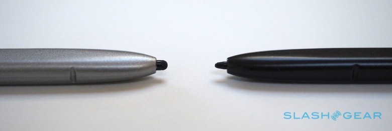
The big change, though, is in the nib. Much narrower than before, it's just 0.7 mm wide so as to feel, so Samsung says, like a regular ballpoint pen. At the same time, the pressure sensitivity has doubled to 4,096 levels.
Though Samsung insists that there are real artists producing real art on their smartphones, I suspect if you're anything like me the actual benefit will be more around how handwriting looks even more lifelike. The Note 7 makes excellent use of its improved pressure recognition: you can see it in how the virtual ink flows as you write, and how much nuance you can get into your sketches.
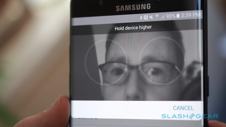
Underneath the display is a physical home button that doubles as a fingerprint scanner, as on the S7: it can be used with up to five different digits. However, above the screen is the Note 7's second biometric security system, an iris scanner.
Teach the phablet your eyes – it'll save only one set – and you can unlock the Note 7 just by glancing at it. Samsung says it's more accurate and secure than fingerprints, won't be fooled by a photo or video of the registered eyes, and works even if you're wearing glasses or contact lenses. Sure enough, in my far-from-scientific testing I couldn't fool the phone into unlocking at someone else's glance, though the fact that you have to swipe the lock screen to access iris scanning means it's usually easier just to hit the home key with a registered fingertip. I didn't have issues with my (fairly strong prescription) glasses, either.
Unlike the last Note, the Note 7 is water-resistant. According to Samsung it's not only dust-tight but can be fully immersed in water, though it's worth noting that IP68 doesn't mean resilience to high-pressure jets so you probably should avoid power-washing your phone. If you so wish, you can even keep writing with the S Pen while you're underwater, should inspiration catch you in the bath.
After a week or so with the Note 7, though, I'm still not convinced that a curved display and a stylus work together perfectly. The Note 5 may not have been able to demonstrate Samsung's prowess on curving OLED panels, but it also didn't suffer an S Pen that at times just slides off the edge of the screen.
I can't say the same for the Note 7, and while the curve is slight – a lot less than that of the far-more-frustrating Note 5 edge – it did still cause the odd skid and slide while I was trying to work with on-screen graphics at the very edges. Deal-breaker? No, but another example of how tricky striking a balance between mass consumer appeal and prosumer practicality can be.
What it does mean is that Samsung can carry over the so-called Edge Panel of the S7 edge, complete with its various shortcuts. Swipe your finger in from the side of the display – you can set it to sweep in from the left or the right – and you can flick between shortcuts to your favorite contacts, apps, tasks, calendar entries, and headlines. There's even a location-based "edge" which changes the content according to whether you're at home or at work.
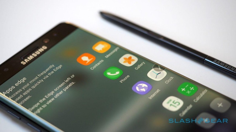
In my experience, S7 edge owners either love the Edge Panel interface or ignore it completely, and I have to say I fall into the latter camp. Happily it's just one aspect of Samsung's latest version of TouchWiz, running on top of Android 6.0.1 Marshmallow.
With every review of a Samsung device I write, I find myself saying much the same thing: TouchWiz was broadly reviled in the early days, not undeservedly so, but has improved significantly in the intervening years. On the Note 7, that means less garish graphics, cleaner menus, and a more Material Design feel overall.
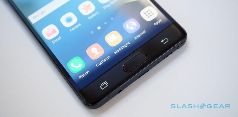
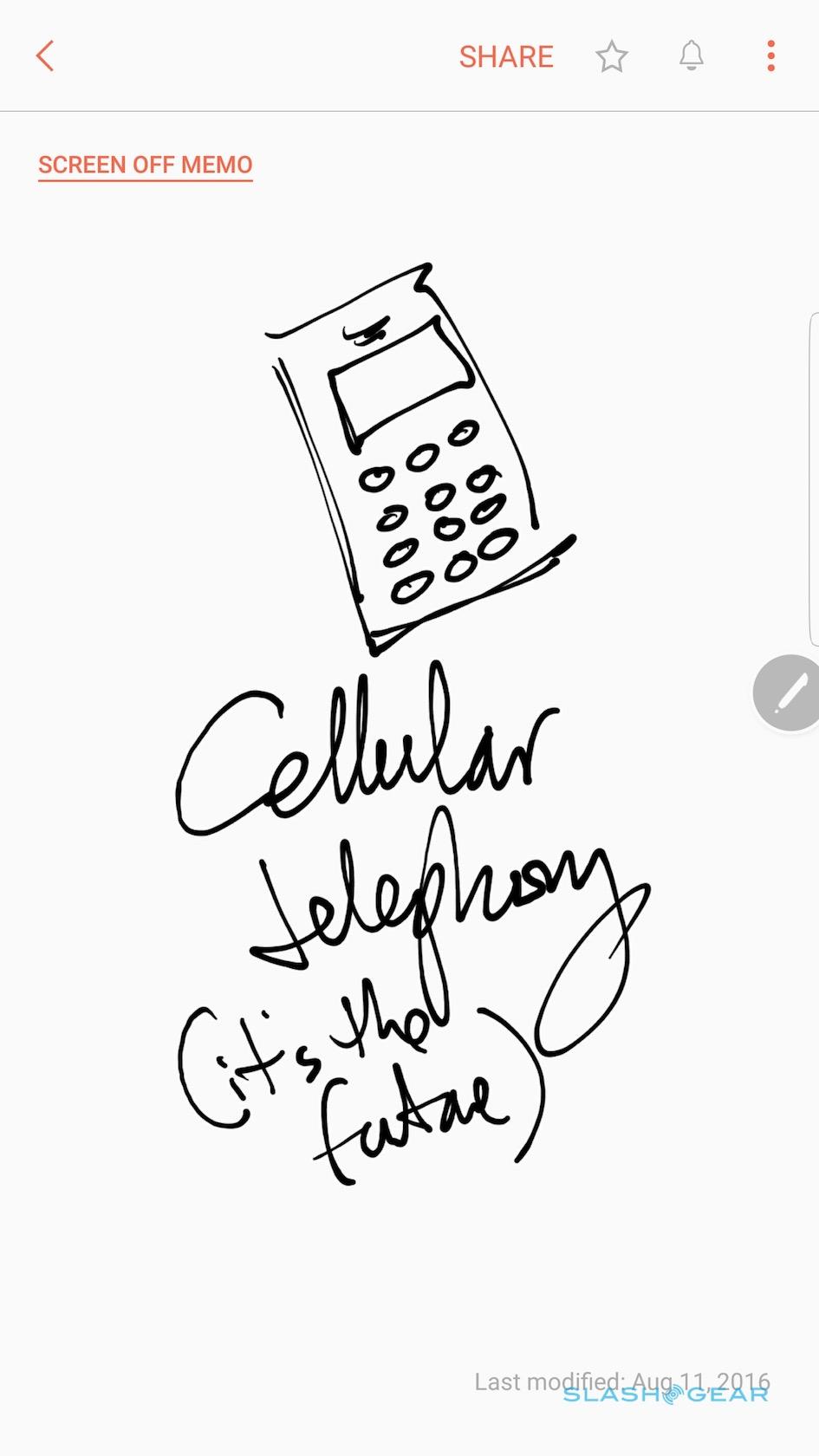
However, where on other Samsung devices it can feel like modification for its own sake, baking in S Pen functionality does give TouchWiz more purpose on the Note 7. Whip the stylus out of its silo while the phone is in standby and you can scribble monochrome notes directly on the lock screen, without needing to unlock it first. It's like having a very convenient pad of Post-Its in your pocket at all times, and perfectly illustrates Samsung's grasp of what makes the Note powerful.
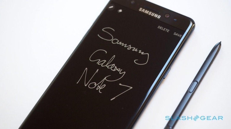
Pull out the S Pen while you're using the Note 7, meanwhile, and you get the same semi-circular shortcut menu as before, only with a few extra options. Magnify basically floats a jeweler's loupe over the display, with adjustable levels of enlargement, while Translate sets Google's language translation engine on any word on-screen you point at (sadly just one at a time, not in full sentences).
Happily, Samsung has condensed what used to be a confusing gush of S Pen and memo related apps – Action Memo, Memo, Scrapbook, and S Note – into a single place, Samsung Notes. That's where your Screen-off Memos are saved, and where you can organize handwritten, typed, and sketched notes into different categories. It's all synchronized with Samsung Cloud, of which new Note 7 owners get a 15GB chunk.
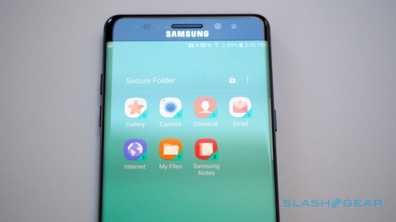
A new Secure Folder works basically as a separate enclave for business or private data. You can lock it down with a fingerprint or an iris scan, but it's more than just a passcode protected safe space.
Instead, apps running inside the Secure Folder are effectively completely separate installs from their counterparts outside of it. That allows you to use an entirely different account with them, should you wish: Samsung envisages that being handy for businesspeople wanting to keep personal and corporate email separate, but it's just as handy for everyone else who has two Snapchat accounts but doesn't enjoy logging in and out of them in the same app.
All this is running on an octacore processor – four high-power CPU cores for general use, and a further four for low-power tasks – and 4GB of LPDDR4 RAM. Samsung will have a 6GB version, but not for the US; your location will also decide which processor you get, either Qualcomm's Snapdragon 820 as in the US, or Samsung's own Exynos. Performance is much the same as with the S7, unsurprisingly, since that used exactly the same architecture.
There's only one storage option, a sensible 64GB. Samsung includes a microSD slot, too, which means adding up to 256GB more is straightforward. It's a welcome reversal compared to the Note 5, which offered no way to expand the internal capacity.
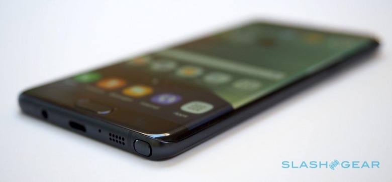
Connectivity includes WiFi a/b/g/n/ac (2.4/5GHz) with MU-MIMO (2x2) support, Bluetooth 4.2 LE, ANT+, NFC (for Samsung Pay, among other things), and a USB-C port. After the aborted attempt to popularize the wider USB 3.0 port on the Note 4 3 – which turned out to be under-utilized and fairly fragile – Samsung has dusted off its collective hands and embraced the newer connector, which has the benefit of not caring which way around you plug a cable in.
There's a USB-C to microUSB adapter in the box, sensibly, since not everyone is ready to make the jump quite yet. Unfortunately whereas USB-C can in theory support video output too, plugging the Note 7 into a USB-C equipped display does nothing. Meanwhile, those who have already bought a Gear VR will need to replace it with the new version thanks to the change of port; at least the updated virtual reality headset is backward-compatible with existing Galaxy phones thanks to an interchangeable connector.
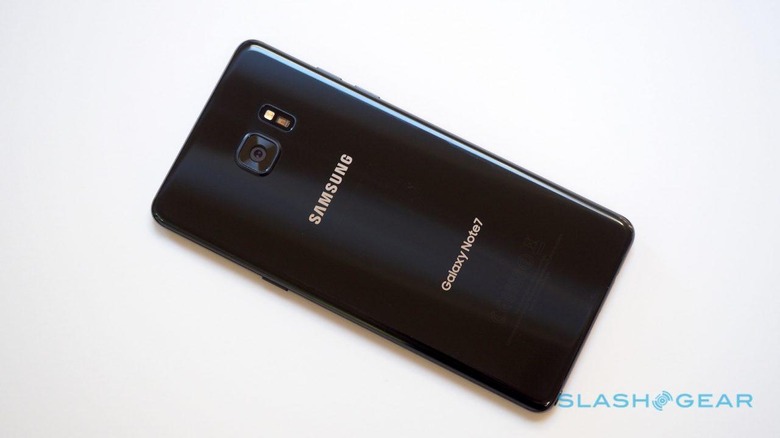
Borrowed wholesale – and no worse off for it – from the S7 is the camera. Samsung has been widely praised for the Dual Pixel 12-megapixel f/1.7 camera with optical image stabilization already this year, and it puts in just as successful a showing on the Note 7 now. Expect great detail, accurate colors, and capable low-light performance in stills, not to mention smooth 4K video.
The Galaxy S7's front-facing 5-megapixel, f/1.7 camera also makes the jump to the new Note, but Samsung has revamped its camera app to make it a little easier. Modes are now accessed with a swipe across to the left; filters to the right; swiping up or down flips between the front or back cameras.
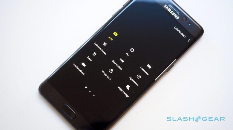
Twitter and tumblr fans, meanwhile, get what I suspect will be the Note 7's unexpected hit feature: native GIF creation. There are actually two ways of making the animated pictures, the most straightforward involving simply hitting the "share GIF" button while a video is playing back. That automatically uses the subsequent six seconds.
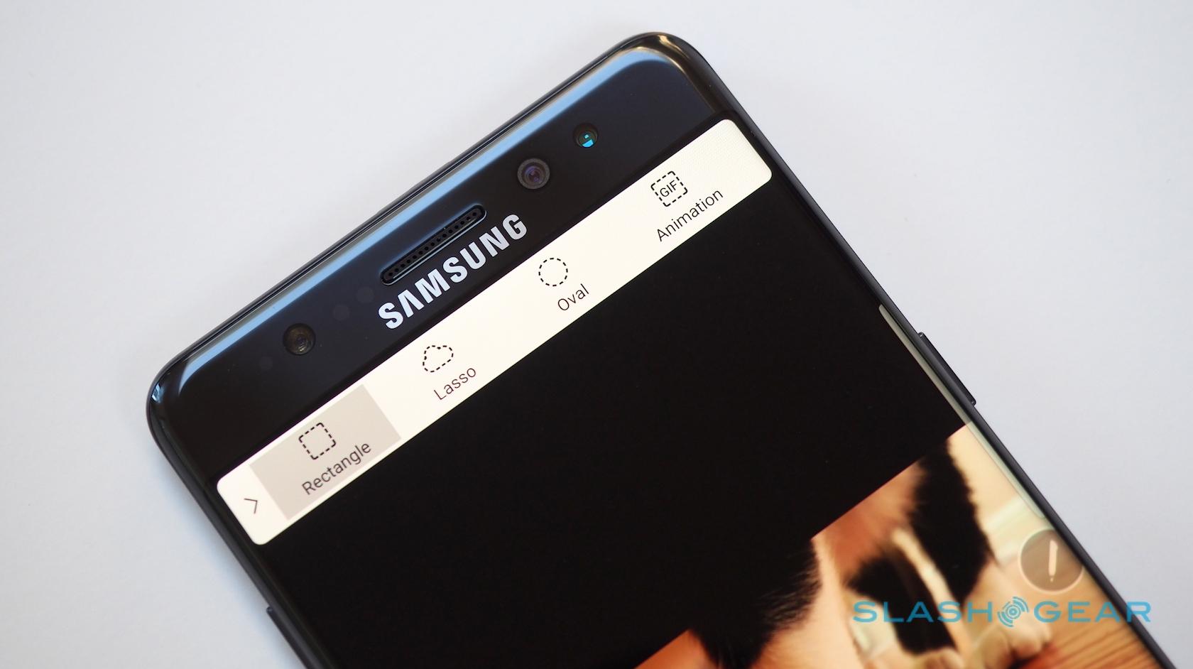
A little more complex – though more flexible, too – is Smart Select. As before, that has rectangular, circular, and free-form selection for still clippings, but on the Note 7 adds a GIF select tool. Position the resizable box atop any video, whether your own or any non-DRM clip, and, when you hit record, you can capture anything up to 15 seconds in length.
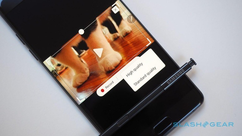
Samsung offers two quality modes: the same six second GIF came out at 10.9 MB in "High" resolution, and 2.8 MB in "Standard". Visually the difference was noticeable to the eye, but it does mean that social services like Twitter, which limit GIF upload size, have less chance of complaining about the cat animations you're trying to share.
The Gallery app also supports GIF editing now, including cutting out individual frames, adjusting aspect ratio and speed, changing the direction of playback and whether the animation loops, and adding in images, stickers, text, and drawings.
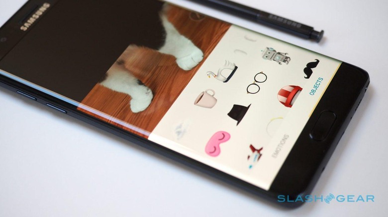
A business essential? Almost certainly not – unless you have a really, really fun job – but it's a great illustration of how Samsung isn't just thinking of enterprise tasks when it looks to how content creation on a mobile device might work.
Something everyone can probably agree on is that more battery is always a good thing, and so at 3,500 mAh – a welcome 500 mAh increase over its predecessor – the Note 7 is well positioned. No, you still can't replace it yourself, but Samsung does offer both fast charging with a compatible adapter in the box, and fast wireless charging that's compatible with both of the common standards in play.
Whichever way you charge it, I suspect you'll be pleased with how long the Note 7 lasts. A solid day is no problem; two days is perfectly achievable.
I can almost see long-standing Note fans being a little put out by just how much mass-market appeal Samsung has given this sixth-generation phone. Once upon a time your flexible phablet demanded some sacrifices in return for a big screen and a handy stylus; now, it's only slightly larger than an S7, is just as easy to hold, has the same quality camera, and eclipses its smaller sibling on not only security but software features for business and fun.
My suspicion is that S Pen power-users may not take to the dual curved display, but I think the improvements in battery life and photography, not to mention the addition of water-resistance and the restoration of an expandable memory slot will be enough to placate them.
In short, this is not only the best Note that Samsung has made, but it's a strong contender for being the best Android handset out there today.
NOW READ: Samsung Gear 360 Review
That doesn't mean it's for everyone, mind. Though the Note 7 may be smaller than the Note 5, it's still a big device; not everybody wants or needs a 5.7-inch screen. It's expensive, too, and isn't going to get Android updates as rapidly as a Nexus will. Meanwhile, with the iPhone 7 waiting just around the corner, the more considerate shopper might do well to wait and see what Apple has up its sleeve before jumping into bed with Samsung.
Right now though, if you've the pocket and the purse for it, there's not much to dislike about the Galaxy Note 7. Samsung has somehow managed to squeeze the bulky compromise out of its most capable smartphone, made a tempting bigger brother to the Galaxy S7 and S7 edge, and paved the way for a triple-headed offense against whatever might be simmering away in Cupertino.
