Samsung Galaxy Note 4 Review: Phablet Refocused
Samsung can't afford to stumble with the Galaxy Note 4. The fourth-gen phablet arrives as Samsung wakes up to a new, and not especially rewarding, phase in its mobile life: the discovery that throwing a hundred designs at the market and hoping at least some of them stick no longer has the same sales success as it once did. At a time so fiercely competitive, Samsung can't count on simply having originally created the Note 4's segment to commend this latest model. It needs to deliver as much in the hand as its specifications promise to on the page.
Design
Samsung's affinity for plastic has prompted more than a few arguments over the years, generally centered on the perceived quality of the material when it comes to phones with flagship aspirations. Plastic in and of itself is not a bad thing – it has some obvious advantages, in fact, like being more accommodating to bending and twisting than metal might, not to mention its lighter weight – but Samsung's preference for glossy finishes had begun to look cheap next to its matte or metal competition.
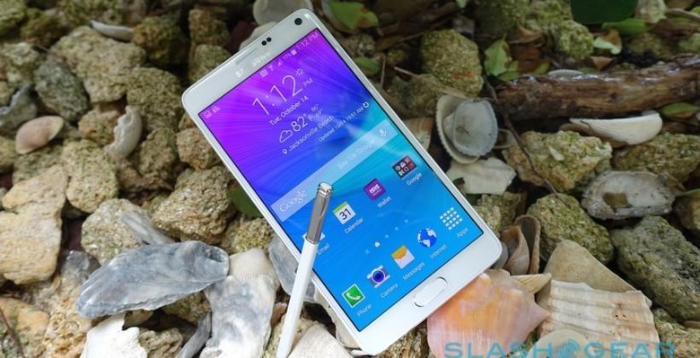
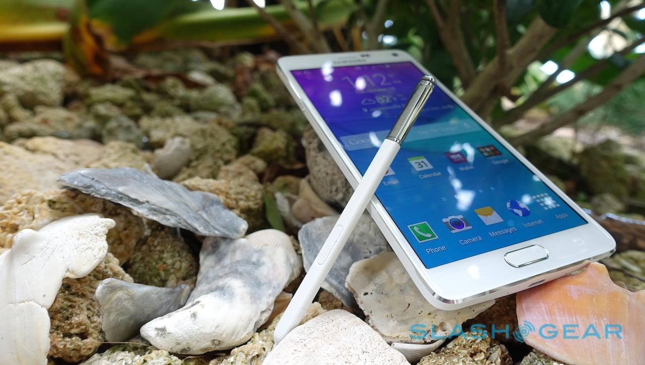
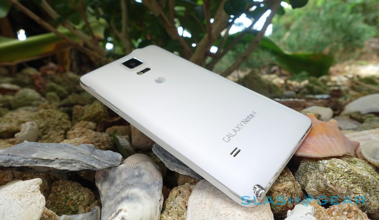
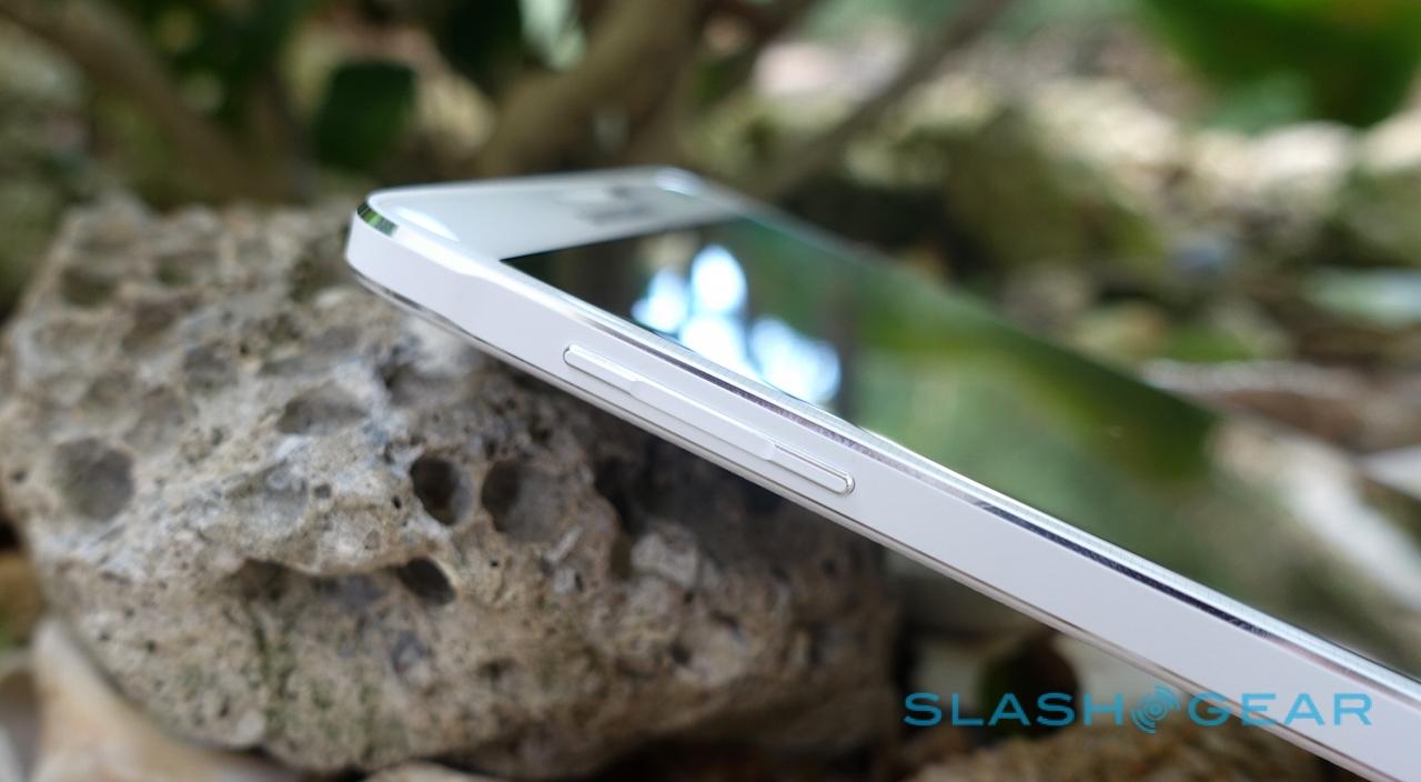
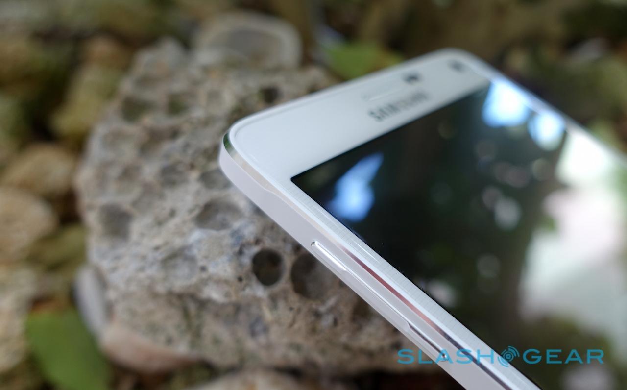
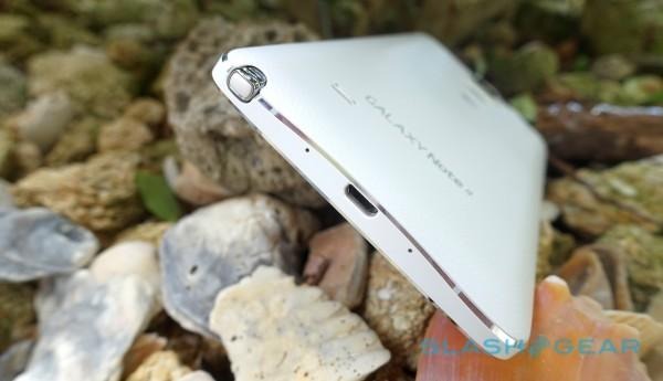
Happily, the Galaxy Note 4 addresses things, though in a very Samsung way. The new phablet combines metal and plastic in a similar way to the Galaxy Alpha, with a sleek metal frame containing slices of inset matte plastic and then a leather-textured plastic back cover.
There's method to it, too. At 153.5 x 78.6 x 8.5 mm the Note 4 is not a small device, but at 176g it's only 4g heavier than an iPhone 6 Plus, despite having a larger screen and a pull-out stylus. Samsung has focused on its touch-points in a far more compelling way than on previous devices, too: the edges are pleasingly chamfered and the buttons crisp.
It's not a ruggedized phone, or even a water-resistant one – Samsung tells me that would've required adding more bulk than the company felt users would accept – but it has been designed with the odd drop or bump in mind. The corners are reinforced, while there's Gorilla Glass 3 on the front, for instance.
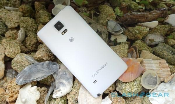
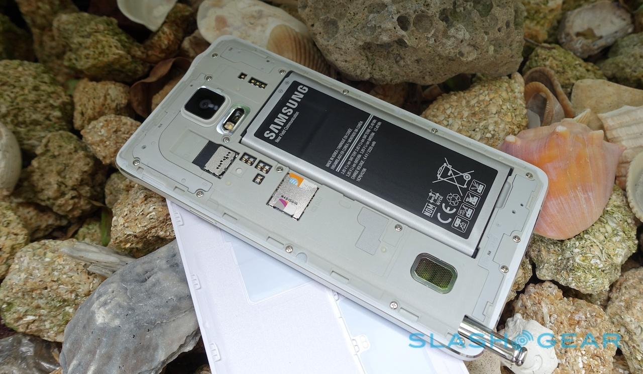
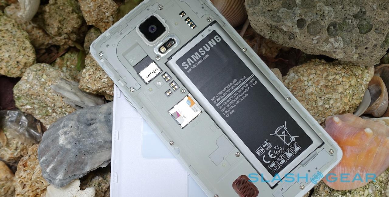
Meanwhile, the removable rear panel has a springiness to your fingertips that's similar to leather (happily Samsung has ditched the faux-stitching around the edge, which made the Note 3 look and feel a little twee), and should hold up to the occasional jab with a set of keys in the same pocket. You'll probably end up scratching the polished metal detailing in the process, though.
In all, while full metal might be the go-to request for many Samsung critics, I think the company made the right decisions for the Note 4. The important thing is that it no longer feels cheap in your hand: side by side with a Note 3, and the step up in perceived quality is instantly noticeable.
Hardware
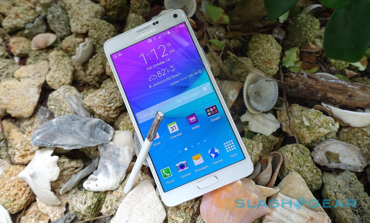
The Note series has always been a powerhouse when it comes to specifications and performance, and the Note 4 doesn't depart from that. Most obvious is the display: at 5.7-inches it's the same size as the panel on the previous Note, but the Super AMOLED now runs at Quad HD 2560 x 1440 resolution, rather than just Full HD.
It's a stunning screen. At 515 ppi it's increasingly pixel-dense, meaning smooth on-screen text and graphics, while the colors pop and the contrast ratio is huge. Viewing angles are so broad you could effectively watch a video from near side-on without any color inversion – not that, admittedly, you'd probably want to do that – and there's the choice of Adaptive Display to automatically adjust color, contrast, and other settings according to what's on-screen at the time, or a more neutral profile if AMOLED's richness is too much for you.

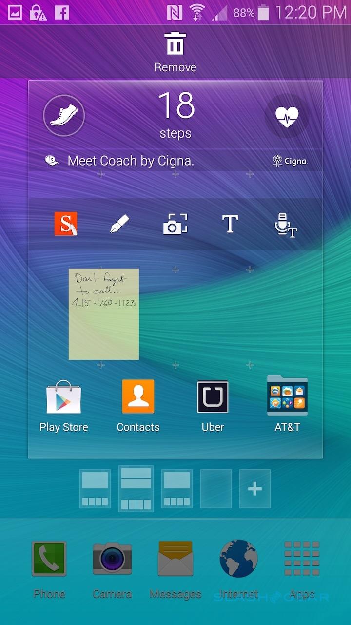
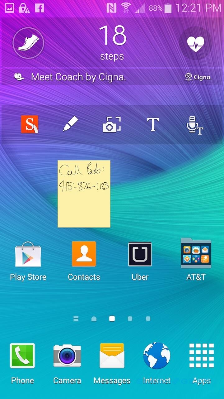
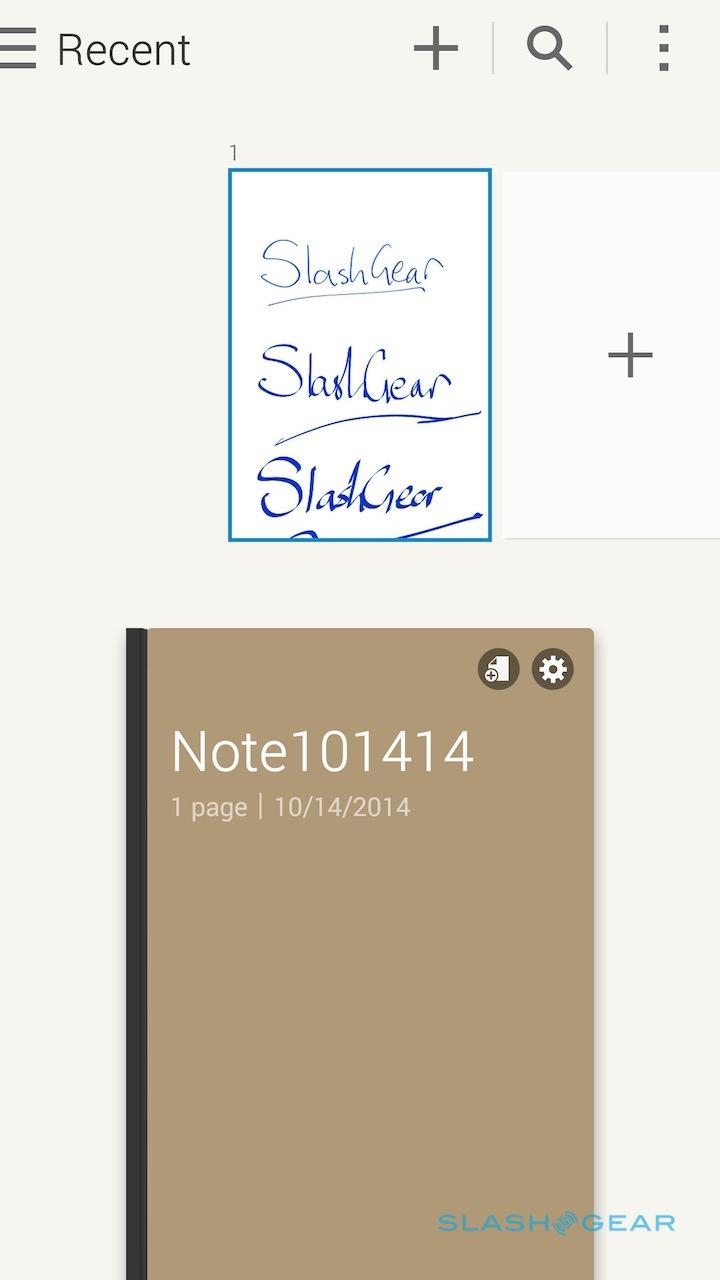
The Note 4 may not be the first phone to offer Quad HD, but it could be the first to take real advantage of it: one of the software features allows you to pin handwritten Post-It style notes to the homescreen, and even though they're roughly the size of a chunky icon, because of the resolution you can still read your own writing.
Inside, meanwhile, there's either a 2.7GHZ quad core processor – Qualcomm's Snapdragon 805 – or a 1.9GHz octa core processor – Samsung's own Exynos, pairing a 1.9GHz quad core with a 1.3GHz quad core and switching between them based on load – depending on where you buy your Note 4. Either way, you get 3GB of RAM and 32GB of internal storage, plus a microSD slot content with up to 128GB cards.

Connectivity includes HSPA+ and either 4G Cat.4 (150/50 Mbps) or Cat.6 (300/50 Mbps); obviously those maximum speed figures are in theory, and your actual experience on compatible networks will be less. WiFi a/b/g/n/ac (2X2 MIMO), Bluetooth 4.1, NFC, ANT+, and USB with MHL 3.0 HDMI support are also included, and there's an IR blaster built into the top edge.
Interestingly, Samsung has opted to backtrack on USB 3.0 – which was present on the Note 3 – and outfit the Note 4 with a regular microUSB 2.0 port. It's no great loss, frankly (Samsung says consumer feedback suggested they didn't require it and might, in fact, have just been confused by it on the old phone), and more useful is the Download Booster system which allows a WiFi connection and an LTE connection to be coupled for speedier downloads. Just beware of the potential hit on your 4G data package if you make frequent use of it.
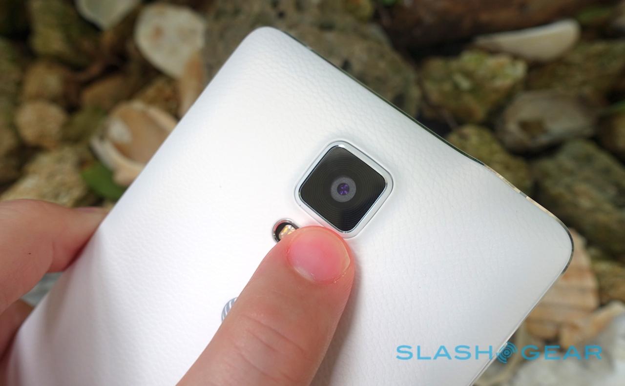
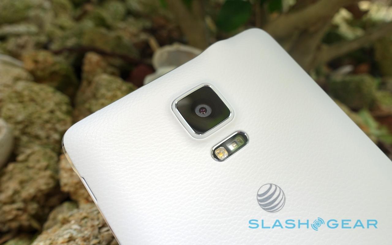
The usual accelerometer, digital compass, gyroscope, ambient light, proximity, and barometer sensors are onboard, though they're joined with some less-common options. The "hall sensor" works with smart covers to automatically turn the Note 4 on and off when you open and close them, while a pulse scanner integrated under the rear camera can now read not only heart rate but blood oxygen levels.
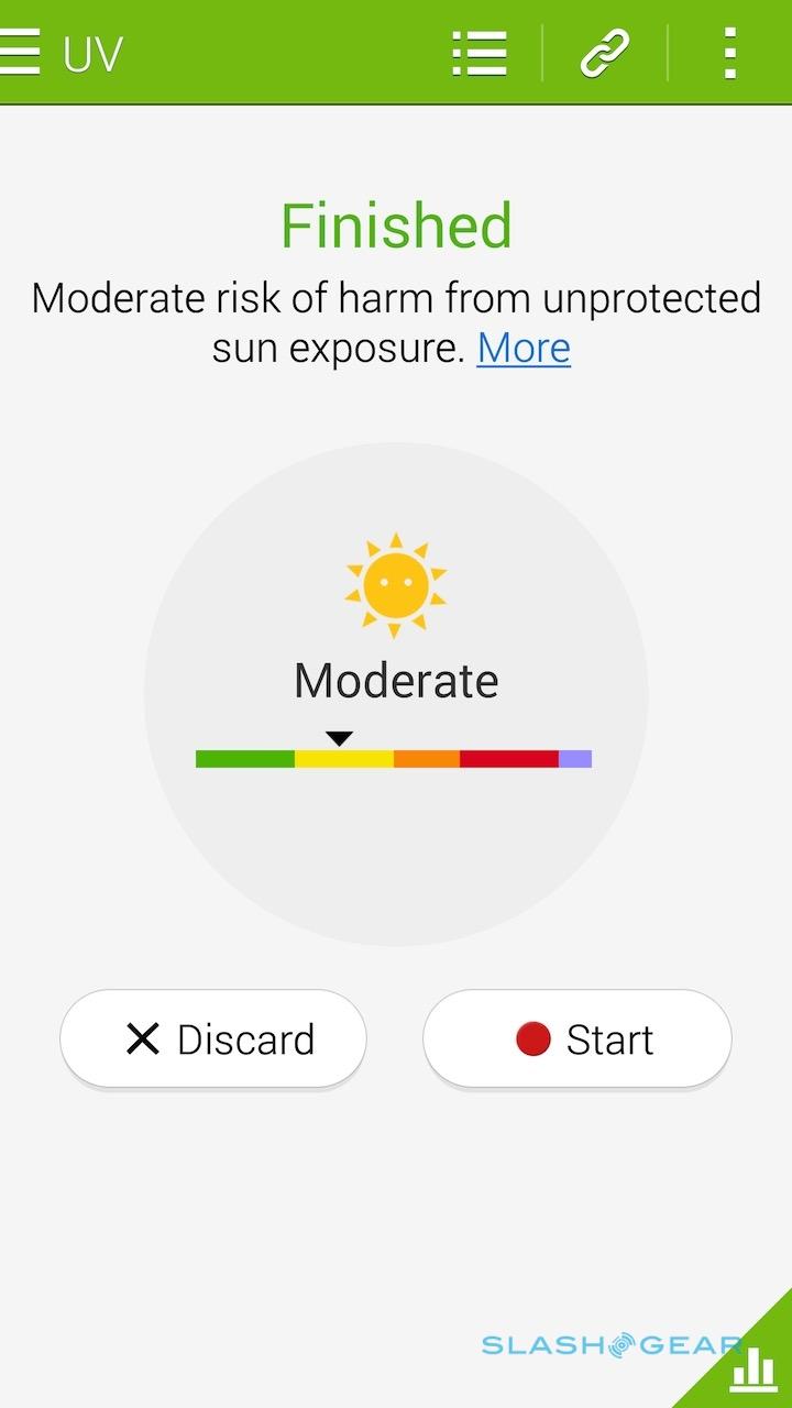
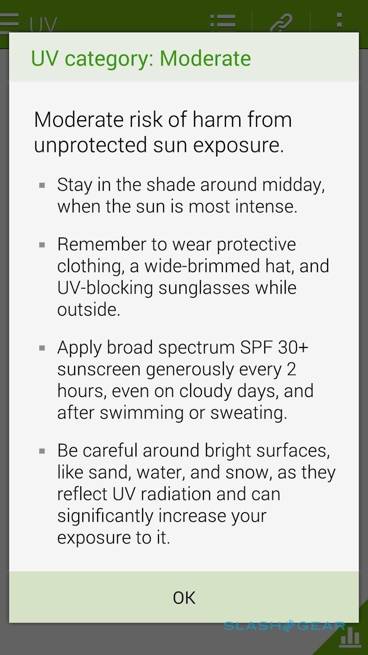
An ultraviolet sensor tracks UV levels in sunlight, and can help Samsung's S Health app to make sunblock recommendations. Finally, there's an improved fingerprint scanner built into the physical home button: it seems more consistent than that of the Galaxy S5, as well as more resilient to swipes made at a slight angle, though it's still not quite as flexible as Touch ID on the iPhone which allows you to come at the home button from any direction.
S Pen
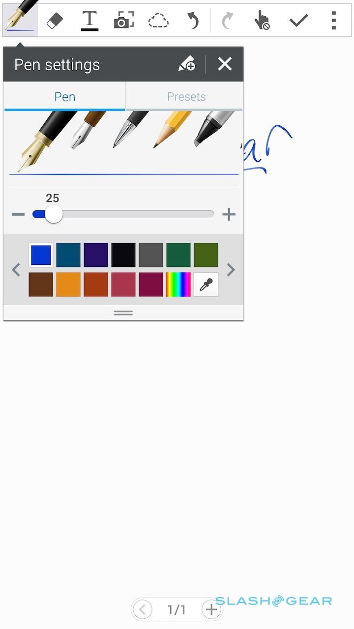
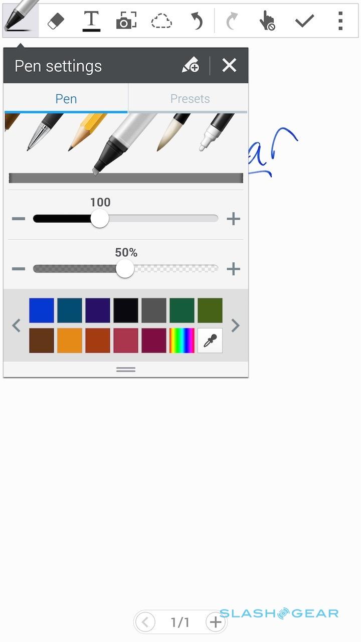
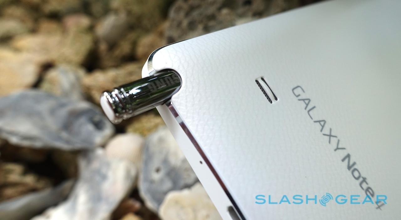
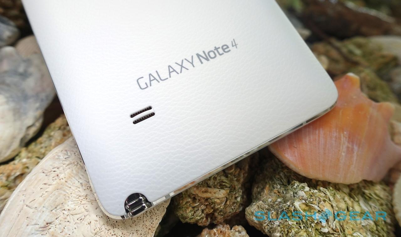
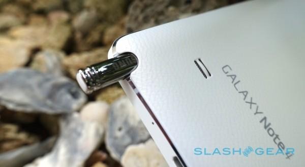
Samsung deserves no small proportion of the credit for resurrecting the stylus, and the S Pen continues to improve with each Note iteration. The square-barreled pen slots neatly into its silo on the bottom edge of the phone, as before, but now supports double the pressure sensitivity – 2,048 levels, versus 1,024 – of its predecessor, while the nib can be detected hovering from as much as 15mm away from the screen.
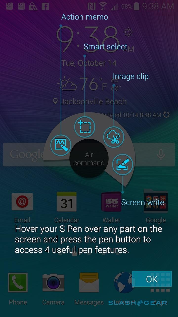
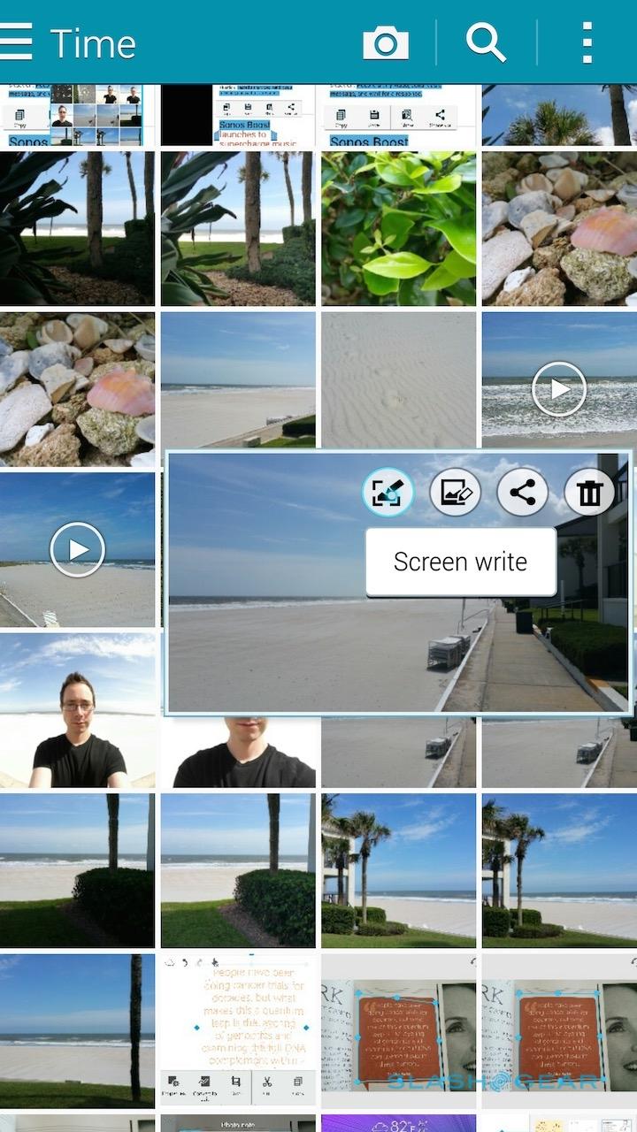
What, exactly, you can do with the S Pen has been improved and refined over each generation of Note, too. Yank out the stylus and, as before, the's a pop-up radial menu for Air Command, Smart Select, Image Clip, and Screen Write (you can get the same menu by tapping the barrel button with the S Pen hovering over the display) but some of the ways the S Pen interacts with text and images have been tweaked for the Note 4.
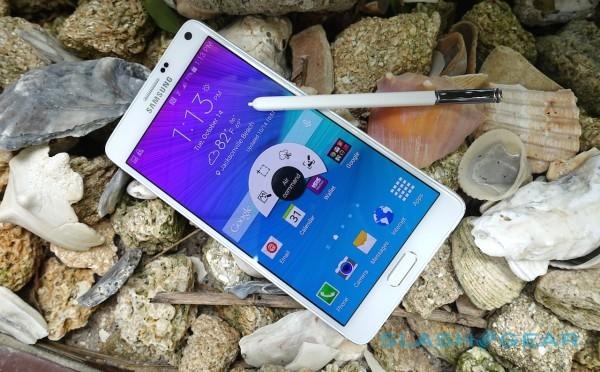
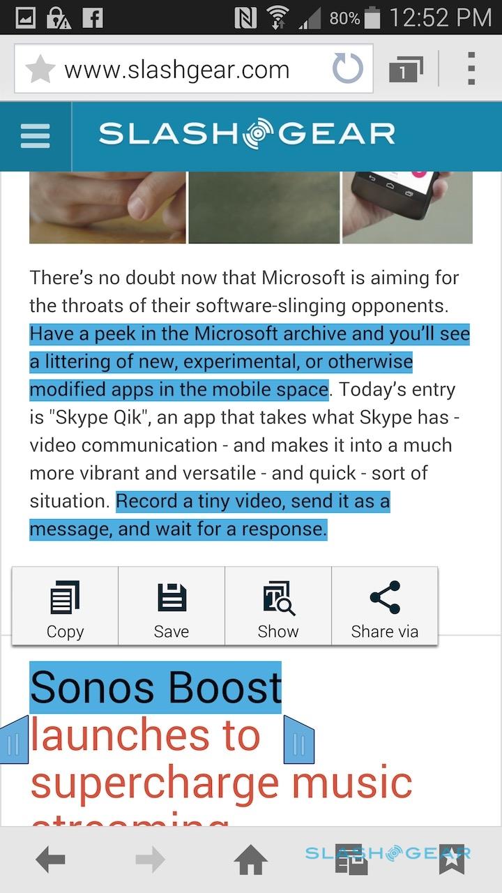
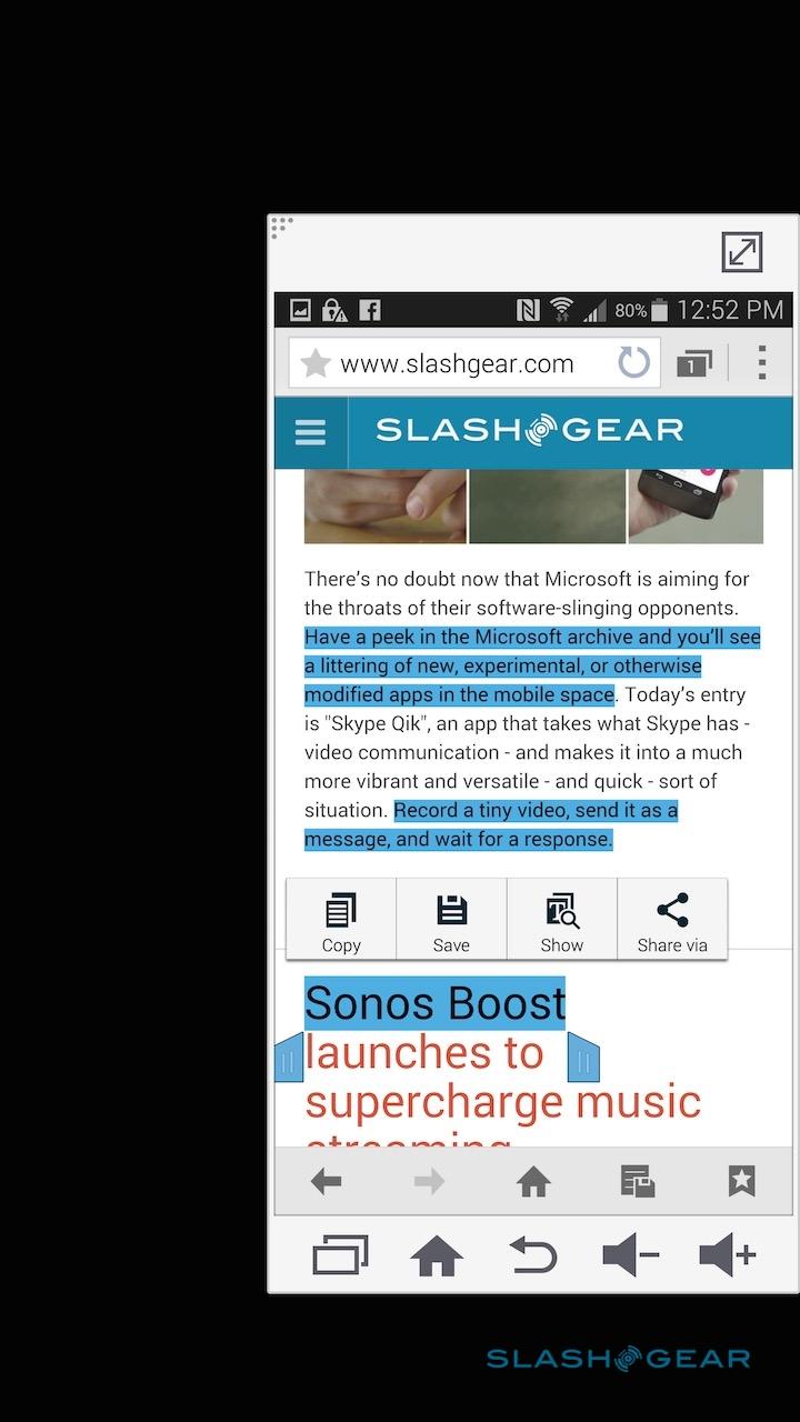
Text selection, for instance, has been made more like a mouse would operate: Samsung calls it Smart Select, and it means you can hold down the barrel button and swipe the S Pen across text and content to highlight it. Usefully, you can select multiple, non-contiguous sections of the page – by swiping across different parts – and then copy them in one swoop.
It's a small change, but it certainly cuts down on jumping between apps or paring back a fully copied page. The same multiple-select feature applies to picking out photos in the gallery, too.
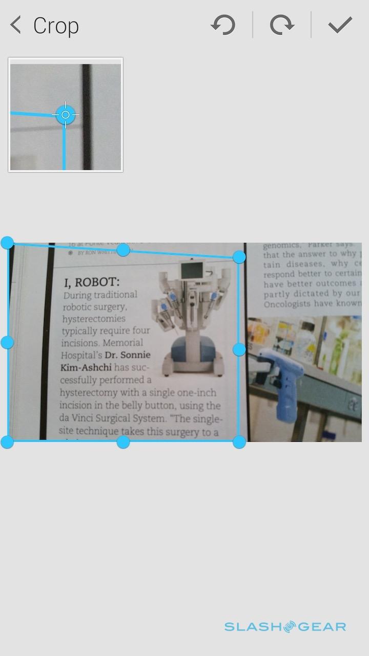
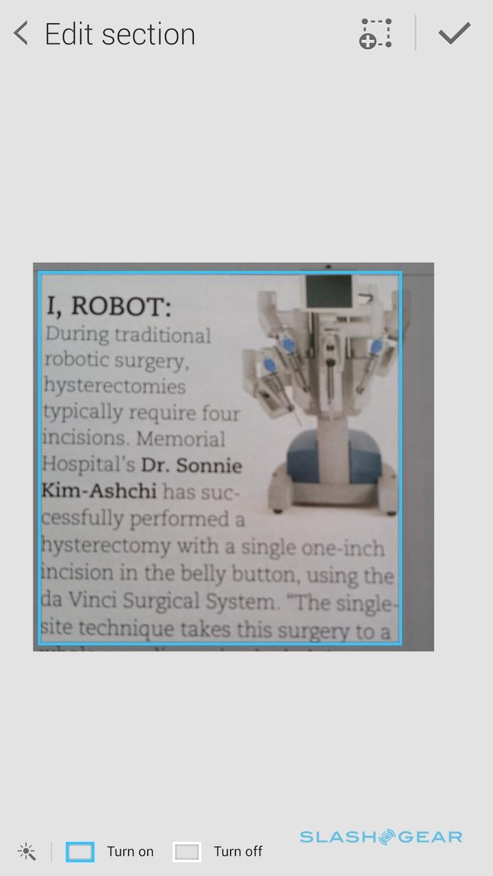
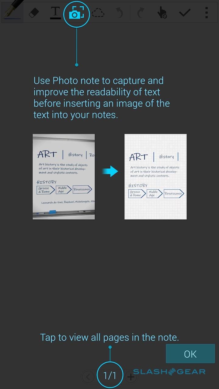
Photo Note, meanwhile, turns the Note 4's camera into a scanner of sorts. Snap a photo – say, of a whiteboard full of plans, or a recipe in a magazine – and Photo Note will attempt to convert that content into a digital version you can manipulate in the S Note app.

How successful it is depends on the original content, and what your overall ambitions are. In Auto capture mode, the phone tries to spot what content you might be interested in snapping itself, though I found it preferred images to blocks of text; to accurately select the latter, I got more consistent results tapping into Manual mode and then adjusting the capture frame myself. Alternatively, you can import a photo already taken from the gallery.

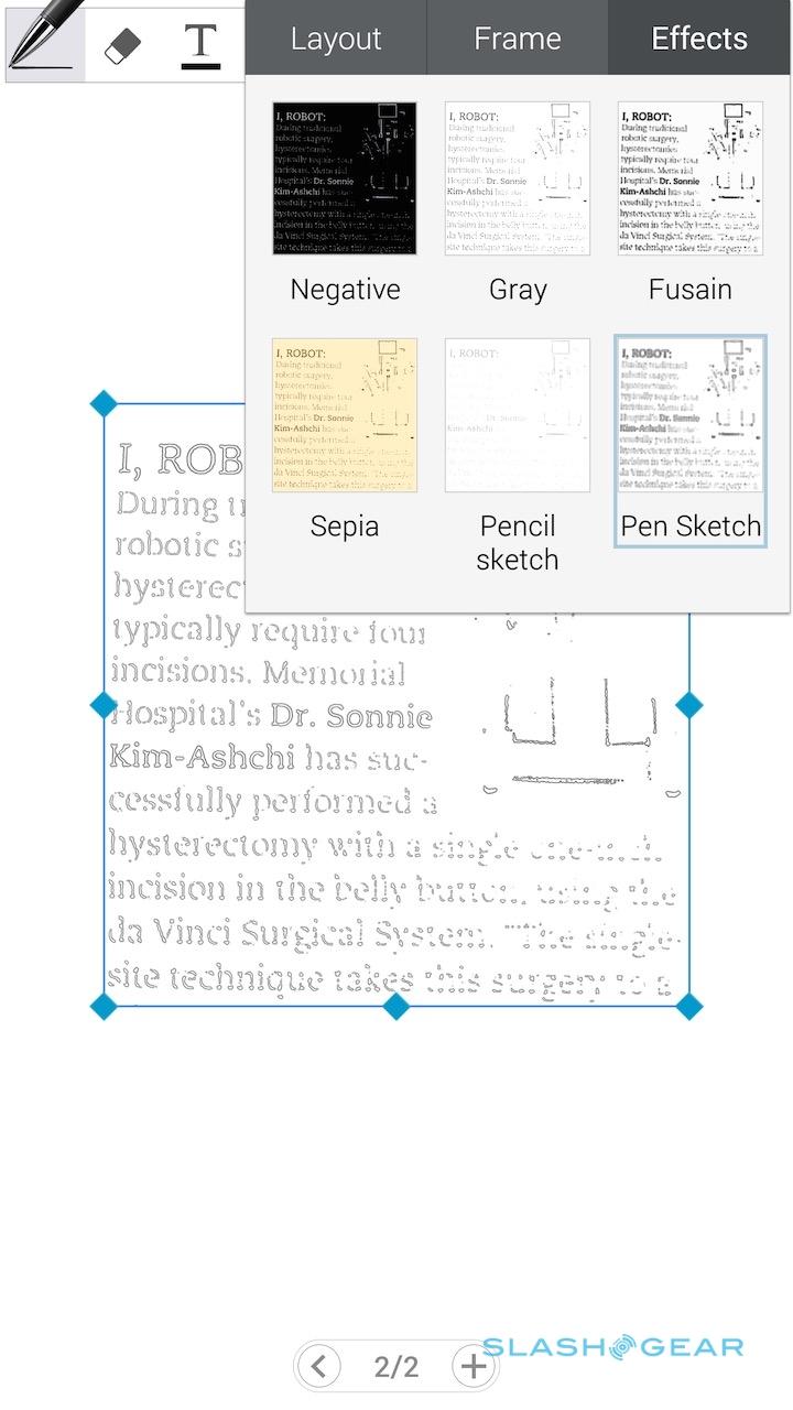
Dragging the edges of the selection box around means you can take into account capture skew – useful if you're not dead-center to the whiteboard – and then Photo Note processes it accordingly. If it's text, you can have the app try to remove the background color: the Note 4 does a surprisingly good job of replacing paper hue with plain white, for instance.
What you don't get is a fully editable block of text, however. There's no OCR to recognize the actual words, only line-recognition that means you can delete words one letter at a time. The effect is similar with images, too: if you've snapped a shot of a flowchart, for instance, you could pick apart each line of it, but it's luck of the draw whether more complex images will be editable in the way that you want them to be.
The feel of the S Pen on the screen is a different this time around, too. Samsung says its made the writing feel more akin to a traditional pen on paper, using a different nib treatment, and there's certainly more friction there.

It's a little like dragging the stylus across a very firm rubberized surface, and it forces you to slow down slightly and be more precise with your strokes. I felt like that suited handwriting – there was less of the slick-screened sloppiness that can result when your cursive is less contained – but missed the old feel somewhat during regular navigation, when the extra drag became more noticeable.
Software and Performance
The Note 4 runs Android 4.4 KitKat, with the latest version of its own TouchWiz interface on top, and just as with the S Pen functionality there's no shortage of modifications and improvements for this generation. As we praised on the Note 3, however, there's a welcome sense of consideration for how phablet owners are actually using their devices, rather than a more scattershot explosion of features that might look good on paper but have little practical use in the real world.
Many of the changes are focused on making the most of the 2560 x 1440 display and how much information you could feasible show on it at any one time.
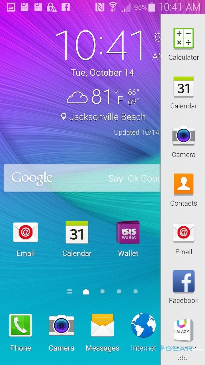
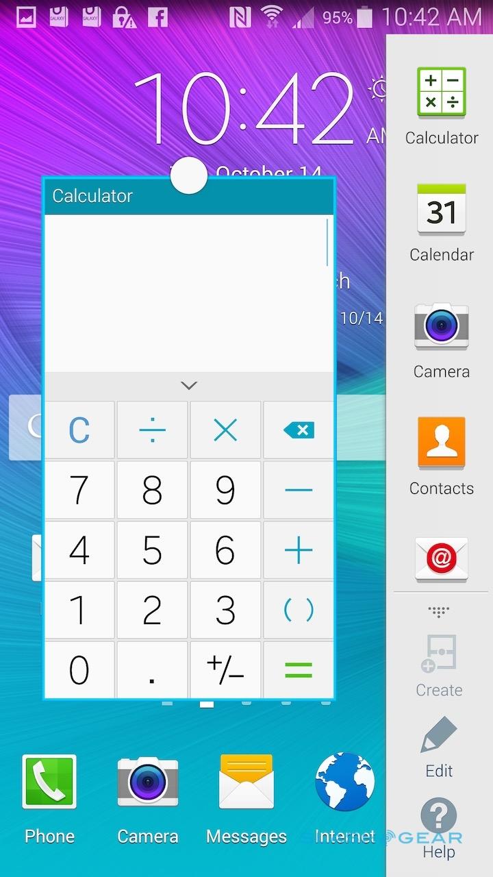
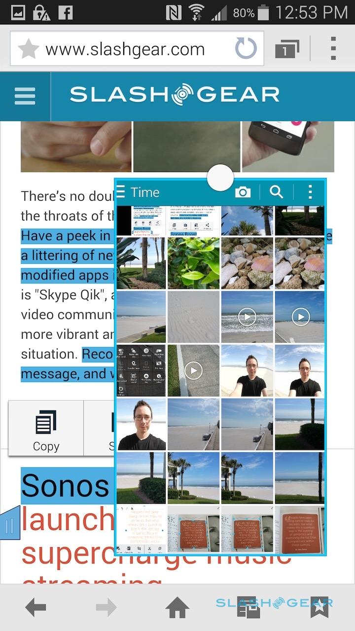
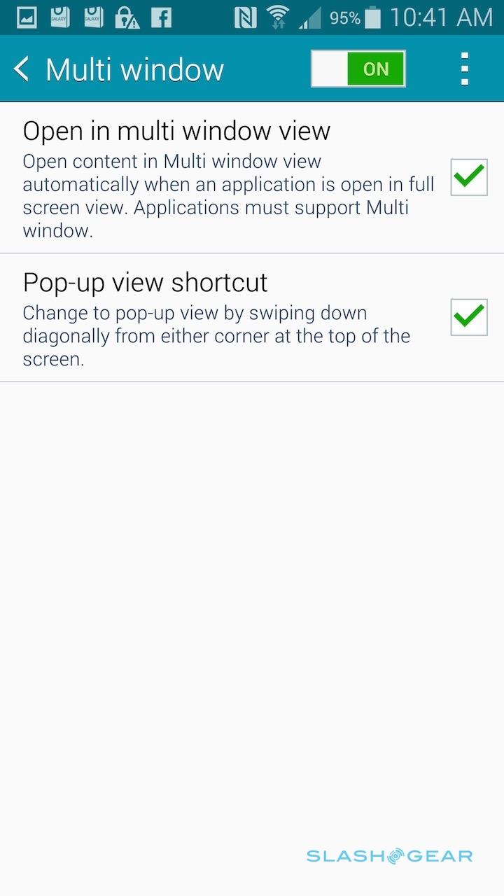
Multi Window, for instance, has streamlined how easy it is to switch an app from full-screen to windowed. It doesn't work with every app, but you can see a list of those compatible by pressing and holding the back button, pulling in the launcher bar on the right. Swiping diagonally down from the top left corner shrinks an app into a resizable window; tapping the bubble at the top allows you to shrink it further, to a repositionable circle shortcut a little like Facebook's Chatheads UI, or to maximize it again.
What's notable about Multi Window is that each app continues to operate as normal, even if it's windowed. The calculator buttons still respond to taps, the dialer can still be used to place calls, and you even get the full camera preview and can take a photo or shoot a video. Samsung suggests that could be handy if you're on vacation and want to keep swift access to the camera while simultaneously browsing a map or webpage.
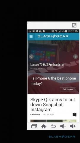
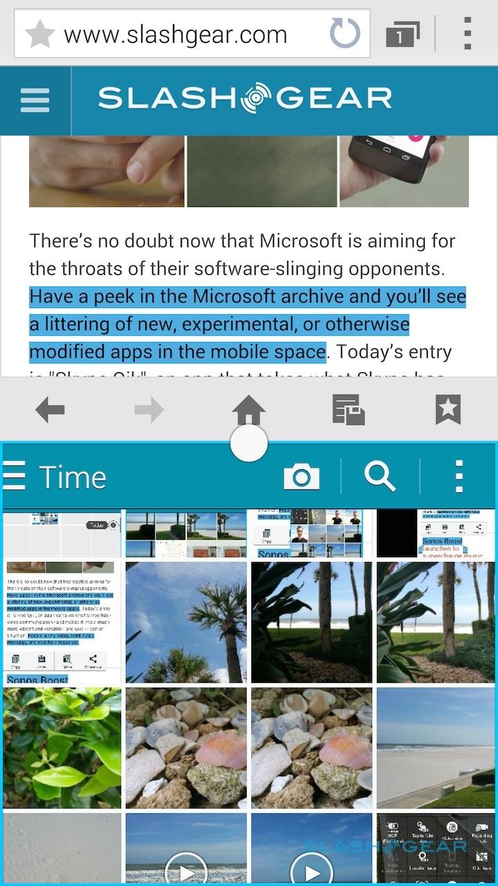
The split-screen Multi Window layout is still supported, putting one app atop the other and allowing you to resize how much space each gets.
However, there's now the ability to let compatible apps open new windows in that layout: for instance, if turned on, that means clicking a web link in the Facebook app will open a second window for the browser and keep both on-screen, rather than leaving Facebook altogether.
Content viewed in these two windows can be dragged from one to the other.
Samsung has had tools to make one-handed use of its bigger phones more straightforward for some time now, but they get a refresh on the Note 4. Swiping your thumb from the side of the screen to the middle and back again shrinks down the display, aligning it to whichever side you swiped from. You can then resize the window further, or maximize it again.
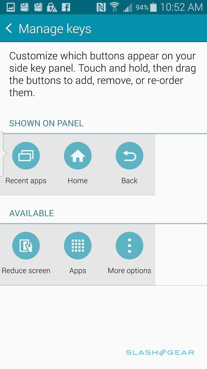
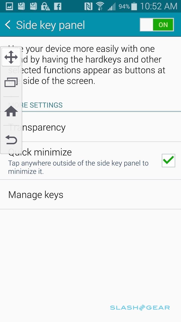
The Reduce Screen Size feature also puts buttons for the app switcher, home, back, and volume up/down at the bottom of that pane, but there's a separate Side Key Panel option which puts a pull-out shortcut menu for things like home, back, and the app menu on the left edge of the display. One-Handed Input, meanwhile, shrinks down input areas like the calculator, phone keypad, and on-screen keyboard, moving them to either the left or the right of the screen so that they're more easily stabbed at with a thumb.
Actually accessing Samsung's screen convenience features is a little less ergonomic than, say, the Reachability feature on the iPhone 6: sometimes, when trying to swipe in and out from the edge to shrink down an app on the Note 4, I just ended up pressing on-screen buttons instead. Once you've managed it, though, it's more flexible than Apple's approach of simply bringing the top half of the interface down to the bottom half of the display.
Samsung's voice control system, S Voice, can now be set to constantly listen out for commands rather than require a long-press on the home button to trigger, though there's unsurprisingly a hit in battery life if you turn it on. Like Motorola's voice system on the latest Moto X, you can set a custom wake command to wake up S Voice, though there's not the same seamless Google Now integration, which is a pity.
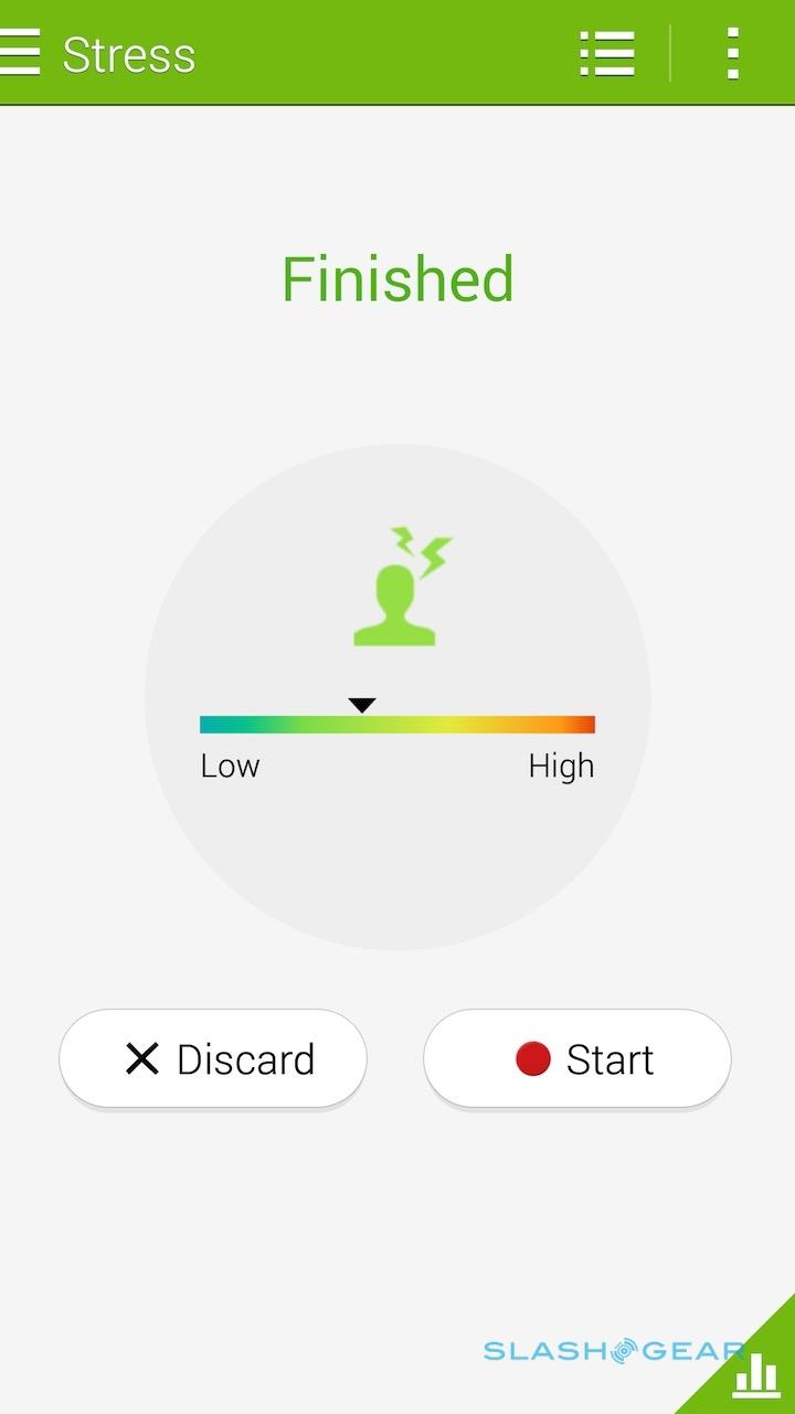
S Health, Samsung's fitness tracking app, has improved to take advantage of the new metrics the Note 4 is capable of collecting. If you're an existing user, you can log in with your Samsung account and have all your historic performance data imported across; there's support for fitness and food tracking.

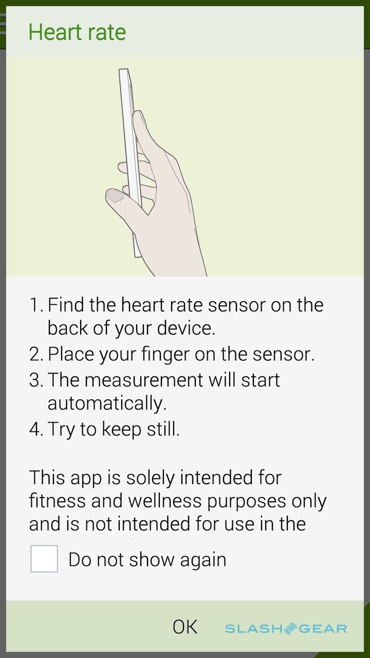
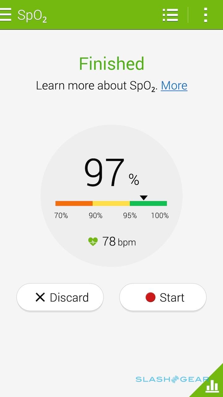
It also logs heart rate, blood oxygen levels, and oxygen saturation (SpO2), in addition to figuring out stress levels and even measuring sun strength using the sensor integrated under the camera on the rear.
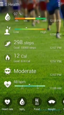
S Health is quick to point out when you first use it that these aren't intended as medical-grade measurements, but I struggled at times to get any measurement at all.
The sensor is incredibly finicky about how you press your fingertip against it: half the time, I'd wait 30-40 seconds only to be told I'd not had my finger in quite the right spot, or that I must've moved during the reading.
In short, while it's a clever idea on paper, in practice I found it to be of mixed usefulness when out in the real world, beyond the basics like pedometer.
Considering I had such a moderate success rate when I was doing nothing more energizing than simply sitting at my desk, the thought of taking a pause while out jogging, maybe, and then trying to stand still enough while jabbing my finger against the recalcitrant sensor to avoid the sad bloop-bloop of the failed-reading message is enough to dissuade me from using it regularly.
Camera
Both the main and front cameras on the Note 4 have had an overhaul, and they're all the better for it. The main camera pairs a 16-megapixel sensor with an f/2.2 lens and optical image stabilization (OIS), while the front camera has a 3.7-megapixel sensor and an f/1.9 lens for improved low-light performance.
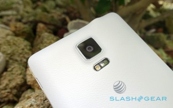
Samsung's camera app itself has been updated, too, with a number of new features. For the front camera, there's a new Wide Selfie mode which is effectively a vanity sweep-panorama: it automatically stitches together a 120-degree frame so that you can fit more people in at once. Selfies taken with the rear camera, meanwhile, allow you to first choose where you want your face to be positioned in the final frame – next to the Mona Lisa, for instance, rather than in front of her – and then uses audio tones to tell you when you're lined-up properly.

If you're less interested in taking photos of yourself and more in general photography, there are new modes there too. Live HDR (High Dynamic Range) not only delivers more balanced photos where usually areas of particular darkness or lightness might lead to murkiness or blow-outs, but gives a real-time preview of the end result while you're framing.
A new Advanced Digital Zoom, meanwhile, tries to make up for the absence of a proper optical zoom: when you're between 4x and 8x, it takes multiple images simultaneously and then interpolates their details, coming up with a more precise end result. In practice, it works surprisingly well on stable subjects, though I found a little blur could enter when trying to do the same for fast-moving subjects.
In general, though, the Note 4 produces some excellent stills. There's plenty of detail and the contrast balance generally proved accurate when the phone was left to its own devices; alternatively, it was easy to manually pick an exposure point. Colors proved a little more muted than on some other phone cameras, but not unpleasantly so, and indeed some I showed the images to preferred them to the overly-rich shots from rival devices.
Focus lock is particularly swift, only struggling to keep its position when dealing with close-up subjects. Nonetheless, macro shots came out well, and the OIS does a solid job of smoothing out hand-shake.
Unlike an iPhone 6 Plus, that optical image stabilization is also available during video recording. The Note 4 can shoot at 4K Ultra HD resolution to match its display, though in that case you get 30fps at most; in 1080p Full HD mode you can choose between 30fps and 60fps. There's also support for 1/4x (120fps) and 1/8x (240fps) recording for slow-motion playback.
Galaxy Note 4 Ultra HD video sample:
The results are equally impressive as for stills. Colors are lifelike without being unduly punchy, and motion is smooth. The Note 4's speedy focus lock is evident, too, and there's little of the focus-hunting that other phones can suffer.
Galaxy Note 4 Full HD video sample:
Phone and Battery
The irony I considered every time I held the Note 4 to the side of my head for a call is that the audience for the phablet probably uses their handset for voice more often than most other smartphone owners do. Scale aside, it's a great option if you're a frequent caller. The earpiece is bright and clean, callers had no issues hearing me, and even more impressive is the strength and clarity of the speakerphone. Samsung may not have found space for stereo speakers, but the Note 4's single speaker on the back is loud and proud.

If there's one thing power users would scream about, it's if Samsung didn't do its level best to fit a huge battery into the Note. Happily the Note 4 doesn't stint there, with a 3,220 mAh pack that's not only capacious but user-removable, too.
You may not need to switch it out with a second battery as much, however, since the Note 4 also supports fast charging. In fact, it supports two such standards: Samsung's own Fast Charge, and Qualcomm's Quick Charge. Either way, the promise is a 50-percent charge in around 30 minutes, something I found to be accurate.
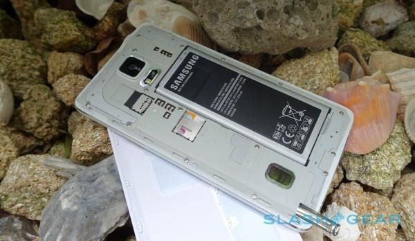
It's worth pointing out that you'll need a special charger to actually support the rapid charging system, but Samsung does include it in the box.
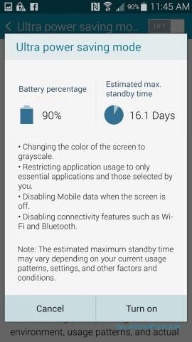
If you can't even spare thirty minutes, there's also a range of power saving modes to choose between.
They can vary from a light touch – restricting background data, perhaps, or throttling back the processor – through to switching into greyscale mode, and finally Ultra Power Saving mode which curtails apps to calls, messages, calculator, clock, S Planner calendar, and browsing, locks the screen into low-brightness black & white, and could give anything up to three weeks of use from a full charge.
Of course, such use would be severely limited – in fact, you'd probably be better off with a feature phone, though even then you probably wouldn't match the Note 4's longevity – but even with less draconian measures the phablet has legs. I was able to get two days of use from a charge without nannying it.
Wrap-Up
Samsung created the phablet segment with the original Galaxy Note, and the Note 4 comfortably keeps the crown. Incredibly well specified, with a noticeable step up in build quality, a fantastic display, and a highly capable and flexible camera, the Note 4 makes no compromise on battery life either.

Just as important, though, the Note 4 hasn't lost its focus on the power users that are most drawn to it. While I've criticized TouchWiz in the past for its cutesy graphics and somewhat disjointed feel, this latest iteration looks far more cohesive and actually offers features that improve everyday use.
There's a premium to be paid for all that, with the Note 4 coming in $100 more than the typical $200 subsidized price for a new high-end handset in the US. It's hard to begrudge that, though, given the combination of hardware and software. Whether you're a digital notetaker or a mobile artist, the accurate S Pen, detail-friendly resolution, and clever multitasking add up to a phone that's a step above most others for simply "getting things done."
