Roku Mobile App v4.0 For iOS And Android Streamlines Navigation
Roku's mobile app is getting an update today on iOS and Android, and streamlining is the name of the game. The update adds a number of shortcuts to the main screen, putting some of the more popular Roku features front and center for easy access. On top of that, a new "What's On" tab aims to make finding content a little easier for you indecisive types.
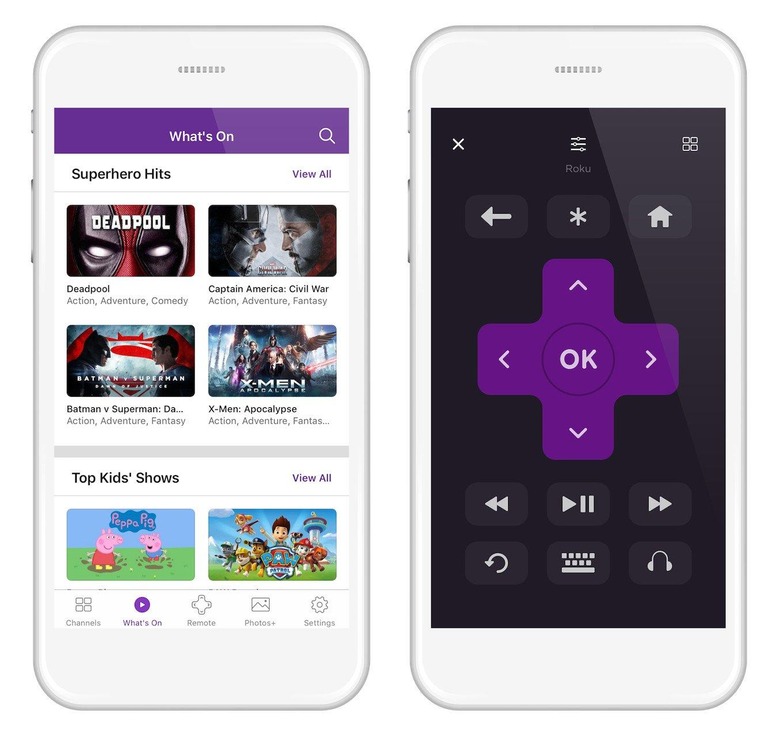
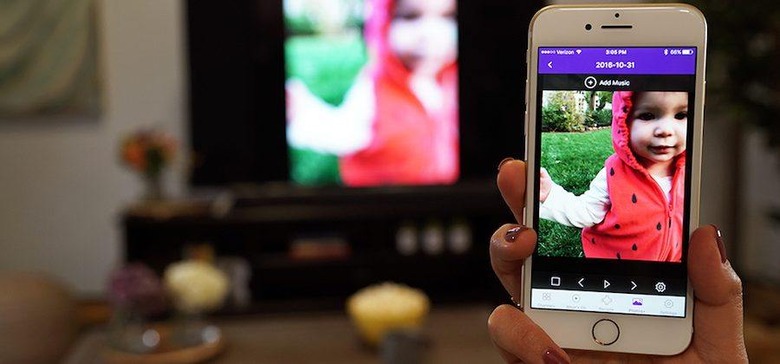
First, we'll start with Roku's new navigation bar. Stretching across the bottom of the app, you'll find shortcuts to your channels, the remote, What's On, Photos+, and settings. The channels and remote shortcuts are fairly straightforward on their own, and you'll use Photos+ to share the photos and videos stored on your device to your TV.
What's On is a new menu that shows a "hand-picked" selection of content. This can vary between movies and TV shows, and includes content that's available for free, rental, or purchase. In other words, the next time you sit down without knowing what you want to watch, you can venture into the What's On menu in the hopes of finding something that catches your eye.

The remote has also received something of a redesign. Roku says that it's rearranged the buttons in the app remote to more closely match the buttons on your physical remote, which it hopes will make it easier to use with one hand. You'll also find a shortcut to your channels on the remote itself, and now when you start streaming a channel from your list, the Roku app will automatically pull up the remote.
Today's update is nothing Earth-shattering, but the number of a ease-of-use improvements being made here should be welcomed by users. This update, which brings the Roku app to version 4.0, is rolling out today, so you should see it soon if your app hasn't updated already.
SOURCE: Roku
