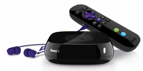
Roku 3 Player Unveiled, Boasts Redesigned User Interface
Those who love the tiny, inexpensive, and all-around awesome little set-top box called Roku will be happy to know that the latest edition has just been unveiled, Roku 3. The set-top box features a sleek black design with rounded, slightly tapered edges and the same signature remote that users have come to love. Check out a picture and video of the device, as well as its specs, after the jump.
One of the biggest changes that users will notice is its new interface, which you can check out in the video below. Says Roku, the updated design offers quicker access to content and features, as well as more content and options being displayed on the screen. Both Search and the Channel Store have been integrated into the home screen to accompany their new designs.
Another new feature is a headphone audio port on the set-top box itself, making it simple to plug in your headset and have a private listening session. When a pair of headphones are plugged into the Roku 3, audio will automatically be switched to the headset while the TV's speakers are muted. No manual settings changes are required; it's all plug-and-play.
Those who use the Roku 2, HD 2500, LT, and Streaming Stick models will see the new user interface roll out as an auto update sometime in April, although a definitive date wasn't given. As for the Roku 3, you can pick it up now from the company's official website, at Amazon or other retailers online. It is priced at $99.99.
[via Roku]
