Project Magazine For iPad Gets Hands-On, Takes A Swing At The Daily
As you might well be aware, the new magazine for iPad, Project, was released this morning. Amid reports that it's both cool and ... not innovative enough, comes a punch from Chris Bell (who's working with the magazine to "guide it along") at Rupert Murdoch, whose "The Daily" newspaper will perhaps attempt to compete with Project in the future: "As Project went on sale, reports emerged that Rupert Murdoch will soon launch an iPad-only newspaper called The Daily, after it came to him in a dream or something. Which, like all Murdoch products, shall doubtless enrich humankind with its impartial political analysis and rolling coverage of shit exploding. Also: hi-def nudity, fingers crossed. But the point stands: the irascible Aussie despot doesn't throw his corked hat into the cyber ring until he's sure of a market."
That quote above comes direct from a post over at Project's online blog counterpart – whether this blog will end up working side by side with the magazine is yet to be seen. Chris Bell goes on to describe working on the mag, saying it's not at all like Minority Report (as some publishers expected (me, for example)), but more "like making a normal paper magazine, but about 1,000 times more fiddly." — Props to Nick Rizzo for directing us to this article.
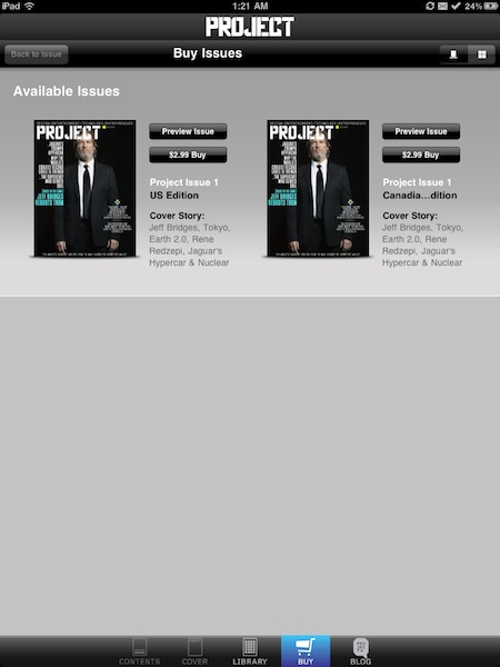
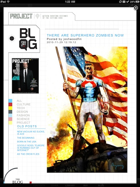
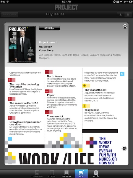
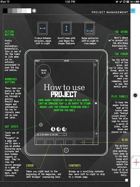
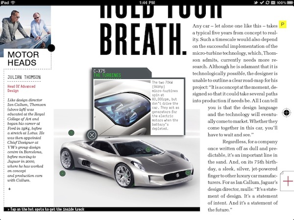
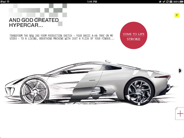
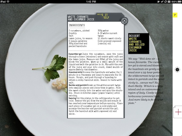
Then there's MacStories who accessed the magazine early on the Italian App Store and posted a bunch of screenshots showing the innards of the first issue of this magazine. One of the first and most interesting aspects of the Projects app answers my previous question — included is a formatted for iPad version of Project's blog.
MacStories goes on to say that besides the lovely moving pictures and videos, they easily draw comparisons to the functionality seen in other iPad mags such as Wired's app, Fortune, The New Yorker, and other Conde Nast publications. What's unsettling is the idea that you can't select text, you can't zoom, and there's basically no options for how you're going to view what you want to view. MacStories describes the app as a "PDF with some interactive elements and pretty navigation" in it's user interface.
So basically this magically beautiful magazine doesn't reinvent the iPad based publication, but does score points for being well designed graphic design wise. Feel free to add your two cents below should you happen upon a copy today. TRON for crying out loud, TRON!
[Via MacStories]
