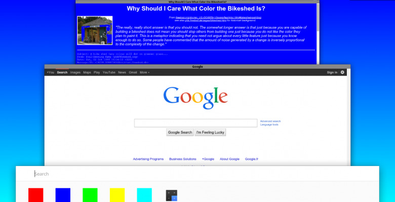
'Project Athena' Aims To Revamp Chrome OS
Material Design is Google's new path forward for Android, but it might also be making its way to Chrome OS. A screenshot of an OS redesign called 'Project Athena', shared by Chrome evangelist Francois Beaufort, hints at some very mobile features coming to the desktop.
The updated user interface that may be coming to Chrome OS takes a lot of cues from Android's Chrome. Tiered windows give way to a more streamlined management tool, and a pared-down bookmarks bar highlights simplicity over all else.
This isn't the first time Athena has made an appearance, either. Athena has previously been tied to split-screens and onboard keyboards. That led Chrome OS fans to cry out for a Chrome tablet, something that has eluded the Chrome OS faithful. Several touch-friendly tweaks make it perfect for mobile, but Google seems content with keeping Android as their mobile offering.
Athena is likely an overhaul to make design a bit bolder and simpler, which is the aim of Material Design. Touch-friendly use cases will make the platform more attractive to users and OEMs alike, as the popular touchscreen Acer Chromebook proves. Tying Chrome in with Android, at least aesthetically, is a nice choice, too.
Source: Google+
