PlayStation Now Gets A New UI Worthy Of Streaming Name
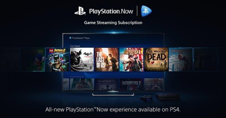
PlayStation Now has been dubbed by some as the Netflix of games due to its streaming nature but up until now, that was pretty much only in name. Now, Sony's game streaming service has something to show for it as well. Taking a cue from the design of actual streaming service, the PlayStation Now interface just received a face lift which truly makes the nascent gaming trend feel more like a streaming service and less like a hard to reach corner of the PS Store.
Previously, looking for PS Now titles was like a hunting game onto itself. You'd have to navigate through the PlayStation Store. That's not really bad but it gives off a different impression, and not exactly a positive one at that. Netflix, Hulu, and its kin have pretty much defined how streaming services should look like. It's focused less on the transactions of buying/renting content and more about easily finding content. In short, the store is only secondary. Browsing the catalog is key.
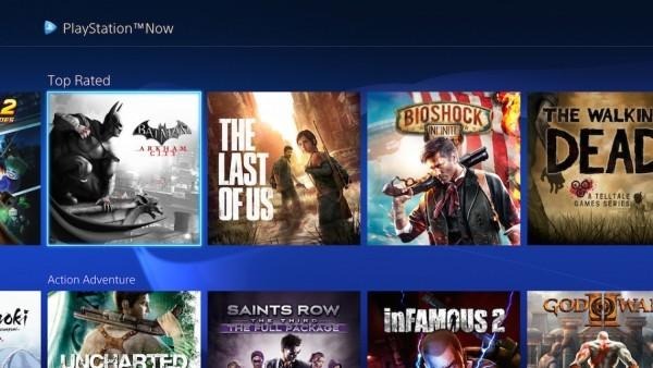
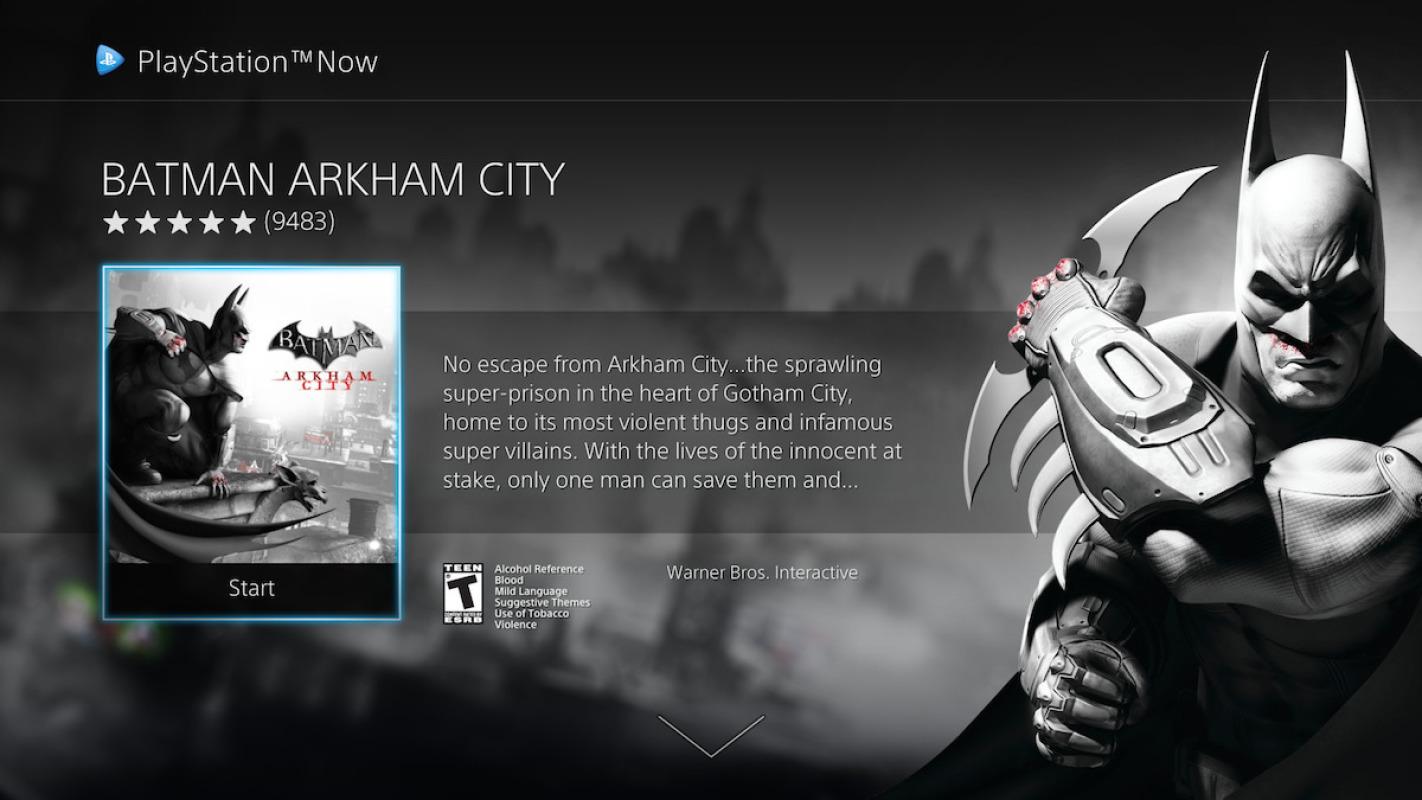
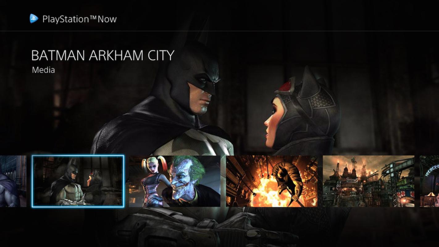
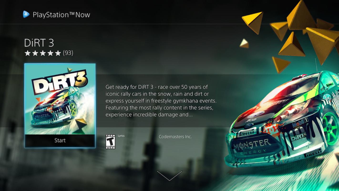
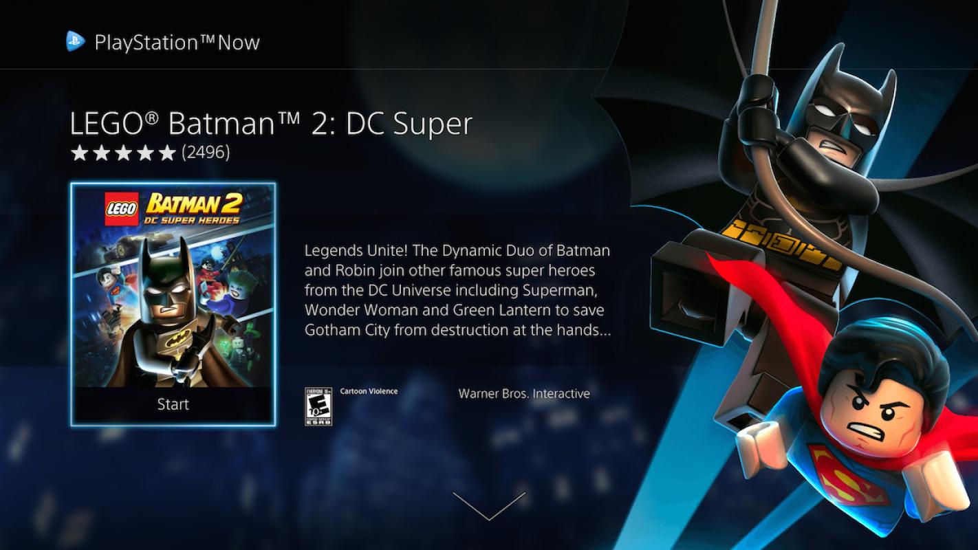
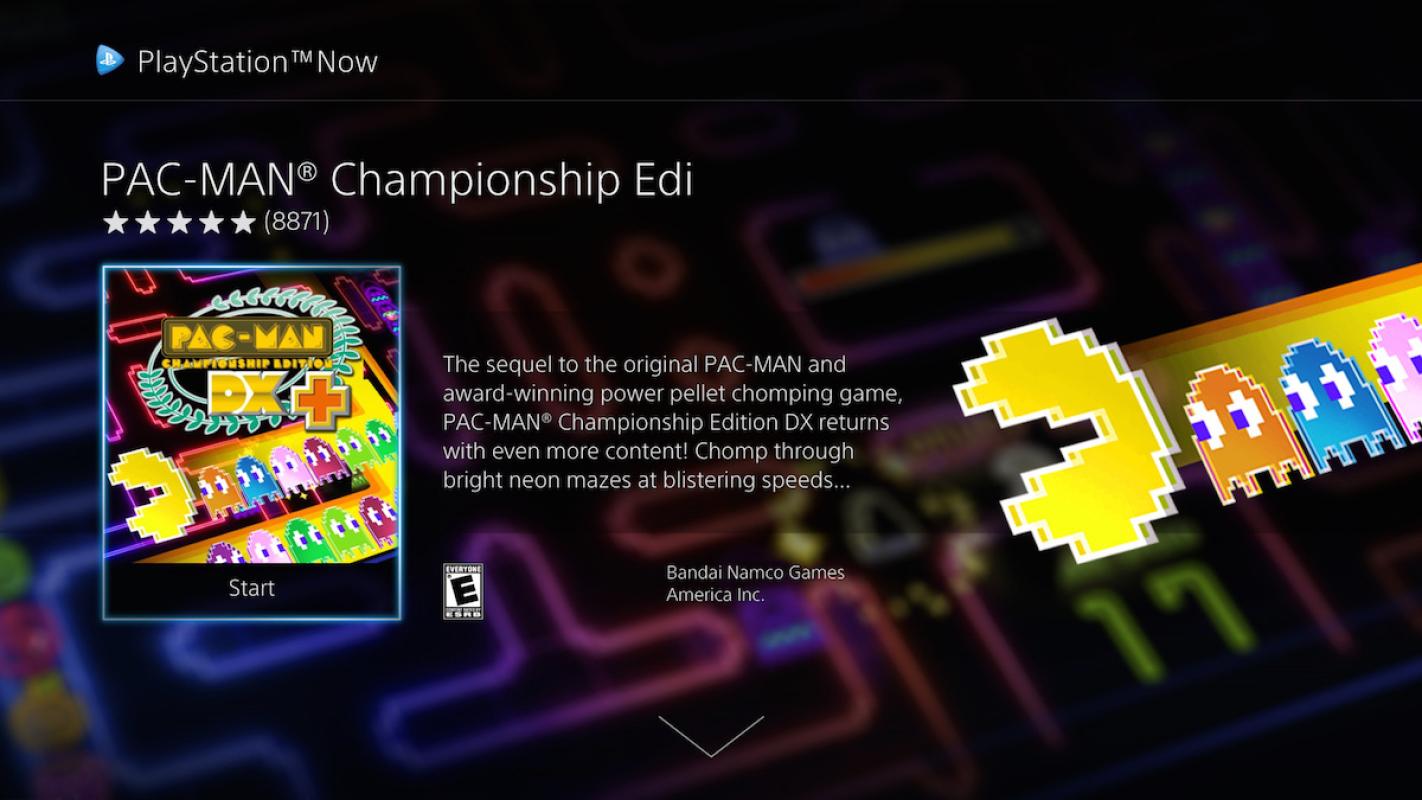
Those are the rather big changes that Sony has implemented in the new PlayStation Now screen. You will now see tiles of games arranged in rows, grouped in categories like Featured games, Recent additions, and genres. Flicking through titles is a breeze and more engaging. Choosing a game brings up more details presented similar to TV shows or films. And from there, its as easy as a single tap to start the game.
The new interface is both subtle yet substantial. It does little to change the service's content, though Sony did also announced new games to be added to the roster. At the same time, it considerably improves the user experience and meshes well with people's expectations of streaming services these days. Of course, that benefits existing PS Now subscribers. Trying to rope in fresh customers will definitely take more than just cosmetic changes.
SOURCE: Sony
VIA: Engadget
