Pinterest Shows Off New Site Design, Invites Users To Test It Out
Pinterest has announced that it's got a new site design in the works, and it's looking for a select group of users to test it out. As detailed on the Pinterest Blog, this isn't a massive site redesign, but the developers are rolling out a few changes in the hope of making the overall experience smoother for users. These include changes to navigation and pins themselves, so while Pinterest isn't shaking too much up, the features it's implementing are pretty significant.
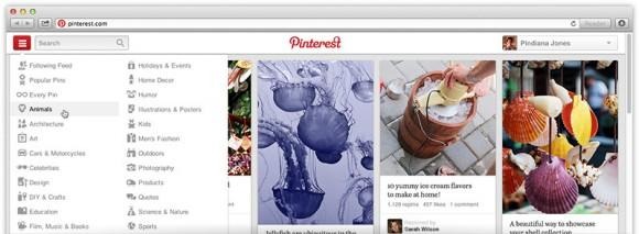
Regarding the changes to navigation, Pinterest is keeping its description short. The company only says that it's made navigation more "intuitive" and faster to boot, showing off a half-image of the new interface. We can see a new drop-down menu split into plenty of different categories on the left of the page, so look forward to that once this new design lands later on down the road.
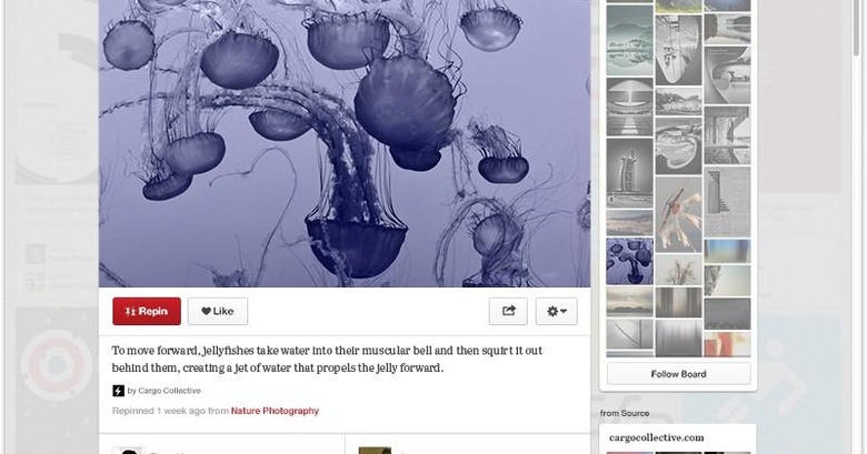
Pins are also getting something of an overhaul in this redesign, with Pinterest making them bigger in general. Users will also see more information related to the pin they're viewing, as the new site will show related pins as well as additional ones from the same board. In other words, expect to lose track of time while browsing Pinterest more often than you already do.

There's no word on when these new features will roll out for everyone, but for now, Pinterest is only going to be testing it with a small group of users. If you want to join this elite few, you can submit your information to Pinterest to be considered as a tester. The company seems to be keeping most things under wraps for the time being, so hopefully we hear a bit more about this redesign soon. Keep it here at SlashGear for more.
