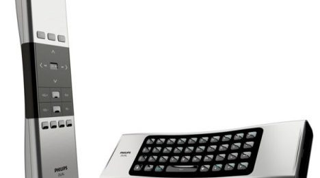
Philips Home Control DUAL Hides The QWERTY Keyboard On The Bottom
If you don't think gesture control is the revolution for your living room, and want something a bit more traditional, but still adds that flair of the future you're so eagerly anticipating, then Philips might be the safer way to go. At least, as far as concept designs go, anyway. Their new Home Control DUAL remote control proves that all sides, the essential ones, anyway, can be utilized to the best of their ability, and make your next remote all the more useful.
As the image above clearly shows, the Home Control DUAL remote control promotes buttons not only on the top, but also on the bottom of the remote. And, with many more remotes now featuring full QWERTY keyboards, why would you want it all on one side, cluttering everything up? Philips' decision to conceptualize the full keyboard on the underside of the remote, and making it a full landscape one at that, means that we have more room to type on, hopefully making it more comfortable.
As we get back into the whole Internet-connected TV trend again, and we navigate through our favorite web spaces right there from our TV, we'll need more remotes like this. And, with the Home Control DUAL's touchpad, you'll be able to navigate the cursor with ease, from one corner of your screen to the next. No word on when this could see the light of day, unfortunately.
[via App Market.tv]
