Pebble Smartwatch Review
Pebble stole Kickstarter's heart, eclipsed companies hundreds of times its size at CES, and got many people reconsidering the role of the wristwatch in today's smartphone-saturated world: not bad for a startup already burned once from a failed smartwatch project. After taking more than $10m in crowdfunding, Kickstarter began shipping out its Bluetooth-connected watch late last month, aiming to fulfil nearly 70,000 backer pledges by March, and then move onto $150 preorders after that. So, will Pebble's vocal supporters get some smart bang for their Kickstarter buck? Read on for our full review.
Hardware
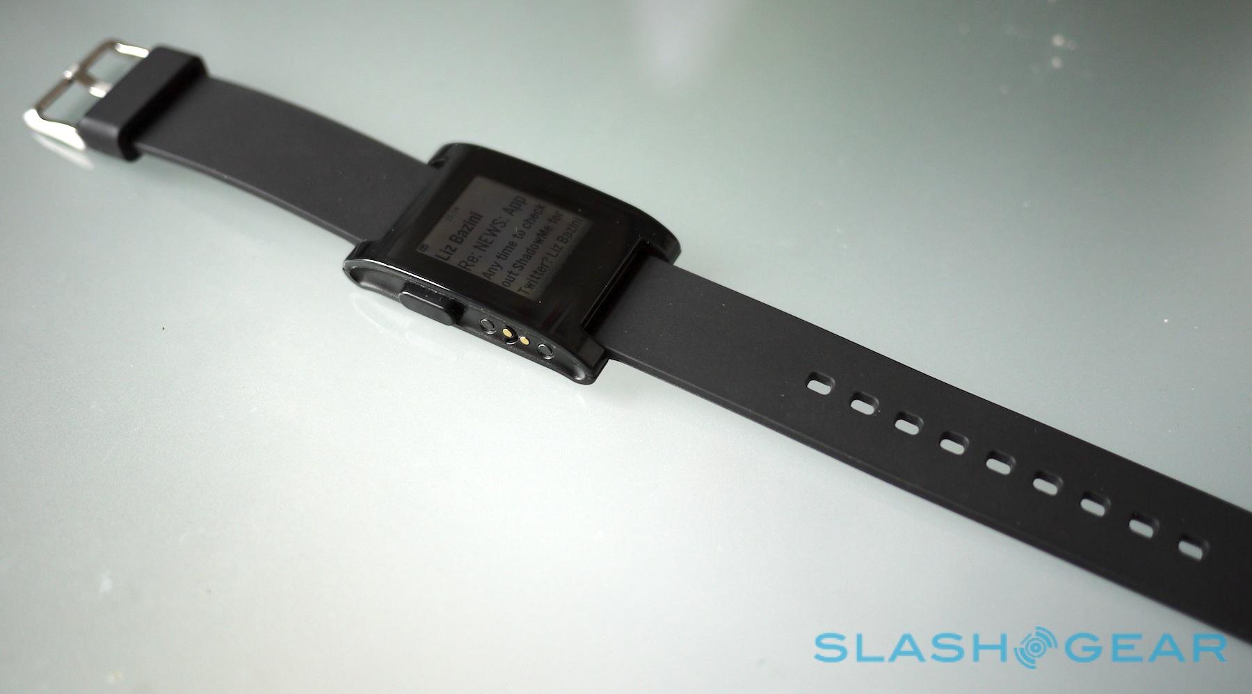
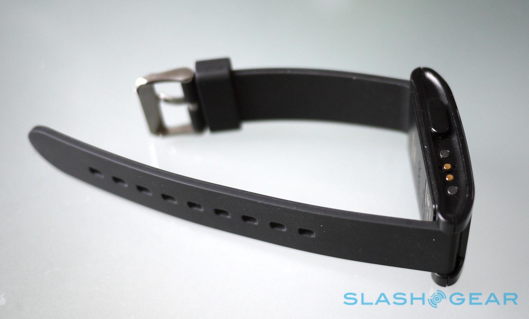
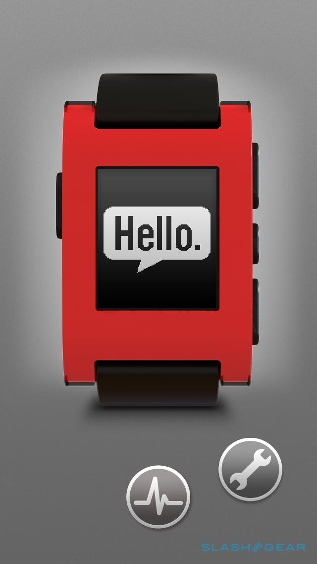
Functional. That's probably the best way to describe the Pebble, especially if you ordered the black version. The standard strap is a chunky black rubber affair, with enough holes for even the plumpest of geek wrists, though you can switch it out with any standard 22mm band. It's comfortable enough, though not especially stylish. It raises a quandary for those who still wear watches; Pebble feels akin to a basic Swatch, and if your wrist is normally home to something more expensive, you'll have to decide whether the smartphone connectivity is worth the loss in good-looks and cachet.

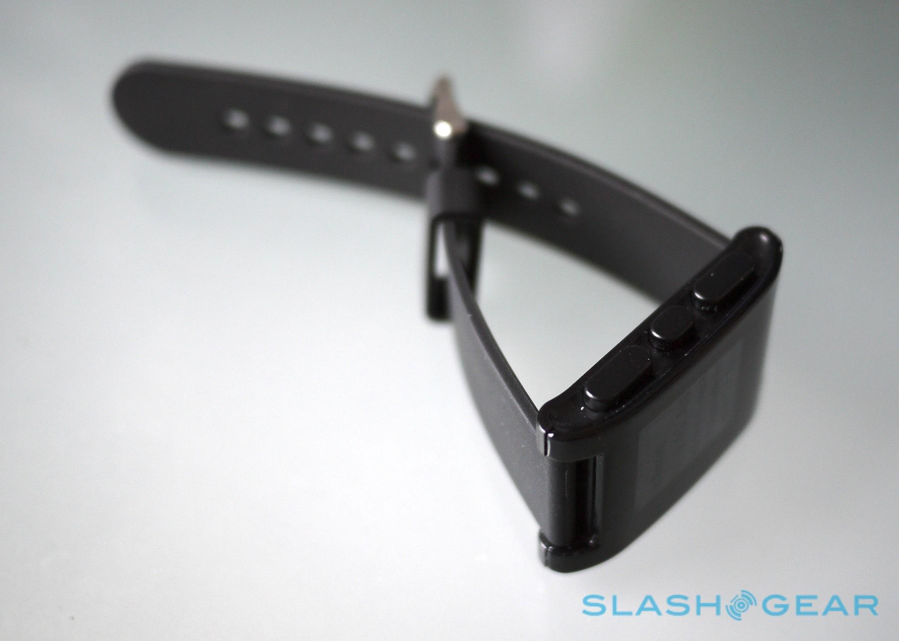
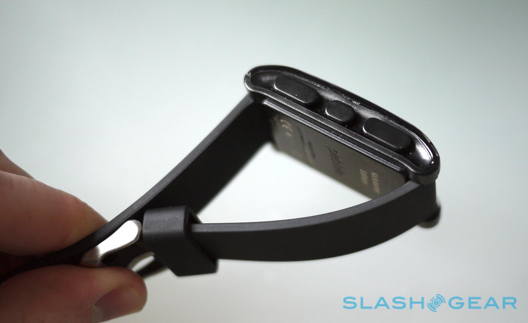
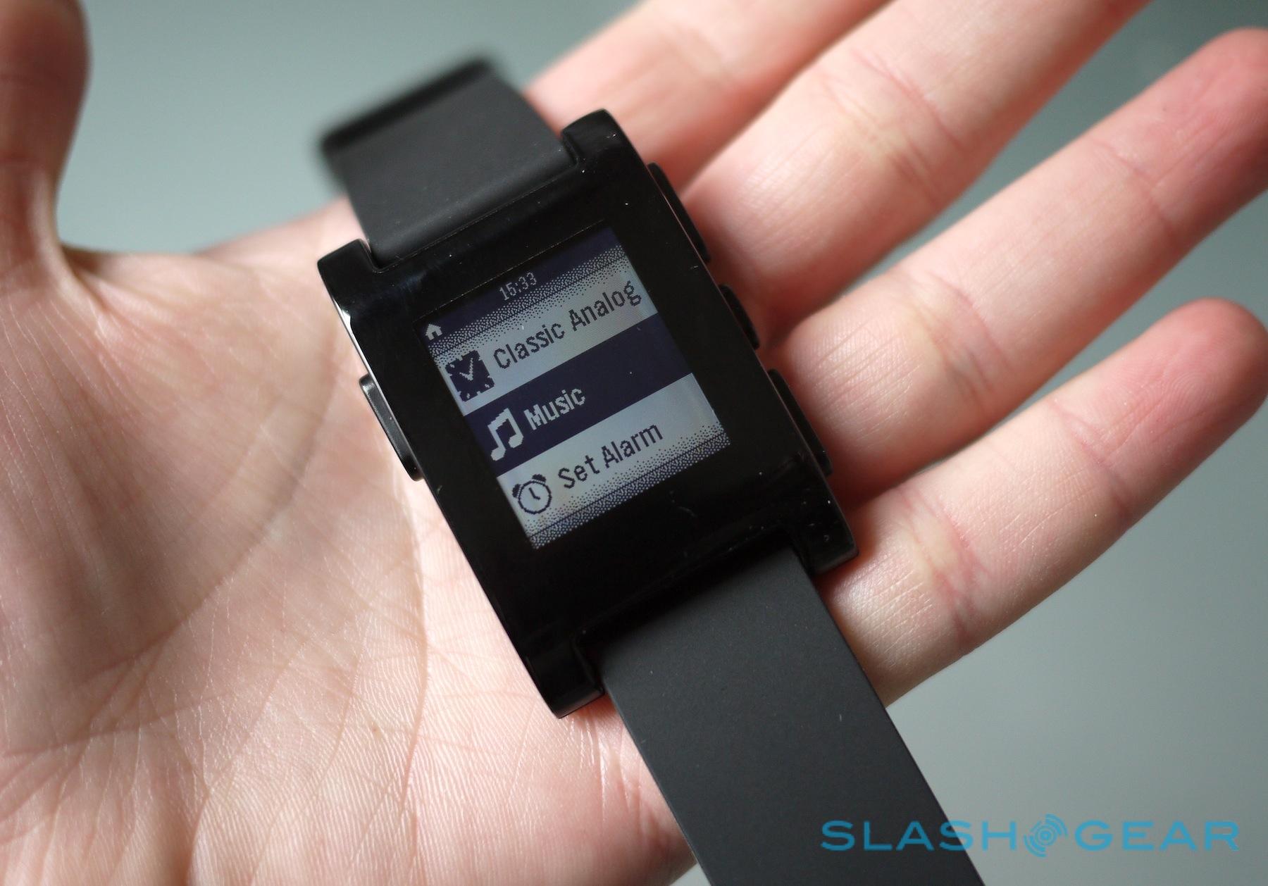
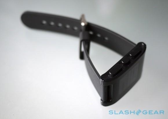
As for the main unit itself, it's solid but hardly inspiring in its design. The fascia is a shallow arc of high-gloss shatter- and scratch-resistant plastic that picks up fingerprints with alacrity, while there are four large, easy to press buttons spread around the sides. On the left, a single button calls up the main menu, while the top and bottom buttons on the right scroll up and down; the center right button works as a select key.
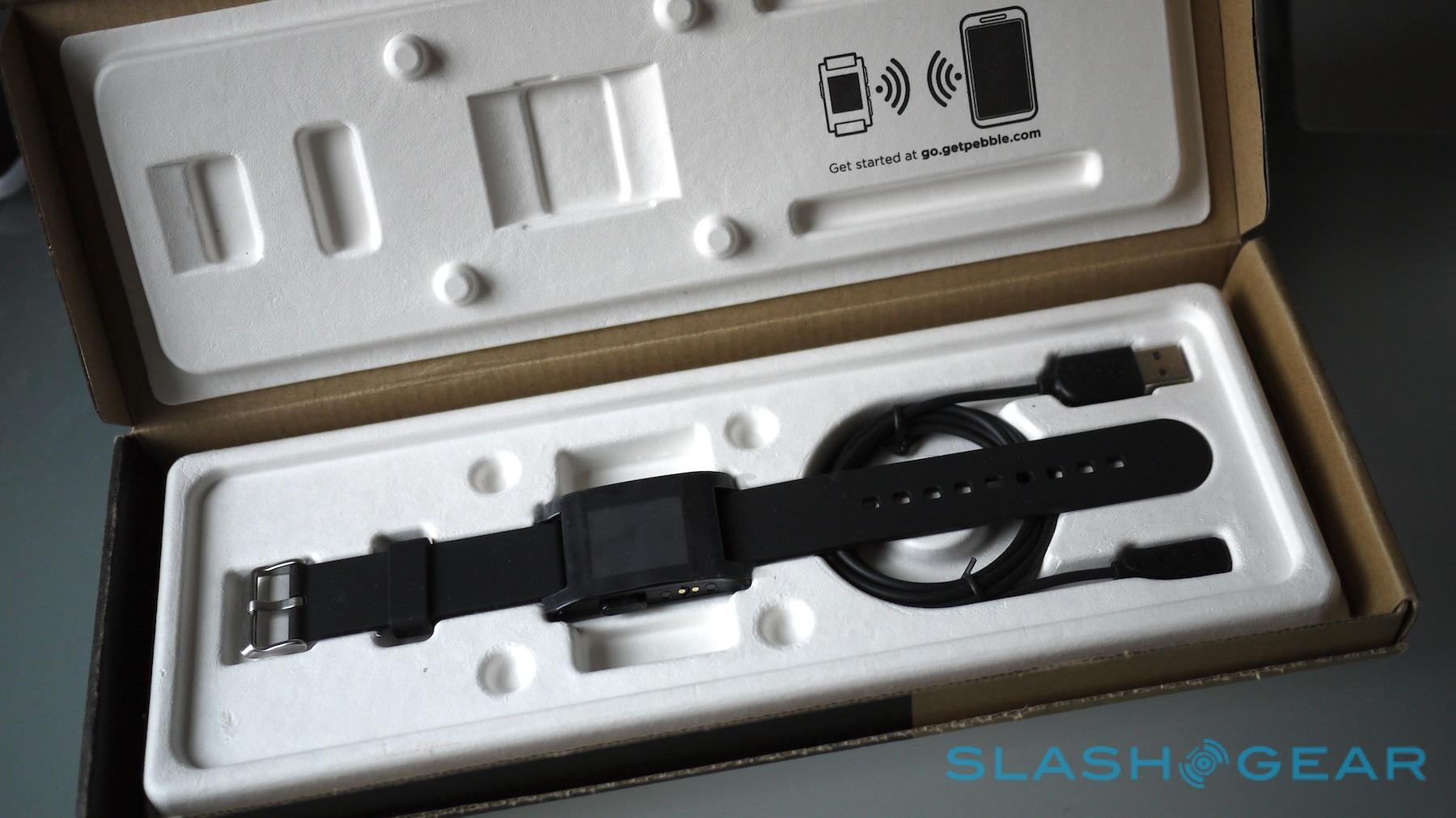
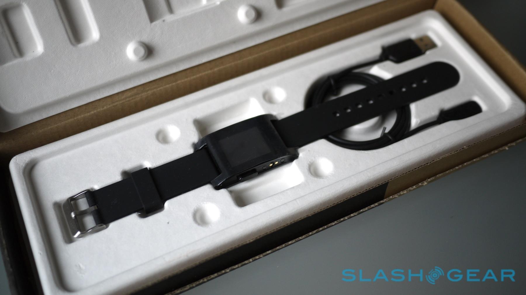
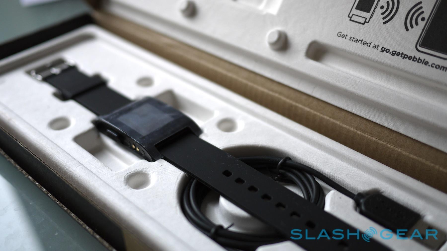
Pebble opted for a sealed, non-user-replaceable 140 mAh battery, since that allowed the watch to be made water-resistance. In fact, it can handle 5 ATM, meaning you can go swimming while wearing it or keep it on in the shower; it's also happy with either fresh or salt water. To charge it, there's a proprietary magnetic dock connector on the left edge, to which an included USB cable clings. There's no AC adapter in the box, though you can use a USB port on your computer or any standard USB charger (such as that came with a cellphone).
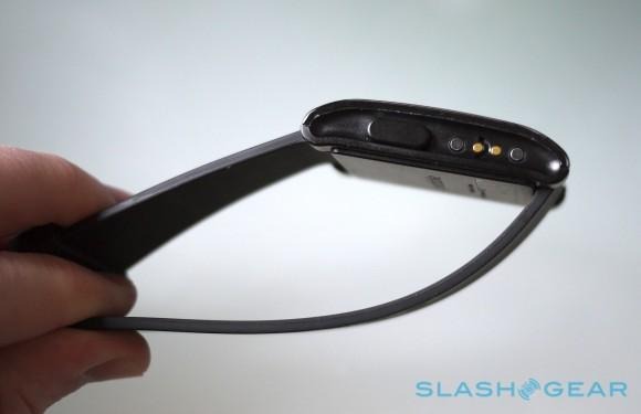
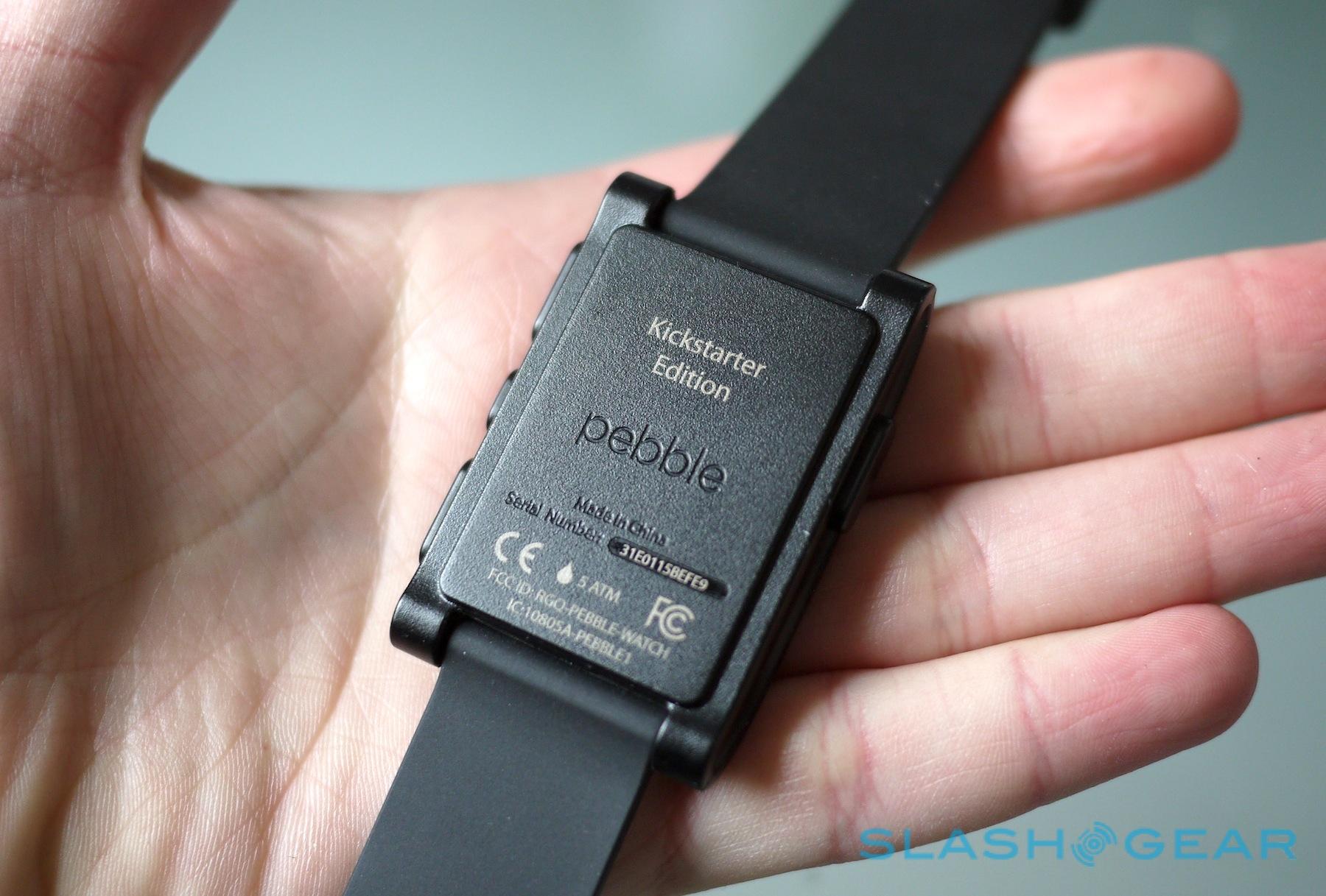
On the back there's an embossed Pebble logo – no other branding is outwardly visible – along with the serial number and "Kickstarter Edition" printed. It weighs in at 38.5g including the strap, while the watch section itself measures 50.33 x 32 x 8.44 mm; that makes it slightly thicker and longer than Sony's SmartWatch, though narrower, and the curved fascia of the Pebble makes it seem slimmer than the blunt-edged Sony.
Inside, there's an ARM Cortex-M3 processor, a 3-axis accelerometer, a digital compass, and an ambient light sensor, as well as a Bluetooth radio. That, in hardware terms at least, supports Bluetooth 4.0, though currently the Pebble software locks it to Bluetooth 2.1+EDR. A vibration motor is easily felt, though it's also audible; we would've been happy with a more discrete sensation (since it's right on our wrist) for something that couldn't be heard by people sitting nearby.
Display
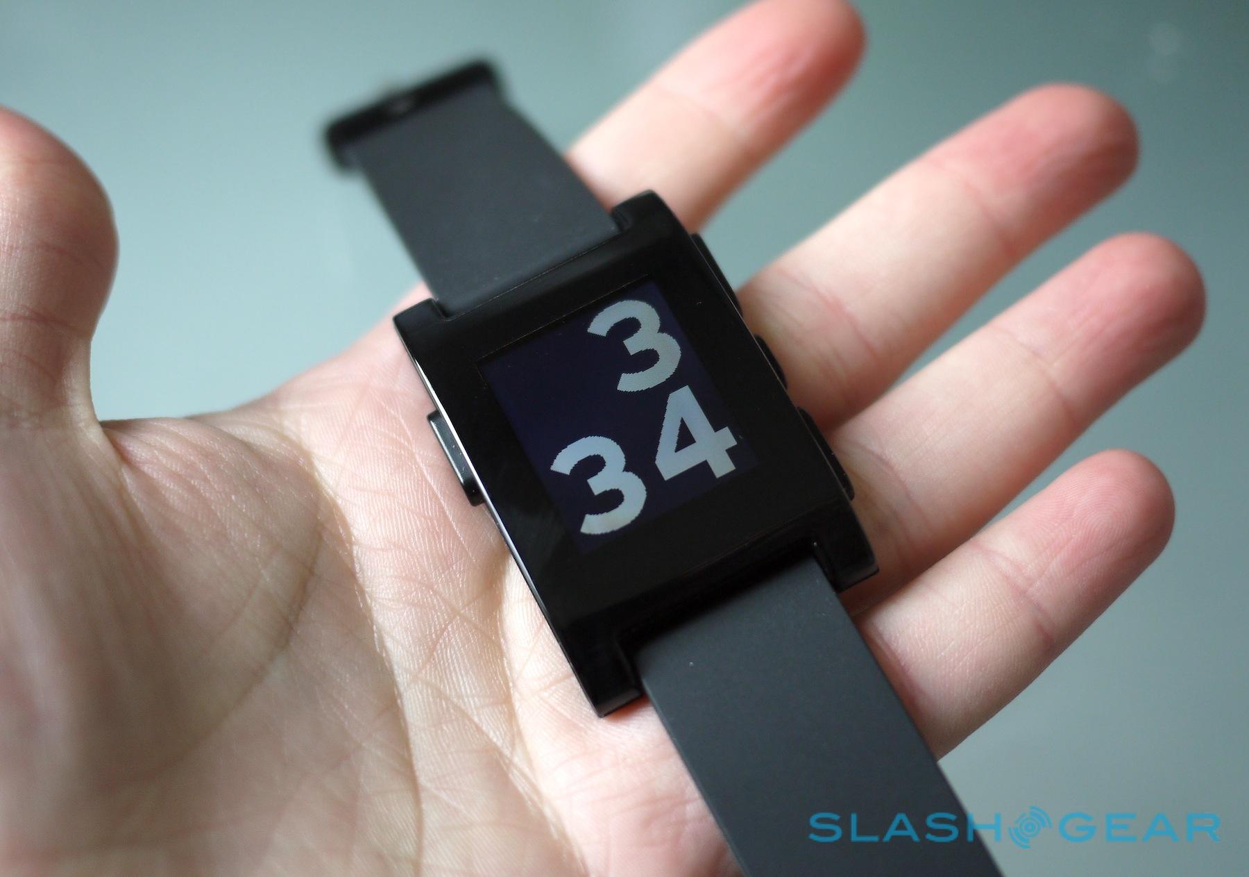
The 1.26-inch monochrome display Pebble opted for is described as e-paper, though it's not the same E Ink technology we're familiar with from ereaders like the Kindle. Instead, the 144 x 168 pixel panel is a very low-power screen that relies on ambient light for illumination for much of the time, reflecting that back out to make the display more visible. It also means you don't get the "black flash" every time you change the on-screen image, as you do on an ereader. Outdoor visibility is great, and there's a backlight which comes on sparingly when the ambient light isn't sufficient.

The power-sipping nature of the screen means Pebble has been able to keep the panel active constantly: like a regular digital watch, you can always see the time. Without the backlight on, whites are more accurately greys, though we generally didn't have issues glancing down and seeing what the time was.
Software
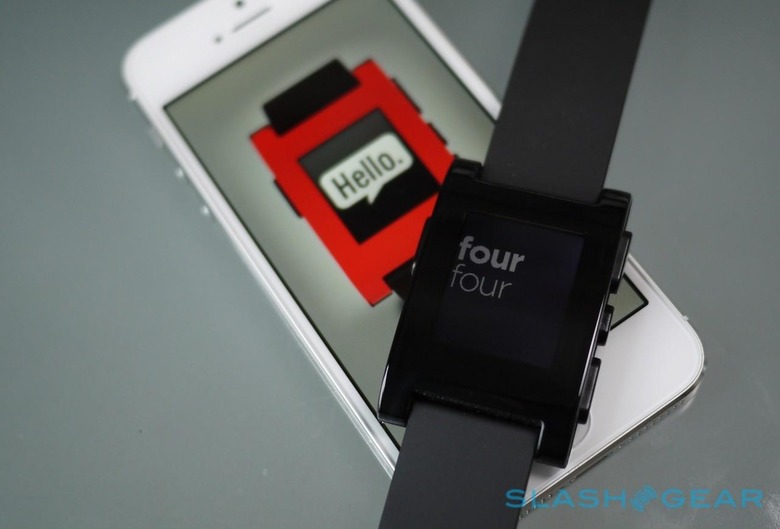
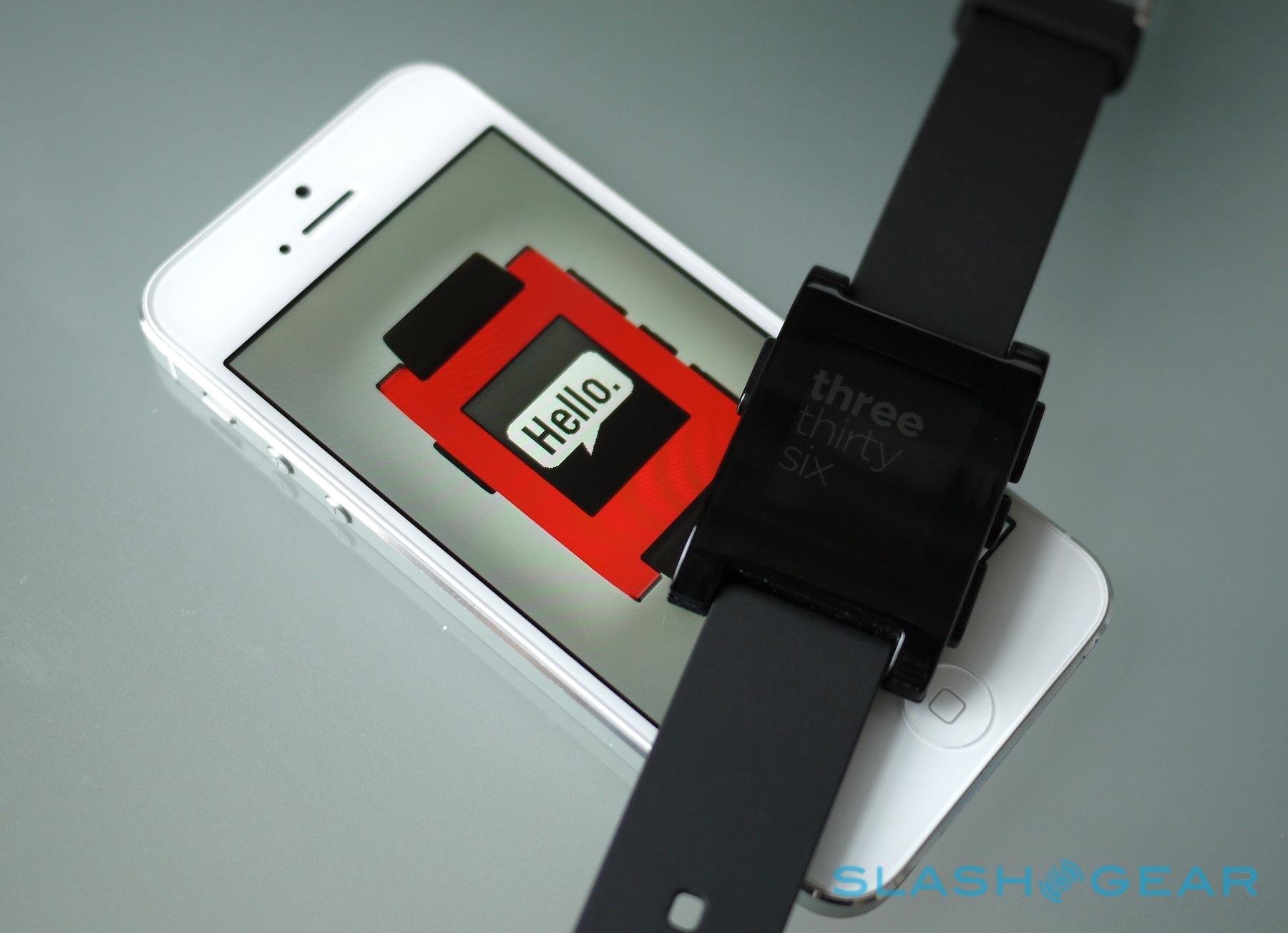
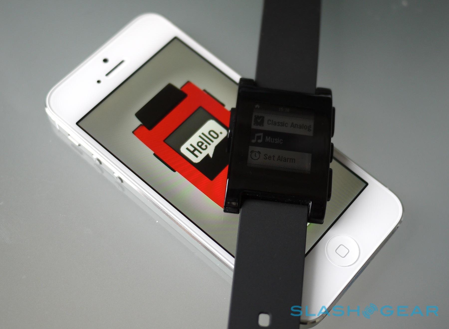
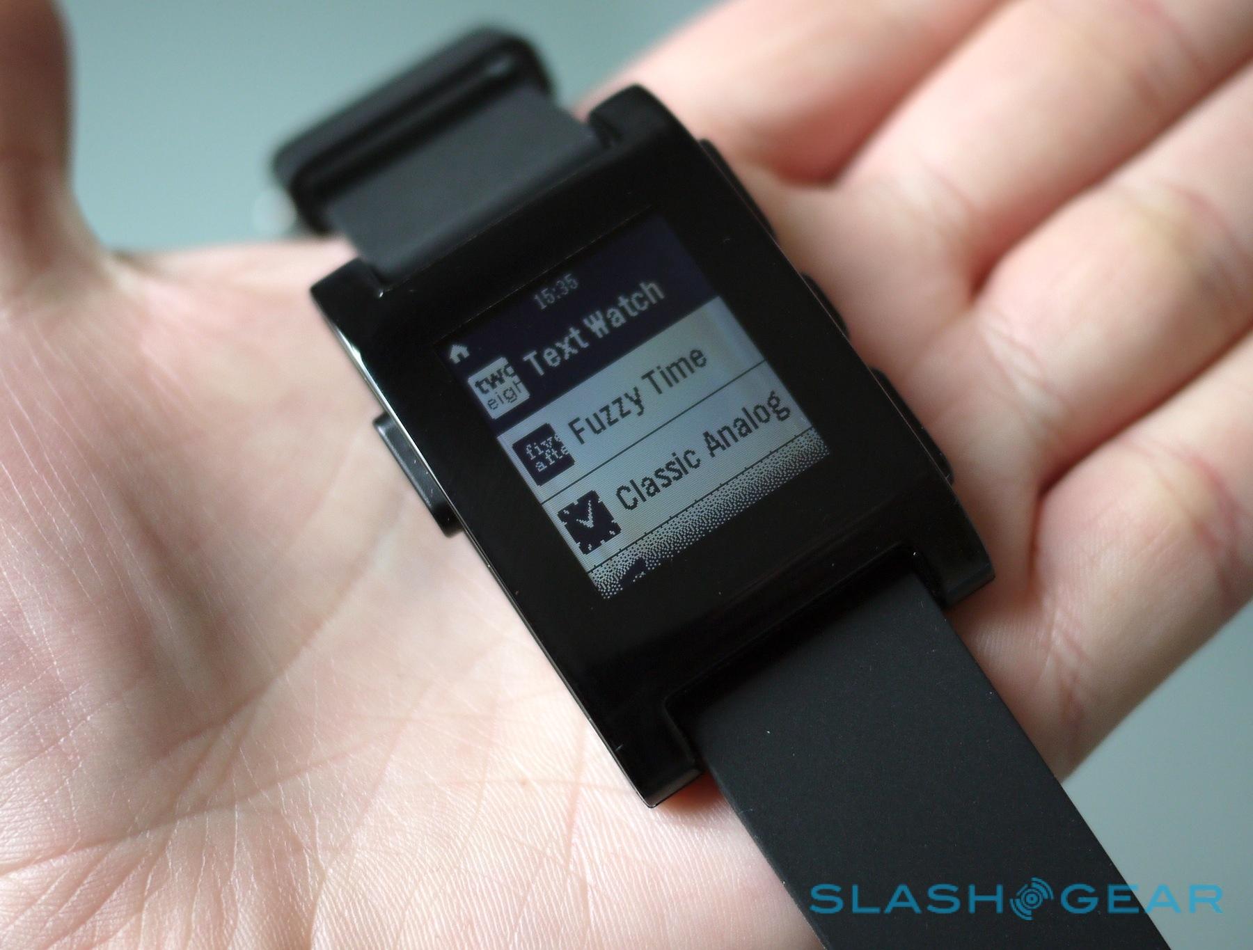
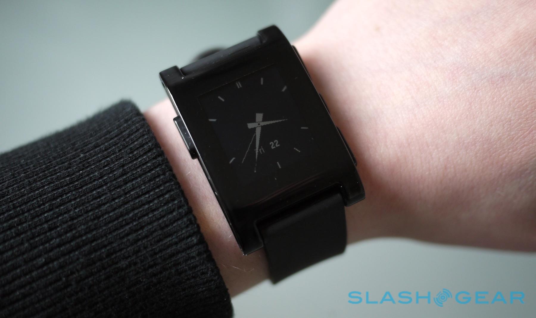
On its own, Pebble is pretty dumb. It comes with three watch faces preloaded – Text Watch, which prints "twelve one" or "five forty" rather than showing numbers; Fuzzy Time, which sacrifices accuracy in favor of more vague indicators like "noon"; and Classic Analog, with a traditional watch face along with day and date – and the music control app, as well as the ability to set alarms. If you want any more, you'll have to jump into the respective app store for your smartphone.

Pebble supports iOS and Android at present; Windows Phone and BlackBerry users are out of luck. Your iPhone or iPad will need to be running iOS 5 or above, while your Android phone or tablet will need Android 2.3 or above. Interestingly, the two apps are very different, a division that's forced by virtue of the ways iOS and Android work with external devices.
Pebble Video Review:
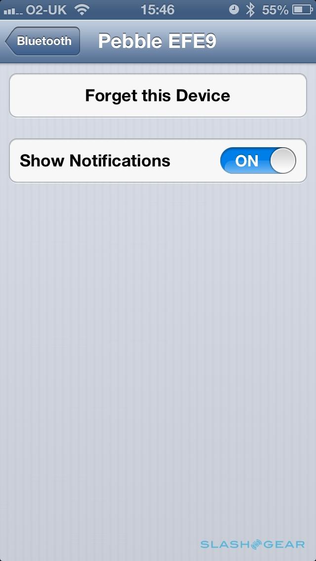
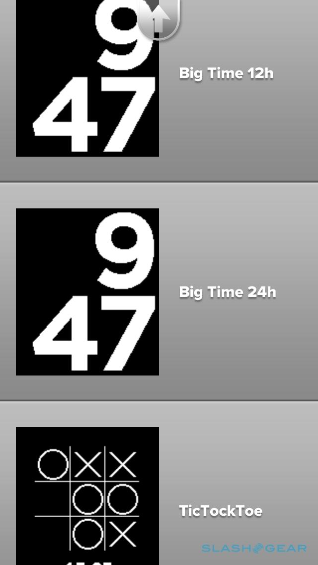
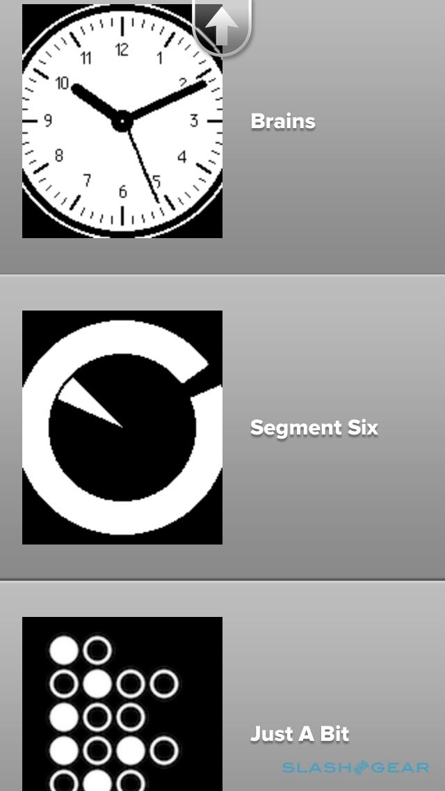
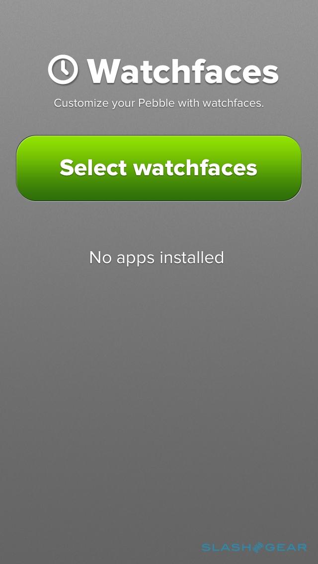
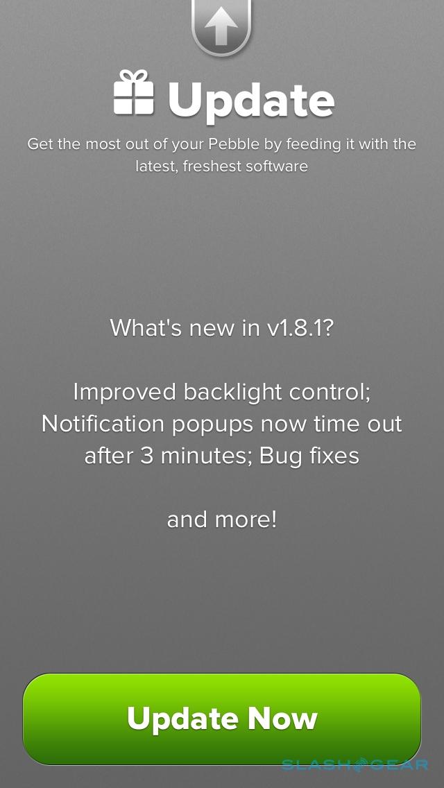
On the iPhone, the Pebble app is used to pair up the smartwatch, and to choose between the seven optional watch faces (which range from basic analog layouts to Toykoflash-style confusion). Eventually, Pebble promises, there'll be an app store of its own, through which developers will be able to offer their own software to enhance the smartwatch experience. Right now, though, Pebble is keeping things locked down as it works on satisfying all of the promises it made through its Kickstarter campaign.
To actually control the notifications iOS sends through, you have to turn to the iPhone's Notifications page. There's no specific mention of Pebble there, but if you switch the individual notifications you want routed to the watch off, and then on again, they start to pop up on the watch's display. It's hardly an intuitive system, but it's one you soon get used to doing: as it stands, every time you disconnect the Bluetooth connection and then reconnect it – say, if you walk out of range of your phone as it charges on your desk – you'll need to go through the same off/on toggling process to get the alerts pushed through again.
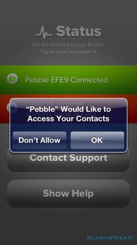
It's not the only frustration we found with iOS. Our iPhone seemed okay with the fact that, despite the Pebble connecting over Bluetooth, it wasn't a headset (although it showed up as an audio option during calls); however, when we tried to use Siri, it would automatically attempt to use Pebble as the microphone. That could actually have been quite useful, except Pebble doesn't have a microphone or speaker, so Siri wouldn't work until we disconnected the watch.
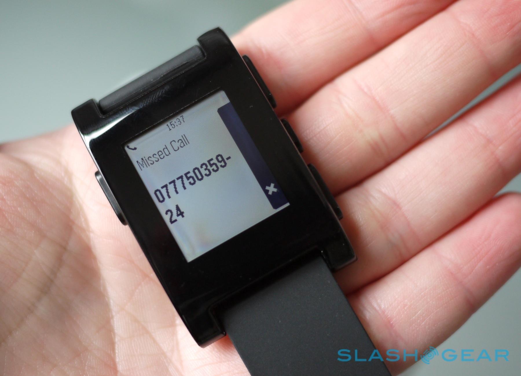
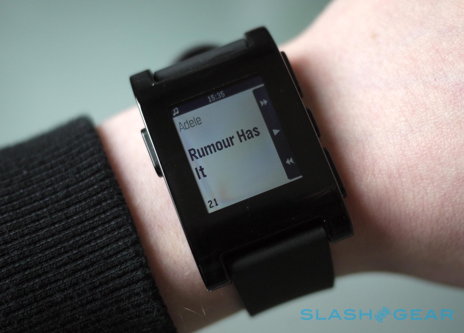
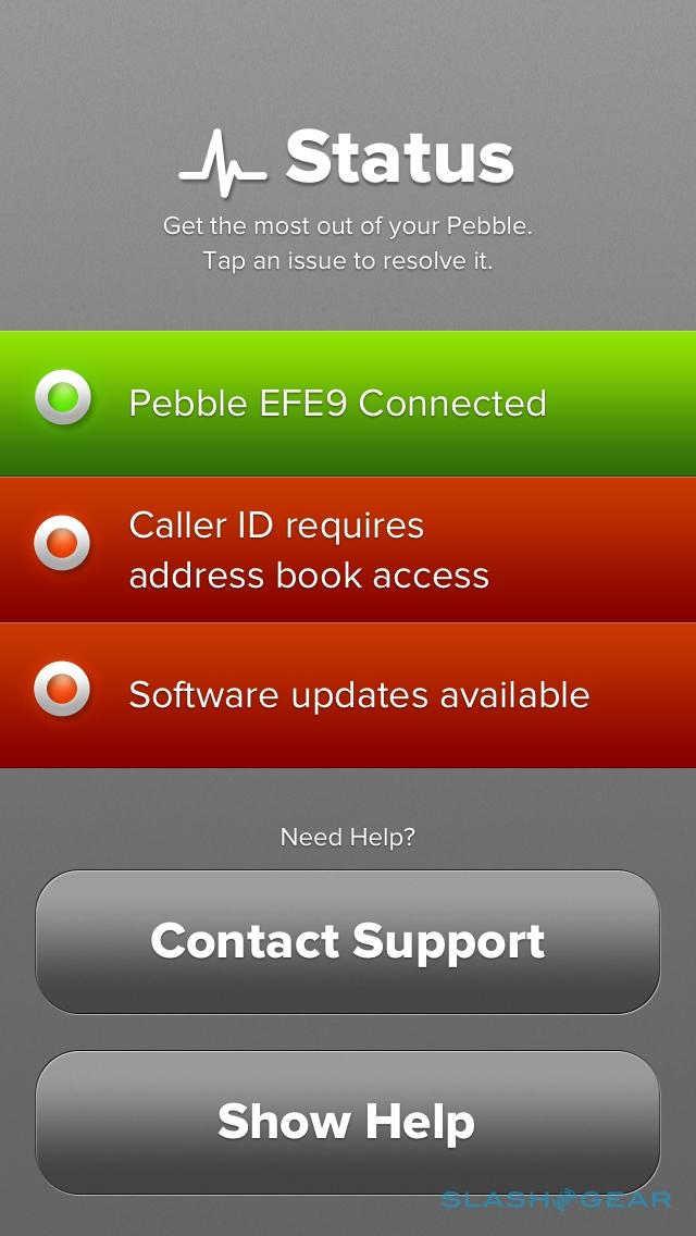
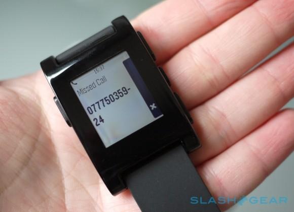
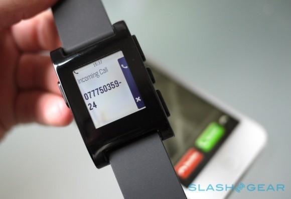
We also couldn't get Caller ID to work – Pebble would show just the number, even if the caller was saved as a contact – though music playback control worked as it should, supporting the native iOS Music app along with third-party apps like Spotify. You get artist, album, and track name on-screen, as well as skip back/forward and pause controls. Unfortunately, Pebble didn't recognize the Sonos app, and so couldn't control that.
The Android app takes a different approach. There, everything – watch faces, notification settings, eventually app installations – happens within the one piece of software. Every compatible phone app is listed, with a checkbox to select whether Pebble will alert you to a new update: you can have phone and SMS notifications, calendar reminders, new mail broken down by each account active on the phone, Google Talk and Google Voice, and Facebook. However, the permissions you need to assign to the app are pretty broad if you want all that to happen – Pebble needs your Gmail passwords and access to all of your notifications, for instance, if you want to see them on your watch – and there are still omissions, so for instance Twitter direct messages don't pop up yet.
As you might have noticed, the flexibility of Pebble when paired with an Android phone is considerably greater than when with an iPhone. There's no calendar alert support for iPhone yet, and in fact you're predominantly limited to email, content in Messages, and calls. Similarly, there's no way to have notifications show just on the watch, not on the phone: if you want Pebble to show an iOS alert, it has to be included on the lockscreen. On the flipside, Pebble's music controls only work with Android apps that support the Bluetooth AVRCP (Audio/Video Remote Control Profile); any that don't simply won't respond, with a notable offender there being the Spotify app.

No matter which platform you use, exactly what Pebble will let you access is limited. Though the watch will buzz for every new notification that comes through, you can only scroll through the most recent one. Anything older requires you to pull out your phone to check; in fact, there's not even a count to say how many messages, calls, notifications, and the like you've got waiting. Calls can be answered or rejected, though you can't stop the watch from buzzing but let the call ring out (as you can by hitting one of the volume buttons on your phone).
Battery Life
There are two batteries to think about with Pebble: the watch's own power, and the battery in your phone. Keeping a Bluetooth connection permanently active will take a toll on your handset; Pebble suggests it'll be in the region of 5- to 10-percent per day.

In practice, we found that whereas an iPhone in our typical use would last from morning through to night on a single charge, when we started using Pebble it would invariably expire mid-evening. That's with no other changes to use beyond hooking up the smartwatch. The impact on a Samsung Galaxy S III, meanwhile, was roughly the same, with the phone expiring an hour or two earlier than we were used to.
As for the Pebble watch itself, the company claims up to a week's runtime from a single charge, and that could well be improved once Bluetooth 4.0 support is enabled (not that we have a timescale for that happening). It's not easy to keep track of, however: the only time a battery icon shows up is when you reach certain levels: full, low (i.e. with 12-20 hours of runtime left), or empty; or when you're charging either from a low battery or approximately halfway done. A full charge takes 2-3 hours. With regular use, we saw 4-6 days between charges.
Wrap-up
It's fair to say we're torn over Pebble. After the furore of the Kickstarter campaign, the practicality is a generic-looking watch with basic notification functionality; yes, there's the promise of so much more, but we're nowhere near the point where Pebble does more than just flag up your latest message or allow you to avoid a call without pulling out your phone. Third-party app support is the key, and there certainly seems to be plenty of developer interest, but we still don't know how long it will take to actually arrive.
That means that what you can actually do with Pebble today is limited. We still ended up with our phone out a lot of the time, since Pebble will only allow you to see there's new content, not do anything with it. We'd love to see at least the option to forward emails to someone else (maybe by scrolling through a list of a few preset recipients), or fire back a stock answer like "I'll reply when I'm back at my desk."
Still, the fact that we find ourselves glancing down at other watches for notifications when we're not wearing Pebble suggests that the smartwatch did find its way into our workflow. If anything, it's more useful out of work hours; those times when your phone buzzes and you're watching TV, and you want to quickly triage out anything that can be ignored versus something that warrants grabbing your attention. There's a whole lot of potential there, and so far Pebble is just scratching at the surface. Whether it's worth $150 today depends on how much of an early-adopter you are; everyone else considering dressing their wrist with some smart technology might want to wait and see how third-party apps change the Pebble experience.
