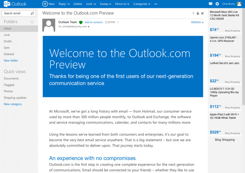
Outlook.com Hands-On
As Microsoft brings on a whole new era of computing – or so they hope – with Windows 8, so too do they attempt to take on the beast that is Gmail with their own Outlook email service on the web. What we've seen thus far is not a far cry from Gmail, with Microsoft taking what's good about their Metro stylings from both Windows Phone and Windows 8 and working to make the email service as user-friendly as their biggest competitors. And what's best – you can use the email address you already have to get all your mail in to this inbox quite simply.
When you sign in with your Microsoft account – an account you've already got if you have a Windows Phone, mind you, you're instantly presented with a nice, clean, nearly-empty inbox. In the inbox you've got one mail from the Outlook Team and another from Windows Live Hotmail. That's right, legacy internet users, incase you've not been following along – Hotmail is fully teamed up with Microsoft for this release.
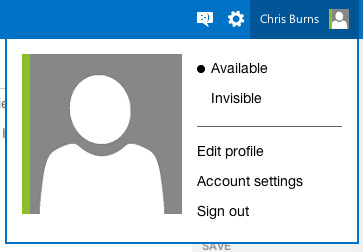
Up on top you've got the Outlook name and logo, a + New button to start up a new email, and all the way on the right you've got Messaging (which connects with Facebook), settings, and a quick-link to your profile – and more account settings too. The fact that this profile link and settings are up in the upper-right-hand corner should be setting off some bells for Google. It's a little too familiar, and we're sure Google will have a bit to say about it soon as well.
That said, it certainly is where these elements belong. Google didn't put them up there because they just thought they'd look nice, that's for sure. Next you've got Search Email in the upper left-hand corner of the screen under the Outlook logo. This search bar is also right where it should be and makes a whole heck of a lot of sense in being there. You've got your Folders under this with a simple refresh button, Inbox, Junk, Drafts, Sent, and Deleted folders too. You can also make a new folder right from this list too.
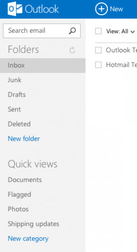
Under that you've got several different options for how to see your email with Quick Views – documents, flagged, photos, shipping updates, and New Category again. I'm certain we'll be using the Shipping Updates view more often than any of the rest.
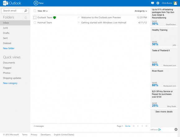
The center has your emails with quick actions for more than one selection, easy to read and see fonts all around, and emails having quick-action buttons appearing when you mouse over each of them. You can also flag emails from here and you've got tags that show how important each mail is as well. Inside each email you've also got a majorly impressive view. HTML is in full effect here, with large beautiful text bodies for all to see.
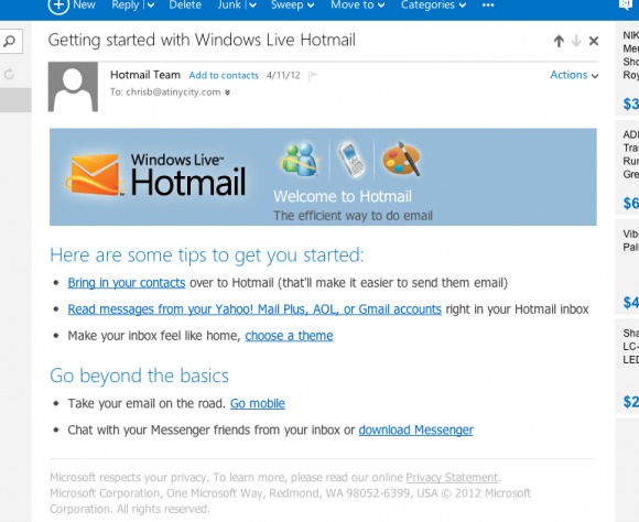
The whole layout is rather respectful to the eyes, and the only piece of baggage the whole system carries over from the old world of email is the set of Bing Shopping ads that sit on the right. We'll have to see how we can... deal with those soon. Skype for video chat will be popping up too, we're sure, so stick around for the updates as they happen.
You can check this system out right now by heading to Outlook.com, and be sure to let us know how you like (or dislike) it all soon!
