OS X Yosemite Design Highlighted For Desktop
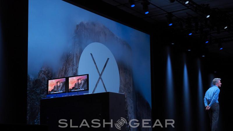
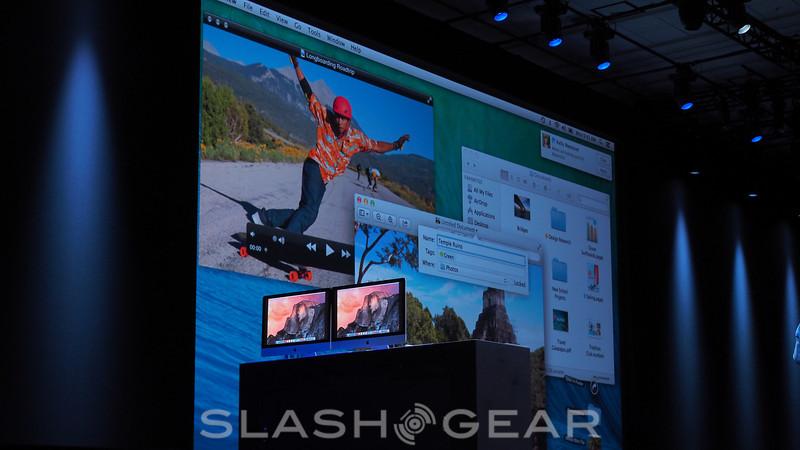
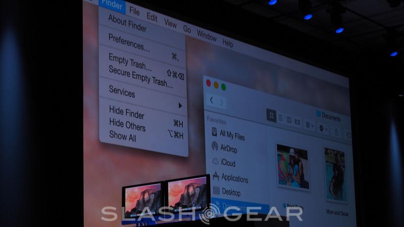
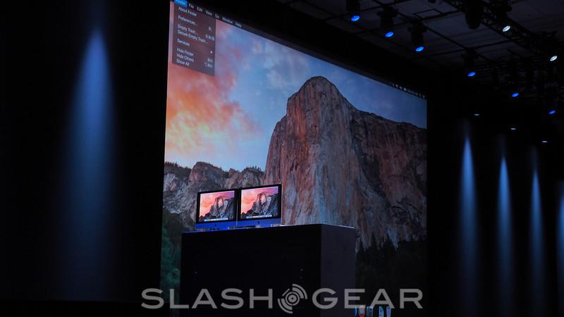
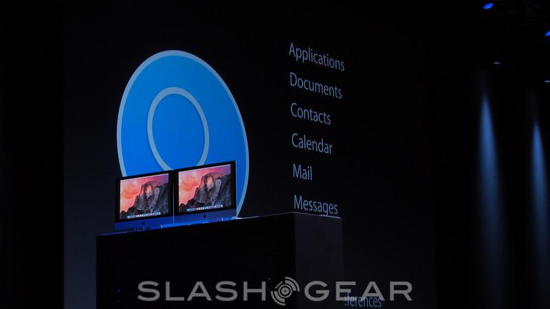
This week Apple is showing off their newest desktop operating system OS X Yosemite. At WWDC 2014 they've teased how it'll work, but to get that deep, they've had to show how it looks. This system will look very similar to OS X Mavericks, but here several icons are getting a little flatter.
This release will be focusing on Interface, Apps, and Continuity for the future of the platform. While this next user interface has icons that have been flattened, and this certainly indicates an iOS-ification of the system, there's still a desktop-depth to them.
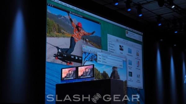
You'll find toolbars and window materials also updated, as Apple Craig Federighi made clear. "Focused always on clarity, but also utility," said Federighi, you see the user of translucent materials in the window titlebar – carefully crated translucent materials."

There's also a new "dark mode" which allows "pro users" to focus on the center of the screen.
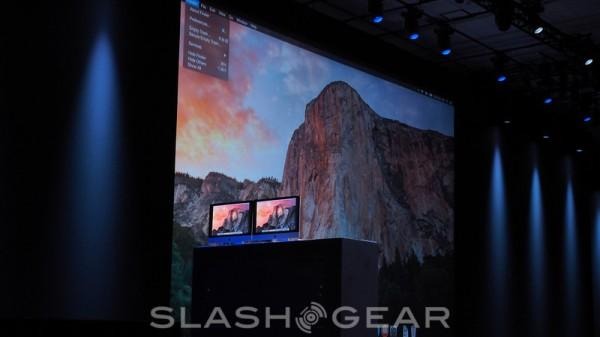
Notifications Center will be one of the first apps in desktop mode to be given a new look. One new mode with Notifications Center is "Today View", which will give you a rundown of what's happened and what will happen the rest of your day.

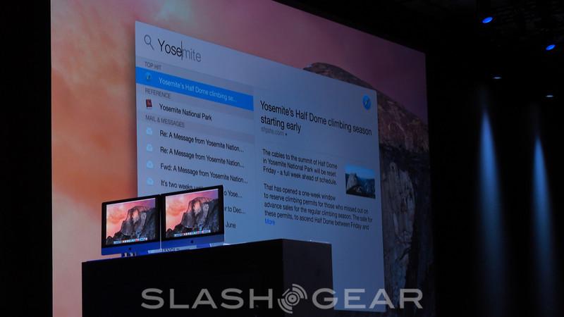
Today View also moves through the rest of your system, allowing you to make better use of Widgets, Spotlight, and iMeassage.
Stick around as we continue to dive into WWDC 2014 with our Apple hub all day long and on into the week!
