OS X Mavericks Preview
Apple promised us a software-rich WWDC this year, and the company delivered. While iOS 7 looks set to be the biggest change in the company's mobile offering since the original iPhone, OS X Mavericks teased the latest refinements to Apple's desktop platform. Not so flashy as iOS 7, perhaps, or as sweeping in its changes, but no less important as Apple continues to join together the dots between its platforms. Mavericks is still a work-in-progress, but Apple provided us with a recent build of the new OS X to get to grips with the highlights – and pick out the key changes – ahead of its full release this fall. Already, there are signs that Mavericks will be another must-have OS X upgrade; read on as we get to grips with the new heart of Mac.
From the off, it's worth remembering that Mavericks isn't finished yet; this isn't a review, and there are likely to be changes and refinements along the way as the final build is polished up. Still, there's certainly enough to do a top-level assessment, before we dig through the claimed 200+ new features Apple says will be included in this 10th release of OS X.
There are always risks when you're changing something users are attached to. Apple's previous move to close the distance between OS X and iOS has been met with both suspicion and concern, with long-standing Mac fans worried it would see the platform's more powerful and flexible functionality marginalized in favor of making it effectively an iPad with a keyboard and trackpad. Instead, Apple has taken OS X in a slightly different direction again; Mavericks doesn't pull the rug out from under you, with unnecessarily ground-sweeping changes, but instead refines the experience with new features that add to your daily use, rather than forcing you to relearn your Mac.
So, more like adding layers to OS X than anything else, though that's not to dismiss the usefulness of some of the changes, only to recognize that they're evolutionary in their nature. With the arrival of AirPlay support in Mountain Lion, for instance, OS was able to push its display wirelessly to an Apple TV hooked up to your big-screen television. However, Mountain Lion's AirPlay implementation was limited to screen mirroring – you saw on the TV exactly what you saw on the Mac's display – rather than expanding the desktop.
That's all changed in this new version of OS X. In fact, we'd argue Maverick's Multiple Displays feature alone is worth the price of the upgrade. If you've got a regular external monitor hooked up to your MacBook, or two screens attached to your Mac Mini, for instance, with Mavericks there's no longer a "primary" and "secondary" panel: instead, each gets a menu bar and a desktop, and each can run full-screen applications completely independently of what's happening on the other display.
However, it really comes into its own when you pair Mavericks with an Apple TV. Now, it's possible to stretch the desktop onto your TV, rather than just duplicate the picture. That means you can keep your kids entertained with an iTunes video while still working yourself on the same Mac; all of the notifications arrive on your own screen, rather than disturbing media playback. Alternatively, you can push IM windows and other frequently-monitored dialogs to your TV, leaving your core display free to focus on the task at hand.
Running the show is Mission Control, which now shows each display as a different desktop preview. Apps can be dragged between them, instantly setting up the perfect work environment.
It's a great example of how intuitive Mavericks is, despite catering to what Mac power users have been asking for. A similar change can be found in the new Calendar app, which now does away with the somewhat claustrophobic faux-leather of the old software and replaces it with a cleaner, pared-back interface that reminds us somewhat of Google Calendar in the browser (no bad thing, given so many people use both together).
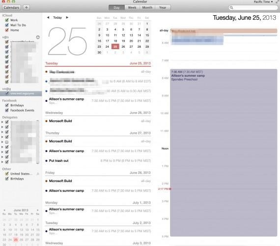
New month and week views join the existing layouts, and there's continuous scrolling to sweep quickly through. It's particularly useful when you're trying to schedule in several weeks that span two months, where before Calendar would make you flip between the views rather than allow the UI to be positioned where you the user wants it.
Clicking into an event is a good example of how Mavericks deepens the links between different apps and services in the new OS X. Logging into Facebook now pulls calendar entries from the social network – including event invitations – in, but there's also custom data from the new Maps app. So, schedule an appointment somewhere, and you'll get a map thumbnail of the location plus travel time estimates (Mavericks is clever enough to use your last appointment location, if it ended less than three hours before, or instead default to your work address) and even a weather forecast for the specific time.
In fact, the new Maps is probably the most obvious addition to Mavericks, and it works particularly well if you're fully committed to Apple's ecosystem, both desktop and mobile. The features are all familiar from iOS, with turn-by-turn directions, Flyover with 3D graphics of certain cities, and points of interest (complete with Yelp reviews); eventually there'll be traffic support, though that's not available in this current build. Since you're unlikely to prop up your MacBook Air on your dashboard, there's the option to print out directions complete with a map.
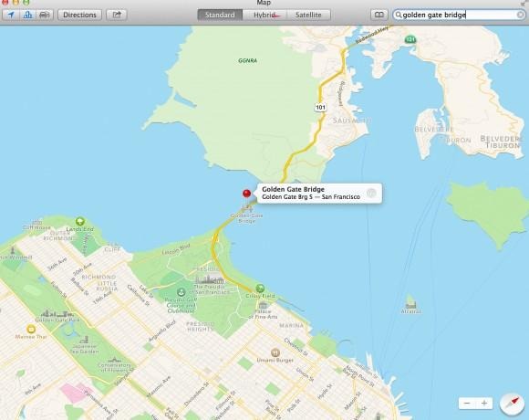
However, if you're an iPhone user (and you're on iOS 7), there's also a useful "Send to iPhone" option added to the drop-down Share menu; a notification pops up on your phone to open up the route in the Maps app. It's not the only refinement you benefit from if you're pairing OS X and iOS; the iCloud Keychain, for instance, both toughens up and simplifies passwords across each platform, first generating hard-to-guess suggestions and then synchronizing them across all of your devices.
Figuring a conservative five passwords punched in a day, taking about ten seconds apiece, that's a total of 5 hours or half a workday saved over the course of a year. It'll store multiple credit card details, too, and even your WiFi passwords. Admittedly, it's less useful if you're not fully committed to Apple's line-up; expect punching in the complex iCloud Keychain-created credentials to take some time if you're doing so on an Android or Windows device. It's a time when we'd love to see a cross-platform app to extend the security feature more broadly, as it does make a noticeable difference when you're browsing and shopping.
Shaving away at time spent jumping between apps, responding to dialogs, and generally navigating is a big part of the Mavericks experience. Notifications, for instance, can now be interacted with directly from the pop-up, so you can quickly reply to Mail or Messages alerts from the dialog itself, delete unwanted messages, and postpone software updates without having to leave the app you're currently in. Alternatively, apps can be left to update automatically in the background. Websites can now tap into notifications, pushing alerts even if Safari isn't running, while the lock screen now lists all the alerts you missed while your Mac was sleeping.
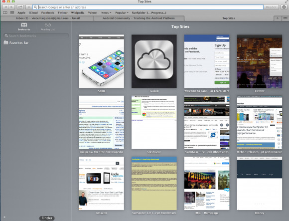
The benefits only really start to show when you consider them cumulatively. LIke the speed boost in the new version of Safari, or the background technology which condenses low-level operations across multiple apps so that they happen simultaneously, rather than repeatedly and individually waking up the process. Scrolling is now GPU accelerated, so it looks smoother, and there's better processor management – working hand in hand with Intel's Haswell 4th-gen Core chips – to minimize unnecessary load when apps are simply running in the background.
Part of the charm is in how Mavericks feels both designed for new Mac users and existing power users. The Finder tabs, for instance, trim a little delay from flicking between windows each time you use them; similarly, if you're an avid tagger, you can there's Tagging support as an alternative to the standard OS X search. It's a surprisingly powerful system, too, with support for multiple different tags to be attached to a single file. However, there's no complex initial setup process to be completed before you start, thanks to auto-suggestions, intelligent automatic labeling, and more. You can even tag files by dragging and dropping them on the relevant label in the sidebar.
Mavericks isn't due to be released until this fall. Nonetheless, in many ways it already feels ready for primetime. We've not encountered a single bug or crash, despite the fact that this is officially beta software, and all of the third-party apps we've come to rely on, like Skitch, Evernote, and Drobo, have worked without a hitch.
Many of Mavericks' real improvements are under the hood; you don't see them happening, only reap the rewards in everyday use. Things like better sandboxing for some of the processes we're more used to seeing crash, like Flash and Java, which is just as useful as, say, the offline voice-to-text support that has been added. Again, this is a preview release, and so we won't be doing anything more quantitative until final software is ready, but already the signs are good.
Apple saved the revolution for iOS 7 this year. The smartphone and tablet platform was overdue a refresh, and that's just what Apple has delivered. In contrast, the changes in OS X Mavericks feel solidly evolutionary, and while that has often come to be interpreted as a criticism, in fact it's exactly what the Mac needs. Apple is poised between its existing users and those fresh to OS X, with iOS often the point of entry. In that sense, Mavericks' drawing together of the ties between desktop and mobile makes perfect sense.
