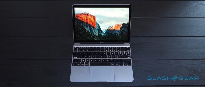
OS X El Capitan Review
2014's OS X Yosemite was Apple's big release; if this were the iPhone, then El Capitan would be the "S" update and expectations comparatively low. While many of the changes this time around have been relatively small, mind, that's not to say this new OS X doesn't make some noticeable improvements, particularly if you're not already using a super-fast current MacBook Pro or Mac Pro.
Many of the core apps have had a revamp. Notes now supports sketches and easy creation of checklists; if you have an iPhone 6s or iPhone 6s Plus, or end up buying an iPad Pro later this year, you'll be able to access the pressure-sensitive sketches created on those devices from your Mac, too.
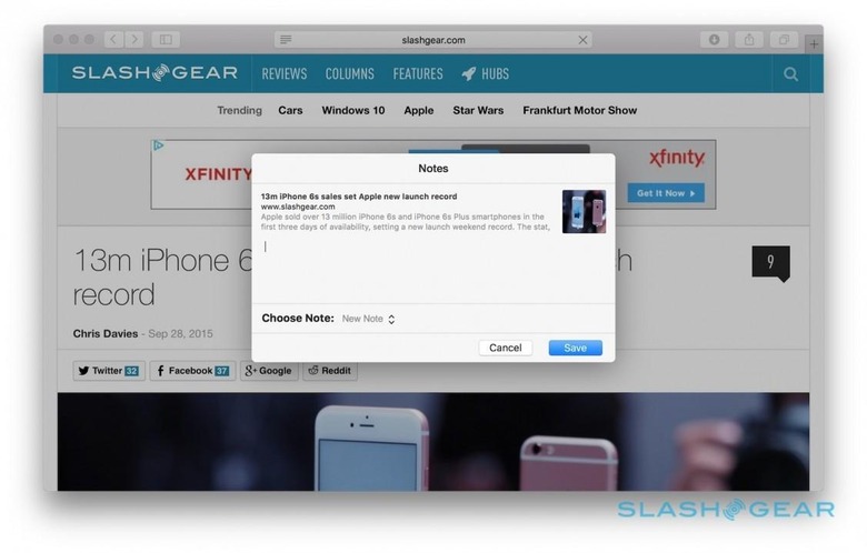
A new attachment browser shows all the dragged-in attachments assigned to notes; that's handy, too, since the app now supports a broader number of file types. Updates to the share menus in other apps allow you to push content directly to a new note. iCloud keeps things synchronized across devices, though there's still no multi-platform support as, say, Evernote offers.
In Maps, there's now live public transit data in select locations, with pedestrian, bus, subway, train, and ferry route information and live departure times. One of the options I like most in Google Maps is the ability to say you want to arrive at a certain time and work backward from there, and that's now supported in Apple Maps, too.
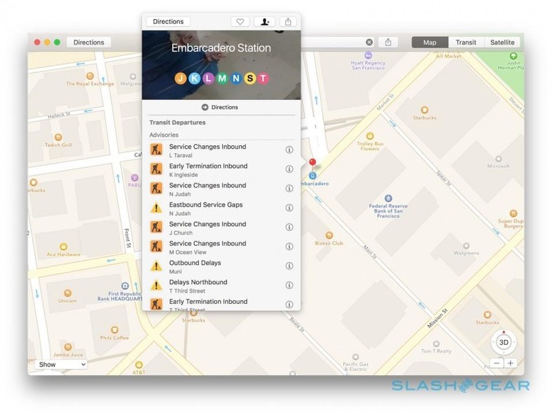
Initially, there'll be data for Baltimore, Berlin, Chicago, London, Mexico City, New York, Philadelphia, the San Francisco Bay Area, Toronto, and Washington DC, along with in excess of 300 Chinese cities. Open a specific stop and you get a list of upcoming travel options, and the same appears in Spotlight searches.
It's not the only improvement to Spotlight, either. I'm already a constant user of OS X's search for its app launching abilities, not to mention quick calculations and currency conversions, and in El Capitan those skills get more comprehensive.
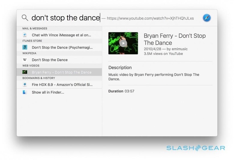
Weather and stocks show up now, along with sports scores – and upcoming fixtures – for multiple leagues like Major League Baseball, National Football League, and Premier League soccer. The top Safari result, searched through Bing, is among the results too, together with streaming video from YouTube, Vimeo, and Vevo.
Unfortunately, you're still dependent on Apple's choice of third-party content. There's no way to add your own Spotlight plugins, and nor can developers inject their own services into the results.
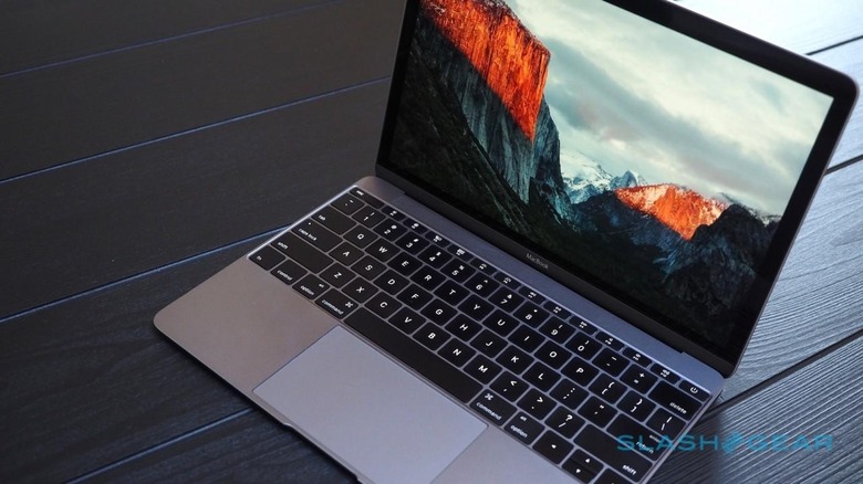
One thing I was particularly interested to see was how less potent Macs handled El Capitan. The 2015 MacBook may be among the newest of Apple's laptop line-up, but it's also one of the most humble in terms of specifications, its fanless design forcing some compromises around processor choice.
I've been using a MacBook since just after the ultraportable went on sale, and while my experience with Yosemite has generally been positive, there have been the occasional moments of sluggishness all the same. Frequent points of frustration have included opening file dialogs from heavier webpages, which could involve a few seconds wait for the app to become responsive, along with lag when opening apps to begin with.
Apple certainly has some impressive headline figures for the performance gain over Yosemite. El Capitan is said to be as much as 1.4x faster at opening apps as well as up to twice as fast at app switching, for instance, and in my experience – though anecdotal rather than timed – software does indeed handle more smoothly when running on the new version.
Some of the other changes are more noticeable. PDF load times are up to 4x faster, Apple says, and again while I've not put it to the stopwatch, big PDFs do indeed seem to open faster in Preview than before. There's less lag between the blank thumbnails appearing in the left column and the body of the document showing up, for instance.
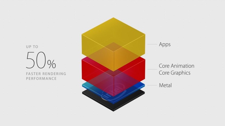
While Apple might be tempted to call it magical, in fact there are solid architecture changes to credit for the improvement. Just like iOS did before it, OS X has switched to Apple's own Metal engine, relegating the aging OpenGL to backup duty.
You can think of Metal – and OpenGL before it – as the engine that sits between the hardware of the Mac, the CPU and GPU, and the apps running on it. For many of these, the switch to Metal will be effectively transparent, and all they'll notice is a performance boost.
Meanwhile other, more intensive software, such as games and graphics editors, are able to hook into Metal directly. They'll need to be recoded to do that – until that's the case, they'll simply use the legacy OpenGL – something which Unity, Autodesk, Adobe, Epic, and others are already doing, but the upshot is a potential tenfold improvement in draw call performance.
You don't need to understand the mechanics to experience the improvements, though. Other changes I've had to coax myself into embracing, like Split View.
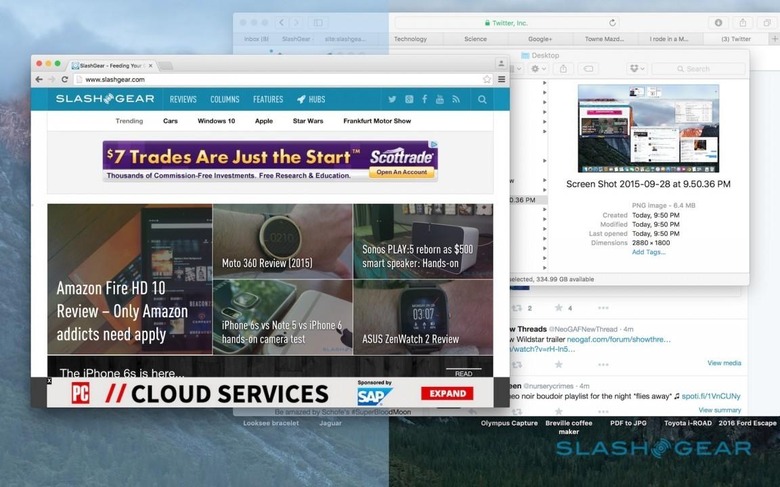
I'm a window overlapper by habit: I like to have a sliver of each open app visible, so I can keep track of where they are. That works okay when you're using a 27-inch iMac, or even a 15-inch MacBook Pro Retina with the display resolution cranked up, but getting that system to play nice with the 12-inch panel on the MacBook is trickier.
Split View addresses that in a similar way to Snap on Windows 10, automatically arranging two apps side-by side in full-screen. Holding down the green full-screen button allows you to drag the app to either the left or right side; you get a choice of open apps on the other half of the display, and can then drag the center split to preference.
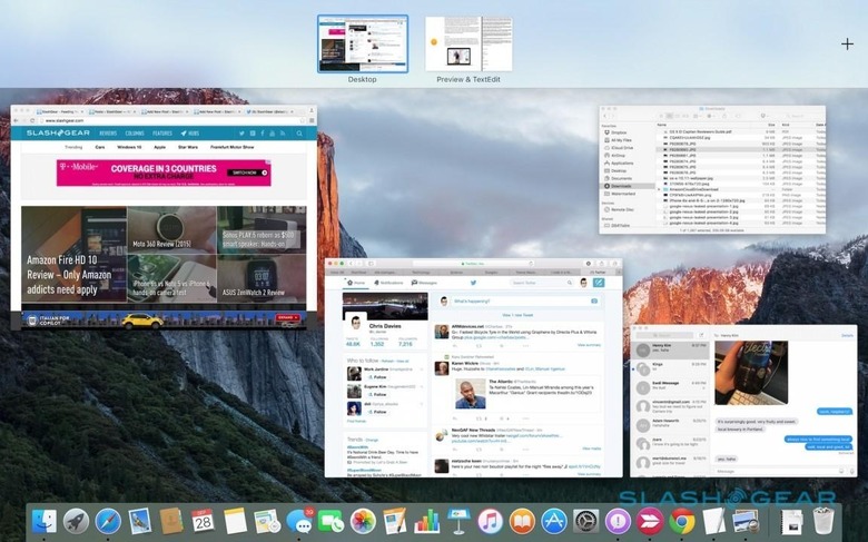
Creating a Split View automatically generates a new Spaces desktop – they run across the top of the screen when you swipe up with three fingers to see Mission Control, just like other new desktops – and you can command+tab between them, too, or use a three-finger swipe left or right. Generally, I still tend to go for my rather more ramshackle window layouts, but Split View has proved handy when I've needed to focus on one specific task.
If anything, it's a dedication to getting things done in the most efficient way that lingers as my lasting impression of El Capitan. From pinned sites in Safari to keep frequently-visited pages locked to the tab bar, through tab audio muting and AirPlay support for streaming web video, to iOS-style swipes to trash or mark-unread messages in the updated Mail and the new IMAP engine which prioritizes downloading your most recent email so they're ready to view quicker, this new OS X is all about gnawing away, little by little, at the pauses and lag that might usually punctuate the day.
Were I to have my way, Apple would take the same approach to extensibility across the board as it has to Photos. That now supports third-party plugins, so that you can make edits, tweaks, morphs, and other adjustments using extensions downloaded through the Mac App Store but accessed directly through the Photos interface.
Wrap-Up
There's a lot to like about El Capitan, not least the price. As a free upgrade it's a no-brainer, and though there might not be any one headline feature or improvement, it polishes away some of the rawer edges that were left behind in Yosemite. You might not use all of them beyond the honeymoon period post-install, but it could add up to a smoother overall experience if even just a few of the tweaks work their way into your day to day routine.
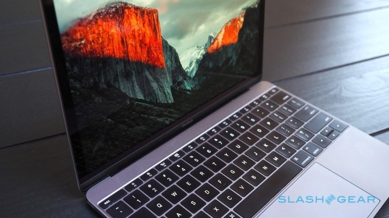
Meanwhile, the switch to Metal gives even more humble Macs a new turn of speed, and as more system-intensive software digs into the new architecture, that will only improve.
OS X El Capitan will be released on Wednesday, September 30th, as a free update through the Mac App Store. Macs running versions of OS X as far back as 2009's Snow Leopard will be able to upgrade to El Capitan in one fell swoop.
