OneNote MX Should Be Microsoft's Windows 8 Content Creation Hub
The importance of Office 2013 to Microsoft's bottom line can't be understated, and yet the company faces no small amount of ridicule amid questions of whether the productivity suite is "relevant" any longer. With Windows 8 fast approaching, and long-standing arguments over whether tablets are for content creation or merely consumption, Office or its Metro-styled MX variant for Windows RT slates hasn't necessarily proved the selling point Microsoft may have hoped it might. The company already has that wildcard, though, and it's been fermenting away under Microsoft's nose for a decade.
The reaction to Office 2013 – perhaps best described as "a necessary evil" – has been muted if only because it's tough to get especially excited over word processing, spreadsheet, email and (take a deep breath) presentation software. Microsoft's Metro UI is a nice touch, and in fact it's been responsible (along with Office 365 and its cloud ambitions) for most of the positive chatter around the suite. Still, it's tough to be too enthused when even Microsoft's attention is elsewhere.
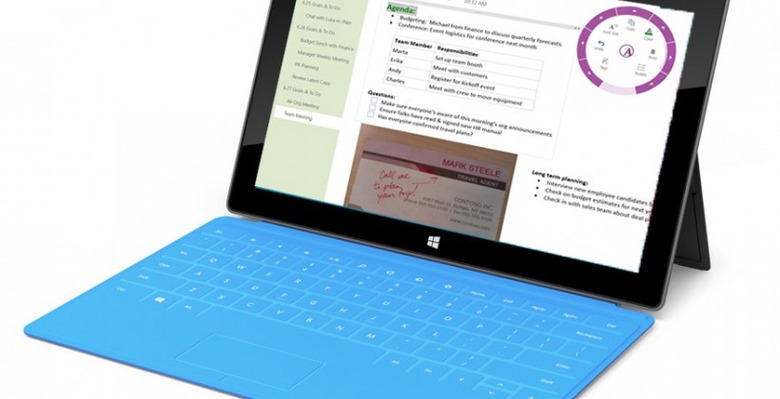
Microsoft is obviously more excited about tablets running Windows 8 than it is about regular desktops or notebooks. Slates may be expected to contribute to a minority of sales overall, but they're attention-grabbing and – many assume – the future of computing, and so they get over-emphasized in Microsoft's strategy. That's already prompted the company to challenge its own OEMs with Surface, no less.

What it needs is the perfect software foil to go with that; something which not only demonstrates how ambitiously segment-stealing Surface is, but how Microsoft is pushing tableteering into segments iOS (and, to a lesser extent, Android) has only partially catered for.
[aquote]The sliding panes of Metro make perfect sense for a digital notebook[/aquote]
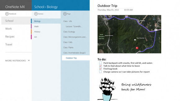
OneNote MX could well be that "killer app". Microsoft's digital notetaking tool has been bubbling away since the Windows XP days, but it's with tablets broaching the mainstream that it's finally ready for primetime. The preview that arrived in the Windows Store today is a good example of why. The sliding panes of Metro make perfect sense for leaves in a digital notebook, as does the Snap View split-screen layout that will allow, Courier-style, two apps to share Windows tablet screen-space simultaneously. (In fact, OneNote MX is crying out for a forward-thinking OEM to slap a couple of 7-inch screens together and do what Microsoft proved too gutless to attempt: give all those Courier enthusiasts the dual-display folding slate they were begging for.)

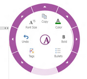
The radial pop-up menu is a perfect example of a UI that's been percolating away in some third-party iOS apps, but which could tip over into the mainstream if Microsoft plays OneNote right. Sized to suit both fingertip and stylus control, it's a simple and convenient hub for common controls and takes a welcome step away from the long, narrow strips of traditional Microsoft toolbars. Less sweeping sideways movement in favor of smaller, more contained button options.
If reaction to Office 2013 has proved anything, it's that people don't really care if their content creation tools are in the cloud, or local, or some hybrid of the two. What prompts enthusiasm is when the tools on offer are usable and intuitive: when they suit the device and the way it's used. Microsoft has woefully underutilized OneNote in the past, but the time is ripe for the app to take its place as the hub of Windows content creation.
