Olio's Smartwatch Bets On Quality And Minimalism: Hands-On
We still don't know what a smartwatch should – or shouldn't – do, but startup Olio is betting on just the right number amount of context and some serious timepiece quality. The Olio Model One, up for pre-order today, is the result: a chunky, touchscreen-faced smartwatch which eschews feature overload and instead focuses on what analog watches have been doing for hundreds of years: giving you the essentials at a glance. I sat down with founder Steve Jacobs to find out why he believes there's more to learn from traditional horology than just blunt case design, and how time saved might be the smartwatch secret.
At a time when Android Wear is putting an increasing number of Android phone features onto your wrist, and the fast-approaching Apple Watch is promising a new breed of smartwatch apps, Olio's pared-back attitude to what should be allowed to run on your timepiece is markedly different.
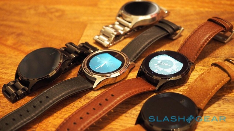
"We're solely focused on saving you time," Jacobs insists when I ask him about the disparity in functionality. Olio isn't setting out to replace the smartphone in any but the most immediate of ways: Jacobs still believes the handset is the best form-factor for interacting with most apps and services.
What needs improvement – and where a smartwatch comes in – Jacobs points out, is dealing with notification overload. That's not just about your phone constantly bleeping or vibrating in your pocket, triggering a Pavlovian response to whip it out every thirty seconds, but organizing those notifications into a way that not only makes better sense, but are more readily acted upon.
Olio founder and CEO Steve Jacobs isn't unfamiliar with shaking things up, though his track record is more about teaching old dogs new tricks. With a CV that includes product development at Apple, Google, Beats by Dre, HP, and Amazon – where he worked at various times on the original iPhone, Beats Studio v1 headphones, Kindle Fire HD tablet, and the original Google Pixel Chromebook – he's turned his engineering background into a career in helping twist old paradigms into new gadgets.
He's also obsessed with quality. "I really hate making cheap plastic and rubber shit," he joked with me, arguing that Olio's approach involved the team asking itself "what do we love about this material?"
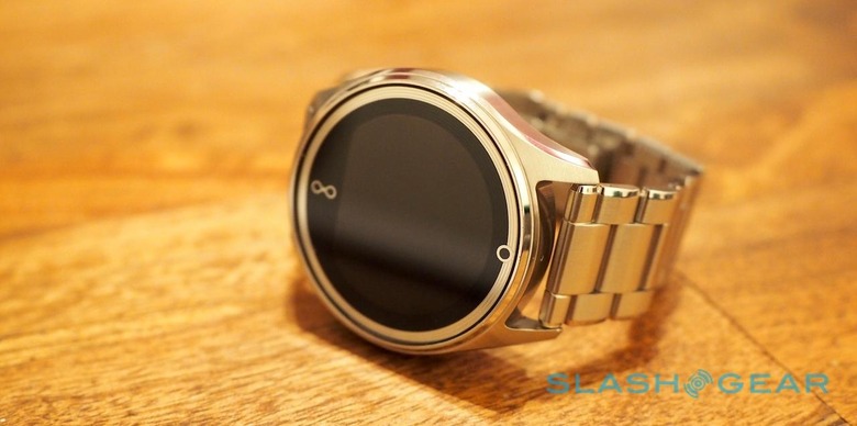
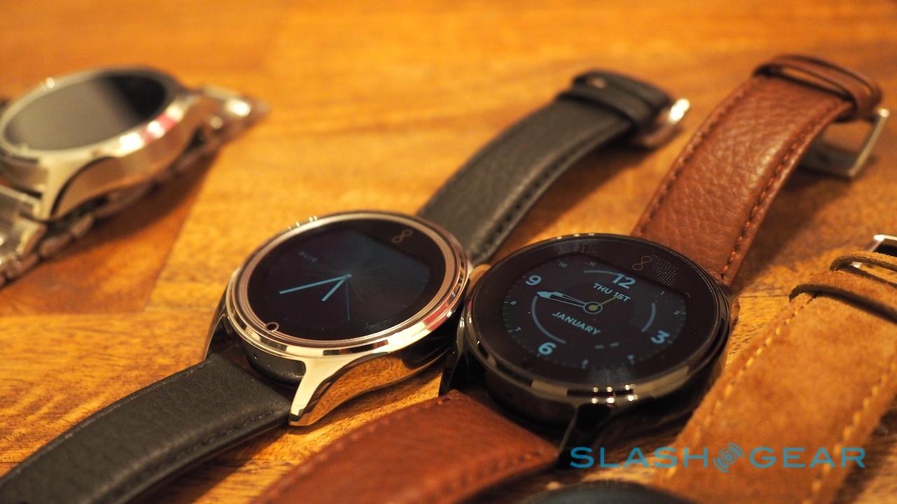
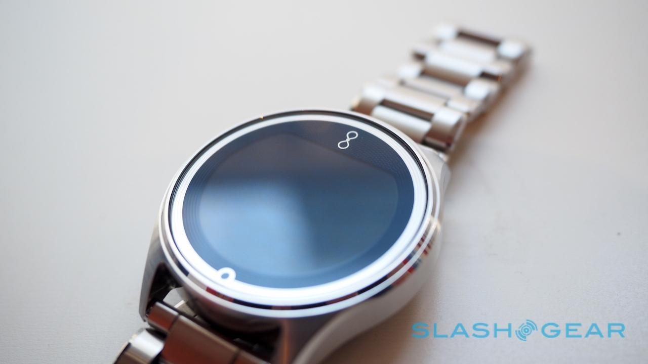
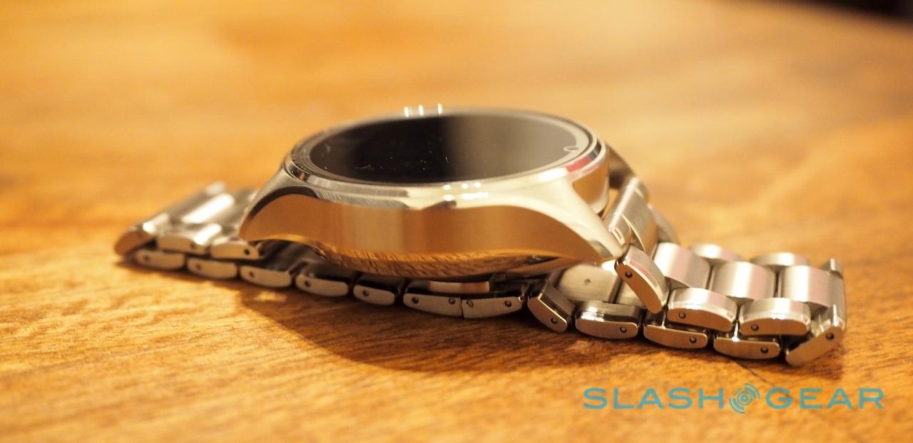
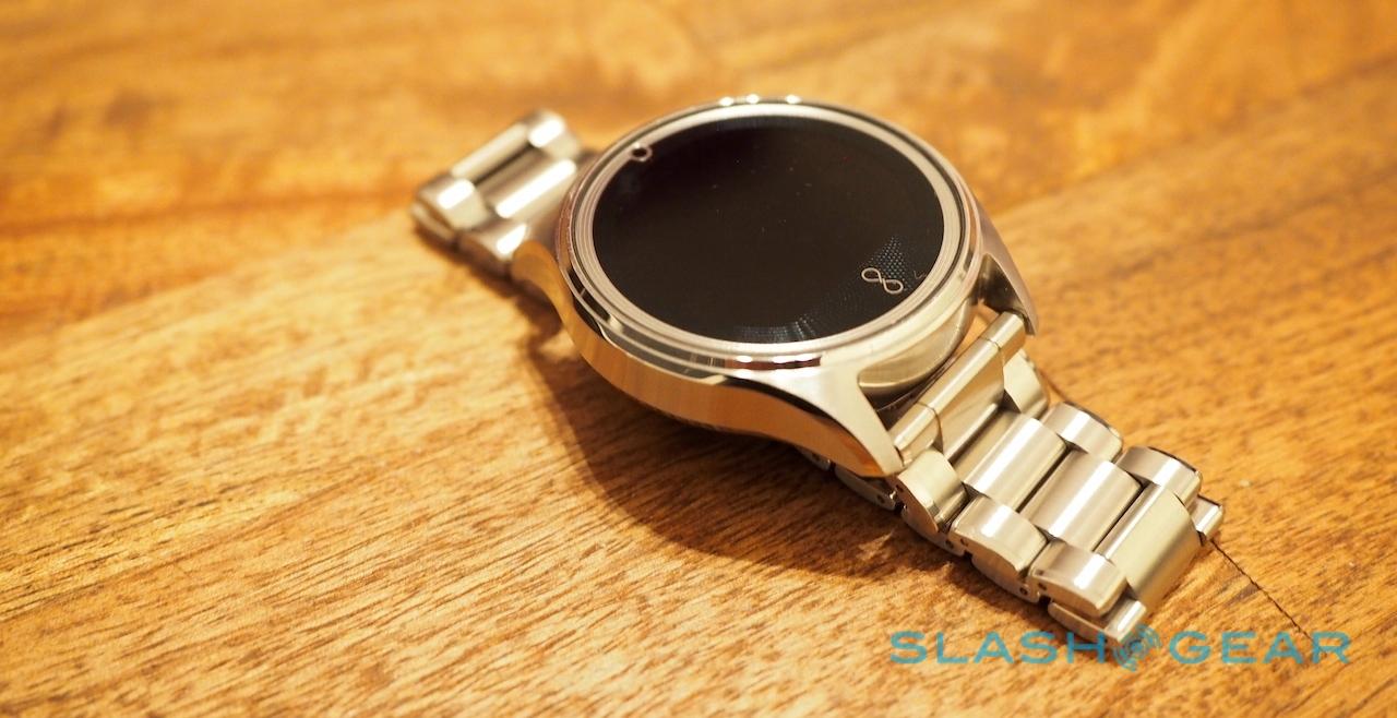
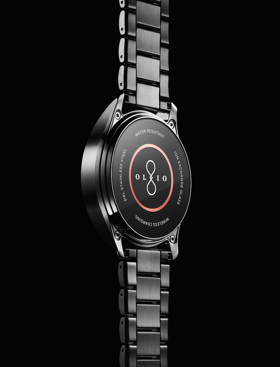
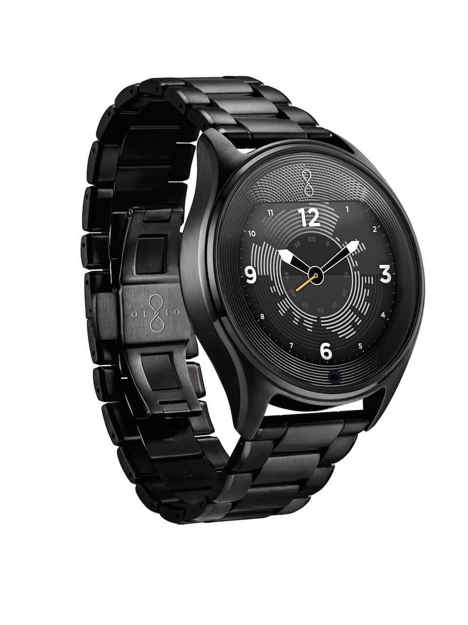
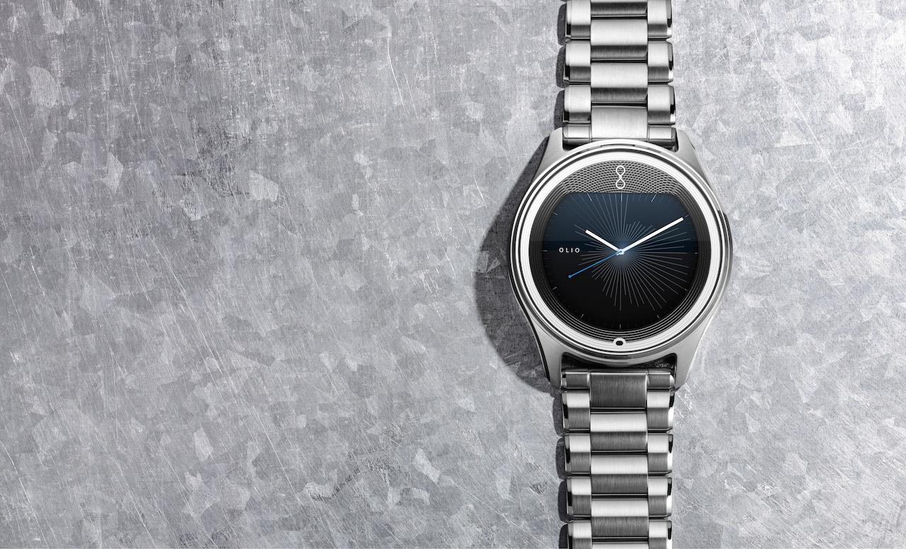
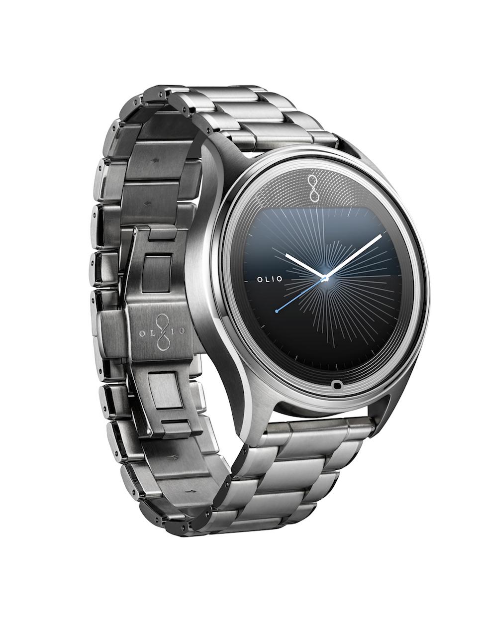
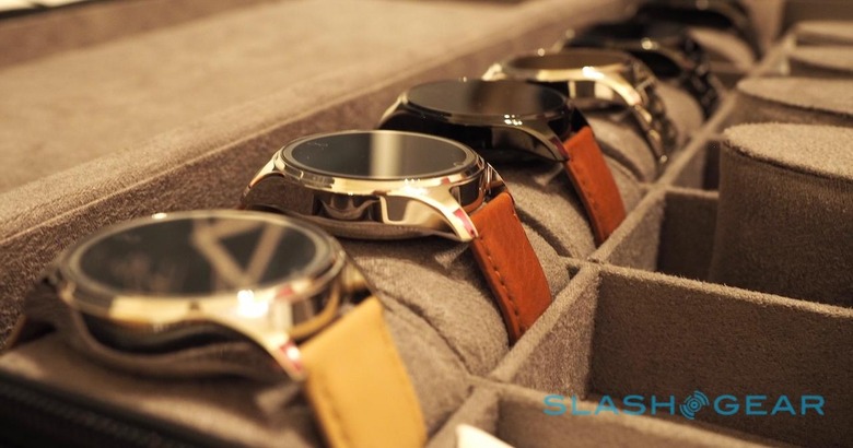
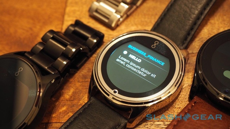
So, as you'd expect, many of the details that make Olio's first watch special are those which illustrate the amount of thought that went into it. The 316L-grade stainless steel casings are milled to 20 micron accuracy, then hand-finished, as are the bracelets, for instance. Olio came up with its own physical vapor deposition (PVD) process for the black version, so that the coating was evenly applied in-between the links rather than just across them.
Meanwhile, the rear glass – which has an oleophobic coating to protect it from wrist oils – has a custom-designed inductive charging coil, echoed in the patterning on the fascia of the watch that shimmers when light catches it.
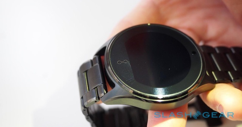
Even the way the Model One sits on your wrist has been carefully managed. Again, borrowing from traditional watchmaking thinking, Olio paid careful consideration to where the center of gravity lies, since that affects the location and the pressure of where it comes into contact with your flesh.
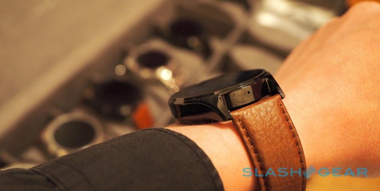
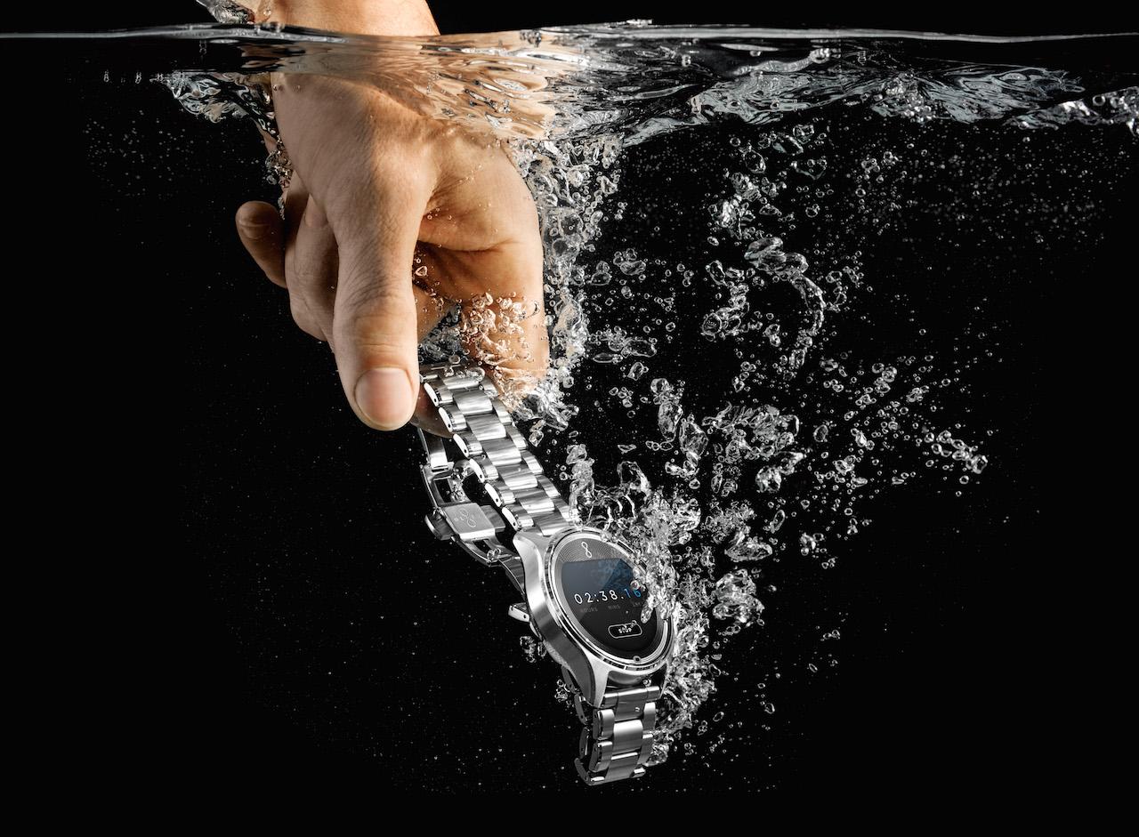
Meanwhile, four "ballast" zones – in each of the corners – can be precisely adjusted so that each Model One rests just right. On top of that, it's water, impact, freeze, and dust resistant, and can stand up to being worn in the shower (though Olio doesn't recommend going diving with it on).
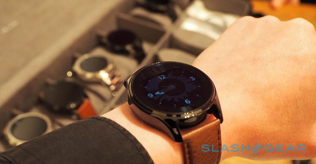
There's no getting around the fact that this is a chunky watch. It does, however, quickly mask its bulk after you wear it for a brief period; as I sat talking with Jacobs, the Model One on my wrist, I soon forgot it was there. A side-effect of the low center of gravity is that it sinks under your shirt cuff rather than riding up over the top of it.
Of course, making a finely-crafted watch would be for naught if the functionality wasn't on a par, and that's where Olio's big bet on simplicity comes in.
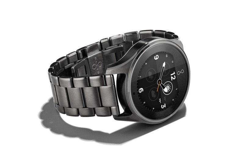
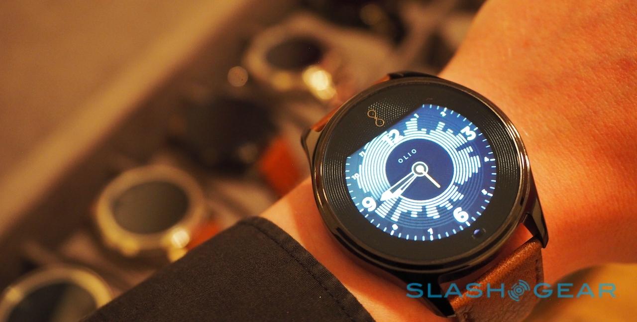
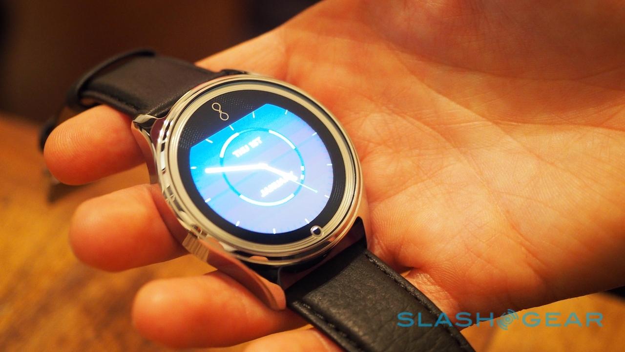
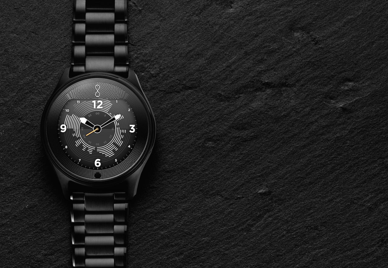
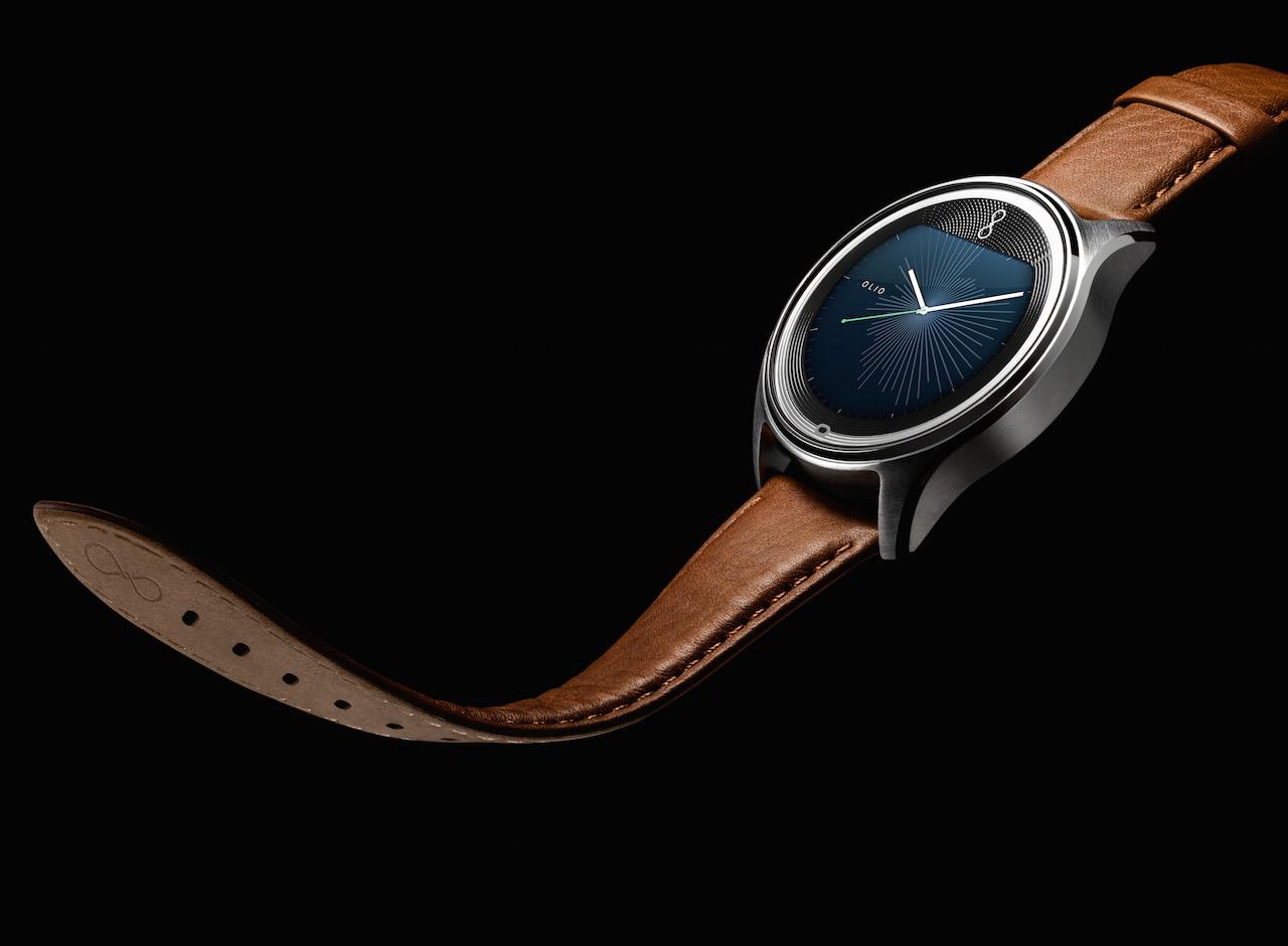
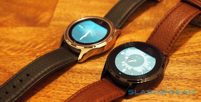
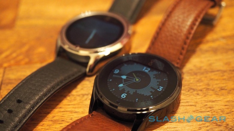
Olio's homegrown platform starts with the watch face – an analog equivalent, differently styled out of the box to suit the case and strap – and the "rays" that emerge from the center. They illustrate the last twelve hours of your digital activity, changing every 12 minutes and giving you not only a unique design, but showing you the ebb and flow your day is taking.
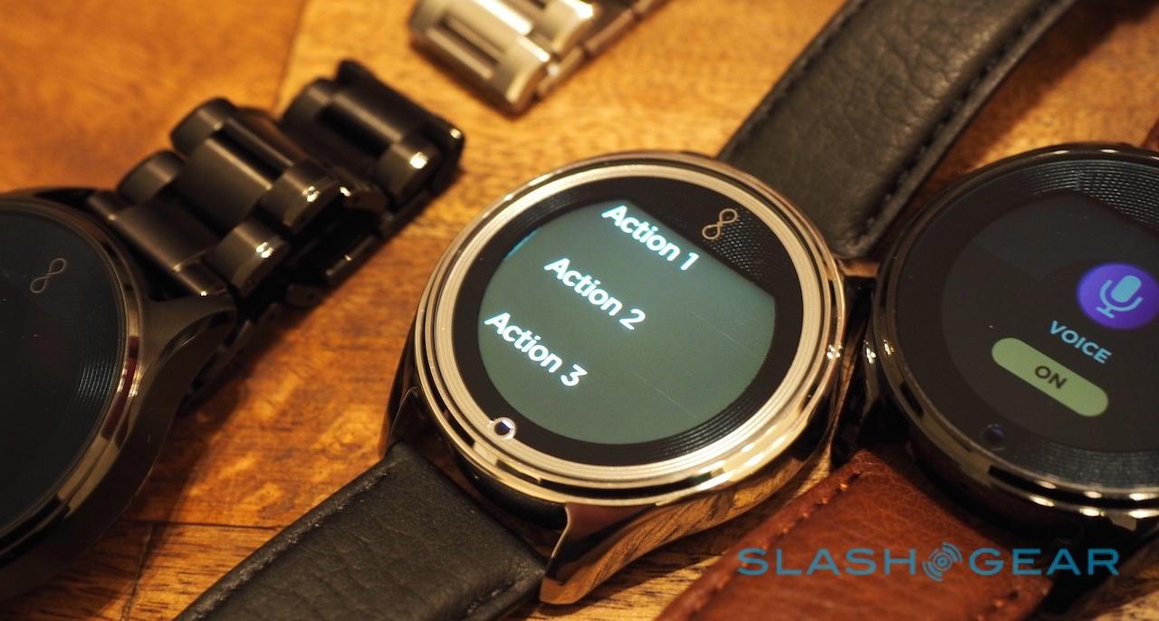
Swipe left and right, and you get a few simple faces: a schedule pane, which shows empty slots for upcoming scheduling, a weather forecast, stopwatch, alarms, and a timer. Swipe up from the bottom, and you get access to the app functionality, which right now consists of remotely controlling music playback.
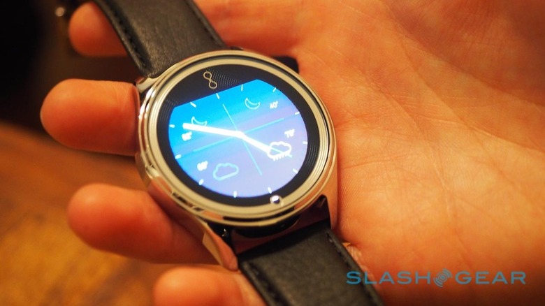
You can't dig through playlists, or search for tracks on Spotify, but Jacobs tells me that's the point: the idea is that you can control the basics without having to look at the Model One's display. It's worth bearing in mind that Olio is still working on the UI, and as such what you see in these photos is still a non-final software build.
Pull down from the top and you get the settings, including a do-not-disturb toggle. For notifications, though, you need to get more bold with your swiping.
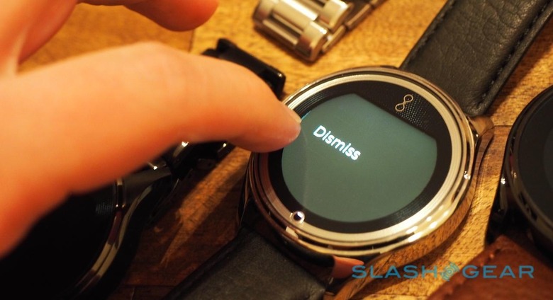
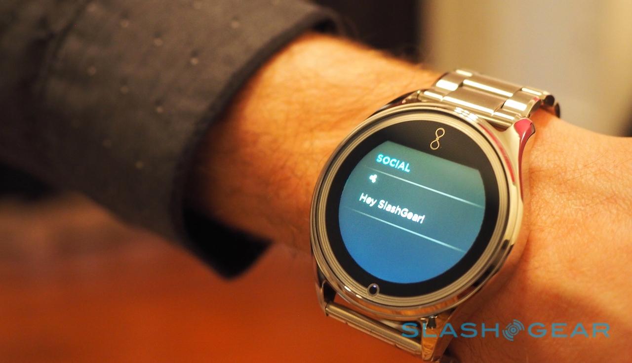
Drag a fingertip over from the left or the right edges of the screen, and you get access to what Olio refers to as "temporal streams": effectively past and upcoming notifications organized into two strands.
Under "earlier" are things like missed calls, incoming messages (the full content of which can be read on the Model One), and alarms. Under "later", you get upcoming appointments and other things yet to happen.
Actually reacting to those things borrows a memo strategy from Barack Obama. On the President's memos, Jacobs explains, there are three boxes along the bottom: "yes", "no", and "tell me more", one of which he ticks when he's read the message.
Cutting it down to three simple options forces a decision and avoids procrastination, and it's that which the Model One echoes. On a notification, you can swipe one way to dismiss it, tap it to open and see more (such as the content of an SMS or email), or swipe the other way to trigger an action (or access a short list of actions) predefined on your phone.
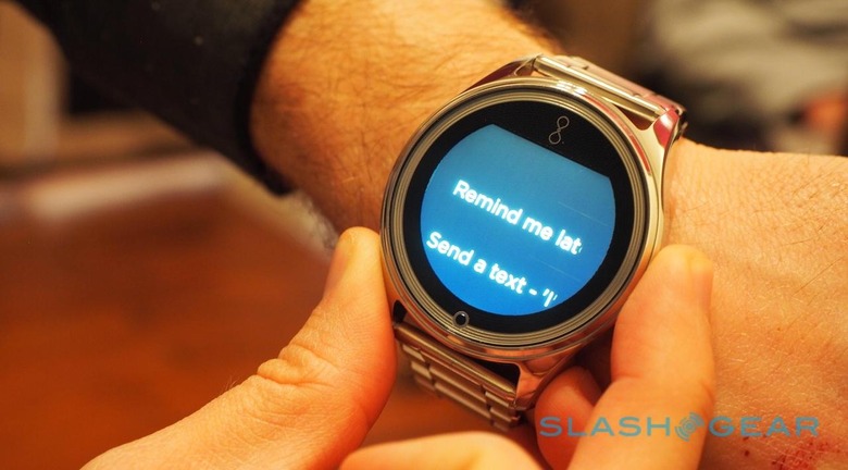
That might include firing off a canned reply, or telling Olio that you want to be reminded about the alert later. That way, Jacobs explains, there's no "losing" notifications just because you don't act on them straight away.
Accompanying that is Olio Assist, a cloud-based personal assistant that acts as an interface between the Model One and other services, as well as injecting some context into your notifications. It looks at individual preferences, schedules, contacts, and such, and then sets actions and makes timely suggestions based on the idea of "how can I save this person time."
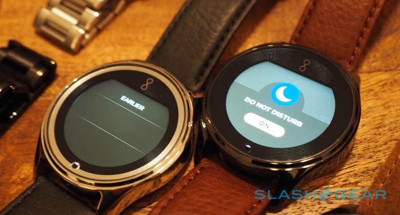
For instance, if you're going into a meeting, Olio Assist might ask "do you want me to hold your incoming messages?" and, if you swipe to accept, then not only silence your phone but give you a recap of what you missed when the session is over.
Similarly, if someone tries calling or messaging while you're driving, Olio Assist could tell them you're occupied, and then remind you to get back in touch with them later. "Nothing is going to get dropped," Jacobs says, explaining that Olio Assist learns from your preferences over time, but never oversteps the mark. "It's not predictive, but perceptive."
Also helping single Olio out is its compatibility with Android and iOS, rather than just one platform. Jacobs is also in talks with various potential partners, discussing how they might tap into the smartwatches sensors for health logging, for instance, or even in automotive, giving autonomous or semi-autonomous vehicles cues on whether drivers are alert to take control should the system require it.
The familiar names in fitness, home automation, and entertainment are all expected to show up, but not necessarily with their full range of features. Olio doesn't envisage you being able to precisely set your Nest thermostat temperature from your Model One, for instance – that's something better suited to doing in a smartphone app, Jacobs argues – but it might pop up an actionable notification that relates to it in a very specific way.
That might be asking you if you want to prematurely shut the air-conditioning off if unexpectedly nobody is home, something you can quickly act upon or dismiss with a single swipe.
The final component to the Olio story is upgradability. A premium casing isn't something you're going to want to discard every few years, and so Jacobs and his team have designed the internal "brain" – the Model One's equivalent of the watch mechanism – to be swappable later on, when features improve.
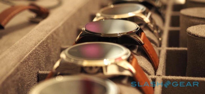
Exactly what will, and won't, be upgradable isn't defined yet – Jacobs said that the internal hardware made sense, but the display itself might not – but Olio's goal is to broaden the range rather than just replace the Model One. The company isn't opposed to licensing out Olio Assist and the smartwatch's OS, should potential partners be keen.
Is that the right balance of functionality for the price Olio is charging? I'm all for more context in wearables, rather than just more features, but Olio faces a challenge selling app-hungry potential users on its minimalistic approach.
Pre-orders kick off today, at $595 for the steel finish and $745 for the black finish, each with a leather band. Opting for a link bracelet will carry a premium, of course, and Olio says the initial run is limited to 500 units.
MORE Olio Devices

