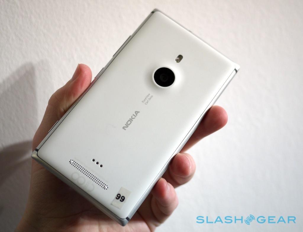
Nokia Lumia 925 Hands-On
The Nokia Lumia 925 bottom line is simple: it's the best looking, best feeling Windows Phone 8 handset Nokia has given us to-date, and while it may not be PureView as the 808 outlined it, Nokia is aiming big with claims that it offers the best low-light performance of any smartphone on the market. Officially announced today, we caught up with the Lumia 925 to see whether it truly lives up to its premium billing, and whether – as Nokia insists – it can live alongside the Lumia 920 and 928, rather than just muddy the waters. Read on for our first impressions.
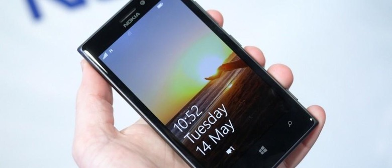
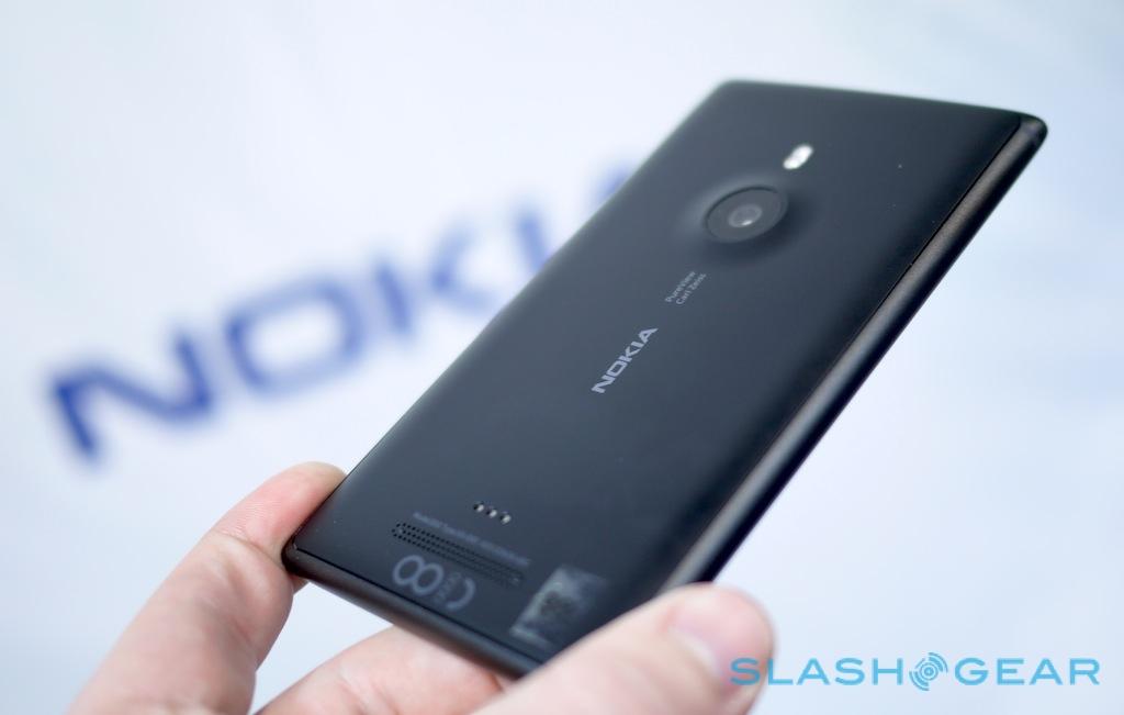
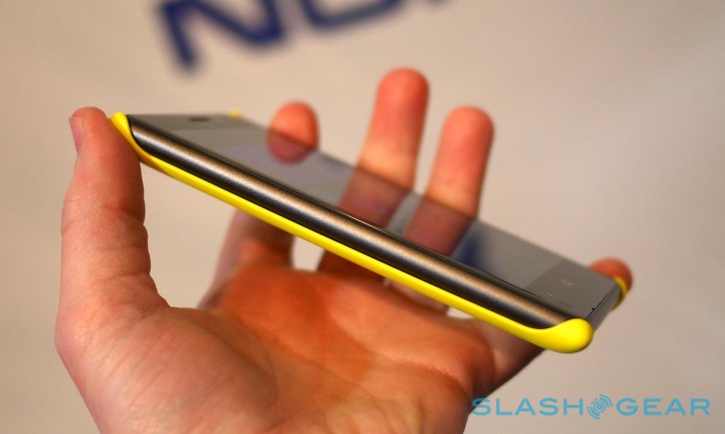
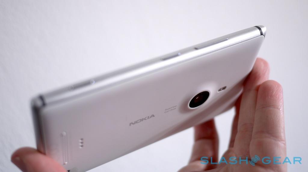
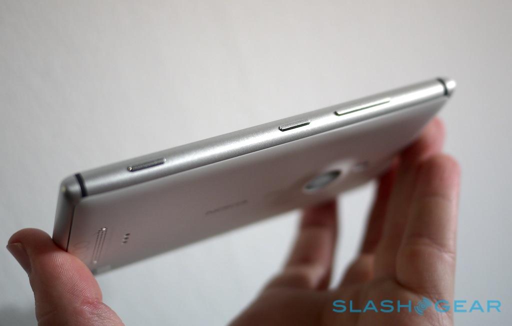
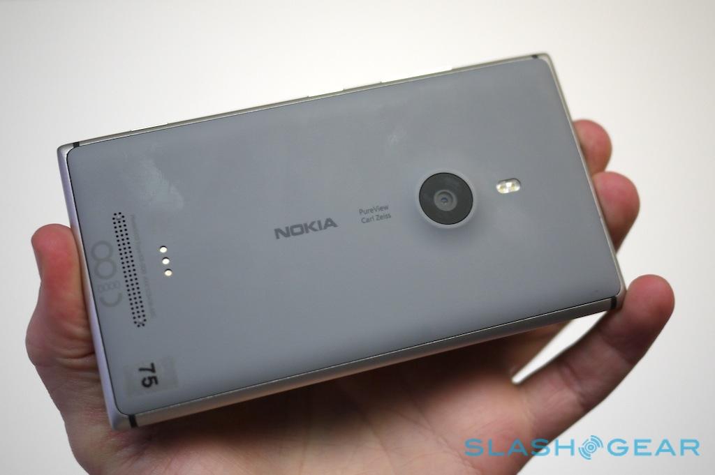
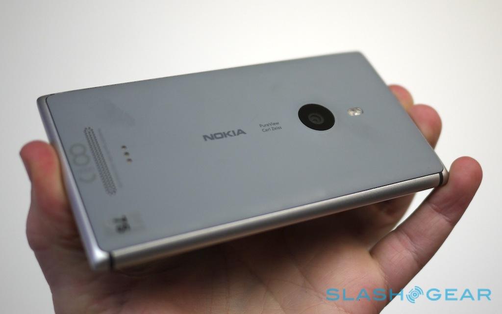
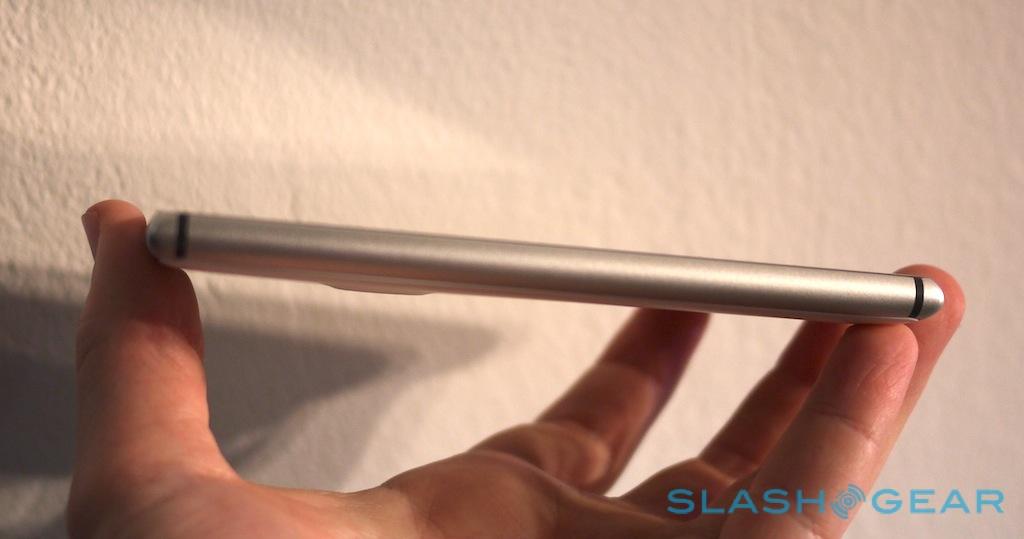
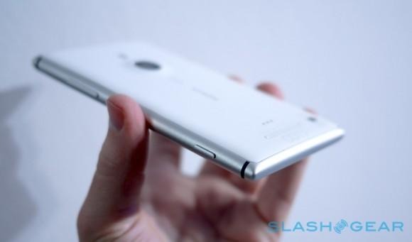
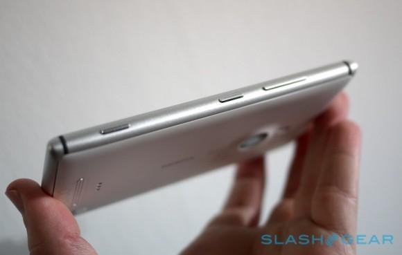
There's something about metal which makes a phone feel great. Apple knew that with the iPhone 5; HTC realized it with the One; and now Nokia has succumbed with the Lumia 925 (previously known as the Nokia "Catwalk"). Specifically, the 127.5 x 70.5 x 8.5 mm, 139g chassis is constructed around a frame of anodized aluminum, which tapers to tactile, curved edges on all four sides. The metal also serves an important purpose beyond rigidity and feel, however; it's the antenna for the Lumia 925's pentaband 4G LTE radio (as well as the GSM/UMTS bands), saving space by making it a constituent part of the phone.
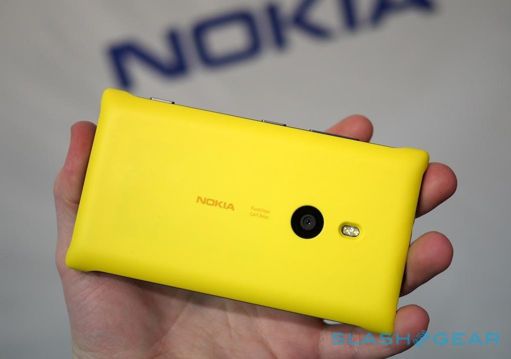
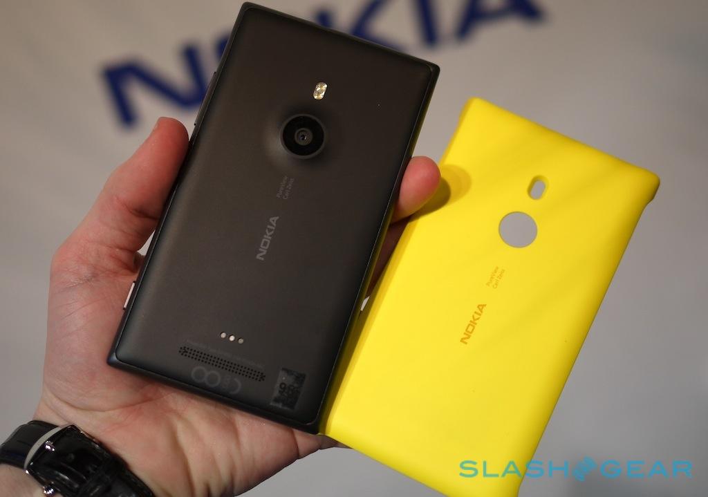
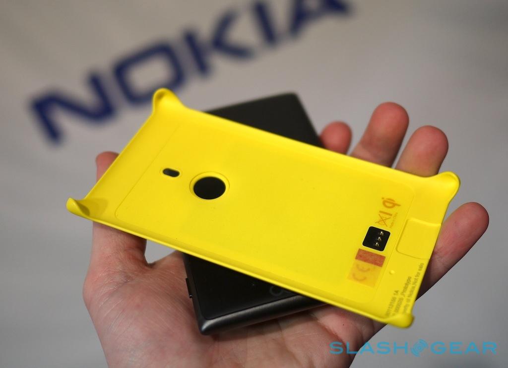
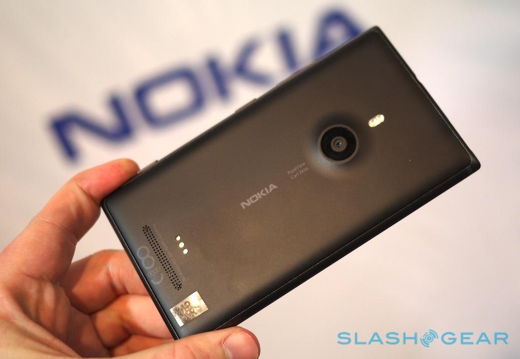
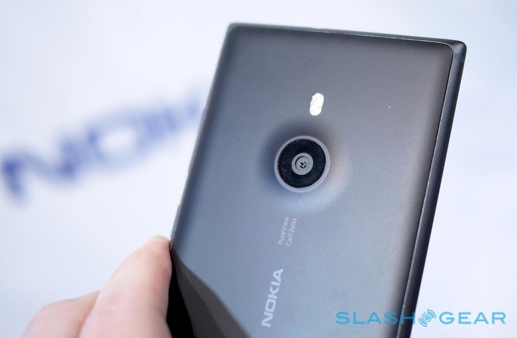
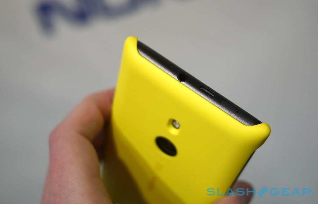
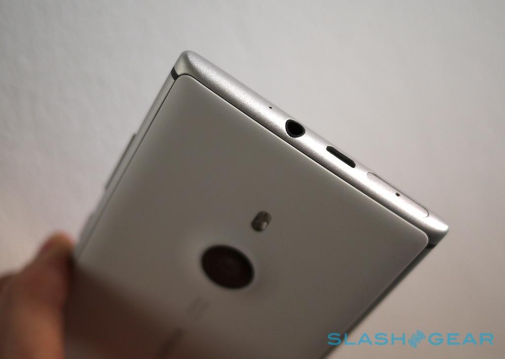
On the front there's a slice of toughened Gorilla 2 Glass, while on the back there's Nokia's favorite polycarbonate. Plastic meets metal in a gentle curve at the edge of the phone, neatly dovetailing in a way that feels great nestled into your hand; that polycarbonate also swells – Nokia says "pillows" – to accommodate the camera lens, atop the dual-LED flash. A row of contact points for the optional wireless charging shell are below.
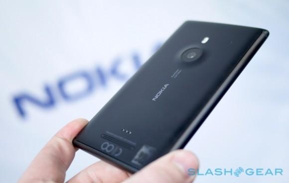
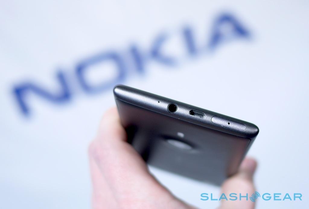
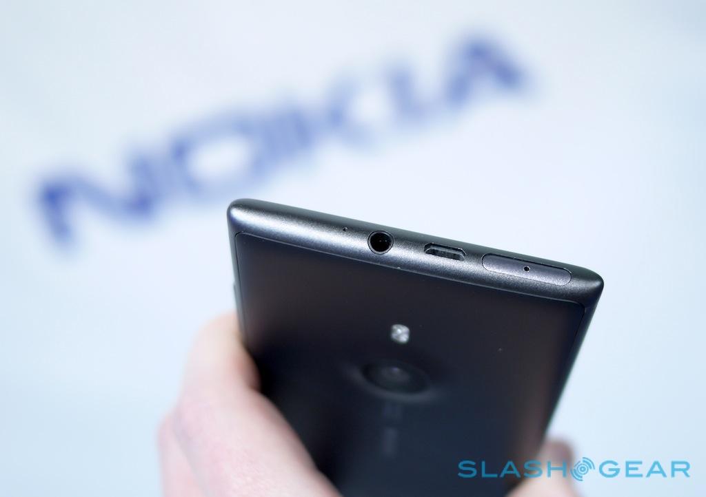
In terms of hand-feel, Nokia is onto a winner out of the gate. Gone is the heft of the Lumia 920, and its slightly toy-like glossy plastic, replaced with premium-feel materials and a more refined design. A 3.5mm headphone jack and a SIM slot punctuate the top edge, along with microUSB connectivity, while the usual volume rocker, power/lock key, and camera shortcut run along the right edge.
Nokia Lumia 925 hands-on:
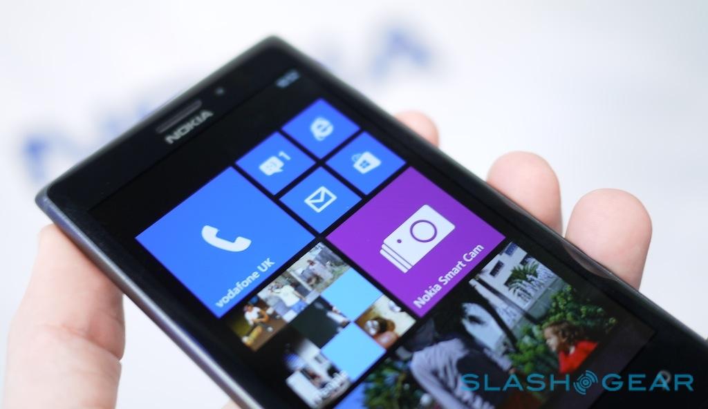
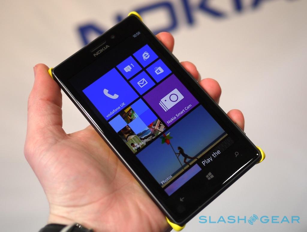
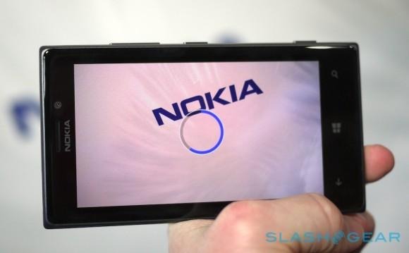
Up front is another improvement, the 4.5-inch OLED ClearBlack display that debuted on Friday on the Lumia 928. Just as on the Verizon phone, it supports a high-brightness mode for outdoor readability, and super-sensitivity for use while wearing gloves. It's also stunning to look at: colors are vivid, blacks inky, and the broad viewing angles mean you can glance almost entirely askance at the Lumia 925 and still make out graphics without aberrations. The 1280 x 768 resolution may not be the Full HD we've seen on some recent Android devices, but it's certainly sufficient for text and the like on a 4.5-inch phone to be smooth.
Nokia's emphasis with its recent Windows Phones has been on their photographic abilities, and the Lumia 925 is no different. Like the 920 and 928, it bears the coveted PureView branding, and in fact it packs the same 8.7-megapixel sensor as they do. The optical image stabilization system – which physically moves the entire camera assembly to match shake and judder – is also the same, as is the dual-LED flash system from the 920.

What's different is the lens, and here Nokia and Carl Zeiss have cooked up a World's First on a smartphone: the first 6-part lens. Where the Lumia 920/928 have 5-part lenses, combining five different plastic components, the new Lumia adds a sixth, glass lens, which Nokia claims will improve sharpness and low-light performance.
In fact, Nokia says the Lumia 925 is capable of the "best low light images without a flash" of any current smartphone, with its f/2.0 lens, OIS, and exclusive Zeiss optics. It also uses the 925 to debut Nokia Smart Camera, a suite of effects and post-processing that can replace the default camera app should the owner see fit.
Smart Camera approaches things much in the same way as HTC and Samsung have on the One and Galaxy S 4, respectively: with the assumption that having more photo data to choose from is A Good Thing. In the Lumia 925's case, that means firing off a burst of 10 frames over the course of 2.5 seconds when you hit the shutter-release, elements from each of which can then be combined or generally modified in different ways.
In the gallery, Smart Camera clusters of shots show up with a single thumbnail, but when you open them (and tap the "Smart Camera" legend) the editing potential is unlocked. First up is Best Shot, which analyzes each of the ten frames and picks out whichever it decides is the best based on sharpness and other details. Swiping left and right allows for a manual override. Swipe down, meanwhile, and you go through the other options: Motion Focus, Object Removal, Action Shot, and Group Shot.
Motion Focus tries to inject some more vigor into your stills. Smart Camera automatically identifies the subject of the frame – you can swipe left and right, and see white outlines of each of the potential subjects that can be used – and then applies one of two degrees of blurring to the background. A similar editing system is implemented in the Object Removal system, with the Lumia 925 identifying potentially unwanted people or objects moving through the frame, and then combining elements from the ten different shots to get rid of them.
Nokia Lumia 925 Smart Camera demo:
Group Shot is the face-combining system we've already seen on previous Lumia devices, based on the same Scalado tech as BlackBerry 10 has used on the Z10 and Q10. Nokia tells us its version in Smart Camera is actually newer than what we've seen before, another exclusive for the Lumia line-up.
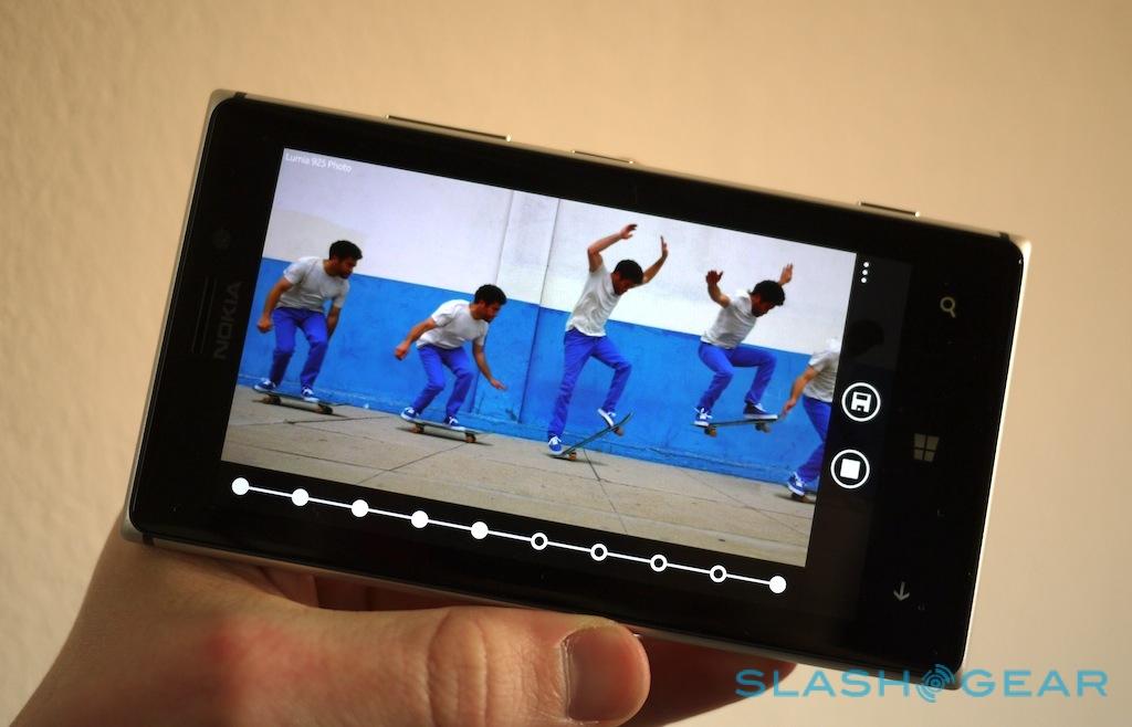
Finally, and perhaps most impressive, is Action Shot. This works best when there's a moving object passing through a still frame: then, just as with Motion Focus, the Lumia 925 identifies the moving subject and allows you to combine multiple versions of it on top of a single background. A row of straightforward buttons along the bottom allows you to toggle content from each frame on or off, while a fade button blurs out details from all but a single, user-selected frame.

They're ambitious effects (and Nokia says more are on the way), but they're also system-intensive. Smart Camera shoots and saves the cluster of ten images swiftly, which is good since we hate missing a great image because of a sluggish phone, but actually using the editing tools demands some patience.
We clocked the Lumia 925 in at 15 seconds just to analyze the frames initially, when we tapped into them from the gallery. That process needs to be completed each and every time you open the same set of ten stills: there's no caching of the analysis, for instance. Tweaking things like the combinations of Action Shot frames happens instantly, but there's another delay involved when you export the final result, with it taking around 14 seconds to spit the still into the gallery.

Now, it's worth remembering that Nokia still has some time to finesse the software – the Lumia 925 isn't expected to hit shelves until June, after all – but it does take away some of the immediacy of the tweaking process. There's also no way to just look at all ten frames without jumping straight into the editing suite, which can make browsing through photos a stop-start affair.
It's a shame, because generally the phone runs smooth and fast. With the same dualcore processor and RAM as the Lumia 920 and 928, the Lumia 925 had no problems running through the browser and other apps that we could find. There's also Nokia's own HERE Maps and HERE Drive+, with offline turn-by-turn navigation among other things, and the full array of Windows Store apps to choose from. Nokia Music for free streaming and offline playlists is also included.
If we had to compare the Lumia 925 to the rest of Nokia's current range, it's probably best described as the specifications of the 928 with the sleek design of the 720, only with build quality that's a step above anything we've seen from Nokia in recent months. Photos simply don't do the Lumia 925 justice: you have to pick it up and feel how its careful curves fit into your hand.
True, there have been some compromises along the way – Nokia's decision not to integrate wireless charging is perhaps acceptable given the dimensions of the phone, and the company's supposed goal of "meaningful thinness", but it also should be ashamed that there isn't a snap-on wireless charging shell included in the box – but overall it's the most compelling Windows Phone Nokia has made so far.
The full judgment will have to wait until we can spend some more time with the Lumia 925 and see how it – and its camera abilities – fit into our daily lives. That should happen closer to the smartphone's June 2013 release, with it landing in the UK, Germany, Italy, Spain, and China initially, followed by the US and other countries.
