Nokia E7 Browser & Multimedia [Video]
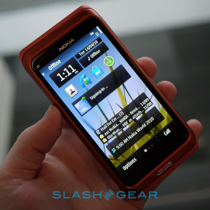
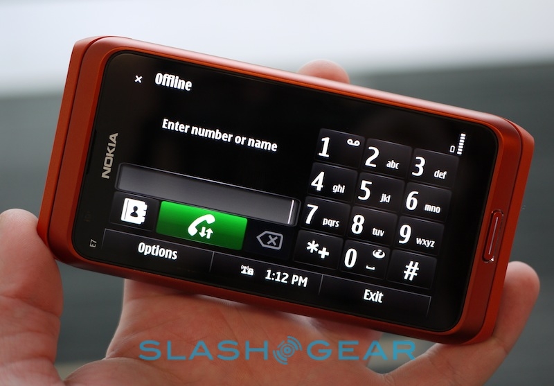
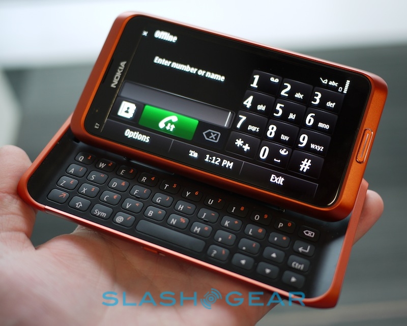
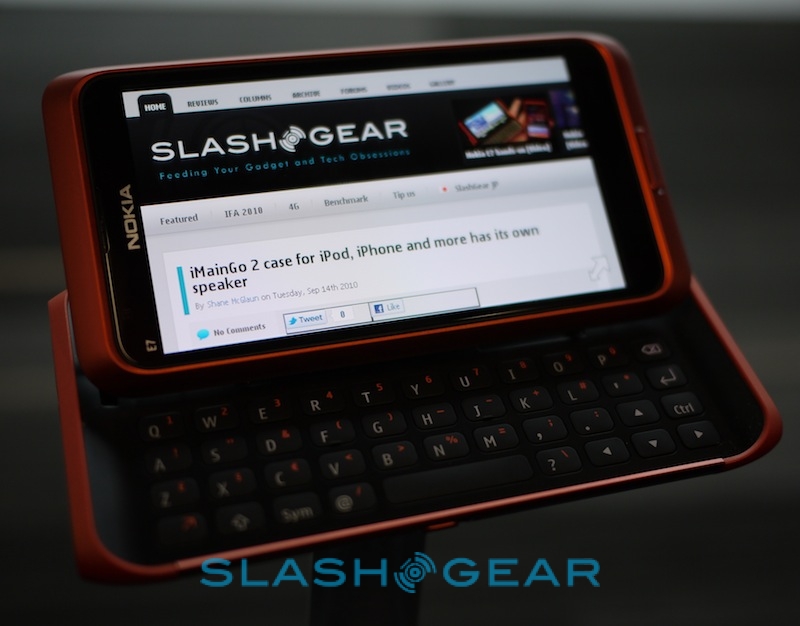
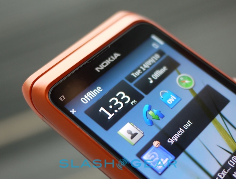
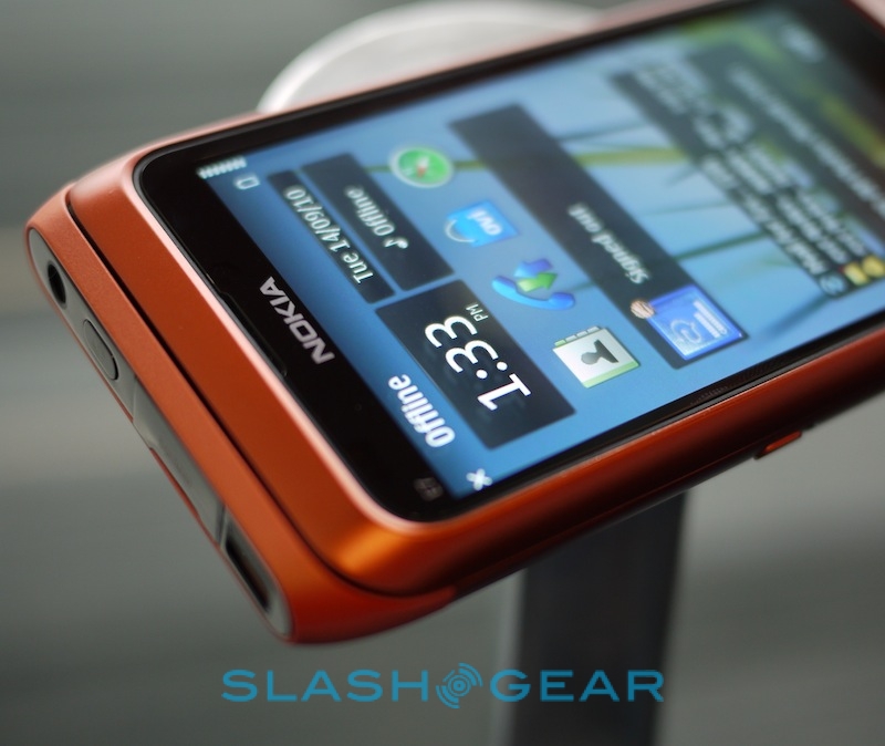
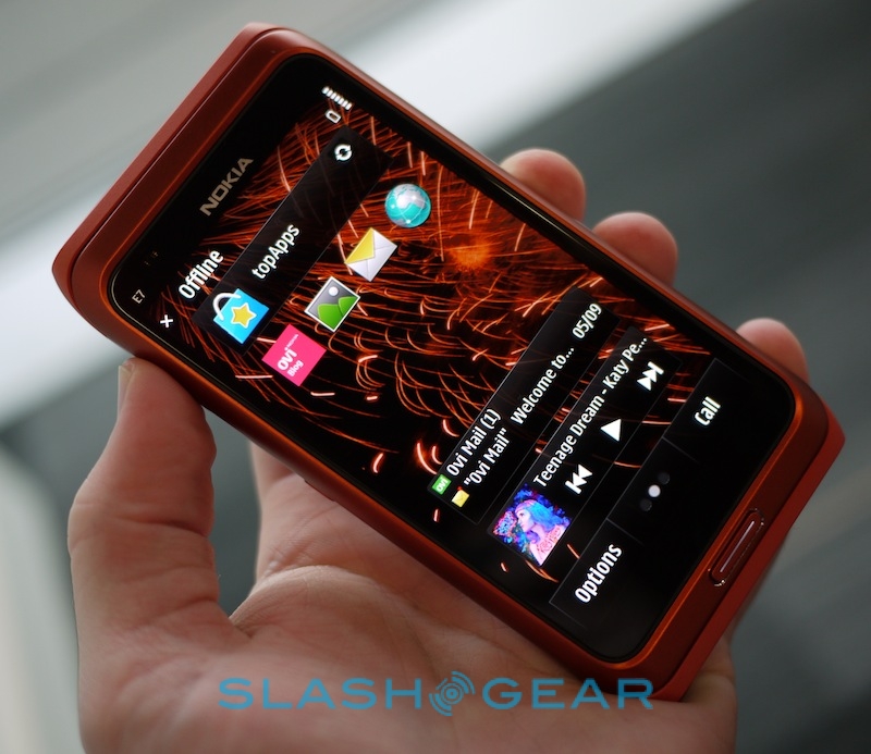
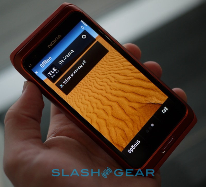
Nokia's E7 may slot into the Finnish company's business-centric ESeries range, but that's not to say the handset has nothing for more mainstream users. We spoke to Nokia's David Rivas, VP of technology management, about the E7's multimedia appeal, together with finding out why, exactly, they're so confident with it as an enterprise offering. Meanwhile we also grabbed some more time with the E7 and shot more hands-on video and photos, all of which you can find after the cut.
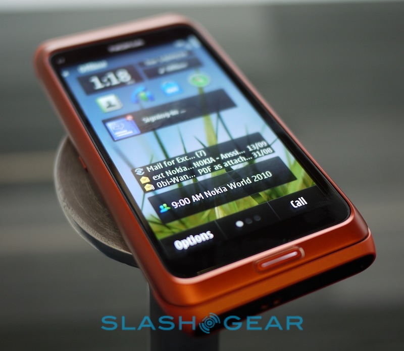
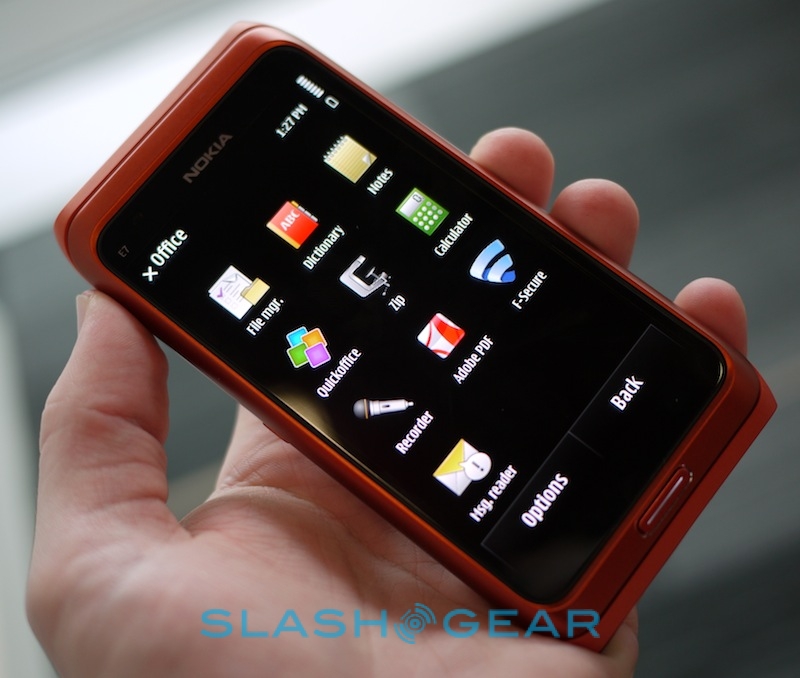
According to Rivas, the key differences between the N8 and the E7 is the software suite. The E7 is the first device from the company to show the fruits of their collaboration with Microsoft, including preloaded business apps and much stronger integration with enterprise services like Exchange. However, Nokia also envisages the E7's huge screen and strong connectivity to appeal to multimedia producers and consumers, as well as mobile bloggers.
Nokia E7 browser & multimedia demo:
[vms 2ce17fd8fcd40041c068]
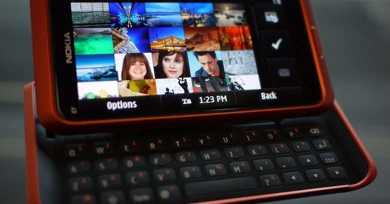
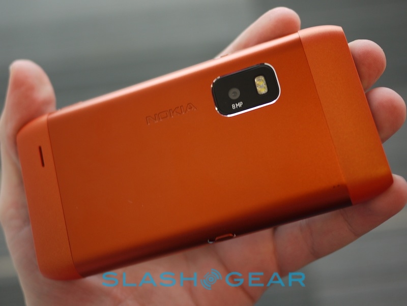
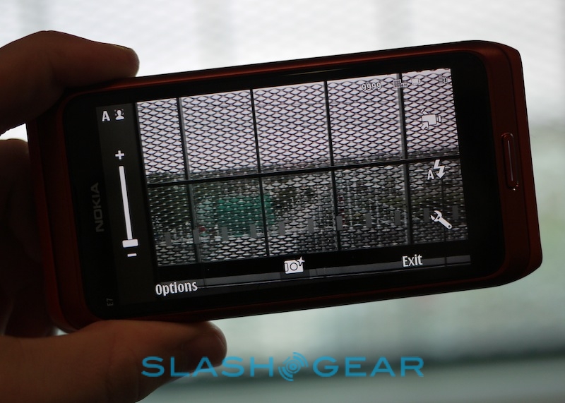
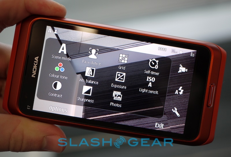
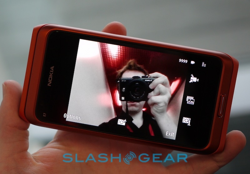
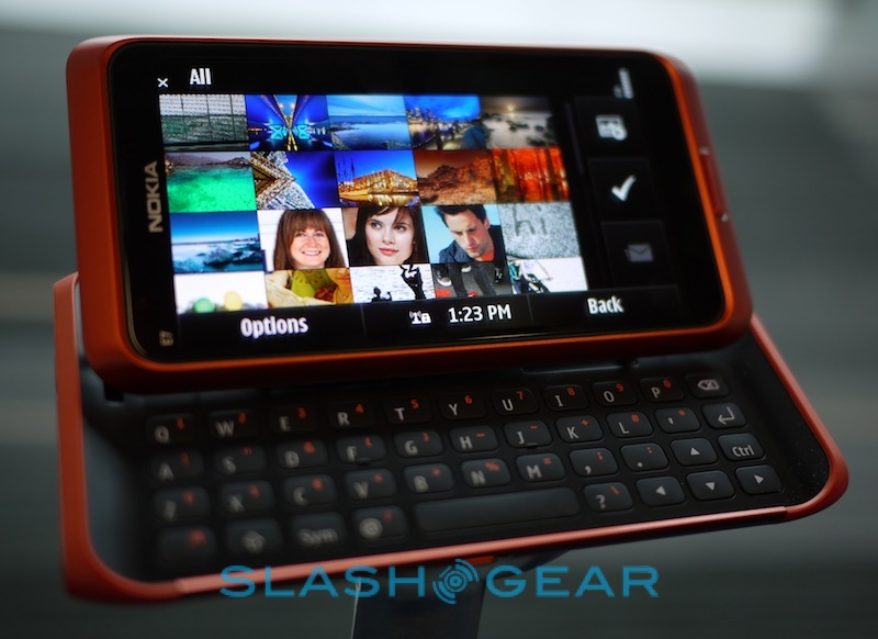
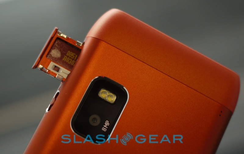
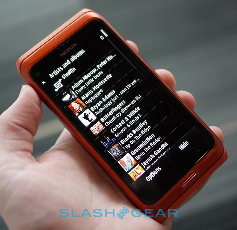
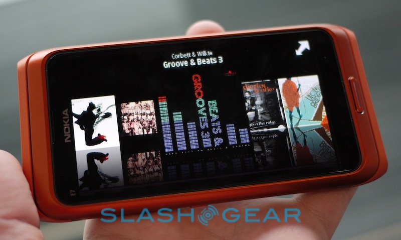
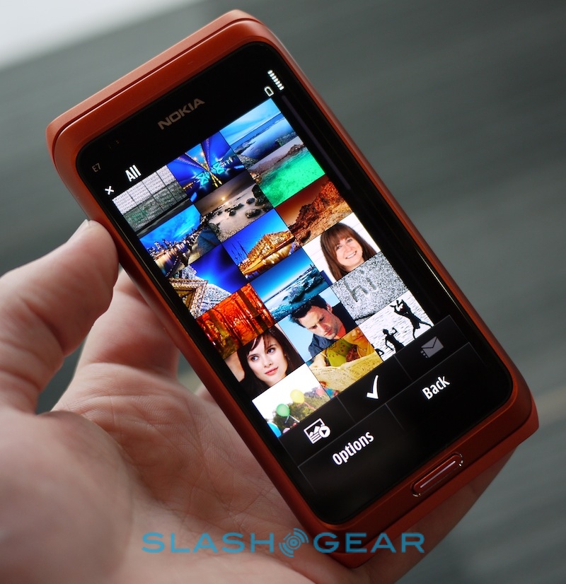
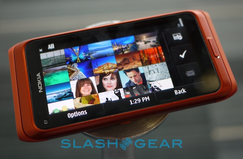
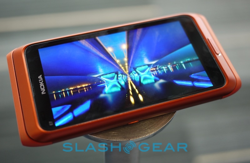
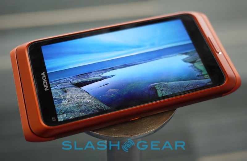
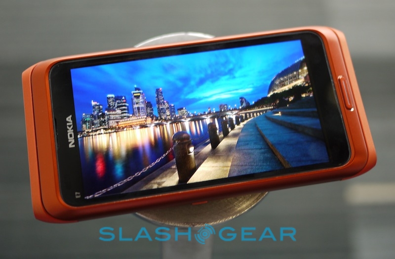
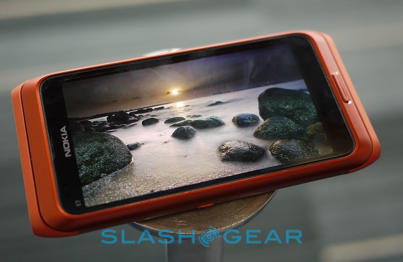
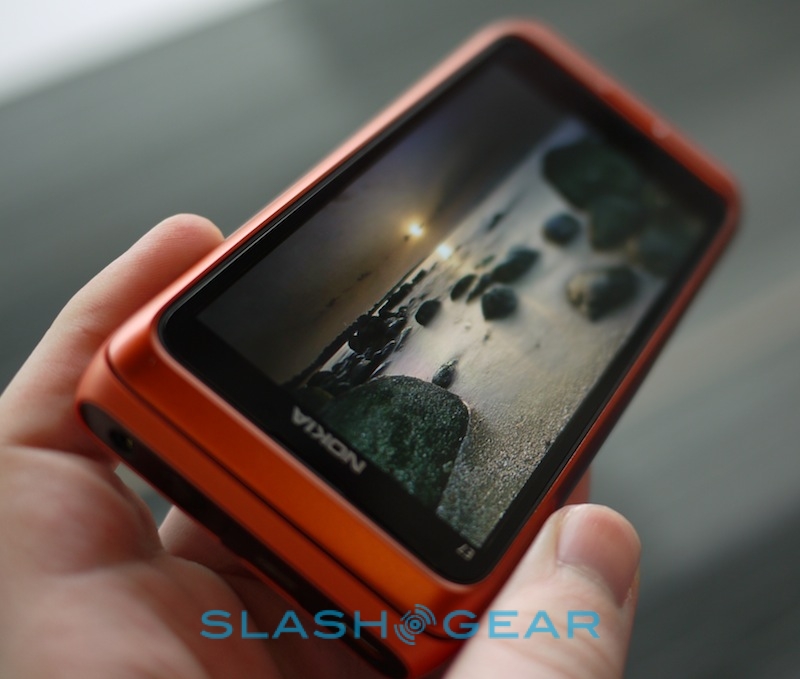
We can't really argue with that. The E7's 4-inch 640 x 360 AMOLED – using Nokia's new ClearBlack Display tech – is clear, beautifully color saturated and looks great showing off photos and video (including those taken by the phone's own 8-megapixel autofocus camera). Symbian^3's media browser is as close to CoverFlow as you imagine Apple's lawyers would allow, and the handset's processor proved easily capable of keeping up with fast-flicking navigation.
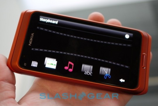
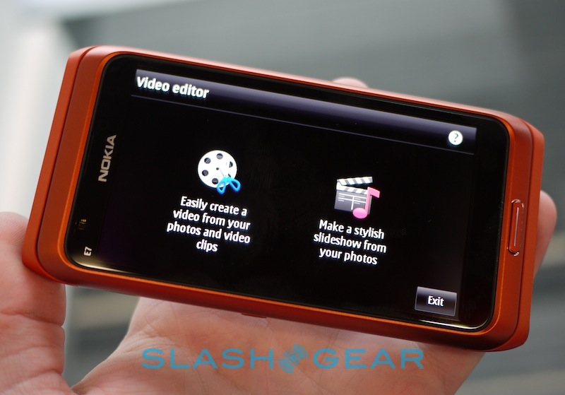
As on the N8, the E7 gets Nokia's preloaded video editing app (which can also be used to create photo slideshows), complete with transition effects, titling, optional soundtracks and even basic editing. Unlike iMovie for iPhone, it's not a cost-download either.
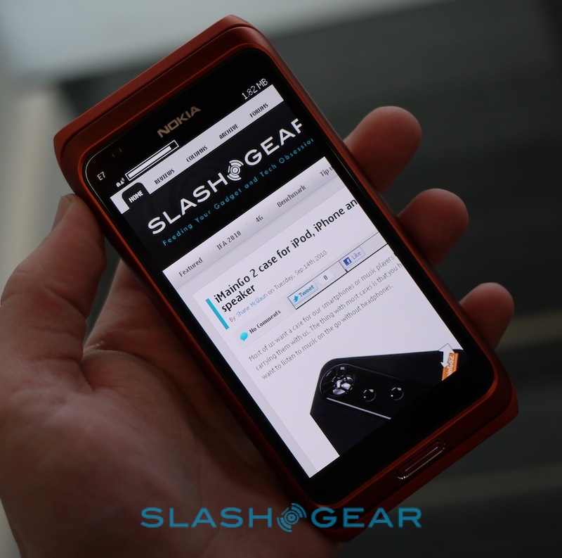
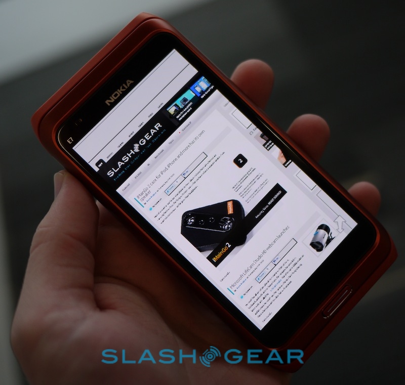
The browser is solid, meanwhile, but not the best on the market. Although it supports multitouch for pinch-zooming, the animation is jerky and there's a pause while the page renders. Pinch-zooming in the photo viewer was stronger. Double-tapping a block of text, which for instance on Android will automatically reflow it to suit the zoomed-in screen, only zooms, meaning there's still plenty of side-scrolling to be done.
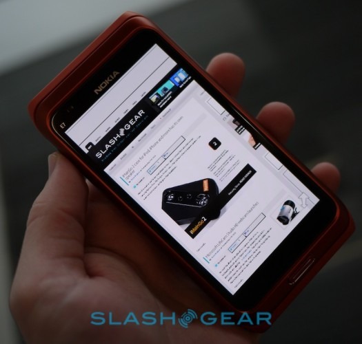
That'll all improve, however, when Nokia's new Webkit-based browser is launched. According to Rivas, that will put them on the cutting edge of mobile browsing technology, and is evidence of Nokia's stance that the browser is the single most important application on a device today. The new version will prioritize efficiency and compatibility with web standards, and see the underlying rendering engine made available to other applications (whether Nokia's own or from third-parties). That should have the effect of boosting app speed, since a sluggish browser engine has often been a stumbling block for developers.
Rivas also confirmed that E7 owners can expect regular firmware updates, moving away from the historic pattern of a few OTA changes but generally "big" sideloaded upgrades, and instead transitioning to more regular, incremental OTA packages. However there'll also be more significant PR updates, which Nokia expect to be much more timely in their release.
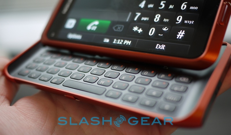
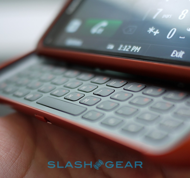
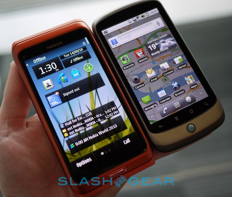
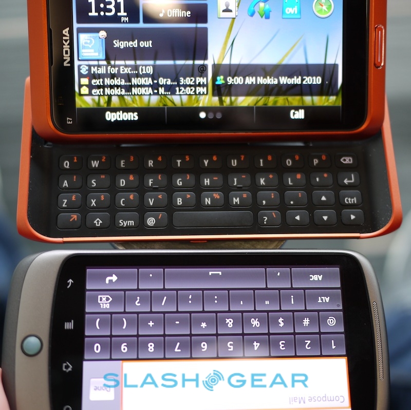
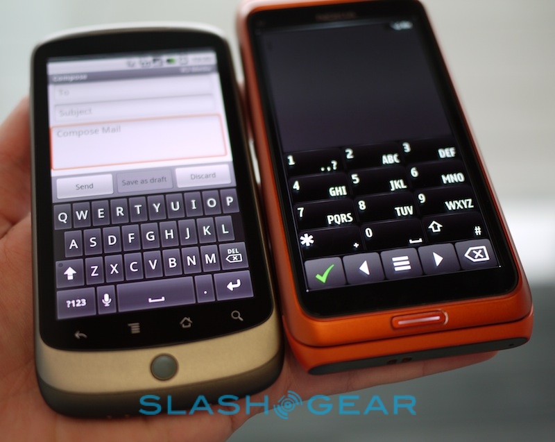
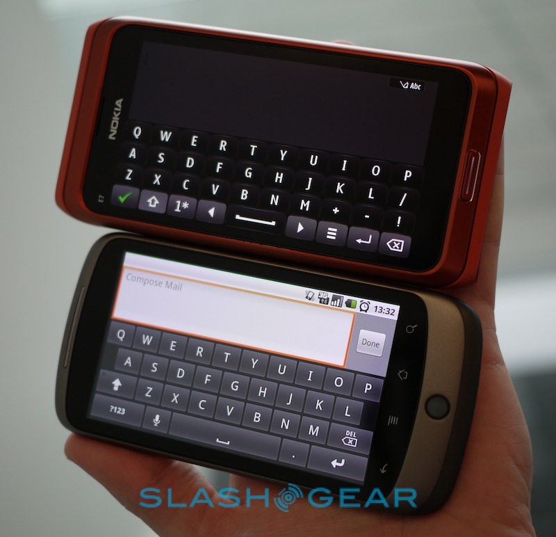
There's plenty to like about the Nokia E7. The display is brilliant, easily better than the Nexus One we compare it with in the gallery below, while the QWERTY keyboard is useful and tactile. Truth be told, if it were running Android we'd have no qualms at all about its mainstream success; with Symbian^3, as with the N8, there's a sense that the hardware is a few steps ahead of the software it runs. The company is still bullish about their smartphone sales, and still enthusiastic about Symbian and its future, but while the OS is certainly well polished (as Michael Gartenberg says, it's the best implementation of the platform to-date) it simply doesn't feel as fresh as its Android, iOS and webOS rivals.
