Nokia 2010 Symbian UI Update Gets Previewed
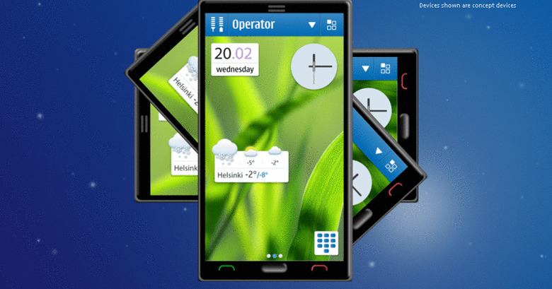
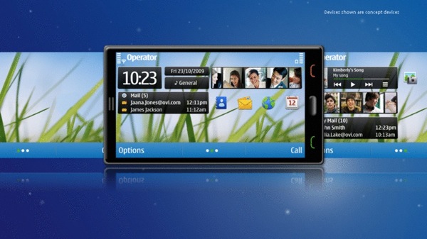
Nokia's promise to overhaul the Symbian UI yesterday was heavy on stats but light on screenshots, but thankfully the company's webcast is fair overflowing with concept renders. The Finnish company has promised not only to make the UI more attractive – by cutting out clutter and upping scrolling rates from 15fps to 60fps – but more functional too, slicing out the number of taps required to complete tasks or launch features, and giving users "large capacitive displays" to do that tapping on.
It's probably too much to expect the slick concept device Nokia's designers have thrown together to be anything like what the company have on the drawing boards, but we certainly wouldn't argue with a keyboard-free capacitive version of the N900. One of the biggest changes, Nokia claims, will be removing some of the more frustrating user prompts, and with 350 of them that's a decent move toward a less-frustrating owner experience.
In the end, we'll have to see exactly what Nokia come up with on shipping devices; we've seen concept videos and mock-ups before, but there seems to be something stopping those excellent ideas from transitioning to production handsets. Still, with two "major product milestones" on the cards for 2010, and the UI project underway, Nokia don't look to be taking their flattening market share lying down.
[viddler id=ce1982dd&w=540&h=219]
[via Engadget]


