Nokia 2010 Symbian UI Update Detailed: Built On Qt
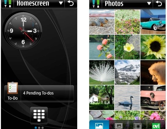
Remember the concept mockups of what Nokia envisaged its Symbian S^4 UI might look like after it's reworked in 2010? The company showed off a brief video demo back in early December 2009, and now they're opening up the floodgates with some more technical information, a concept proposal and a call for feedback from users and developers.
Nokia have also been upfront about what elements of S^4 UI design overlap with rival platforms, and how they differ. In their User Interface Concept Proposal (v.2) [DOC link], they compare it to Android's moveable homescreen (though Symbian Foundation has "independent unique pages" rather than one multi-panel screen), the way Palm's webOS does away with Exit commands (but Symbian will save exit state and release phone memory rather than keep the app running in the background), and the iPhone's "flattened application library" (though Symbian will use an alpha-ordered layout with various viewing filters, rather than manual organisation).

Notable tidbits include top and bottom menu bars that can slide completely offscreen, streamlining menus down to just four – contacts, music, photos and applications – along with support for irregularly shaped homescreen widgets that can be freely placed. There'll also be a central power/notification menu and more consistency throughout the UI, together with support for transparency in application chrome. The new UI will be built in Qt, and replace the existing S60 Avkon UI framework along with directly supporting touch and "hybrid" devices.
[via Twitter]
