Nexus 10 Review
Google's Nexus 7 demonstrated that the search giant should be taken seriously in affordable tablets; now, the Nexus 10 has arrived to prove Android has big-screen star quality. Offering a display that out-Retinas Apple's iPad and no shortage of top-tier specifications, the Samsung-made Nexus 10 also manages to do all that while undercutting the iPad 4 by $100. Android tablets have always had more of a problem than ticking the spec sheet, though, so does the combination of Jelly Bean 4.2 and the Nexus 10 mark a real turning point? Read on for our full review.
Hardware
While ASUS and Google made some brutal decisions to bring the Nexus 7 down to its sub-$200 price point, the Nexus 10 demands far fewer compromises. In fact, Samsung has delivered a few "firsts" in its new tablet, most notably the 10.1-inch 2560 x 1600 WQXGA display (more on which in a moment). The Nexus 10 also gets a dual-core 1.7GHz Exynos 5250 A15 processor with Mail T604 graphics and 2GB of RAM, and a choice of 16GB or 32GB versions. Like the Nexus 4 smartphone, though, there's no memory card slot for adding your own storage; Google would rather you opted for its Drive cloud.

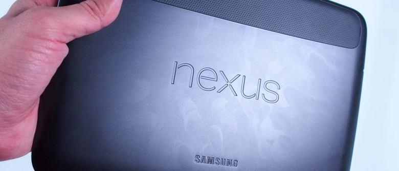
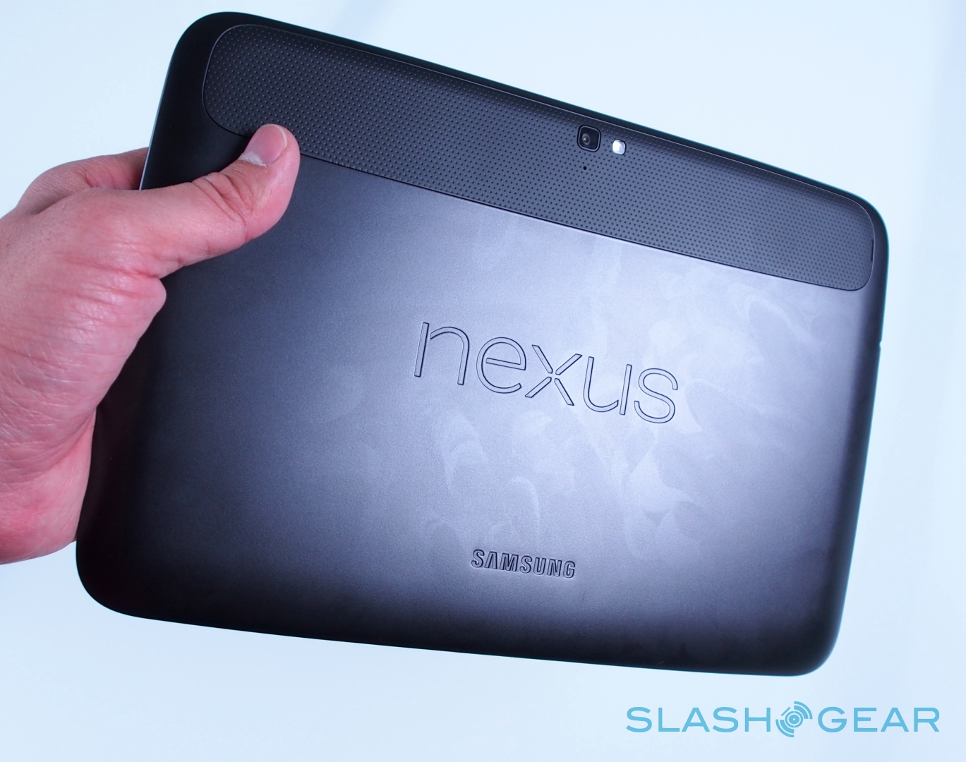
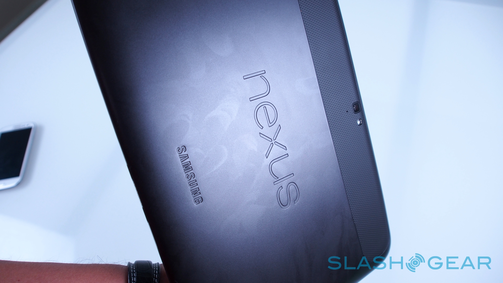
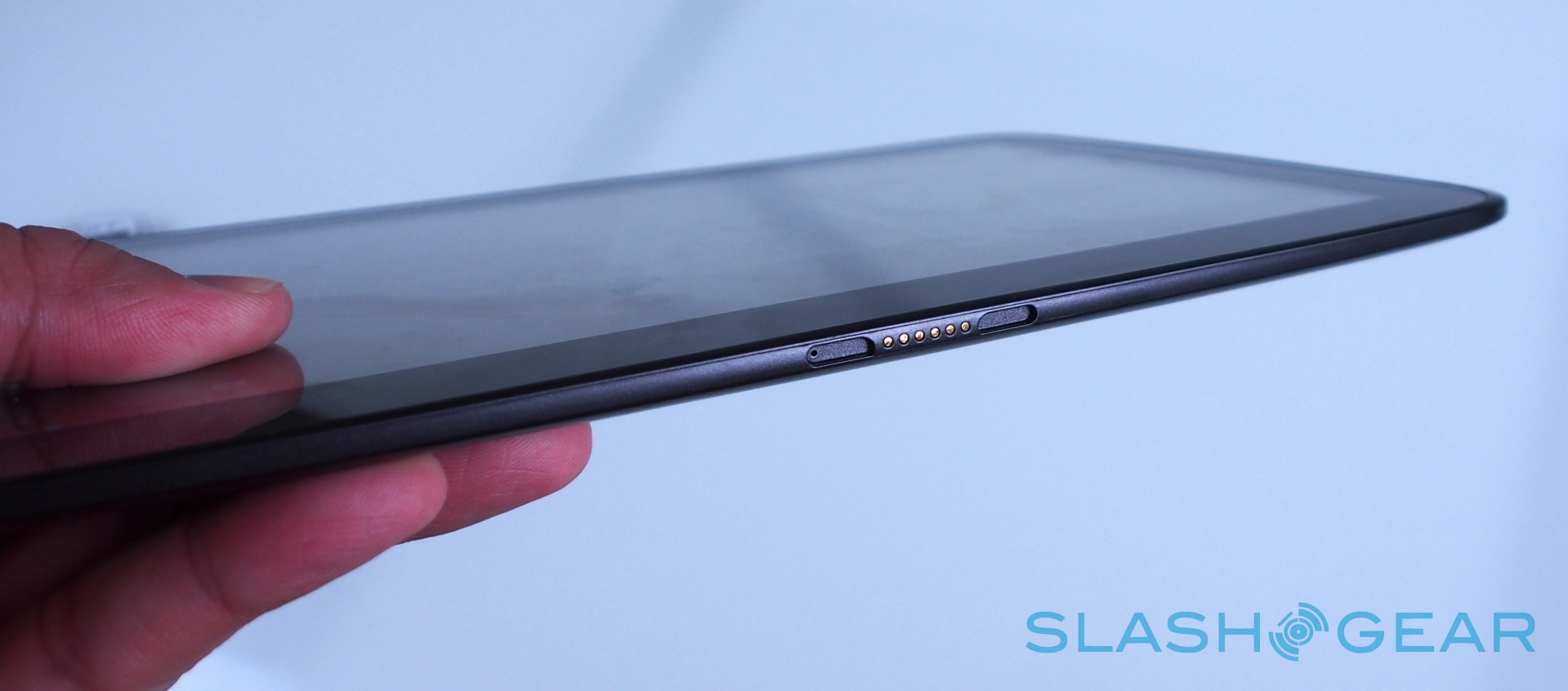
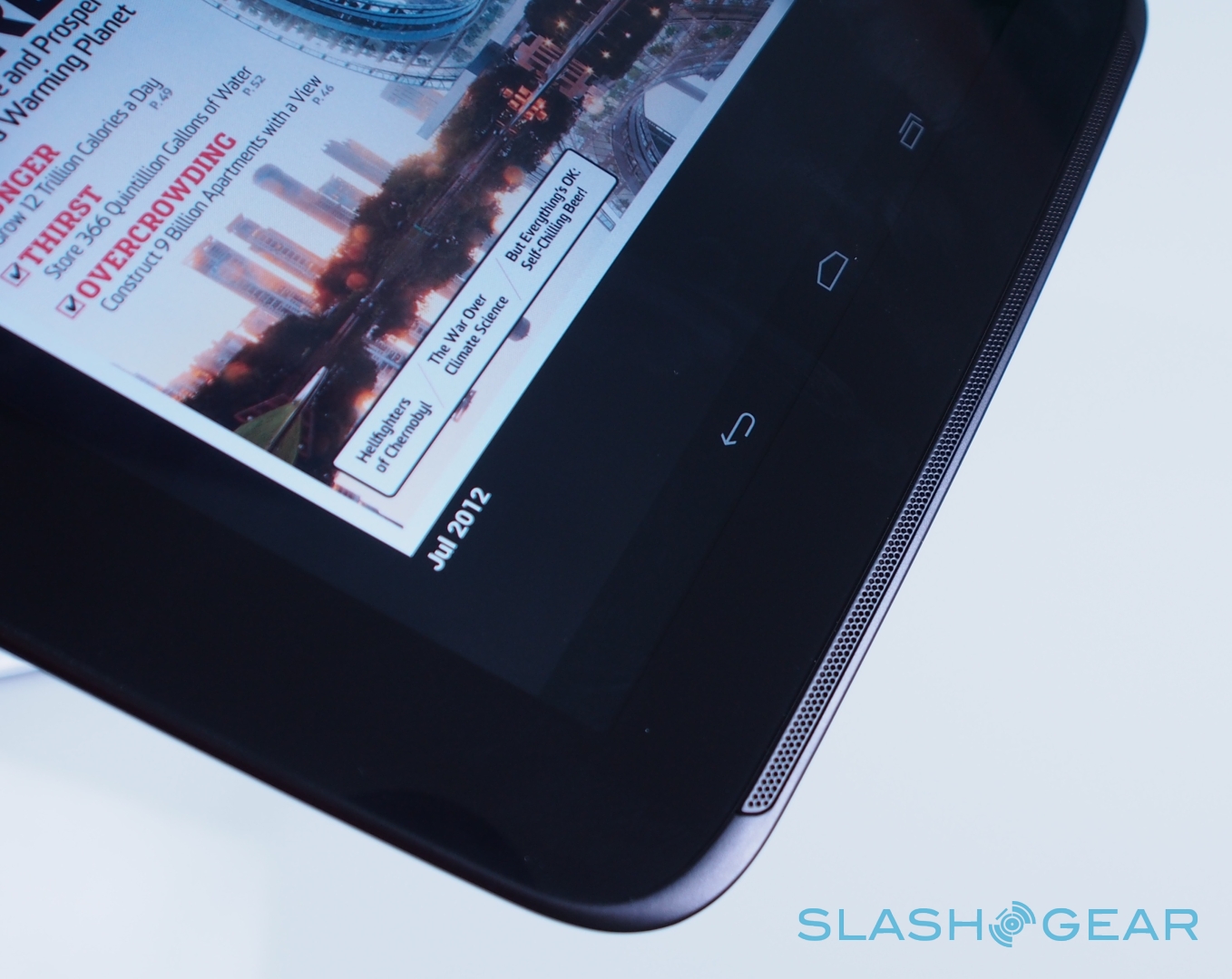
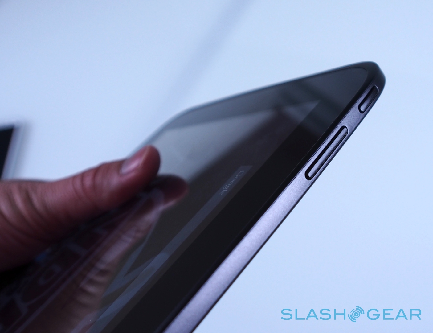
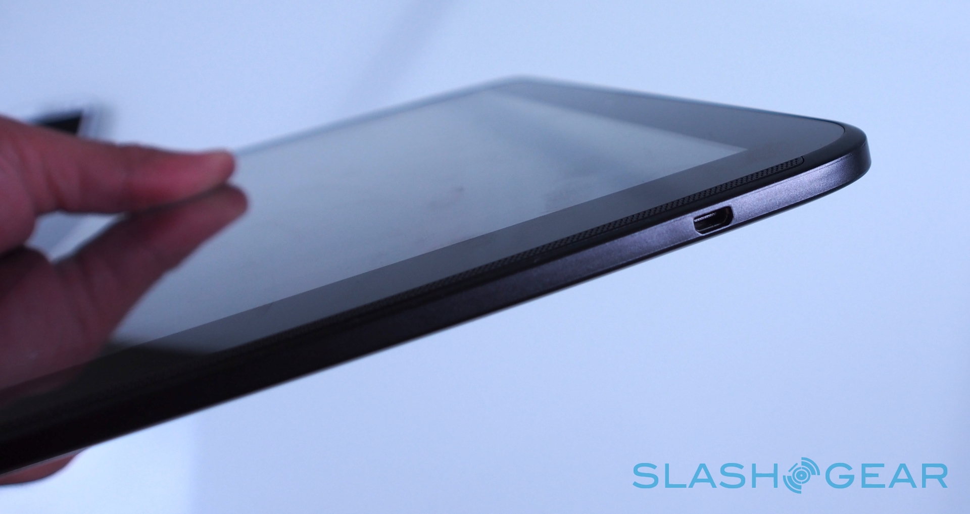
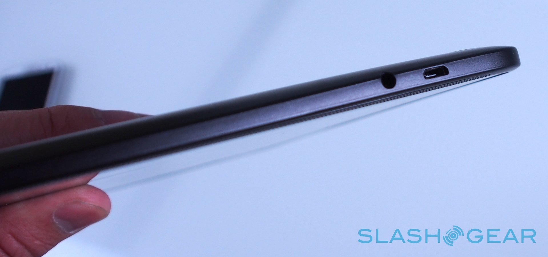
Recent Samsung tablets have generally been lightweight plastic, but while the Nexus 10 sticks with plastics rather than metal, it feels far higher quality despite keeping things low on the scales. In fact, the tablet weighs 603g and measures a curved 263.9 x 177.6 x 8.9 mm, finished in a pleasant and grippy soft-touch material that's easy to hold even single-handed. It's reminiscent of the original Motorola XOOM Android tablet, though also reminds us of HP's TouchPad, albeit considerably thinner.
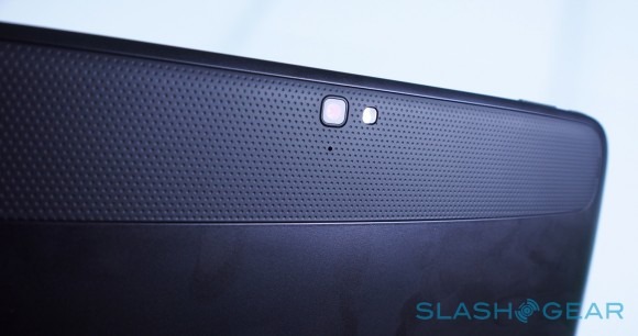
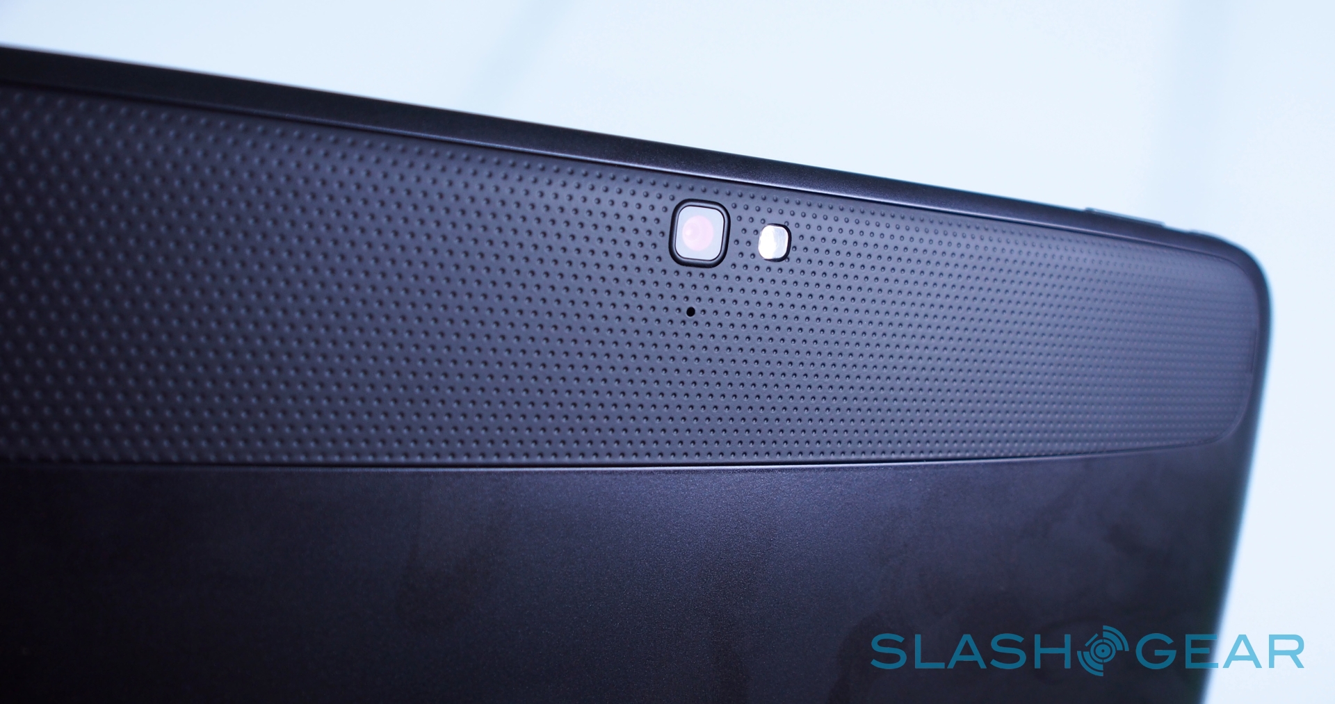
On the front, there's a 1.9-megapixel camera for video calls, with a 5-megapixel main camera on the back with autofocus and an LED flash. Ports include microUSB and micro HDMI, and in a welcome change the Nexus 10 charges from microUSB rather than using a proprietary connector; there's a 3.5mm headphone jack and Pogo pins for use with a dock. Inside there's WiFi b/g/n (with MIMO support for faster connections and better range) and Bluetooth 4.0, together with not one but two NFC chips – one on the front, one on the back – for use with Android Beam.
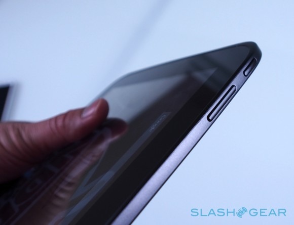
All of the usual sensors are present, including an accelerometer, digital compass, ambient light, gyroscope, barometer, microphone, and GPS, while the battery is a sizable 9,000 mAh Li-Poly pack which Google says is likely good for up to nine hours of HD video playback.
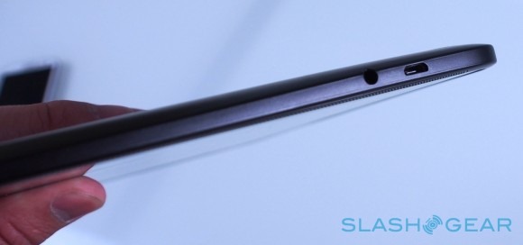
Accessories haven't been fully detailed yet, but we'd expect to see a docking station eventually, and Google will offer a flip-cover the hinge of which swaps out with a panel on the back of the Nexus 10. It will automatically power on the tablet when opened, much as Apple's Smart Cover does on the iPad.
Overall, despite being plastic not metal, the combination of the soft-touch materials and light weight makes for a very easy tablet to hold, and one that doesn't add much to your bag. The matte finish does gather fingerprints and greasy smudges with great ease, however.
Display
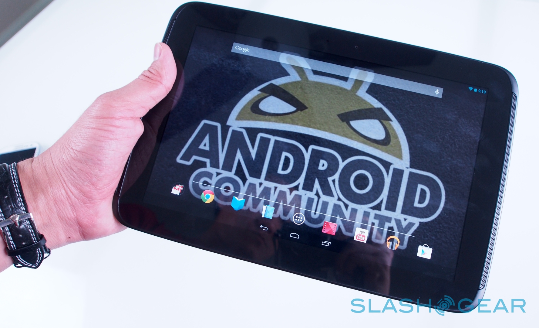
Samsung calls its display a "True RGB Real Stripe PLS" panel; we just call it incredible. At 10.1-inches it's slightly larger than Apple's 9.7-inch iPad with Retina, but its 2560 x 1600 resolution – for a pixel density of 300ppi – means it packs in more dots than the iOS tablet's 2048 x 1536 (264ppi).
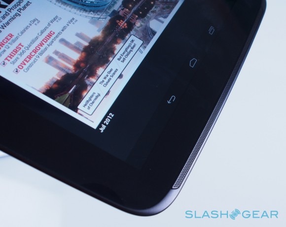
Of course, the idea of "Retina" resolutions, as Apple would have it, is that at a typical usage distance the individual pixels are indistinguishable from each other; you could argue that once you pass that point a greater number of dots is unnecessary. Samsung's panel does have obvious advantages for some of the uses Google expects most users to have for the Nexus 10, though, with its 16:9 aspect ratio screen and more-than-Full-HD resolution making it ideal for widescreen video playback without black framing bars.
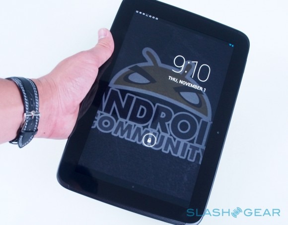
In general use, it's tough to find anywhere to complain about Samsung's screen. Viewing angles are broad and colors vivid, and brightness is consistent across the display. Text is crisp, photos look fantastic, and video is smear and lag free. Happily there's a slab of Gorilla Glass 2 across the top to protect the excellent panel.
Android 4.2 Jelly Bean
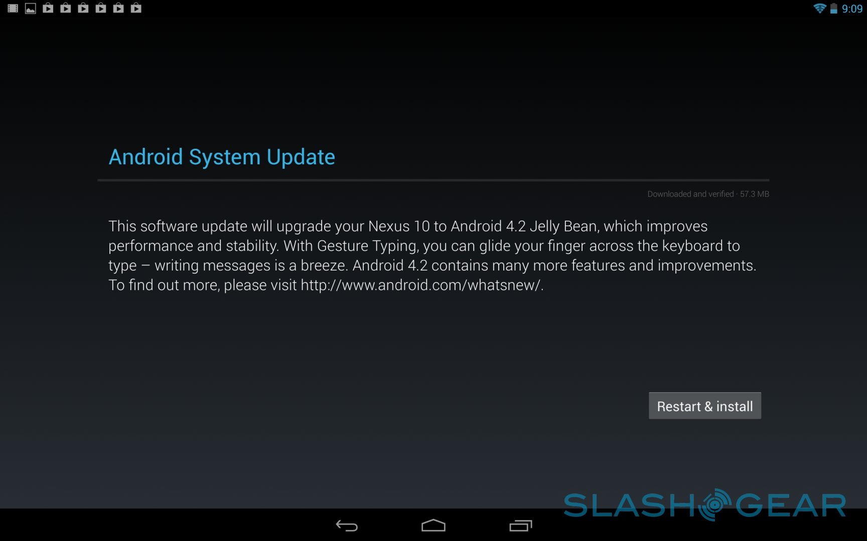
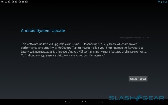
Google's incremental update to Android doesn't even warrant a new confectionary-themed name, but there are a couple of improvements that make particular sense for tablets. Unfortunately, they're also the features that won't go live until the final build hits the Nexus 10 when it ships on November 13, which means we were unable to test out the new multiple user support and lock-screen widgets.
Still, from what Google has shown us, the ability to set up multiple user accounts answers a complaint that has been aimed at most tablets – not just those running Android – for some time now. While it's usual for individuals to have their own smartphone, a tablet is more often a communal device, and there are times when you don't necessarily want others in the household to access your data. That could be email or calendar entries, or bookmarks in the browser, or indeed apps or multimedia you've downloaded, that may not be suitable for younger children.
Google calls it Multi Screen, and it allows each user to have their own homescreen settings, wallpaper, widgets, apps, and games (including high score achievements and save points). When you download new apps, they're limited to your account by default; however, if another user wants the same software, Jelly Bean 4.2 is sufficiently clever to know not to download it again, but instead just copy over a fresh version from the other user account. It should alleviate a huge pain-point for families with a shared tablet.
As for the new lock screen functionality, that will show various widgets for email, calendar entries, and information from other apps without having to unlock the Nexus 10. Just as they can with homescreen widgets, third-party developers will be able to create lock screen widgets for their apps.
Android 4.2's other changes include a new version of Google Now with a greater number of "cards" – now including nearby events and concerts, imminent hotel and flight reservations, places known for being photography hot-spots, and what movies are opening in nearby theaters – which v4.1 users can already try by updating the Google Search app on their device.
It also updates voice search, which can now be used to create appointments as well as search for upcoming meetings, together with launching apps, all by spoken command. As we've found before, voice control can be hit or miss, and you need to make sure you're speaking clearly with minimal background noise if you want to be understood first time.

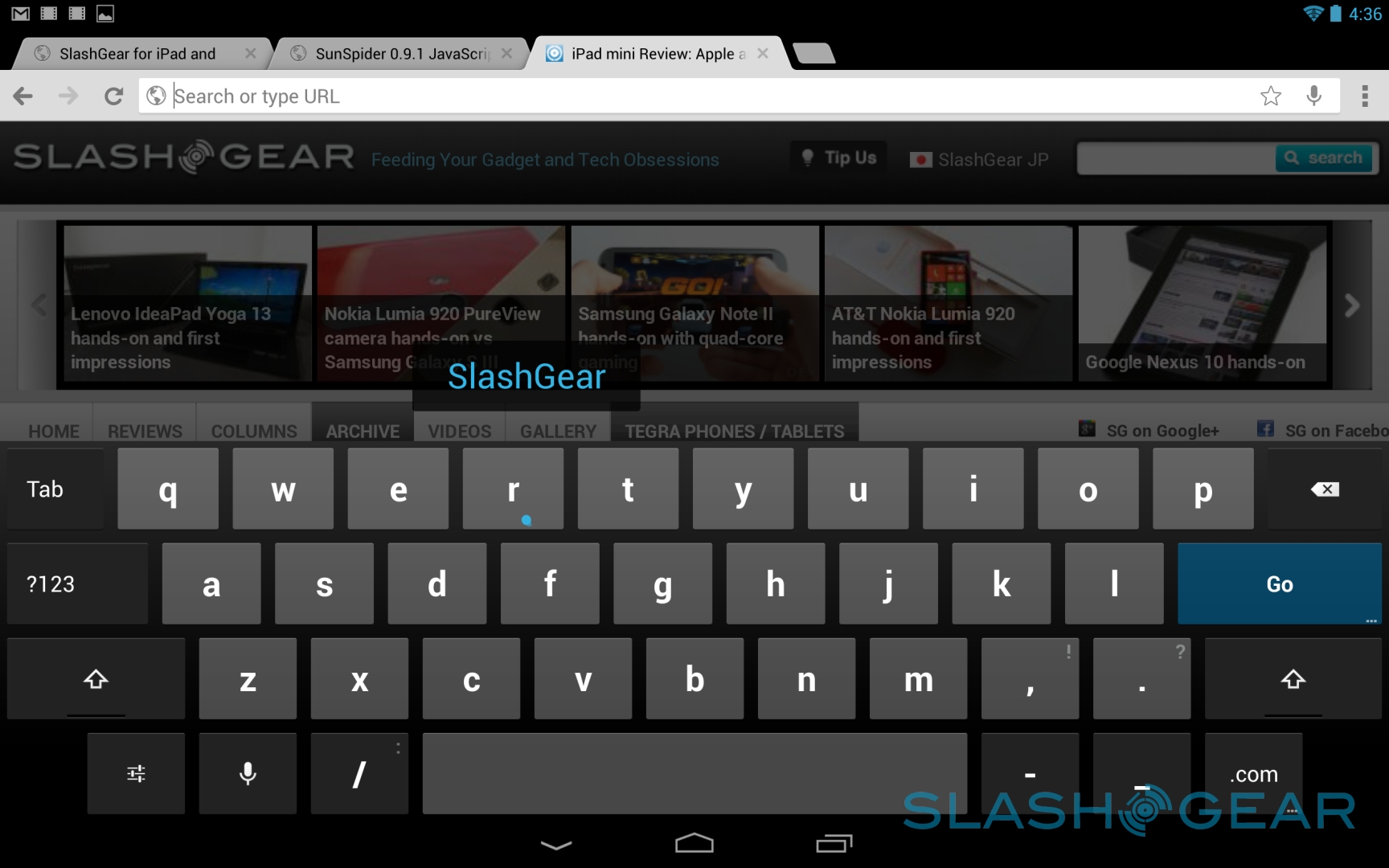
Those not wanting to talk to their tablet can use the new Gesture Type keyboard, which borrows swipe-style text entry from apps like Swype and pairs it with new auto-prediction of words. Google has moved the prediction box from above the keyboard, where you need to glance up from the keys to see it, to hovering just above your fingertip, too. Even with fast swiping between letters, that box – and the prediction – kept pace without lagging behind or stumbling.
If the Nexus 10's excellent display isn't quite large enough for you, and you haven't an HDMI cable to hand, Android 4.2 now supports wireless displays. At the touch of a button you can push the content over to a nearby, compatible monitor or TV, and be watching a video or browsing the web on the big screen. It also works well for gaming, with the Nexus 10's accelerometer used for navigating around race tracks, for instance.
Google's Play store offers movies and TV shows, streamed from the cloud rather than occupying your limited onboard storage, though it does mean you need an internet connection in order to watch them. It also works well with Google+ Hangouts, which makes for a useful impromptu video conferencing setup.
Otherwise it's a general polish to what, by Jelly Bean's first iteration, was already a solid platform. The Gmail app – hands-down the best mobile experience of Google's email service – finally adds zoom support and introduces new gestures for triaging messages, while the notifications system has been made more useful in how alerts can be handled. An alarm, for instance, can be snoozed directly from the notifications drop-down, for instance, or a new email to attendees at a meeting opened straight from the reminder.
Performance
With a dual core 1.7GHz processor under the hood, we had high expectations for performance from the Nexus 10. In practice, day to day use and raw benchmarks told a slightly different story, with the tablet doing better at the former than it did the latter.
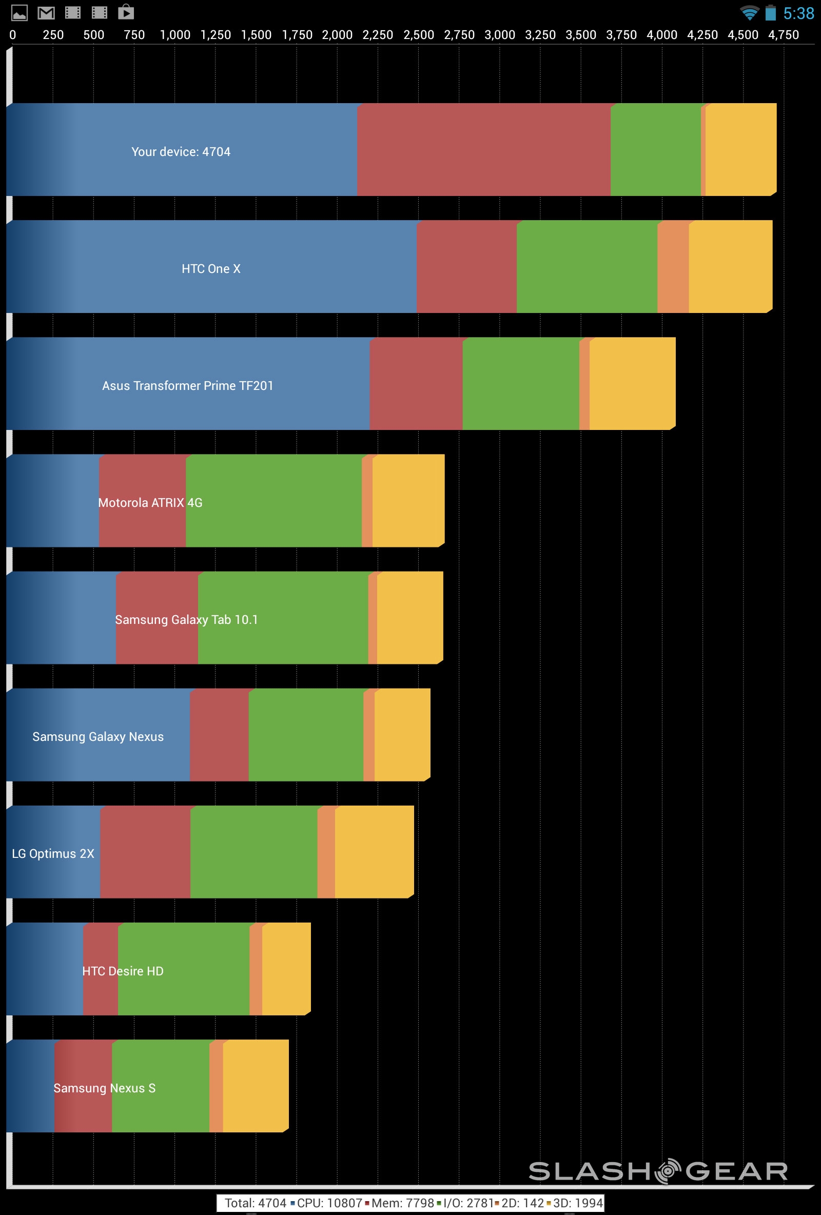
In terms of benchmarks, the Nexus 10 scored 9,123 in AnTuTu, falling short of the Galaxy Note II and HTC One X+; it also fell behind those smartphones in Quadrant, scoring 4,704. Smartbench 2012 gives two sets of results, for productivity and gaming, with the Nexus 10 scoring 3,423 and 2,741 respectively. That was better in gaming than other recent Android tablets, but was still bested by Android phones.
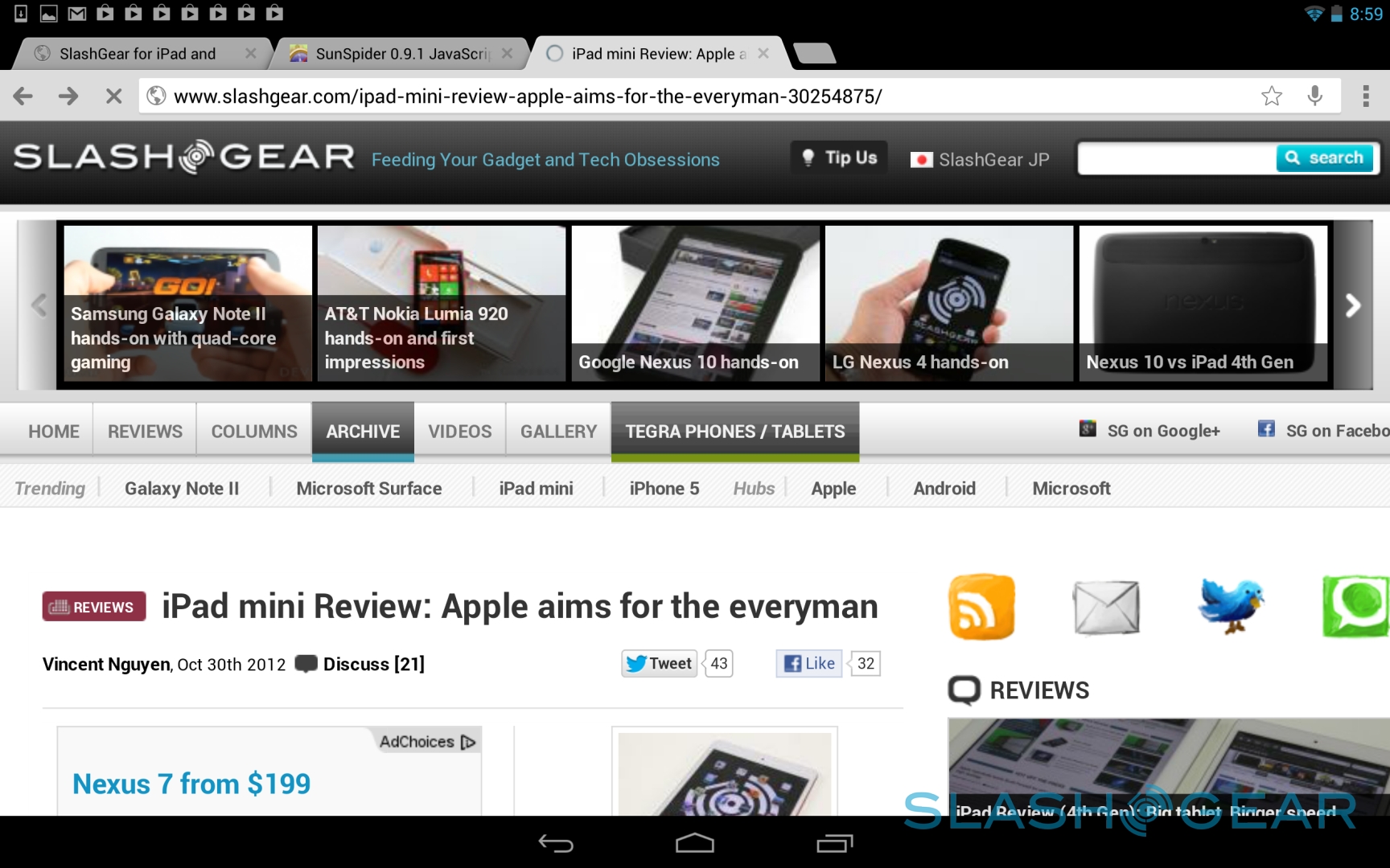
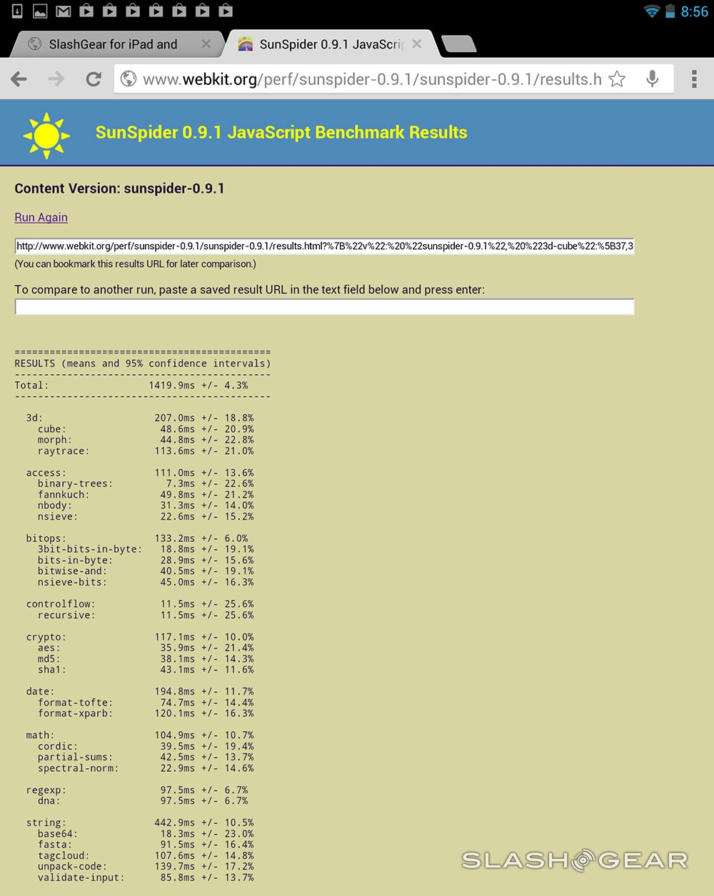
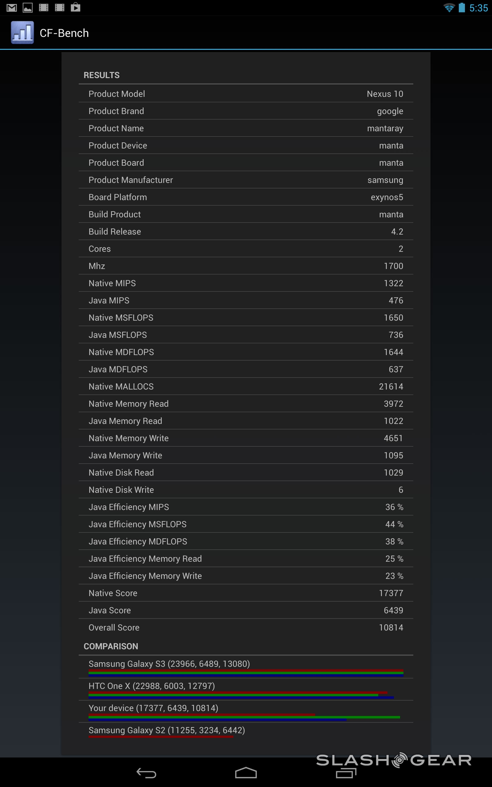
In CF-Bench, the Nexus 10 managed a total score of 10,814 (17,377 native; 6,439 Java), while finally we looked at browser JavaScript performance, with SunSpider coming back with 1,419.9ms (faster is better). It's worth noting that the 4th-gen iPad with Retina display scored 879.2ms in SunSpider.
While the raw numbers weren't necessarily the most impressive we've seen, in general use the Nexus 10 held up to all we threw at it. Full HD video played back without lag, and webpages rendered swiftly; the gaming we tried suffered no stuttering, either.
Camera
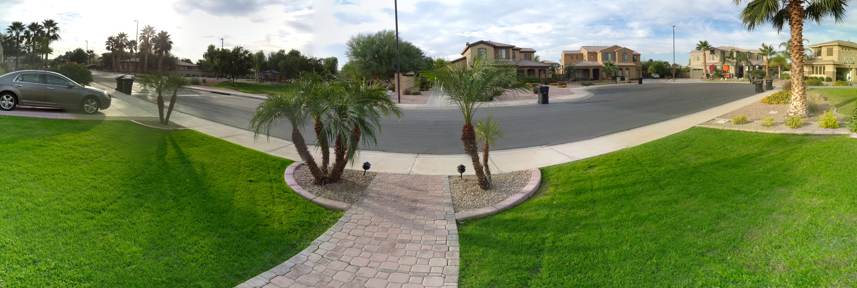
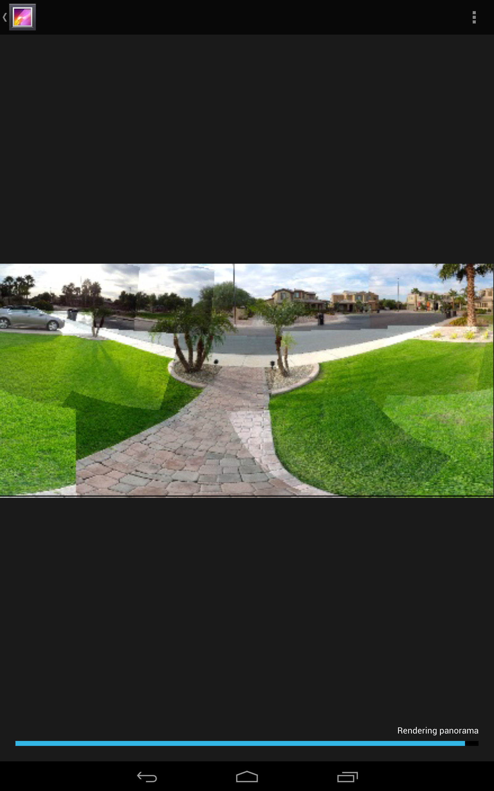
Android 4.2 also introduces new camera features, most notably Photo Sphere. This, like Photosynth on Windows Phone, allows you to create 360-degree images by panning the Nexus 10 around the scene. Clever software stitches them together, and they can then be shared as flat stills or even added to Google Maps. With the latter, the same Street View panning can be used to look around the picture, as if you're stood in the middle of it.

Photo Sphere works, though not every time. Some images come out particularly well – landscapes and other expansive scenes seem particularly well suited, just as is the case with traditional panorama modes – but interior shots seem to introduce more problems with stitching the sections together. It's a gimmick, really, but when it works it's an impressive one.

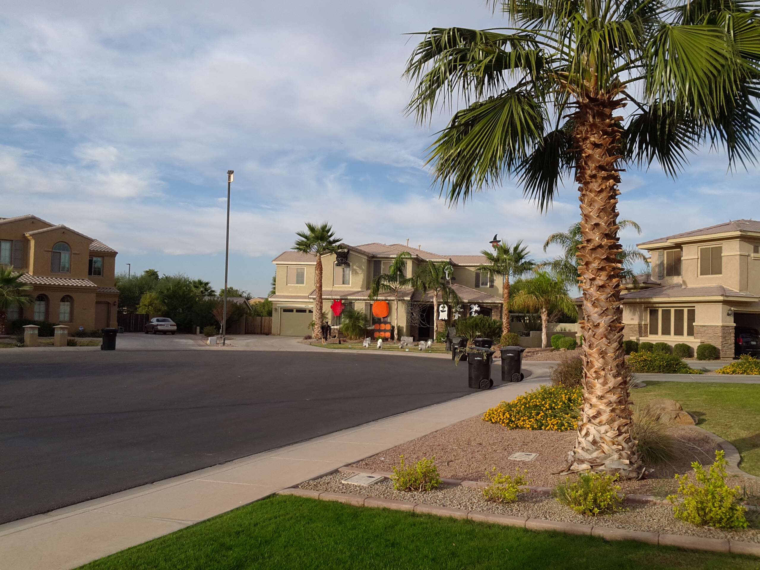
Unfortunately, neither of the Nexus 10's cameras are particularly worth shouting about. The ergonomics of taking photos with full-sized tablets has always been questionable, but the shots that the new Samsung tablet produces aren't in the same league as what, say, its recent smartphones can achieve. The front-facer is sufficient for video calls, but the 5-megapixel main camera produces stills that are only average. Still, the new camera app UI – which puts quick settings for things like the flash just a quick swipe away – is clean and a usable improvement over what Android offered before.
Battery
9,000 mAh is a big battery, but it has a powerful processor and lots of pixels to satisfy. Google's prediction of up to 7hrs web browsing or up to 9hrs HD video playback actually turned out to be over-cautious, however, when faced with more typical mixed use. Browsing, streaming Full HD movies from Google Play, reading digital magazines, and doing some emailing and photography, and the Nexus 10 managed 11hrs, which is particularly impressive.

Pricing and Value
Google demonstrated how ambitious it could be with hardware pricing with the Nexus 7, bringing the 7-inch tablet in at under the $199 price point and making other Android slates look over-priced at the same time. The obvious rival to the Nexus 10, however, is Apple's full-sized iPad, and Google undercuts it by $100. $399 gets you the 16GB version, while $499 hooks the 32GB model.
The hardware, then, is more competitively priced, but there's more to value than upfront cost. Google has renewed its call for Android tablet apps, but the range of titles available still pales in comparison to what Apple's App Store offers for the iPad. That's been our criticism of Android slates since they first arrived in early 2011, and it's a sticky situation Google has yet to conclusively address. Many apps are simply oversized versions of their phone equivalent, and while that might be just about acceptable on the Nexus 7's smaller display, it squanders the capabilities of the Samsung tablet's pixel-rich panel.
Wrap-up
There's no denying that Samsung and Google have put together an impressively specified tablet in the Nexus 10. The incredibly high-resolution display is wrapped up with a very capable processor, and while the Nexus 7 feels like it makes some compromises in order to hit its price point, there's less of a sense that the 10-inch version was built to a budget.
That, and Jelly Bean 4.2's software improvements, only serve to highlight the lingering drawback to Android tablets: the shortage of good applications. Android phone users have a significant number of titles to choose from, but too many expect tablet users to make do with magnified versions of the same on their bigger screens. When you're talking about a panel as pixel-dense as the Nexus 10, that's a travesty.
Of course, developers will only begin coding for slates when there's a sufficient market for their apps. Google can't make every app that Android tablet owners might ever want to use: it needs to motivate third-party developers to wade in. Compelling hardware such as the Nexus 10, undercutting well-known alternatives in price, is the best way of doing that. For browsing and multimedia playback, the Samsung tablet is ideal, but early-adopters will have to wait for it to work its magic on developers before the Play store begins to catch up with apps worthy of the Nexus 10's abilities.
