New Google Drive Rolling Out To Users
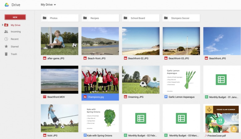
Google Drive is being updated today, bringing in an updated UI and usability tweaks. The update is rolling out slowly, but the differences are notable. Simpler and more effective, Drive is starting to look more like a desktop solution than a web-solution-gone-laptop.
Drive has long been Google's project for legitimizing their productivity endeavors, aiming to bring in unhappy Office users into the fold. Students also find use with Drive, but there have been some issues dogging the service since inception. A big issue was Office document compatibility, and the semi-counterintuitive controls.
Both those issues are changing, with Google announcing at I/O that native Office editing was now part of Drive. The new Drive also fixes some UI issues many had, simplifying the process throughout. A new "new" button is your go-to for creating any new document, and the default view is now thumbnailed by default. You can get details on files straight from the home screen, too. Selecting multiple files is also a lot easier, which was a pretty significant issue until now.
Cleaner and more effective, Drive aims to be more than your picture-dump cloud storage solution. With these changes, it might be. Things like multiple file selection as well as click-and-drag act a lot more like a desktop solution many are more comfortable with, and native Office document editing take care of those "well, I use Drive, so I need you to resend it in a different format" chats.
