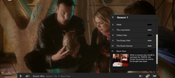
Netflix Web-Based Video Player Gets Massive Redesign
If you're like me, you remember the day that Netflix's streaming video service first launched. And at that time, you would shut off the TV and spend hours watching movies and TV shows on your computer. Now, though, there are millions of people who no doubt have a Netflix streaming subscription and have never even watched any content from the confines of their computer.
Netflix lives everywhere, but it still decided that it was time for a big upgrade to its browser-based streaming platform. So today, it launched a brand new interface that matches the rest of the site and gives users an experience that is more similar to the myriad Netflix apps that are on tablets, TVs, set-top boxes, smartphones, Blu-ray players, gaming devices...need I go on?
So for example, swapping between episodes of a TV series has been greatly optimized, the text that appears on the screen is bigger, and the navigation buttons within the video players are bolder. It's a big change, for those who actually still watch Netflix content on a computer. Of course, Netflix also continues to update its presence on the many other devices that are becoming much more popular video streaming destinations.
[via VentureBeat]
