Moto 360, LG G Watch Shown Off In Android Wear Post
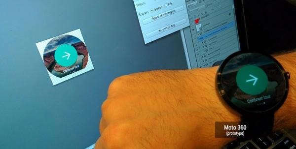
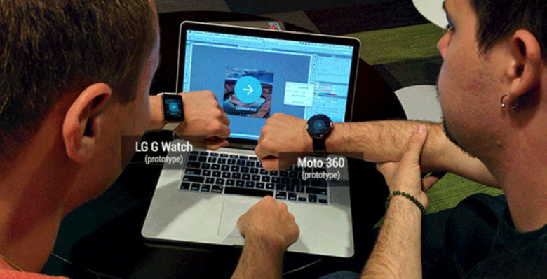
In a recent blog post, Android Wear Design and Developer Advocates Roman Nurik and Timothy Jordan discuss what it takes to build a nice looking, useful Android Wear application. In ding so, we get a good look at what the first two Android Wear devices, the LG G Watch and Moto 360, look like on the wrist. The two devices, aside from being different shaped screens, are strikingly different, and may have you re-thinking your smartwatch choice.
The main takeaway from the blog is that when designing an Android Wear app, tough choices must be made. With such little screen real estate on offer, any Developer must make simple, elegant apps that push timely information without being obtuse. A tough line to walk, no doubt.

The really striking thing we saw in the blog was the size of the watches. The LG G Watch, though square, actually looks a touch smaller than the Moto 360. The round design, while favored by many enthusiasts, looks massive when next to the G Watch.
Though we can't quite judge it until we see it in person, it takes up an entire wrist. We'll also keep in mind that both of these watches are in prototype form, technically; but if they're developing apps for them, it seems as though the screen size is a lock. The Moto 360 still looks smart, but the size may end up putting off some who thought it would be a svelte offering, like a normal wristwatch.
Source: Google
