MeeGo Screenshots Appear Again, Still Looking Good
It's been a couple of months since the last batch of MeeGo User Interface screenshots broke cover. And with these new ones showing off their pretty images, we can say that it was well worth the wait. Despite the fact that MeeGo isn't quite ready for prime time yet (so they say), it's looking like the development cycle is turning the upcoming mobile Operating System into something we could really get into. Of course, these are just development builds, and there is something strikingly Nokia in there, but that doesn't necessarily mean a bad thing.
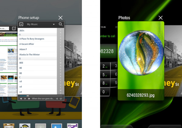
This time around, it looks like these were pulled from a device proper. The new screenshots show us what mulittasking is going to look like on our MeeGo devices of the future. We wish we could see it in motion, but we'll take what we can get for now. As you can see, there's a sort of hybrid between Android and webOS in there, which means if they can find a nice in between, bringing both features together to make something better, it will definitely grab the attention of users.
What we're noticing right off the bat, though, is that lower menu bar, where applications are present. There is an obvious, striking difference between the two screenshots presented here. Even the icons are different. And the stylized bar, too. Will there be an option to change these settings on the fly, whenever you want on your device? Or are these stylized skins for particular devices? We'll have to wait and find out.
[via My Nokia Blog]
