MacBook Retina Review - The Portable Performer
Well it's about damn time the MacBook grew up. For years now, many of us OS X devotees have peered over the fence with envious eyes as Windows machines were given far more portable form-factors. Lenovo has been leading the pack in svelteness, and Microsoft's Surface Pro 3 has been appealing with its detachable keyboard, but at the end of the day Windows simply doesn't do it for me. The arrival of the new MacBook, however, meant those days of coveting notebooks could be long gone, with Apple taking the proven design of the MacBook Air and cutting out every last scrap of excess until – for the most part – only the features that matter remain. That's the theory, at least; I took the MacBook on the road to see if it was also the same in practice.
The Looks
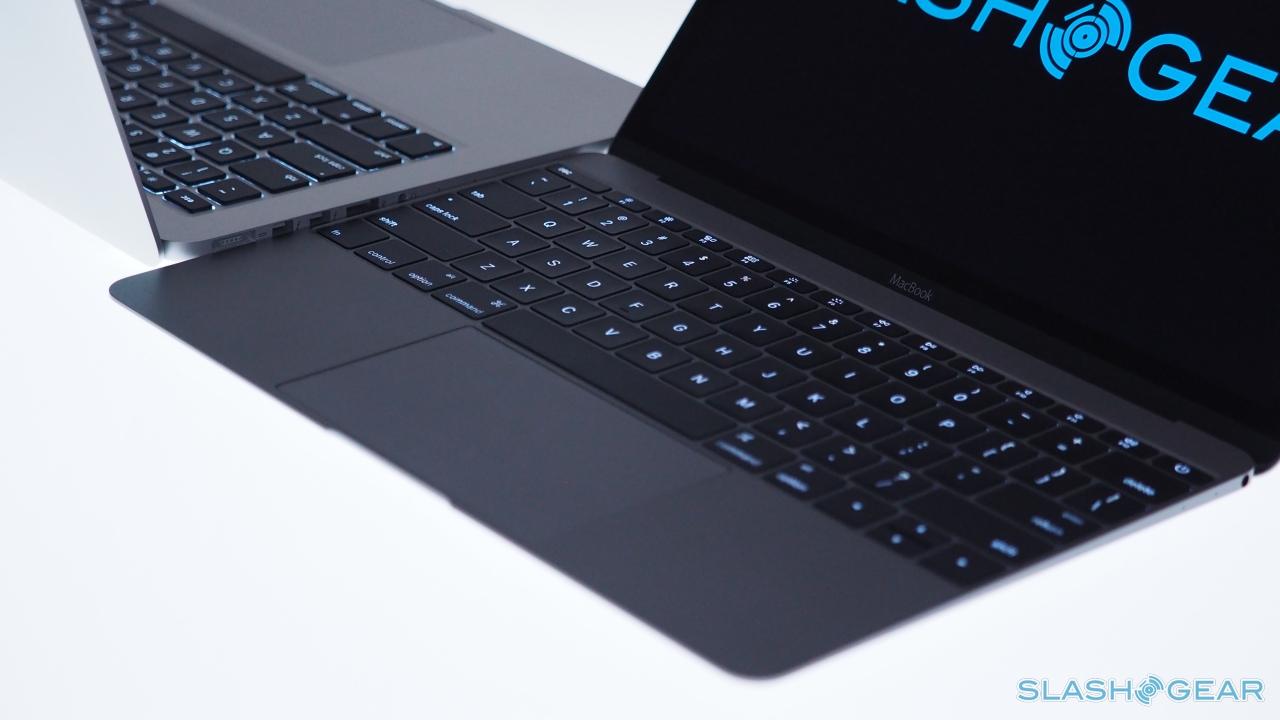
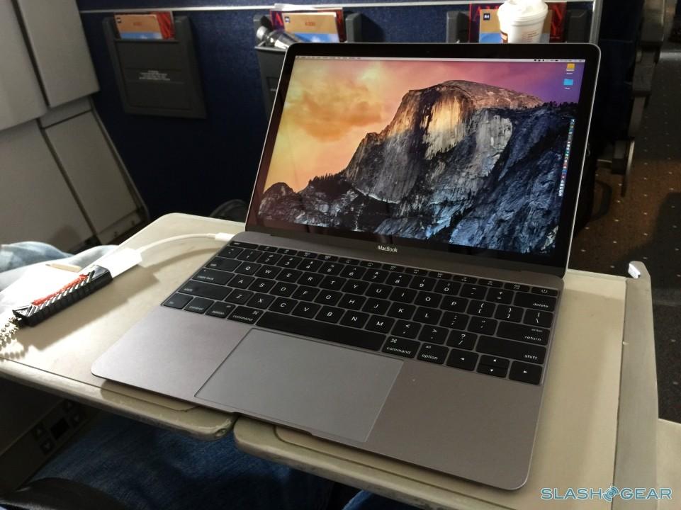
Oh boy, does the new MacBook have it. Apple has a good track record for producing handsome laptops, but it's moved things to another level this time around. In fact, even as I write this review, it's hard to not be mesmerized by the sharp lines.
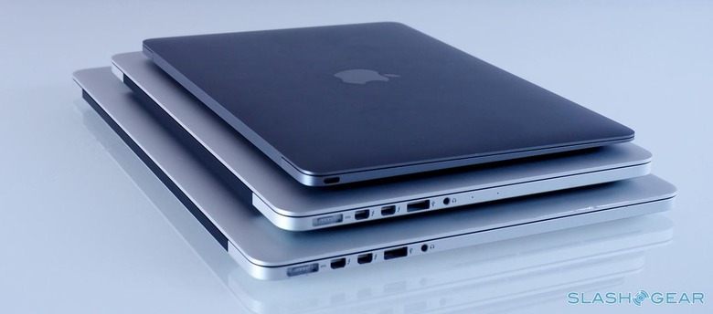
On a technical level, it's the same anodized aluminum as we're familiar with – though now in an iPhone-matching choice of gold, silver, and space gray finishes – but it feels more cohesive altogether. What you see is what you get, there's no added or unnecessary space or bulk to be found. It's tactile, in the same way that you want to run your fingers down the side of an exotic sports car or a high-end watch.
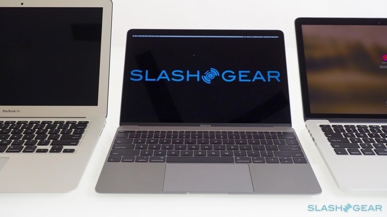
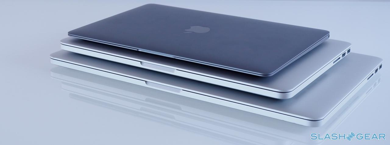
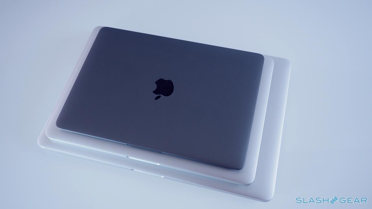
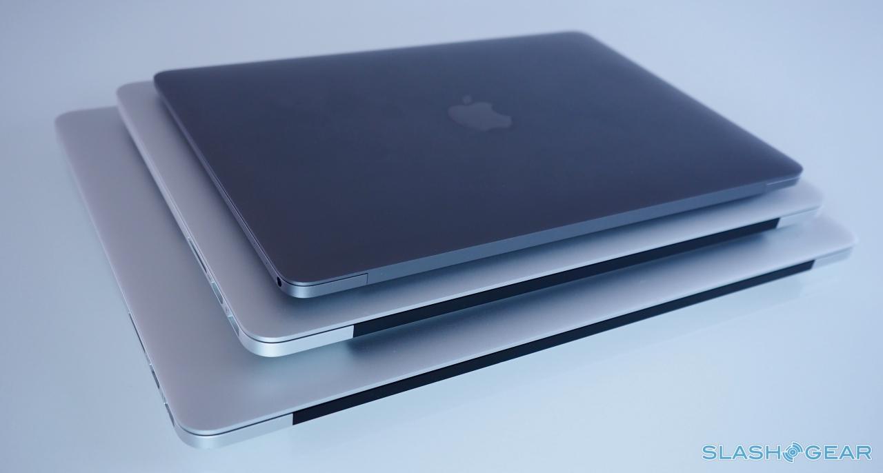
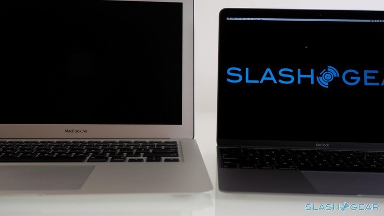
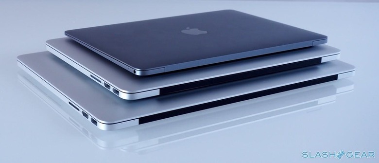
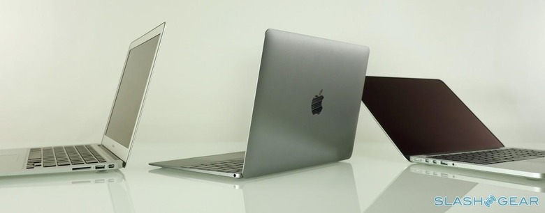
Just dumping the last plastic that's visible wouldn't be enough in and of itself, however: it's the extreme diet that Apple has put the MacBook on that is enough to get a frequent traveler like me excited. It tips the scales at just 2.03 pounds, versus 3.0 pounds for the MacBook Air, or 3.5 pounds for the MacBook Pro.
It makes a huge, huge difference.
On a day to day basis, if you're only carrying your laptop from home to work, or around the office (and maybe to Starbucks a couple of times a week), the numbers might not seem so important. For someone traveling once a week or a few times a month, though, this is a big deal.
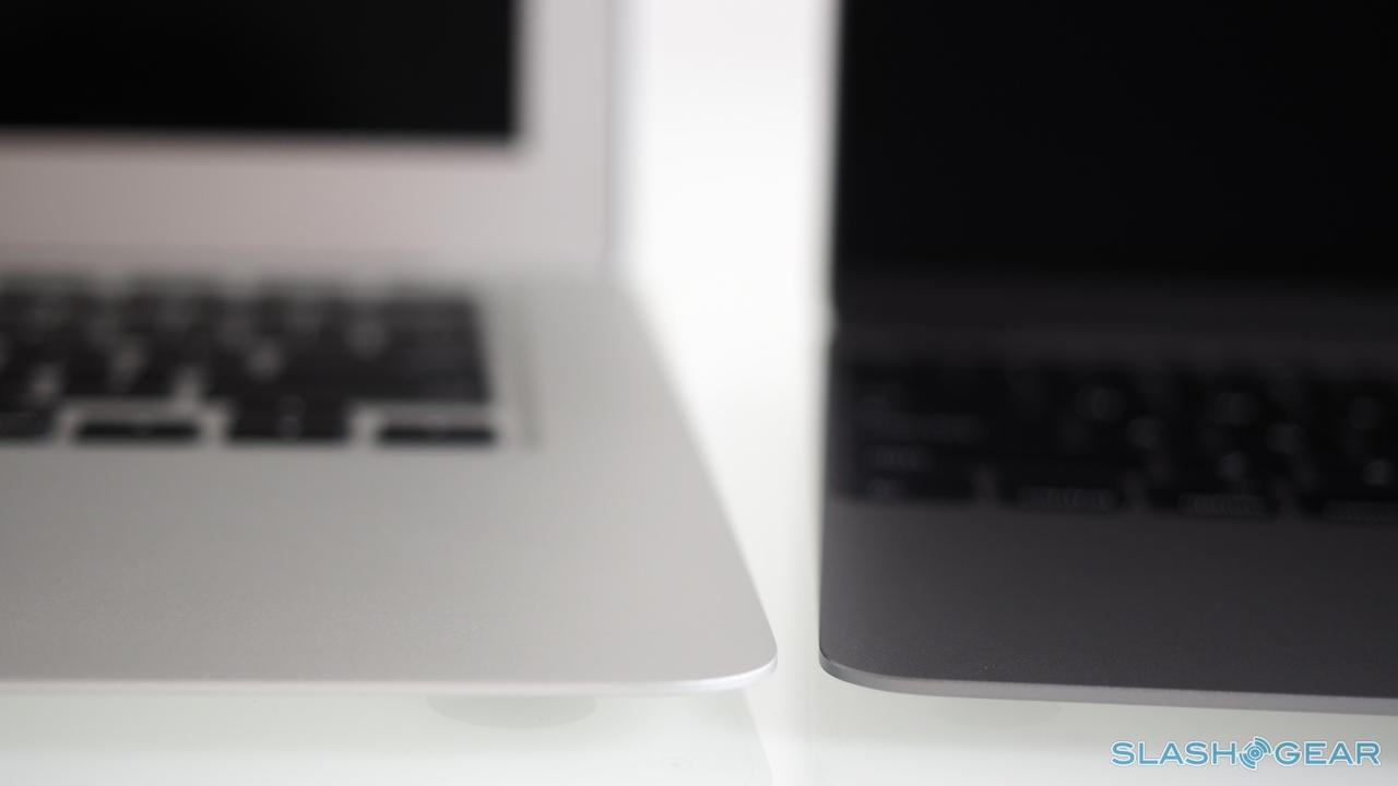
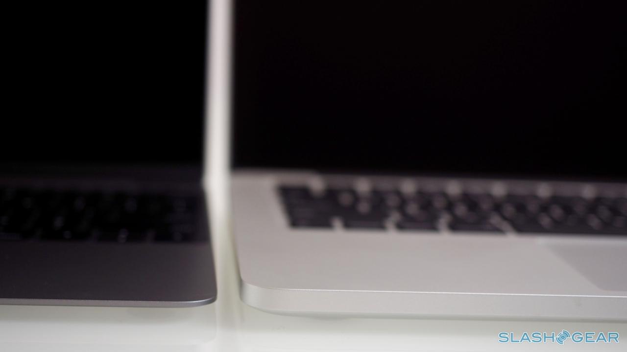
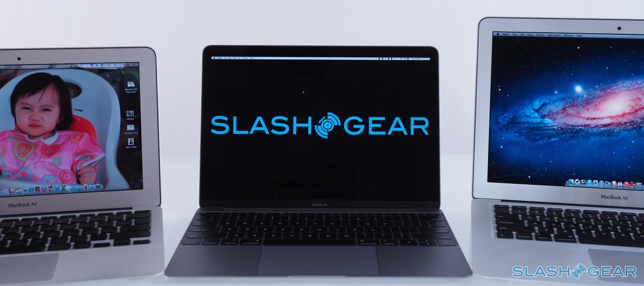
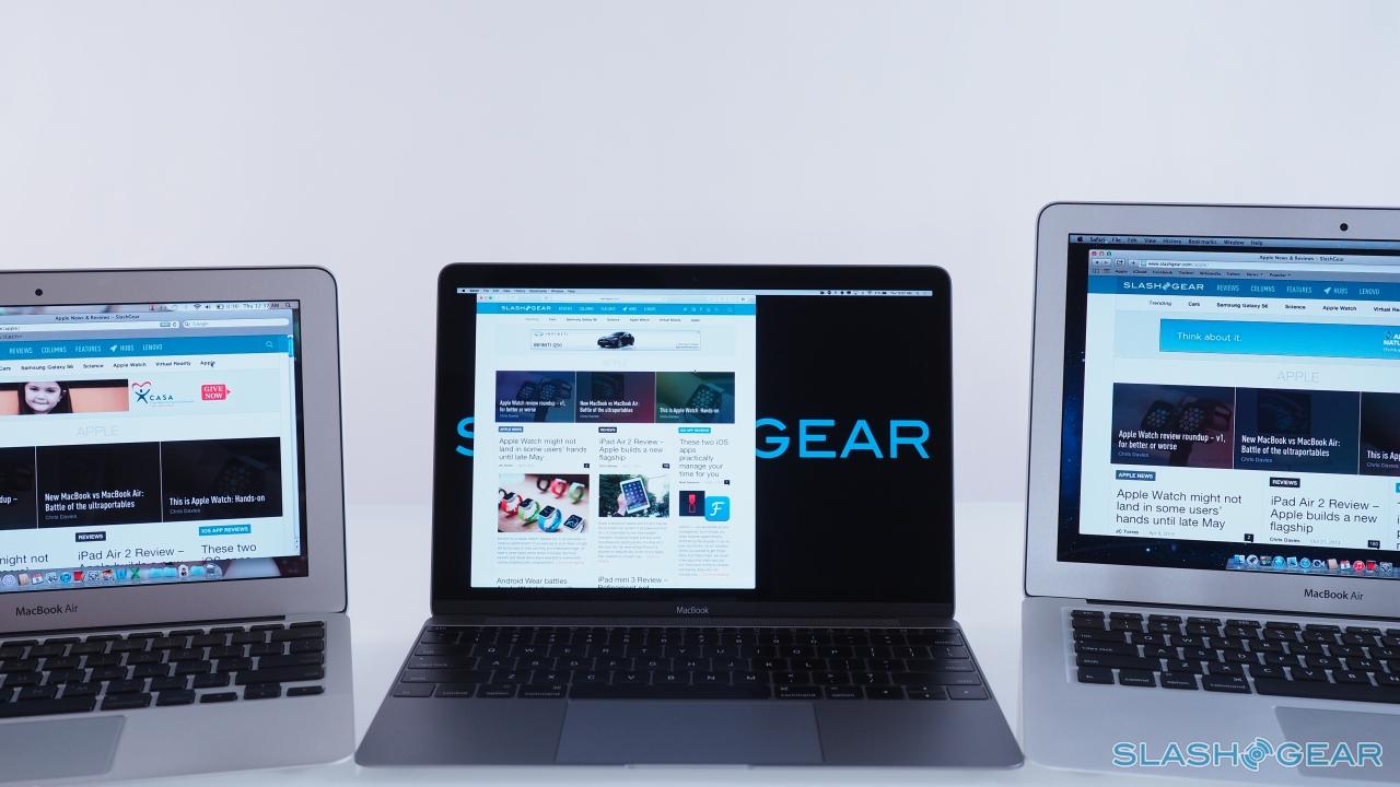
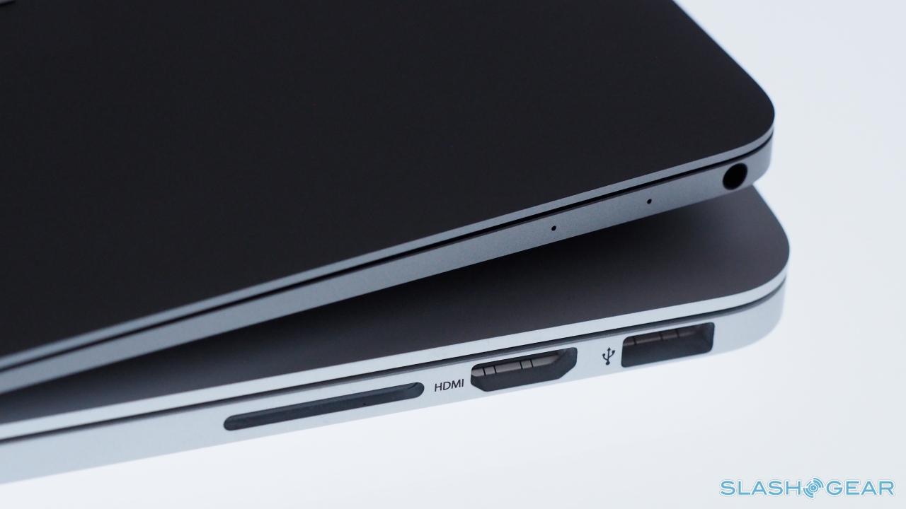
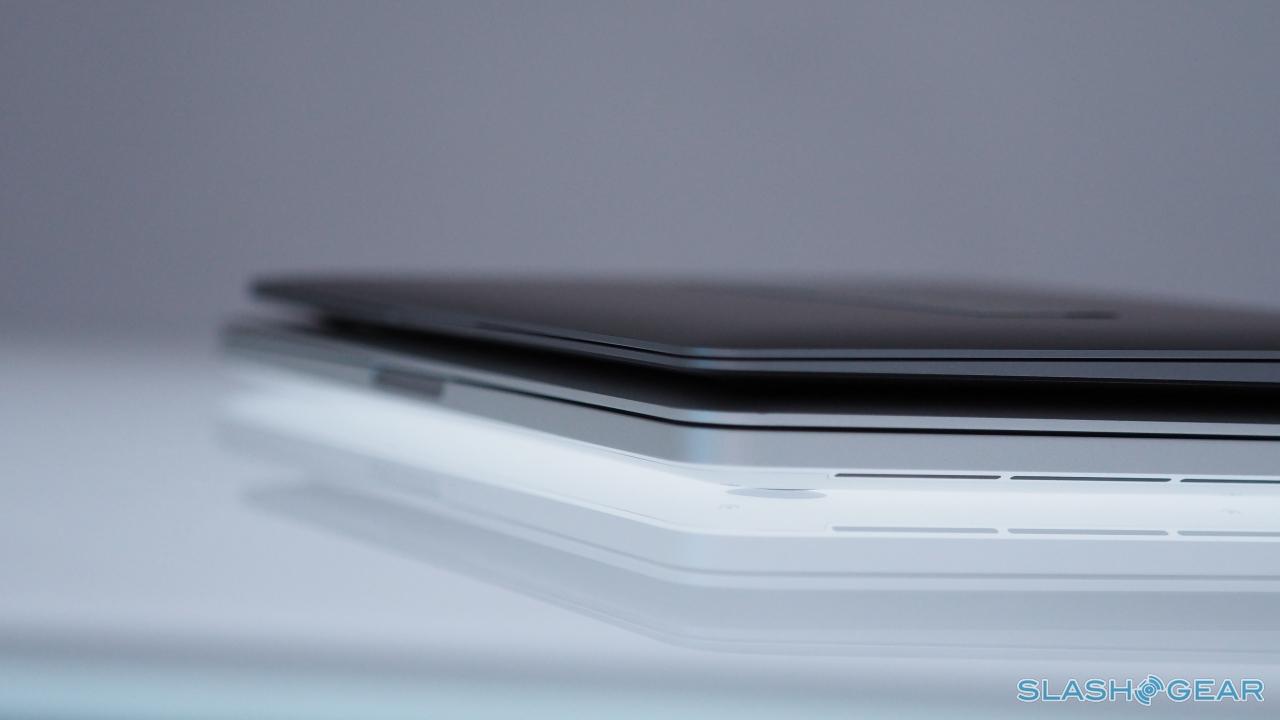
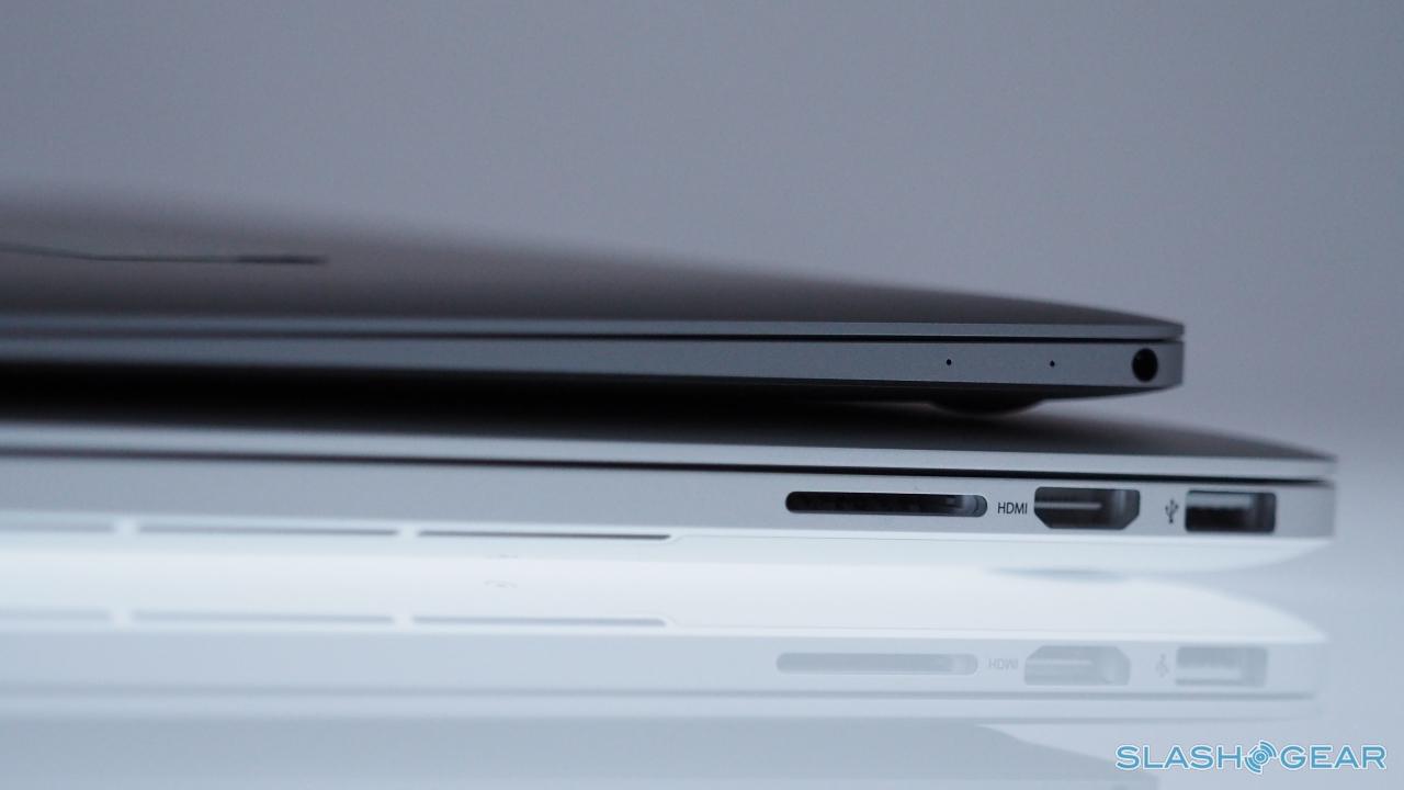
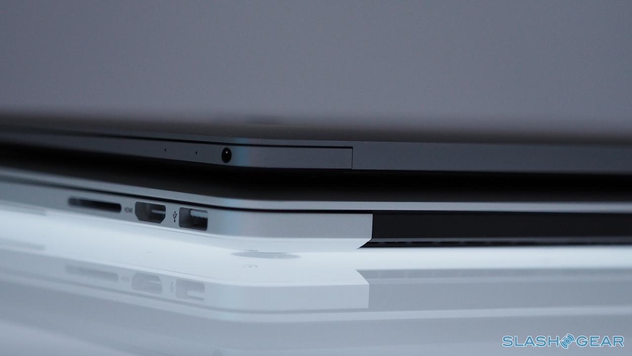
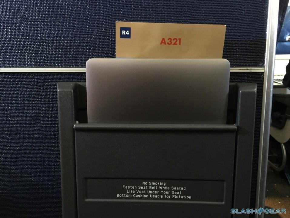
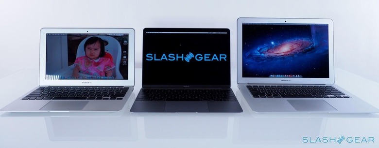
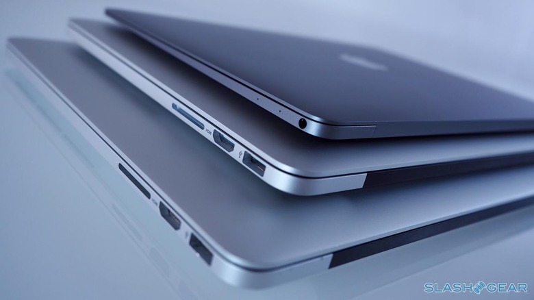
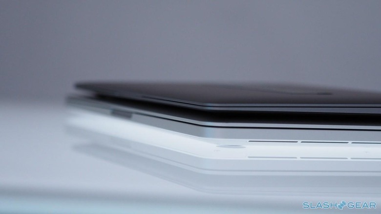
Not only is it a whole pound lighter than the MacBook Air, it's slimmer – just 13.1 mm at its thickest point, and 3.5 mm at its thinnest edge – and the 12-inch profile makes it easier to slip in and out of backpacks than the 13-inch Air. It also opens up a wider range of messenger bags (aka manpurses) since you don't need as much space as a traditional ultraportable might.
For me, it's a no-brainer. A laptop is probably the most important tool for a journalist. When you're a journalist and a photographer, that means even more kit in your gear bag. The weight quickly adds up – not just camera and lenses, but that all-important tripod which can itself come in the same weight as a MacBook Pro.
The Display
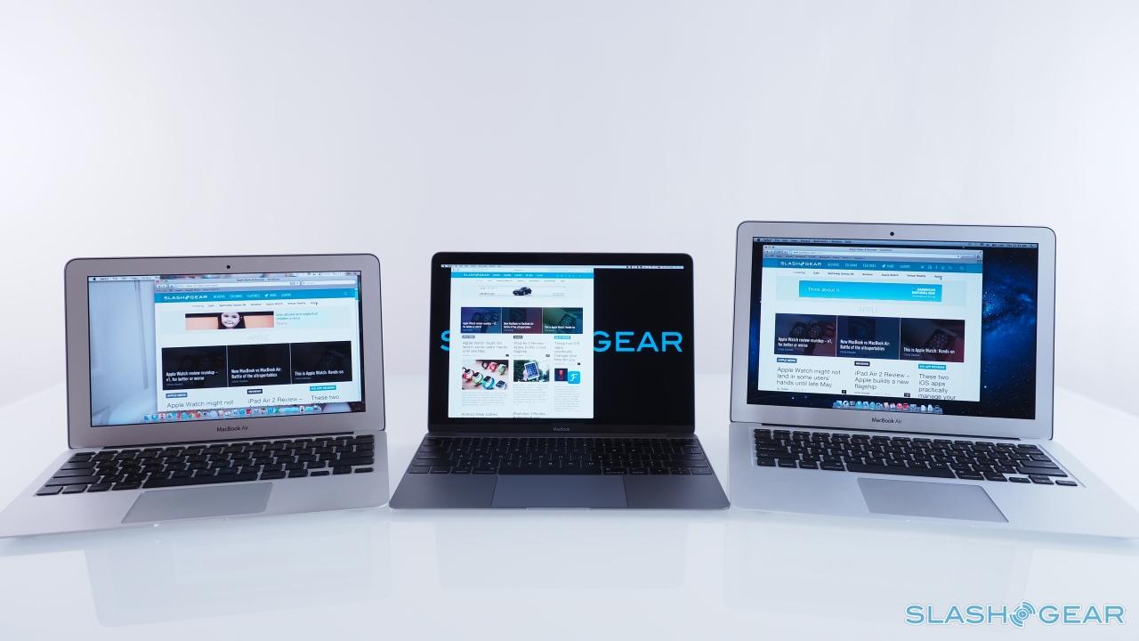
It may be smaller than a 13-inch MacBook Air, but the new MacBook does a whole lot more with its display. Apple's first 12-inch screen, it's a Retina display which means 2560 x 1440 resolution, and it feels perfectly scaled.
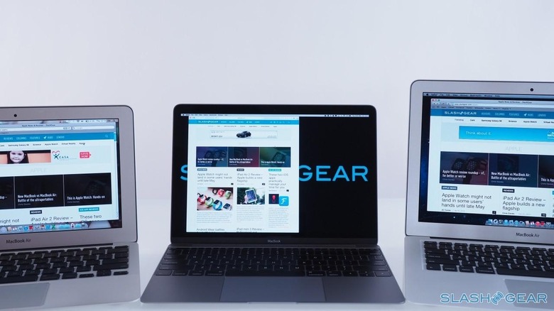
Bright, with rich colors and broad viewing angles, it's a perfect example of what all those extra pixels can be used for. As with other Retina displays, you can opt to run it in Retina resolution – looking like 1440 x 900, but with far smoother text and graphics – or switch it into native resolution and get every pixel to play with.
Sure, you might have to squint a little for some of the smaller graphics and details in that mode, but overall the flexibility is more than worth it. The MacBook screen is neither too big nor too small – I'm looking at you, 11- and 13-inch MacBook Air – and, while it might not be as edge-to-edge as some rival notebooks manage, it's hard to find a complaint about it.
Above the screen is a FaceTime camera, clocking in at 480p resolution. If that sounds on the low side, then you're not wrong: every other Mac in Apple's range has stepped up to 720p. It's a case of accommodating the camera that will physically fit, though unless you're a frequent video caller I don't think it's something most people will struggle to accept.
The Keyboard and Trackpad
Everything about the new MacBook starts from the keyboard. Anything other than full-size was out of the question, so the dimensions of the whole laptop were designed around it.

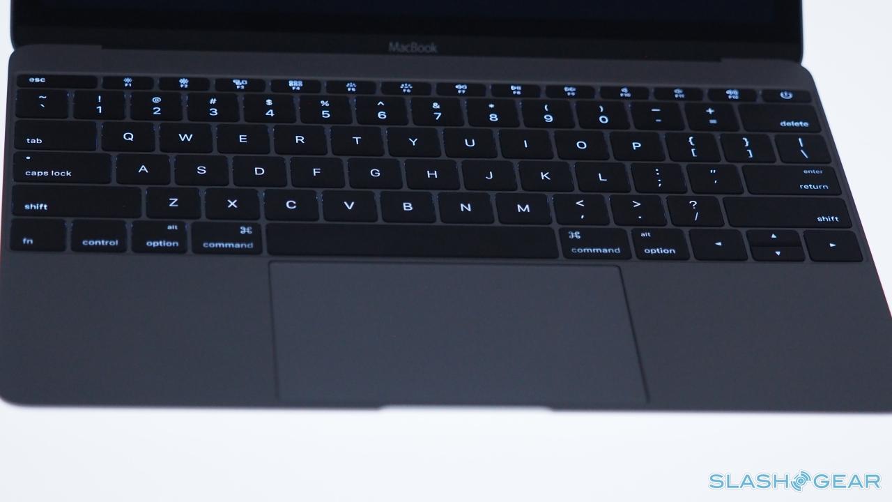
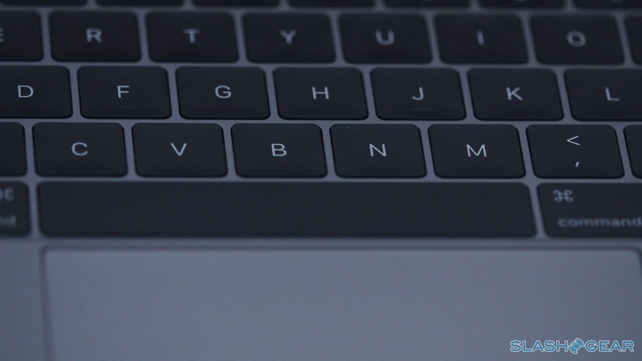
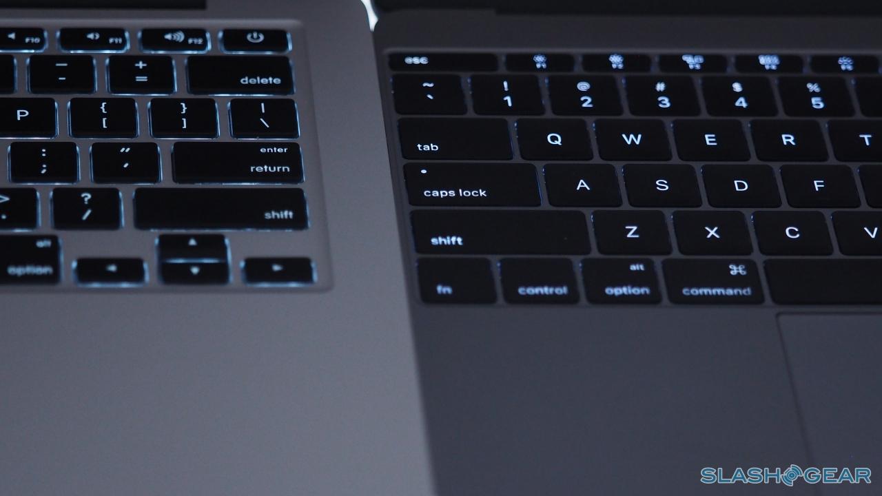
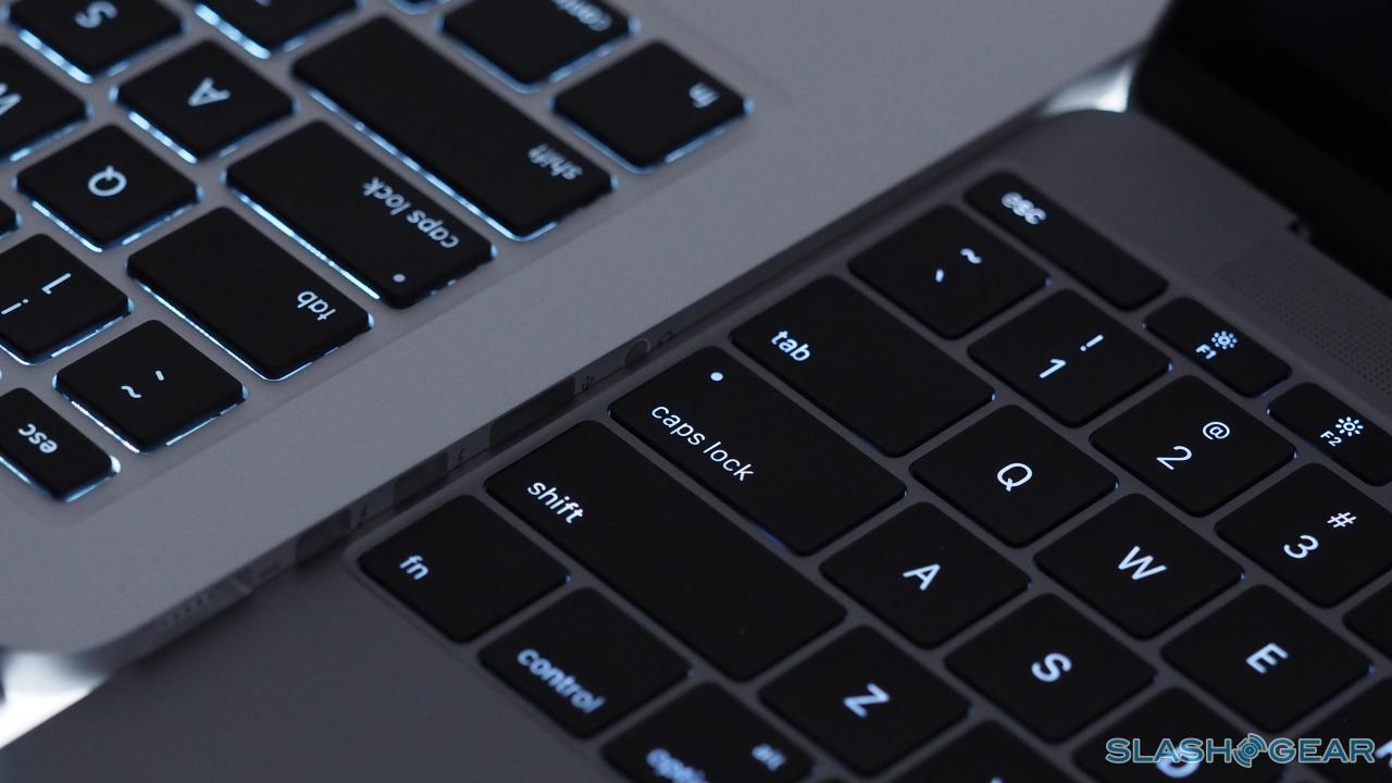
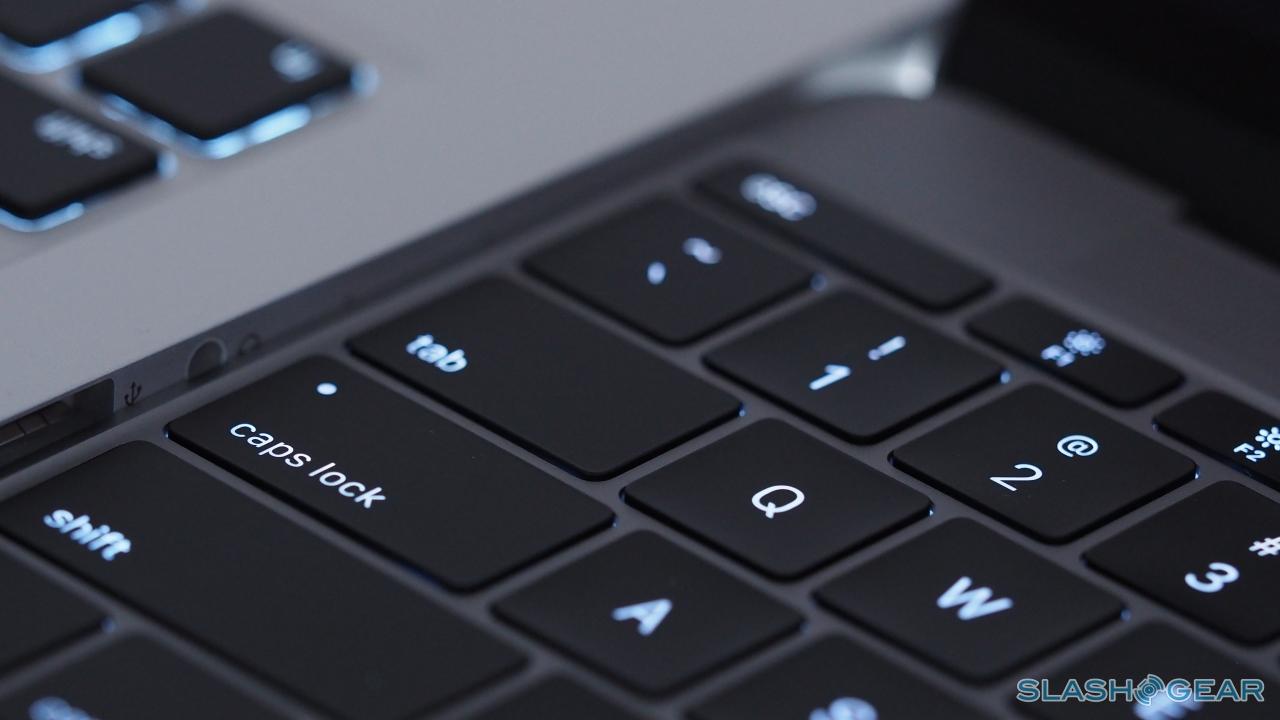
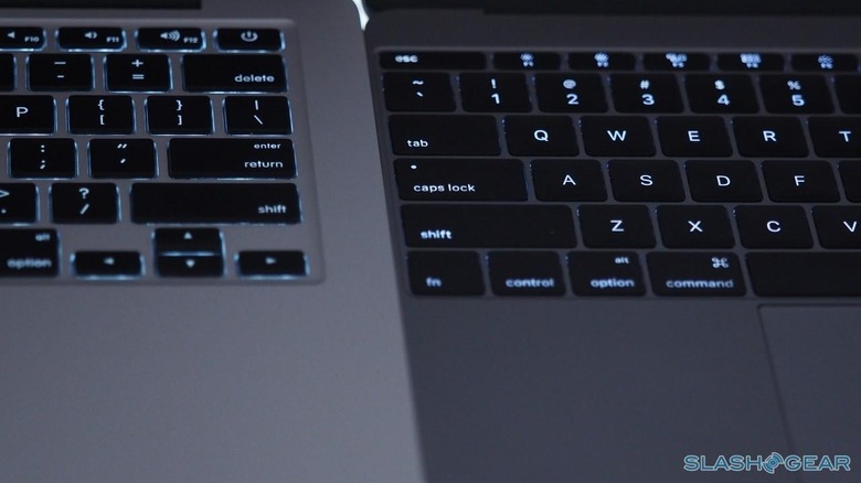
What's interesting is that you don't, at first glance, necessarily see the layout as being full-size. That's because of the larger-than-normal keycaps, 17-percent bigger than on the MacBook Air, leaving narrower tracks between them. They're lower-profile, too, and while it may be the definition of a first-world-problem, the fact that this means they don't leave greasy key indentations and smudges on the display is a huge improvement. It's hard to say if this was a happy accident or planned, but kudos to Apple either way.
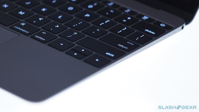
The keyboard becomes even more interesting when you get your fingers on it. Underneath is an entirely new key switch, which Apple has dubbed "Butterfly Mechanism": thinner than usual, but giving a snappier click when you hit it. It's also better balanced, so there's none of the key wobble if you hit the edge rather than dead-on in the middle.
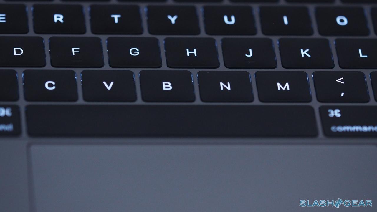
Because the Butterfly Mechanism is smaller, there's also been space underneath for an individual LED to light up each key. Apple even went one step further and mounted it so that the brightness is consistent no matter whether it's pressed or not; it's something you probably wouldn't notice ordinarily, unless Apple hadn't taken the extra effort.
Underneath the keyboard is the Force Touch Trackpad, dominating the wrist rest. It's still a sheet of smooth glass, but now it uses a combination of four force sensors and an electromagnet that mean not only is the feeling of clicking the same no matter where you press, but OS X can figure out exactly how hard you clicked, too.
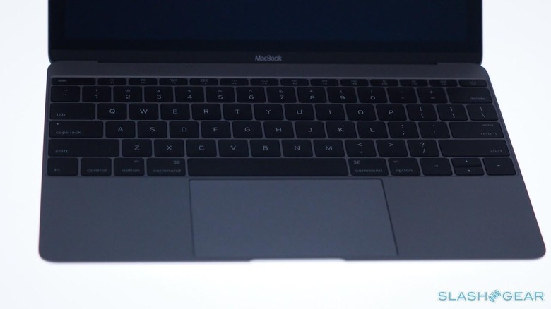
Apple calls it the Taptic Engine, and it's the same technology as has been used on the Apple Watch. For the new MacBook, it means you can adjust how hard a click is to press – across three levels – as well as enabling a "Force click". By clicking and pressing harder, you in effect get another command, which in Yosemite is mapped to things like pulling up a definition of the word you're clicking on, or opening up Apple Maps from an address.
It takes a little getting used to, but after a short while I found I'd adopted Force clicks into my regular use. I knew that was the case, because when I switched briefly over to a MacBook Pro, I found I was trying to trigger the same action on there but to no result. It'll become even more beneficial when third-party developers start tapping into Apple's Taptic Engine and Force click APIs, opening the door to more realistic art apps and more.
The Hardware and Performance
Fanless. Two pounds. 13.1 mm thick. There's a reason Apple can make the MacBook like this, and it starts with Intel's new Core M processors. The heart of the new notebook is an astonishingly small mainboard, entirely passively-cooled.
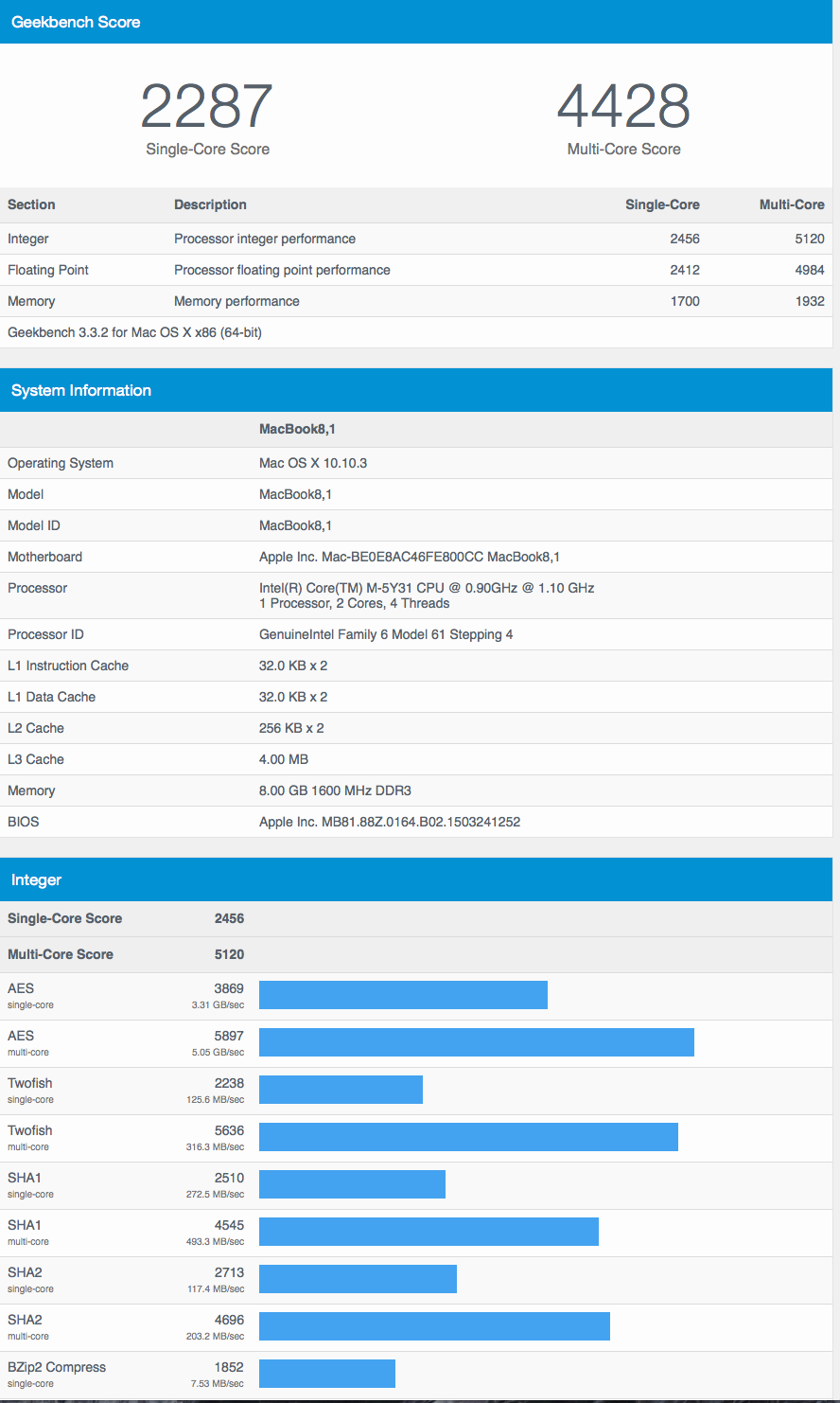
Three versions of the Core M are on offer, starting with a 1.1 GHz dualcore (with up to 2.4 GHz Turbo Boost) with 256 GB of speedy flash storage for $1,299, while a 1.2 GHz dualcore (with up to 2.6 GHz Turbo Boost) and 512 GB carries a $300 premium. 8 GB of memory is standard, and can't be upgraded, though there'll be an optional 1.3 GHz dual-core (with up to 2.9 GHz Turbo Boost).
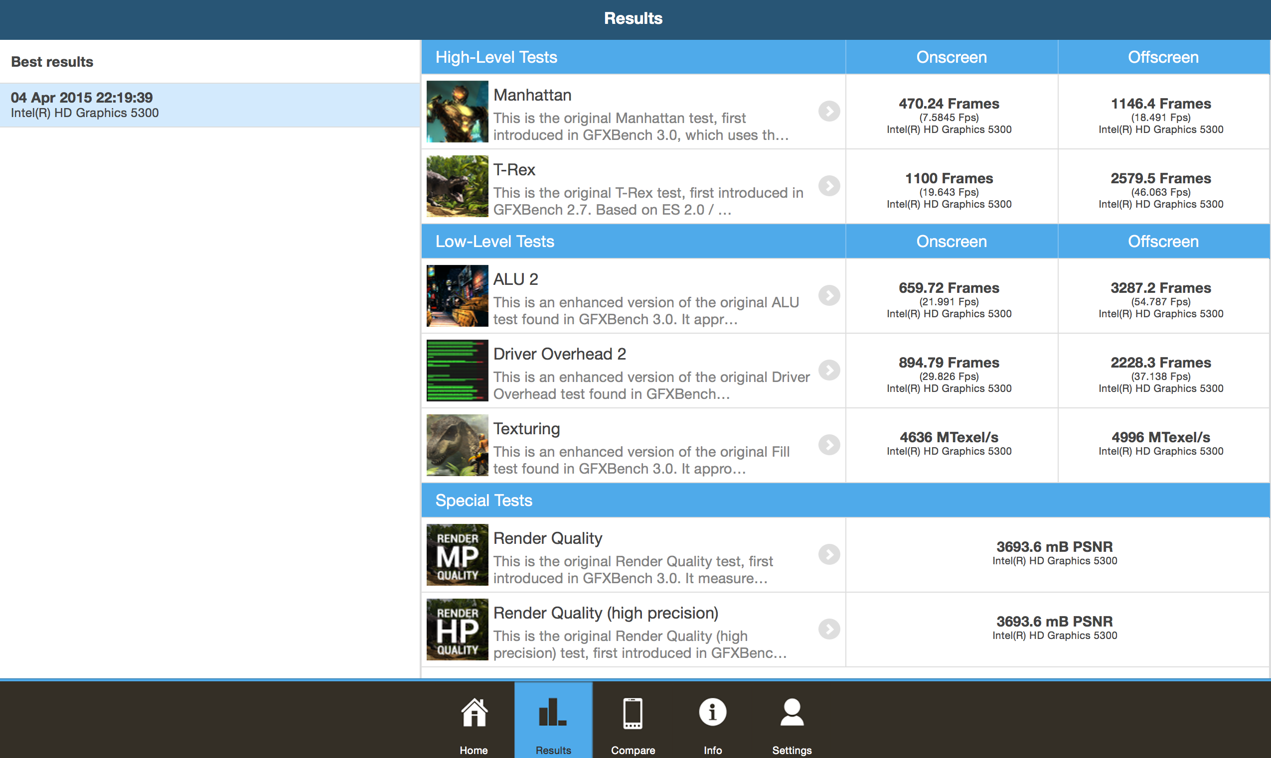
There are some compromises to be made when your silicon is sipping a miserly 5W – hardly anything, even in the mobile processor world – and the MacBook isn't going to be competing with gaming rigs. The Intel HD Graphics 5300 GPU has enough grunt to run both the notebook's own display and an external monitor at up to 3840 x 2160.
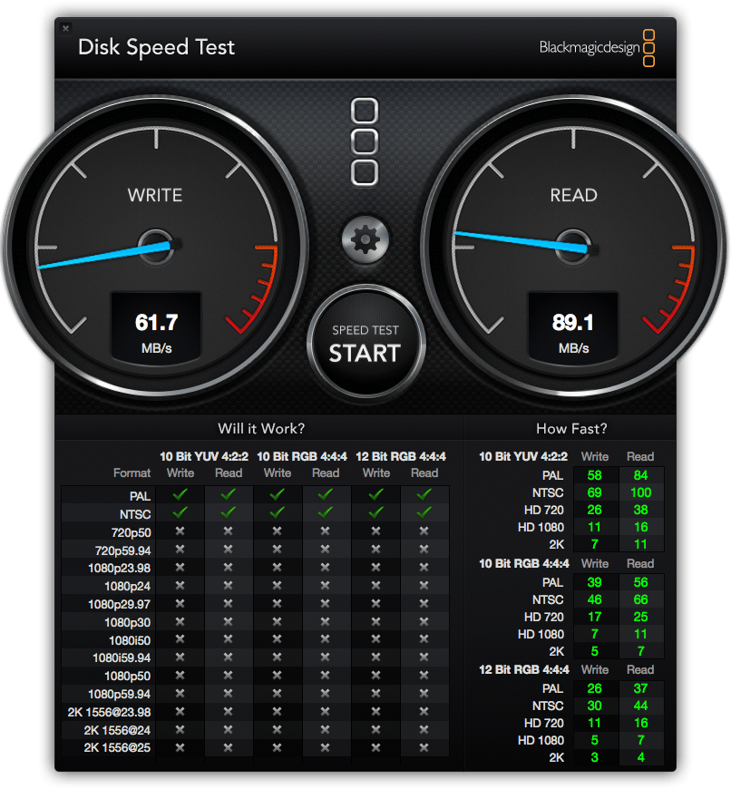
Despite that, I've been impressed by how the MacBook performs. In everyday use – browsing, word processing, editing photos, and such – the base-spec model Apple provided me with handles smoothly, with the fast flash storage helping pick up any slack from the processor.
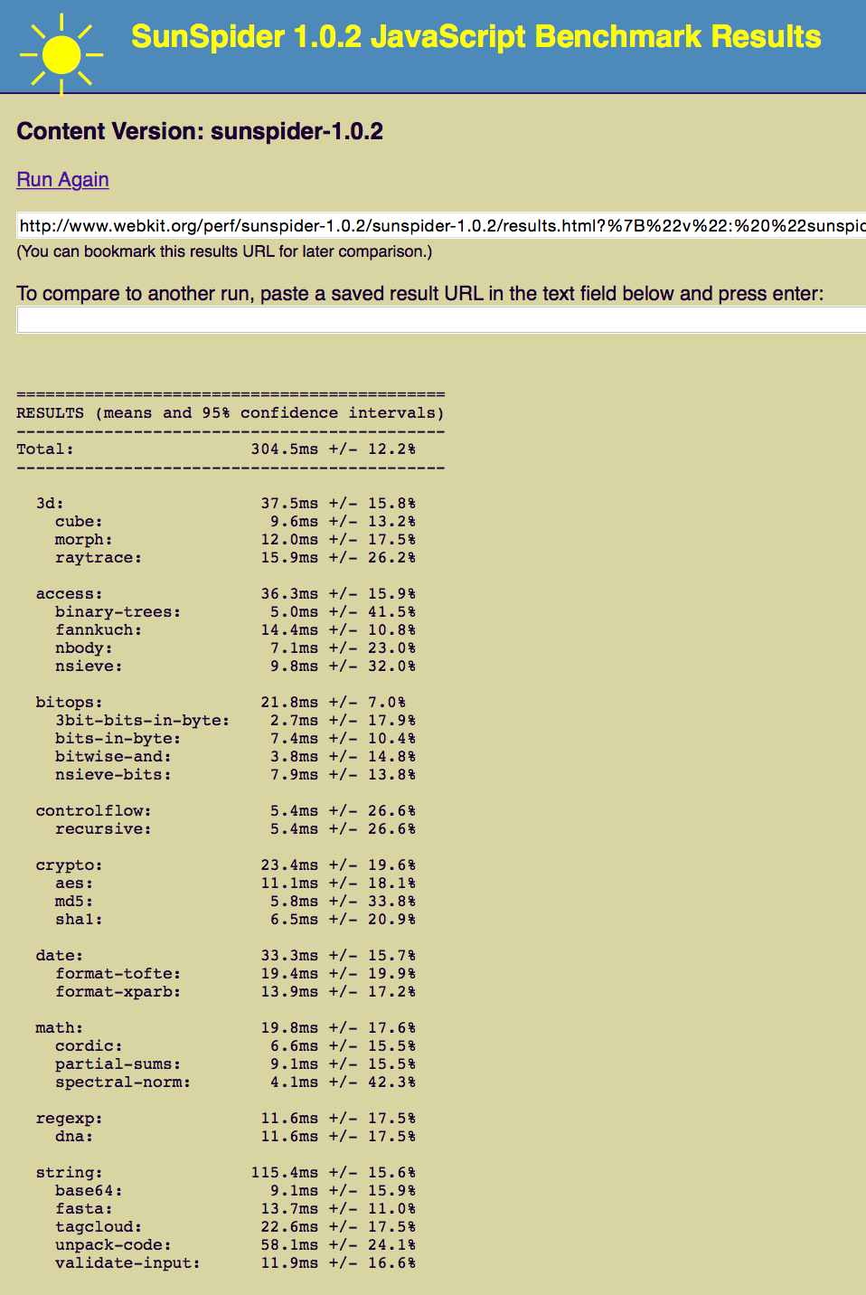
Figuring I might need to process the occasional video while on the road, I fired up iMovie and tried exporting a 5 minute 1080p clip. Surprisingly, that took just 8 minutes 15 seconds to do.
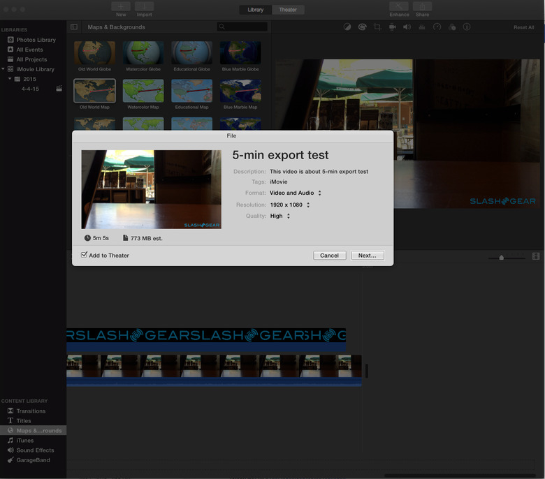
In contrast, a new 2015 13-inch MacBook Pro – with a 2.7 GHz Core i5 processor, Intel Graphics 6100 GPU, and 8GB of memory – took 4 minutes 12 seconds to process the same clip. Roughly half the time, true, but still enough performance from the MacBook to surprise me. (I'm yet to get my hands on the latest MacBook Air, and will repeat the tests on that when I have access for a full comparison.)
Is it fair to compare a fanless MacBook with a more powerful MacBook Pro that's actively cooled? Heat is certainly a legitimate concern when you've done away with the fan, but over the course of writing this MacBook review with it perched directly on my lap over the last few hours, I've barely even felt the faint heat underneath.
Helping is the fact that there's no centrally localized area where it gets noticeably hotter. Instead, the warmth feels evenly spread across the rear third of the base, while it's completely cool under the touchpad.
The Port
That's port, singular. Given Apple's history with physical connectivity – exemplified by the MacBook Air, certainly, but a trend that's spread across mobile and desktop – it should perhaps come as no surprise that the new MacBook takes a minimalistic stance on plugging things in.
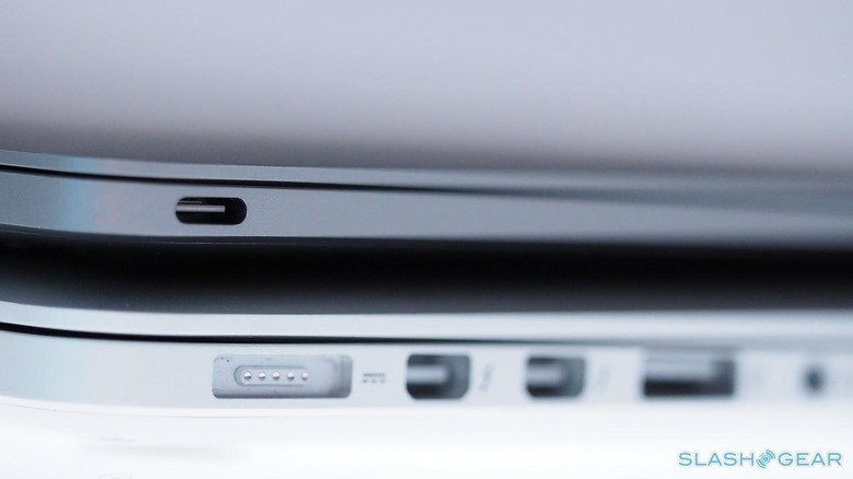
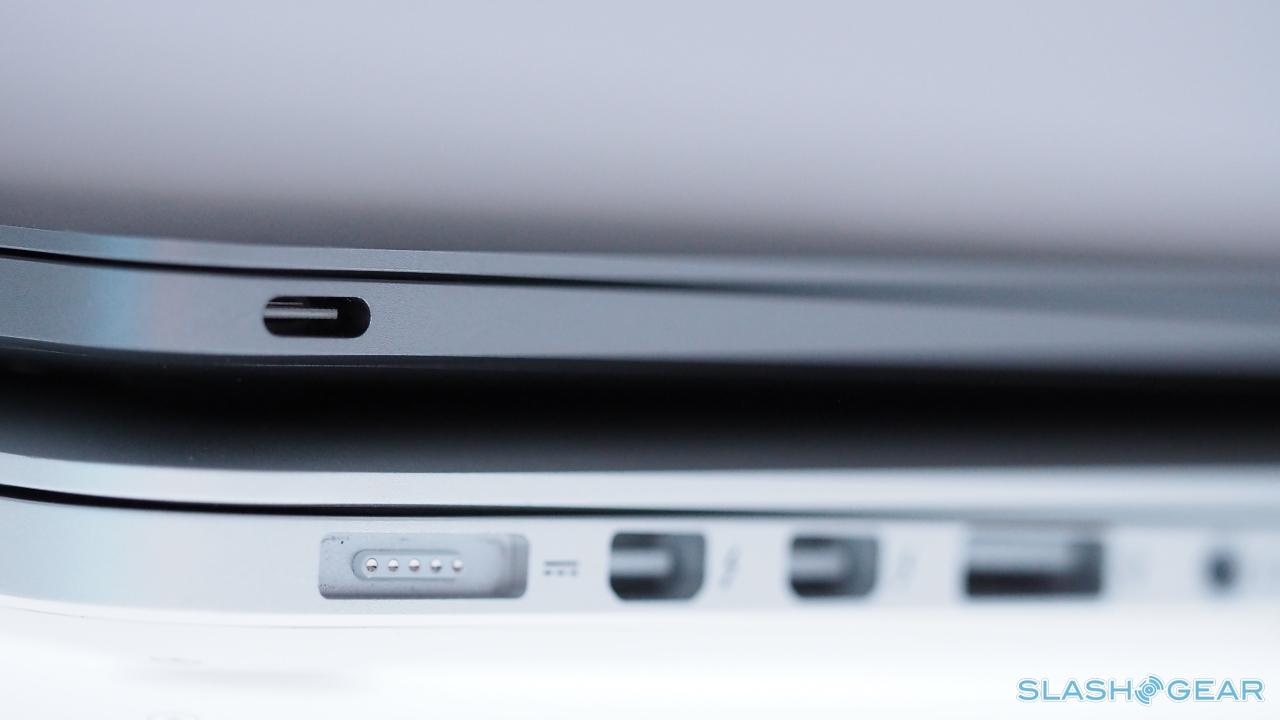
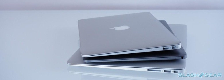
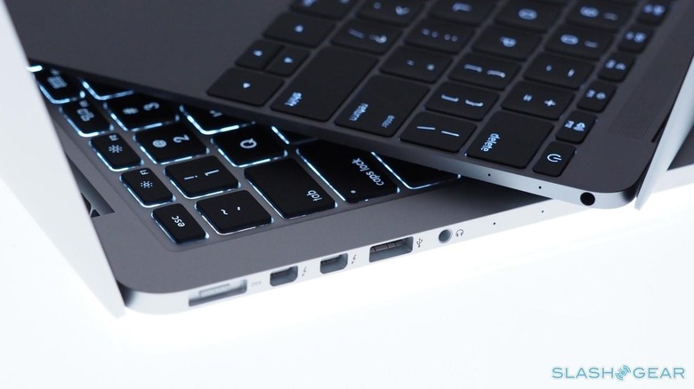
Even so, the decision to grant the MacBook a single USB-C socket on the left edge still seems ambitious, especially as that one port is expected to do almost everything (the exception being audio, since there's a combo headphones/microphone jack on the right edge; I was impressed by the power from the built-in speakers, too, though they unsurprisingly lack in bass).
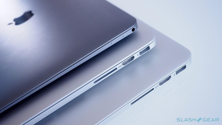
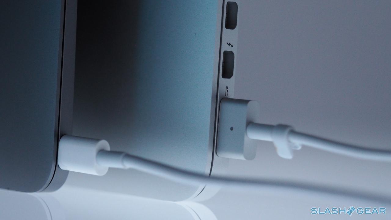
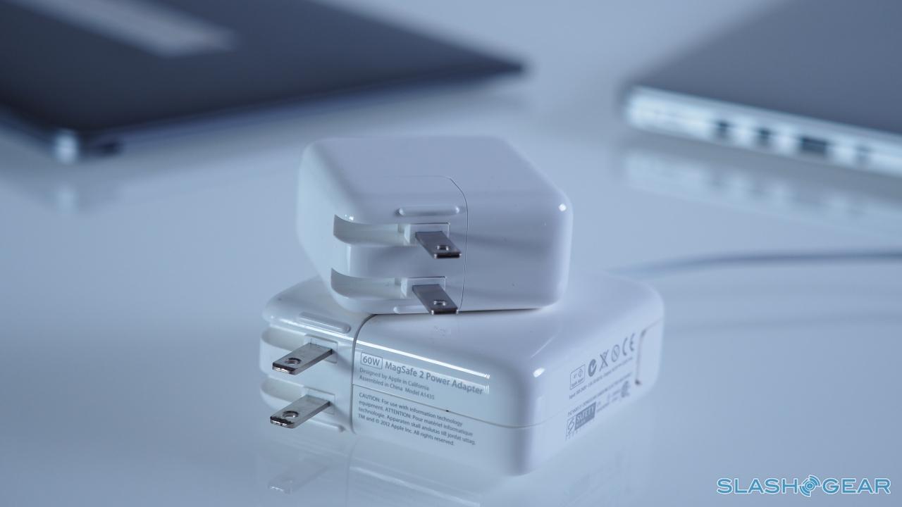
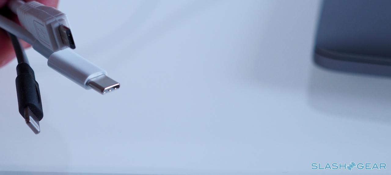
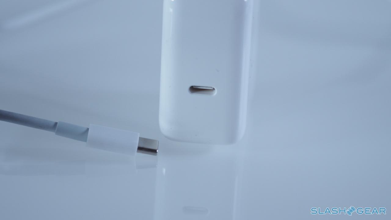
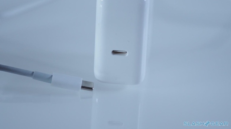
USB-C is going to be the next big standard, a single connector that – like Lightning on the iPhone – can be inserted in either orientation. While it's smaller than the USB 2.1 it replaces, it can handle more power, so Apple has been able to do away with the separate power socket (and unfortunately the MagSafe magnetic connector at the same time, which on previous MacBooks has saved me from inadvertently dashing the notebook to the floor after tripping over the cord). It can also be turned to data, at USB 3.1 speeds of up to 5 Gbps, and displays, hooking up to DisplayPort, HDMI, and VGA monitors and projects if you have the right adapter.
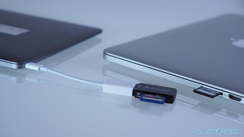
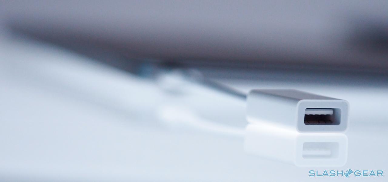
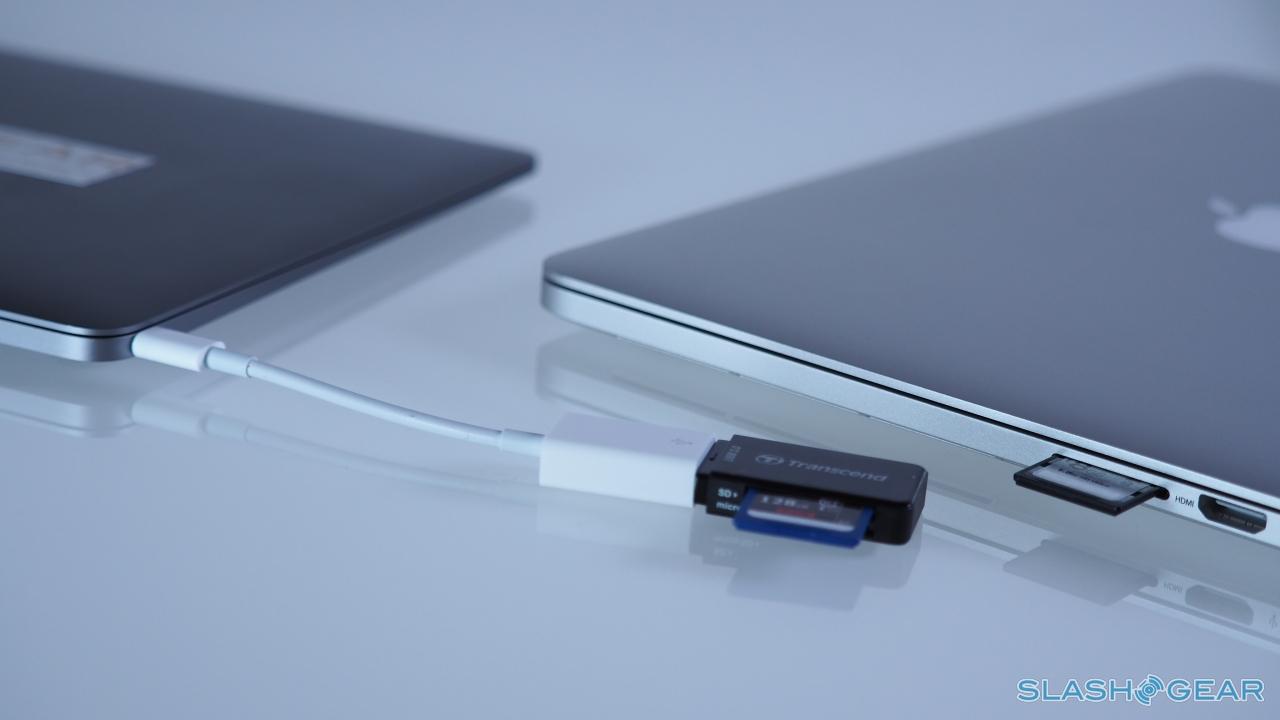
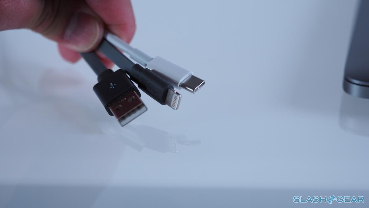
That adapter factor is the big issue. Much like in the early days of USB and Thunderbolt, there's very little that actually supports USB-C natively right now. Instead, you need a converter; Apple will offer three, ranging from a straightforward USB-C to USB dongle, through to USB-C to HDMI, and USB-C to VGA, priced at either $19 or $79 apiece.
Unlike Lightning, USB-C isn't controlled by Apple (though the Cupertino firm did have a big hand in its development) and so third-party manufacturers are free to develop their own cables, adapters, and dongles. They'll be responsible for supplying MacBook users with a USB-C to ethernet adapter, for instance, for those wanting more than WiFi a/b/g/n/ac and Bluetooth 4.0, or a USB-C to DisplayPort adapter.
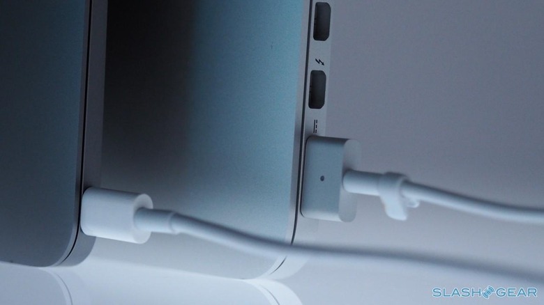
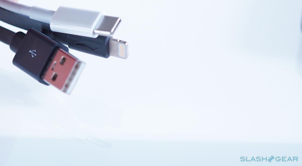
There's a price to be paid to be on the cutting edge, and waiting for everybody else to catch up is generally part of it. Most of the time, I didn't have a problem with the MacBook's paucity of ports, but it did mean I had to carry two cables – USB to Lightning, and the USB-C to USB adapter – to synchronize my iPhone and iPad.
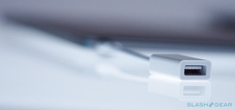
There's still no mention of whether Apple will release a USB-C to Lightning cable for iOS devices, so for now we're at the mercy of the USB-C to USB legacy connector. It's also worth noting that – unlike the more expensive dongles with video outputs – that connector lacks pass-through USB-C, and so you can't both use it and have the power supply plugged in at the same time.
The Battery
Shrinking the mainboard down, and cutting the number of ports to the bare minimum, has left Apple with as much space as possible inside the MacBook's chassis for battery. In fact, it's not just a case of more cells, but better designed ones.

Apple calls them terraced, because if you look at the contours of the stacked packs they resemble different levels in a garden or on a topographical map. It's allowed a hefty 39.7 watt-hour battery to be installed (in comparison, the 11-inch MacBook Air accommodates a more traditionally-shaped 38 watt-hour pack), which is rated for up to nine hours of web browsing over WiFi.
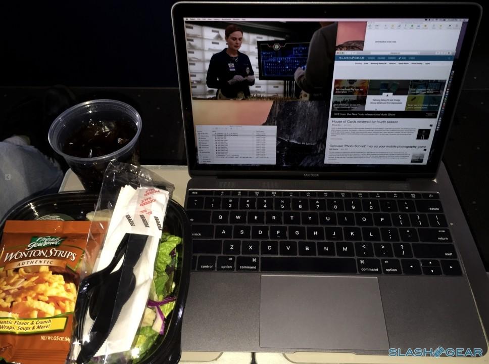
It may be Apple's new baby, but I wasn't going to coddle it. On a flight from New York City to Phoenix I used the MacBook for 5 hours 30 minutes with WiFi turned on, streaming audio to a Bluetooth headset, at default Retina resolution at mid-brightness, and still ended up with 31-percent – or an estimated 2 hours 3 minutes – left. During that time, I watched around three hours of video using iTunes and VLC, browsed the web in Chrome, used Pages to write, caught up with a little email in Mail, and chatted in iMessage and Slack.
It didn't stop there. In fact, once I was home, I squeezed a further two hours of similar use out before the MacBook got to 2-percent and warned me it was about to go into sleep mode.
7.5 hours of that sort of use is impressive. I'm in no doubt that, had I been a little less demanding, I could've prolonged it by another hour or more.
The Competition
If you're an OS X fan, the MacBook's primary competitors are the MacBook Air in either 11- or 13-inch forms. They're cheaper – from $899 or $999 respectively, versus the 12-inch MacBook's $1,299 starting price – but they're bigger, heavier, and have comparatively underwhelming displays. Personally, I know I'd always be side-eying the MacBook and wishing I'd taken the leap.
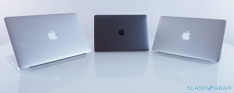
Then there's the 13-inch MacBook Pro with Retina display. It costs the same as the MacBook, at $1,299, but has a bigger screen, far more power with a Core i5 processor, and plenty more ports. On the flip side, while it's the slimmest MacBook Pro to-date it's still about 75-percent heavier than the new MacBook – not to mention considerably thicker – and even with that you don't get the discrete GPU that the 15-inch MacBook Pro enjoys.
It comes down to that power/portability decision again, and that depends on whether you're a regular traveler, intend to use your laptop as your sole computer, and how much more processor-intensive work you plan to do. If you've a desktop or a more potent (but undoubtedly less portable) laptop to rely on for any more ambitious tasks you might face, the MacBook makes a solid accompaniment to that.
Those considering Windows also have a couple of options. The new MacBook is thinner and lighter than Dell's XPS 13, which is 2.6 pounds, though the Dell has a bigger 13-inch screen and is a little cheaper. Lenovo's Yoga 3 Pro, meanwhile, is also 2.6 pounds but has a convertible 13-inch touchscreen, though battery life is worse than on the MacBook.
Microsoft's Surface Pro 3 and, most recently announced, the Surface 3 are each lighter than the MacBook, though they rely on a sometimes fiddly magnetic keyboard cover that pales for typists in comparison to Apple's 'board.
However there's another possibility. Like a lot of people, I've tried using the iPad as a legitimate work tool over the past couple of years, particularly since the arrival of the more powerful iPad Air.
My experiment hasn't been a runaway success, though. No matter what case I've tried, or how brilliant a third-party keyboard accessory is, I simply couldn't make the iPad a fully productive device. The keyboards have never been fully integrated, meaning they then become either a hassle to carry around or add additional bulk and weight to a case.
Meanwhile, iOS simply lacks the sort of multitasking that OS X can do. If there's one thing I've discovered, it's that in this day and age I need to have more than one app open and on-screen simultaneously.
The Final Judgement
It's not too great a stretch to say that, in the time I've spent with the MacBook, I've felt more inspired to enjoy writing again.I can pick it up, drop it on my lap, and just type away. Sure, you might ask what's wrong with the Surface for that, but even with Microsoft's changes to the keyboard mount, the whole thing still feels flimsy and uncomfortable.
In contrast, the new Macbook makes a laptop truly a laptop again. No heat to scorch your lap. Lightweight enough that you can be working for hours without losing sensation in the rest of your legs. And, being that it's a laptop, you shouldn't have to worry about plugging it in after a few hours of use, and there the power-sipping processor and OS X's smarts allow you to keep going for hours.
It's undoubtedly cutting edge, and not everyone is there yet. Those with a bag full of peripherals will find the single USB-C port restrictive, and anybody with more ambitious plans than browsing, writing, watching videos, and a little multimedia processing will probably find the processor and graphics a bottleneck. Fair enough: the MacBook Pro fits that niche with aplomb.

As someone who spends half his life – or more – on the road, however, the 2015 MacBook has been an eye-opener. Incredible design that's also highly usable; lengthy battery life and enough speed to deal with most of the challenges I encounter; and all at a price that, when you take into account the breadth specifications, sounds more and more reasonable. It's a traveller's dream, and that's why it's become an essential in my bag.
