LG webOS TV Hands-On
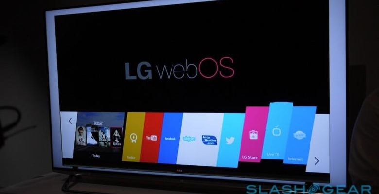
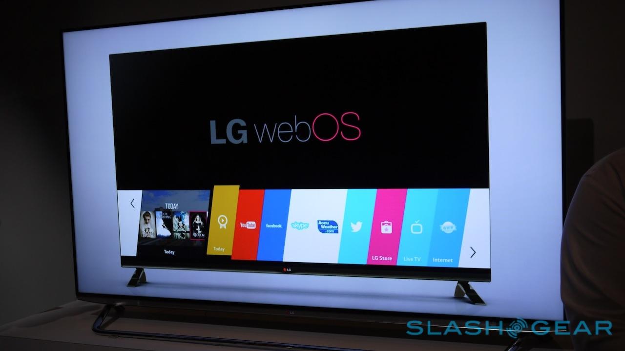
With the newest implementation of webOS, LG is aiming for ultimate simplicity in their smart TVs across the board. What we're seeing in this first iteration – ready for the market this year, mind you – is just that. Moving forward with a simple line of boxes which you're able to select by moving back and forth with a cursor makes webOS as easy to use as it's ever been.
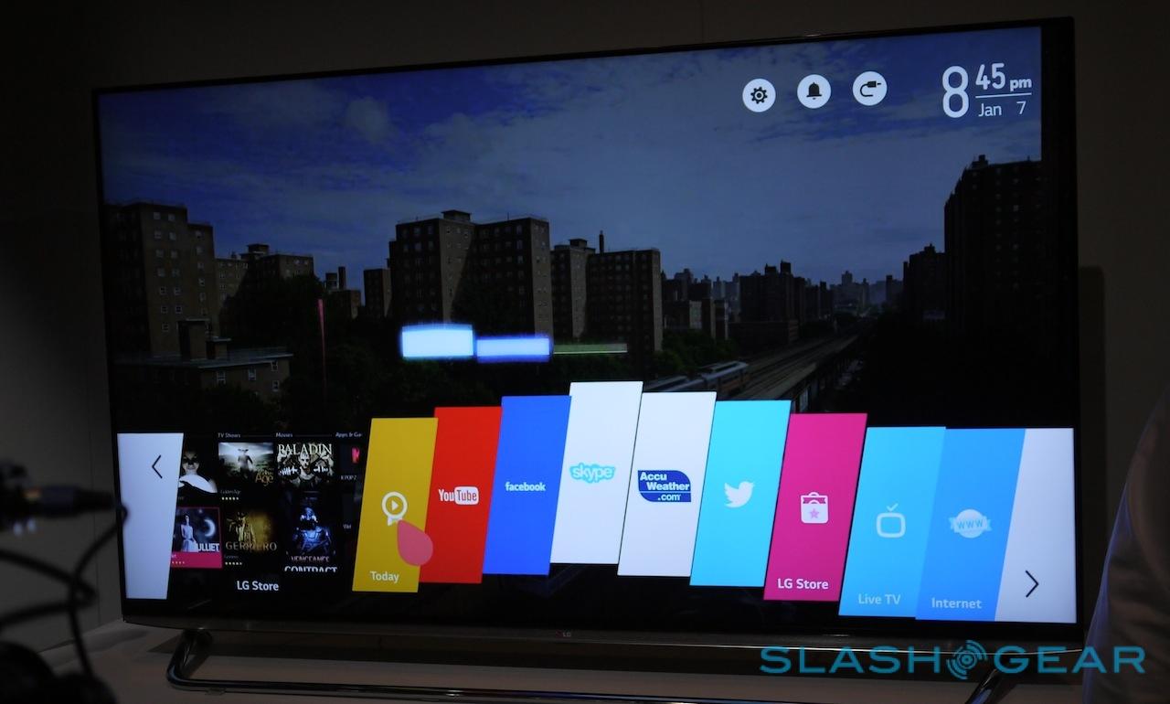
You'll be working with a home screen with the name "present" atop it, with apps like Netflix, YouTube, and Hulu Plus ready for the tapping. Users are able to select their content using the LG Motion remote, selecting these bits with the easy to aim for panels along the bottom of the screen. Above you'll also find Settings with a much larger set of targets – you'll not be needing to hit that up as often, as it were.
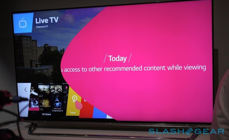
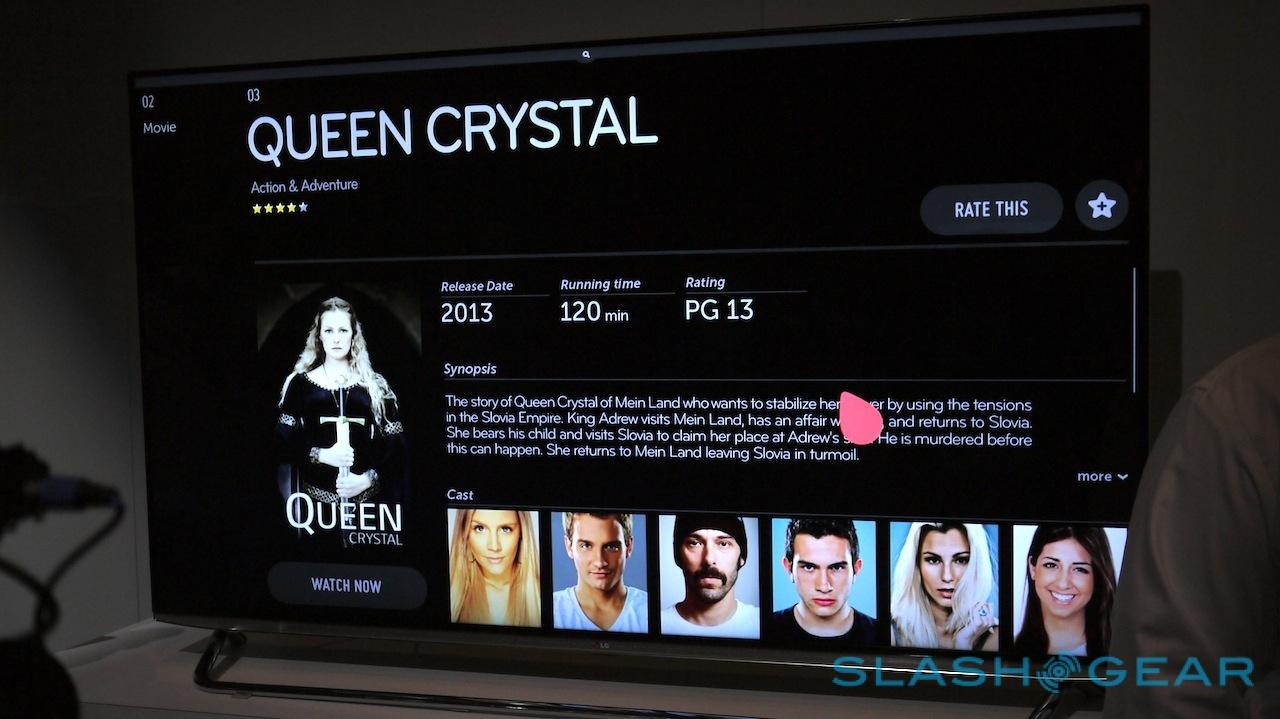
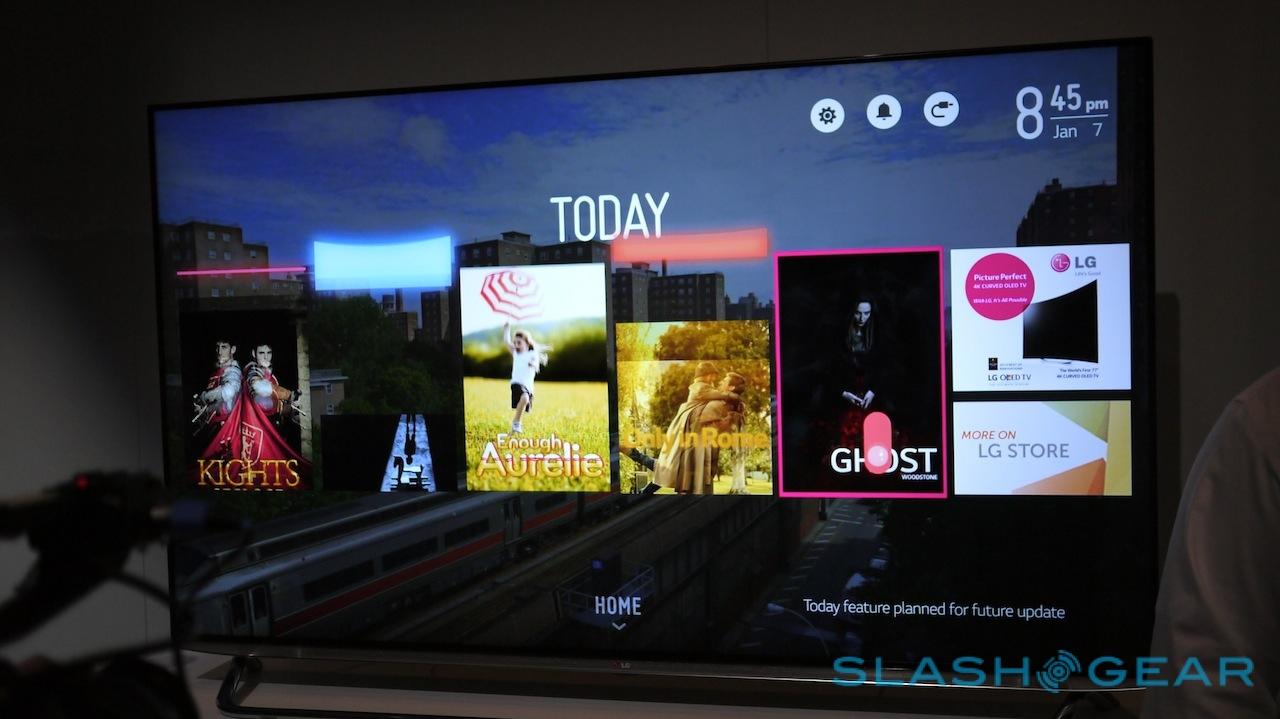
Working with these Cards in a small form, you'll also be able to tap to see larger splash screens for each bit of content. There's what LG calls it's "Bean Bird" present to encourage the user to create a full setup – or you can just run in as simple an iteration as you like.
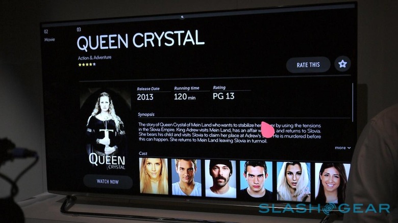
The entire setup is made to blend well – the colors work well with one another, and the aesthetics from top to bottom are quite appealing. It just LOOKS good. While systems like Android and iOS have an impossible mission of making all of their icons – from thousands of apps, no less – match, here LG has (at least at first) created a unified system for looks and use.
We'll be seeing a whole lot more of this webOS system for LG smart TVs throughout the year – and here at CES 2014 without a doubt. It'll be in a large cross-section of LG televisions this season and into the future, too.
